Tag Archive: Great Graphic
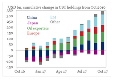
Great Graphic: Treasury Holdings
The combination of a falling dollar and rising US interest rates has sparked a concern never far from the surface about the foreign demand for US Treasuries. Moreover, as the Fed's balance sheet shrinks, investors will have to step up their purchases.
Read More »
Read More »
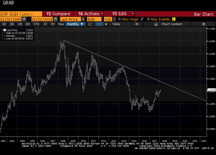
Great Graphic: Euro Monthly
The euro peaked in July 2008 near $1.6040. It was a record. The euro has trended choppily lower through the end of 2016 as this Great Graphic, created on Bloomberg, illustrates. We drew in the downtrend line on the month bar chart. The trend line comes in a little below $1.27 now and is falling at about a quarter cent a week, and comes in near $1.26 at the end of February.
Read More »
Read More »
Great Graphic: Progress
The world looks like a mess. While the economy appears to be doing better, disparity of wealth and income has grown. Debt levels are rising. Protectionism appears on the rise. Global flash points, like Korea, Middle East, Pakistan, Venezuela are unaddressed. At the same time, this Great Graphic tweeted by @DinaPomeranz, with a hat tip to @bill_easterly is a helpful corrective.
Read More »
Read More »
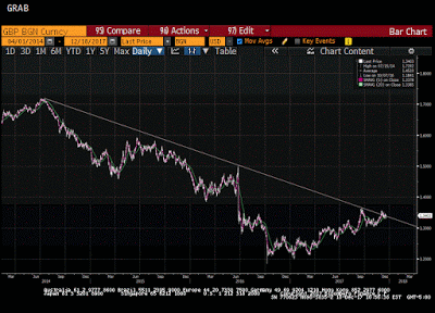
Great Graphic: Sterling Toys with Three-Year Downtrend Line
Sterling is the second major currency this year after the euro (and its shadow the Danish krone). The downtrend line from mid-2014 is fraying. Is this the breakout?
Read More »
Read More »
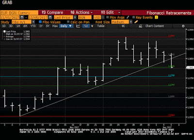
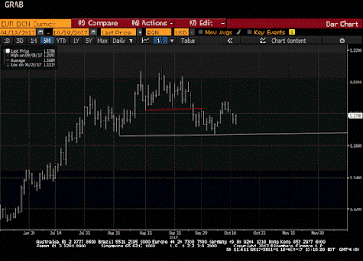
Great Graphic: Euro Pushes below November Uptrend
Euro is lower for the third day, the longest downdraft in a month and a half. It violated the November uptrend. It is testing the $1.1800 area, which houses a few technical levels (retracement, moving average and congestion).
Read More »
Read More »
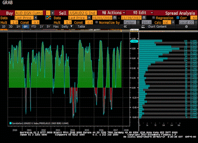
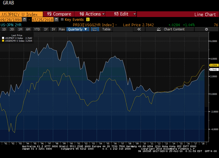
Great Graphic: US 2-year Yield Rises Above Australia for First Time since 2000
The US and Australian two-year interest rates have diverged. There is scope for a further widening of the spread. Directionally the correlation between the exchange rate and the rate differentials is strong, but not stable. Near-term technicals are supportive but the move above trendline resistance is needed to confirm.
Read More »
Read More »
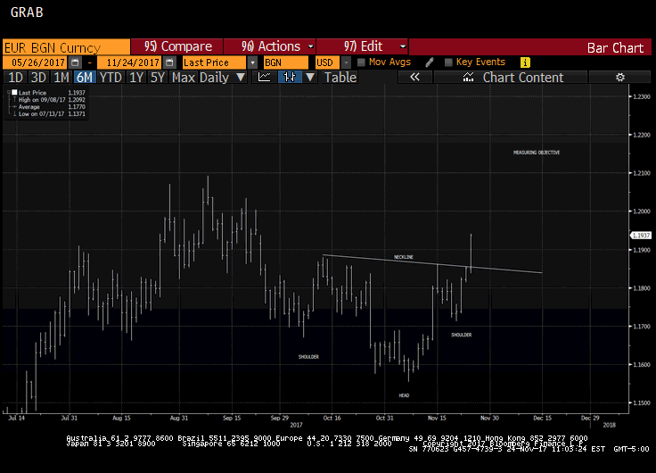
Great Graphic: Is that a Potential Head and Shoulders Pattern in the Euro?
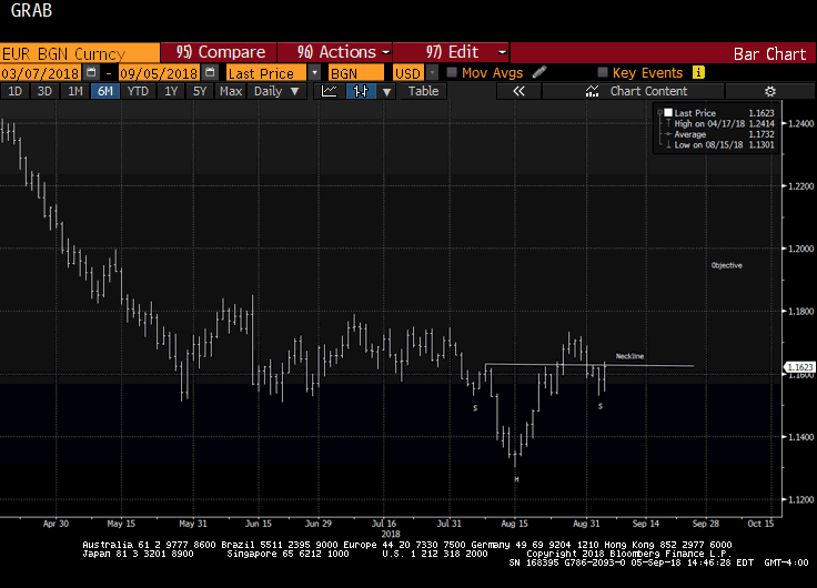
The euro is breaking out to the upside. The measuring objective is near $1.2150, which is near the 50% retracement of the euro's drop from the mid-2014 high. Key caveat: It is about the upper Bollinger Band and rate differentials make it the most expensive to hold since the late 1990s.
Read More »
Read More »
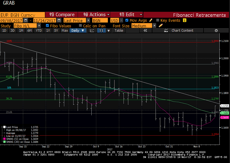
Great Graphic: Euro Approaching Key Test
Euro is testing trendline and retracement objective and 100-day moving average. Technical indicators on daily bar charts warn of upside risk. Two-year rate differentials make it expensive to be long euros vs. US. Beware of small samples that may exaggerate seasonality.
Read More »
Read More »
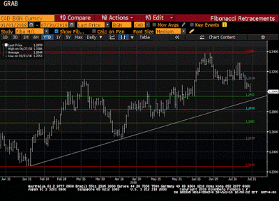
Canada: Monetary and Fiscal Updates This Week
Divergence between US and Canada's two-year rates is key for USD-CAD exchange rate. Canada's 2 hikes in Q3 were not part of a sustained tightening sequence. Policy mix considerations also favor the greenback if US policy becomes more stimulative.
Read More »
Read More »
Great Graphic: The Euro’s Complicated Top
Euro looks like it is carving out a top. The importance also lies in identifying levels that the bearish view may be wrong. Widening rate differentials, a likely later peak in divergence than previously anticipated, and one-sided market positioning lend support to the bearish view.
Read More »
Read More »
Great Graphic: Potential Head and Shoulders Bottom in the Dollar Index
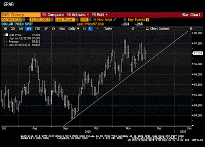
This Great Graphic was composed on Bloomberg. t shows the recent price action of the Dollar Index. There seems to be a head and shoulders bottoming pattern that has been traced out over the last few weeks. The right shoulder was carved last week, and today, the Dollar Index is pushing through the neckline, which is found by connecting the bounces after the shoulders were formed.
Read More »
Read More »
Great Graphic: Young American Adults Living at Home
This Great Graphic caught our eye (h/t to Gregor Samsa @macromon). It comes from the US Census Department, and shows, by state, the percentage of young American adults (18-34 year-olds).The top map is a snap shot of from 2005. A little more than a quarter of this cohort lived at home. A decade later, and on the other side of the Great Financial Crisis, the percentage has risen to a little more than a third.
Read More »
Read More »
Great Graphic: Home Ownership and Measuring Inflation
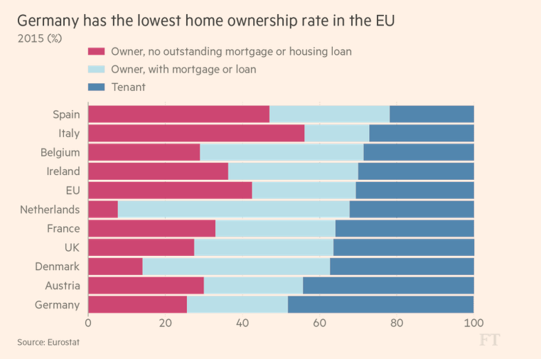
Home ownership varies throughout the EU but is overall near US levels. Germany has the lowest home ownership, and Spain has the most. Italy has the least amount of mortgages. US include owner equivalent rents in CPI, the EU does not.
Read More »
Read More »
Great Graphic: Small Caps and the Trump Trade
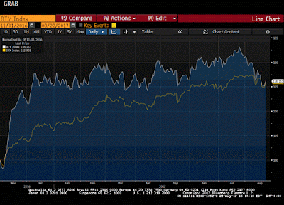
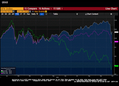
The Russell 2000, which tracks the 2000 smallest companies in the Russell 3000, is threatening to turn positive for the year. It had turned negative in the second half of last week. Many pundits saw its decline and the penetration of the 200-day moving average for the first time in over a year as a sign of an impending down move in the broader equity market.
Read More »
Read More »
How will Yellen Address Fostering a Dynamic Global Economy?
Yellen has identified two challenges regarding the US labor market, the opioid epidemic and women participation in the labor force. The topic of the Jackson Hole gathering lends itself more to a discussion of these issues than the nuances of monetary policy. Dynamic world growth needs a dynamic US economy, and that requires more serious thinking about these socio-economic and political issues.
Read More »
Read More »
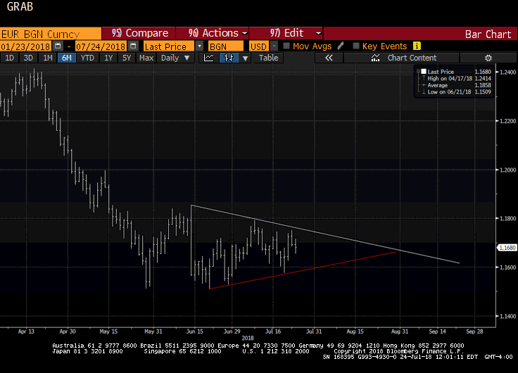
Euro Flirting with Near-Term Downtrend
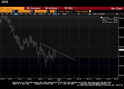
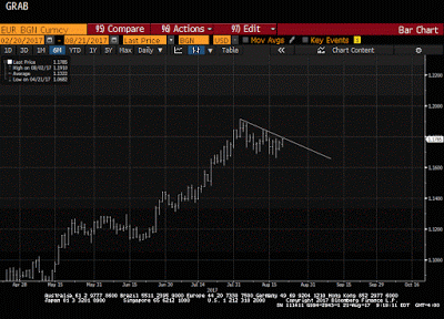
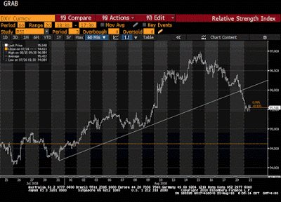
North American traders began the week by selling dollars. Euro is testing a downtrend off the year's high. DXY is testing its uptrend.
Read More »
Read More »
Great Graphic: Unemployment by Education Level
The US reports the monthly jobs data tomorrow. The unemployment rate stood at 4.4% in June, after finishing last year at 4.7%. At the end of 2015 was 5.0%. Some economists expect the unemployment rate to have slipped to 4.3% in July. Recall that this measure (U-3) of unemployment counts those who do not have a job but are looking for one.
Read More »
Read More »
Great Graphic: Italy-It is Not Just about Legacy
A little while back I was part of a small exchange of views on twitter. It was about Italy. I was arguing against a claim that Italy's woes are all about its past fiscal excesses. It is not just about about Italy's legacy.
Read More »
Read More »
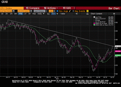
Great Graphic: CRB Index Hits 2017 Down Trendline
The CRB Index gapped higher today and it follows a gap higher opening on Tuesday, which has not been filled. Today's gains lift the commodity index to a trendline drawn off the January and February highs and catches the high from late May. It intersects today near 181.35 and the high has been a little over 181.17.
Read More »
Read More »
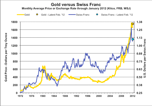
Great Graphic: What Is the Swiss Franc Telling Us?
Swiss franc weakness is a function of the demand for euros. SNB indicates it will lag behind the other major central banks in normalization process. Easing of political anxiety in Europe is also negative for the franc.
Read More »
Read More »


