Tag Archive: Great Graphic
Primary Budget Balances in EMU
Greece debt has rallied as a repeat of the 2015 crisis seems less likely. The EC may turn its attention to Italy's structural deficit. There are several countries, including France that is forecast to have a larger primary deficit in 2018 than 2017.
Read More »
Read More »
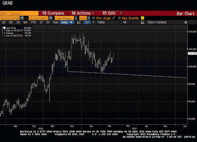
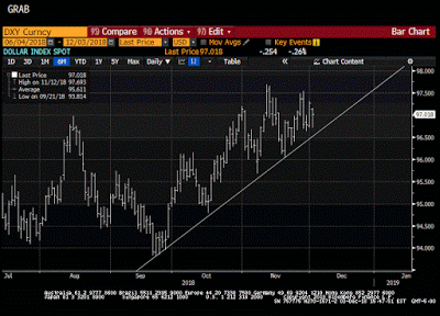
Dollar Index: The Chart Everyone is Talking About
Many are discussing a possible head-and-shoulders pattern in the Dollar Index. We are skeptical as other technical signals do not confirm. We recognize scope for disappointment over the border tax and the next batch of employment data, but European politics is the present driver and may not be alleviated soon.
Read More »
Read More »
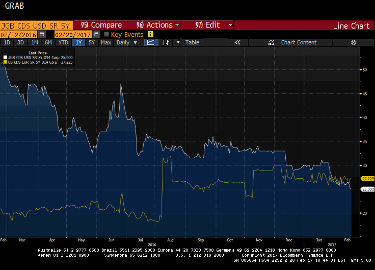
Great Graphic: US and Japan Five-Year Credit Default Swaps
For the first time since the financial crisis, the 5-year CDS on JGBs is dipping below the 5-year US CDS. It appears to be more a function of a decline in Japan's CDS than a rise in the US CDS. We are reluctant to read too much into the small price changes in the mostly illiquid instruments.
Read More »
Read More »
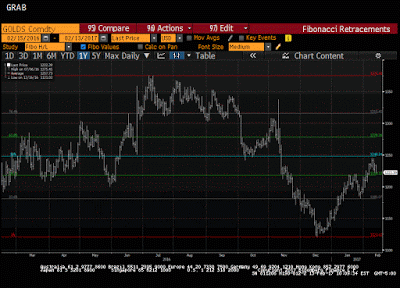
What is Good for the Dollar is Bad for Gold
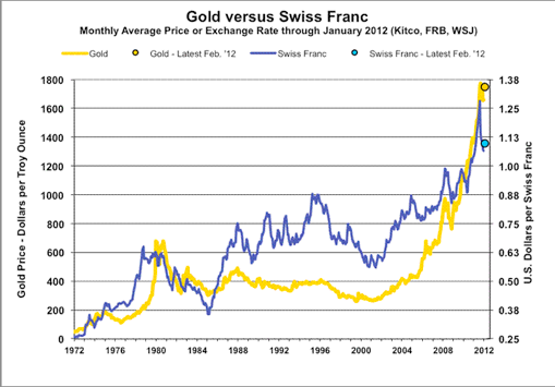
The Dollar Index is powering ahead, moving higher for the eighth consecutive session. Over the past 100 sessions, gold and the Dollar Index move in the opposite direction more than 90% of the time. The technical condition of gold is deteriorating.
Read More »
Read More »
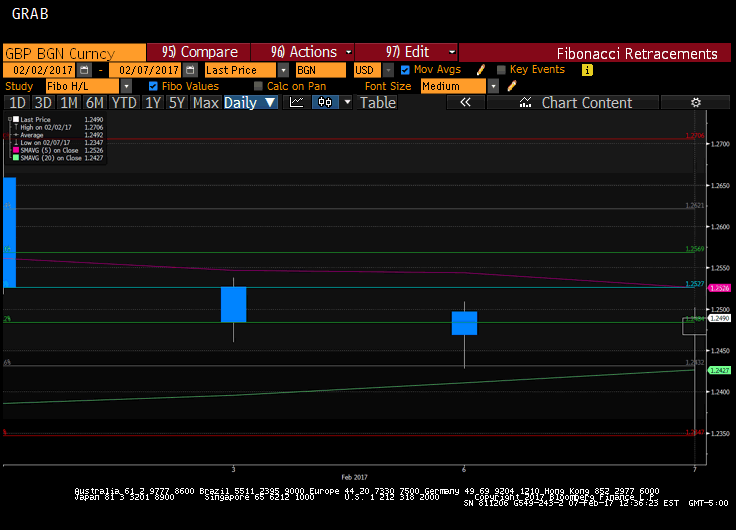
Great Graphic: Interesting Sterling Price Action
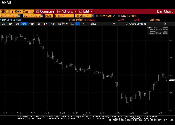
Sterling is having an interesting day. It fell in the face of the US dollar's bounce but has recovered fully. It has not yet traded above yesterday's high (~$1.2510) but it may. It does appear to be tracing out a hammer in Japanese candle stick terms.
Read More »
Read More »
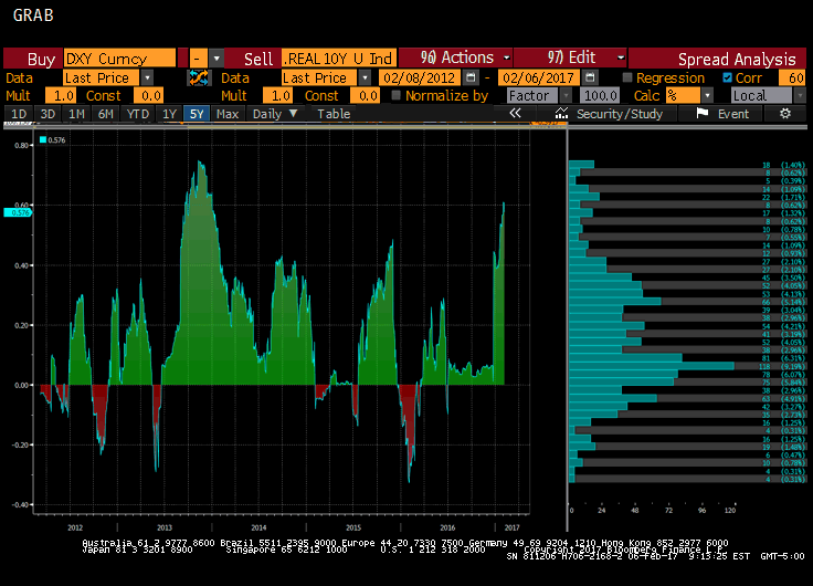
The Dollar: Real or Nominal Rates?
Real interest rates are nominal rates adjusted for inflation expectations.Inflation expectations are tricky to measure. The Federal Reserve identifies two broad metrics. There are surveys, like the University of Michigan's consumer confidence survey, and the Fed conducts a regular survey of professional forecasters. There are also market-based measures, like the breakevens, which compare the conventional yield to the inflation-linked, or protected...
Read More »
Read More »
Great Graphic: French Premium over Germany Continues to Grow
European premiums over Germany typically increase in a rising interest rate environment. France's premium is at the most in two years. France is still set to turn back the challenge from Le Pen.
Read More »
Read More »
Great Graphic: Mexico and China Unit Labor Costs
Mexico has been gaining competitiveness over China before last year's depreciation of the peso. The depreciation of the peso, and other US actions can contribute to the destabilization of Mexico. An economically prosperous and stable Mexico has long been understood to be in the US interest.
Read More »
Read More »
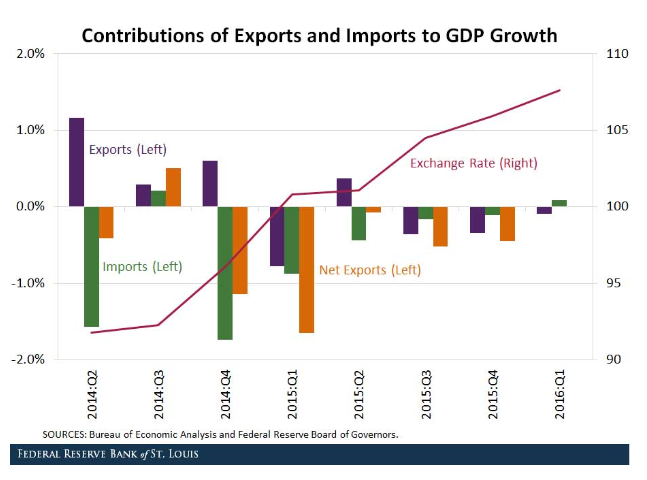
Great Graphic: How a Strong Dollar Weighs on Net Exports
Investors appreciate that a strong dollar can impact US growth through the net export component of GDP. The dollar's appreciation can push up the price of exports and lower the cost of imports. The St. Louis Fed took a look at how the strong dollar from 2014 to the beginning of 2016 impacted the net export function of GDP.
Read More »
Read More »
Great Graphic: Trade and Tariffs-End of an Era?
This Great Graphic was tweeted by the Financial Time's John Authers, who got it from @fathomcomment. The green line is the inversion of global trade (right-hand scale). The blue line is a trade-weighted average global tariff rate. What the chart shows is that since 1990, the decline in the average tariff coincided with an increase in trade (remember green line is inverted).
Read More »
Read More »
Great Graphic: Is the Pound Sterling?
Sterling's 2.75% rally today is the biggest advance in more than eight years. The UK government has done a good job of managing expectations. Over the last week or so, Prime Minister May and Chancellor of the Exchequer Hammond has made it clear that the intention was a "clean break" from the EU.
Read More »
Read More »
The Difference of an A and BBB for Italy
DBRS cut Italy's rating to BBB from A. It will increase the haircut on Italy's sovereign bonds used for collateral by Italian banks. It is not a mortal blow or a significant hit, but is not helpful, except to add pressure on Italy and further reduce its ability to respond to another shock.
Read More »
Read More »
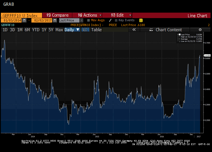
Great Graphic: Real Rates in US are Elevated
The US 10-year yield fell briefly below 1.32% last July. The yield slowly rose to reach 1.80% in mid-October. The day after the election, the yield initially slipped to almost 1.71%. This was a bit of a miscue, and the yield rose sharply to hit almost 2.64% the day after the FOMC hiked rates for the second time in the cycle on December 14. The yield backed off to hit 2.33% at the end of last week.
Read More »
Read More »
Great Graphic: Real Wages
This Great Graphic caught my eye. It was tweeted by Ninja Economics. Her point was about immigration. German had much higher immigration than the UK, but also saw real wage increase of nearly 14% in the 2007-2015 period, while real wages in the UK fell nearly 10.5%.
Read More »
Read More »
You Know what Happened to Nominal Exchange Rates, but What about Effective Exchange Rates?
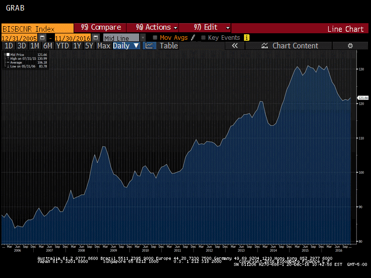
Yen is up slightly this year on an effective trade weighted basis. The euro has gained about 1% this year on an effective trade weighted basis. Sterling's decline has been significant on an effective basis. The yuan's decline looks to have corrected overshoot and is still holding an 11-year uptrend on the BIS real effective basis.
Read More »
Read More »
Great Graphic: Another Look at the Reproduction Problem
In order for a society to be sustained social relations have to be reproduced. Yet now neither the middle class nor capital are able to reproduce themselves. This may be the single greatest challenge our society faces.
Read More »
Read More »
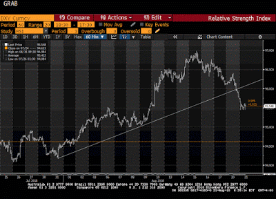
Great Graphic: Dollar Index Update
The Dollar Index's technical tone has deteriorated. It is corresponding to the easing of US rates and a narrowing differential. The risk is that the correction can continue in the coming days.
Read More »
Read More »
Great Graphic: Yen and Yuan Connection
The US dollar has rallied against both the Japanese yen and Chinese yuan since the end of September. Through today, the yen has fallen 9.8% and the yuan has fallen by 3.5%. What they have in common is the rise in US interest rates relative to their own. Since September 30, the US 10-year yield has from below 1.60% to above 2.40% at the end of last week. Japan's 10-year yield has risen from minus nine basis points at the end of September to five...
Read More »
Read More »
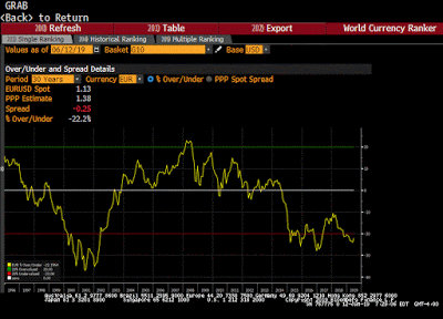
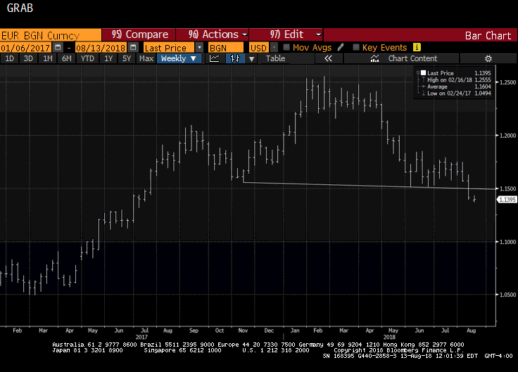
Great Graphic: Euro-the Big Picture
Most economists are focusing on either US monetary policy or US fiscal policy. We focus on the policy mix. After the policy mix, politics is also a weigh on the euro. Our long-term call is for the euro to revisit the lows from 2000.
Read More »
Read More »
Great Graphic: Growth in Federal Spending
Federal spending growth under Obama is lower than under the previous four presidents. Subsequent to the chart, US federal spending has increased. It will likely increase more under the next President.
Read More »
Read More »


