Tag Archive: Great Graphic
Great Graphic: Shifting Trade-Weighted Exchange Rates
The dollar's trade-weighted index is firming and a couple percentage points from the year's high set in January. The yen's trade-weighted index is at several month lows, but remains dramatically higher ear-to-date. The euro's trade-weighted index has begun falling amid concerns that it is the next focus for the anti-globalization/nationalism movement. Sterling's trade-weighted index is extending its recovery as a softer Brexit is anticipated, the...
Read More »
Read More »
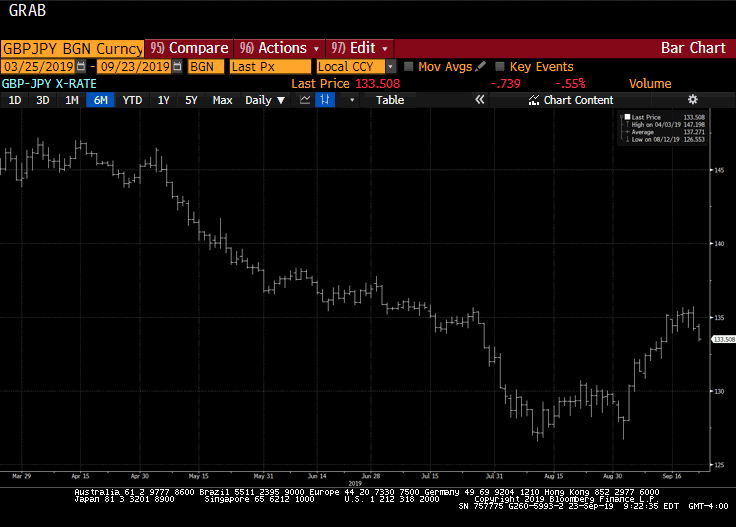
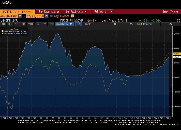
Rising US Premium Lifts Dollar-Yen
US 10-year rate premium is the largest in 2.5 years. US 2-year premium is the most since Q4 2008. Japanese investors likely will be buying foreign bonds, while foreigners may see opportunities in Japanese stocks after being large sellers in the first 9 months of the year.
Read More »
Read More »
Sterling High Court Decision on Parliament’s Right to Vote on Brexit
The UK High Court defends Parliament's right to vote before Article 50 is triggered. The decision will be appealed. Sterling approached an important resistance as it extended its rally for the fifth session.
Read More »
Read More »
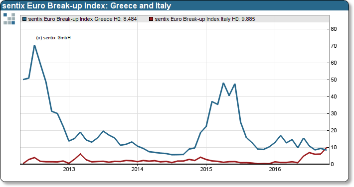
Great Graphic: Sentix Shows a Shift
The risk that the eurozone implodes over the next year has risen, but is still modest. Italy has surpassed Greece as the most likely candidate. The December referendum is the second part of Renzi's political reforms.
Read More »
Read More »
Great Graphic: Italian Banks and a German Bank
DB and Italian bank stocks have been moving in tandem. They suffer from fundamentally different problems. The euro has been selling off as the bank shares rebound.
Read More »
Read More »
Great Graphic: Consumer Inflation: US, UK, EMU
Price pressures appear to have bottomed for the US, UK, and to a lesser extent, EMU. Rise in prices cannot be reduced solely to the increase of oil. Core prices are also rising.
Read More »
Read More »
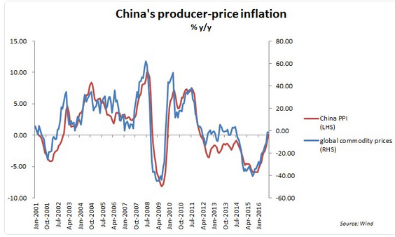
Great Graphic: China’s PPI and Commodities
China's PPI rose for the first time in four years. It is related to the rise in commodities. Yet there are good reasons there is not a perfect fit between China's PPI and commodity prices. US and UK CPI to be reported next week, risk is on the upside.
Read More »
Read More »
IMF’s Reserve Data: Dollar Share Little Changed, Yen Share Jumps, Helped By Valuation
The increase in the yen's share of reserves was flattered by the yen's 9% appreciation. The dollar and euro's share of reserves were stable. Chinese integration has seen the share of unallocated reserves fall. Starting with Q3 data, (available end of March 2017) will break out the yuan's share of reserves.
Read More »
Read More »
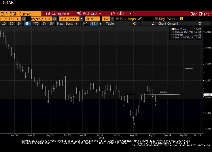
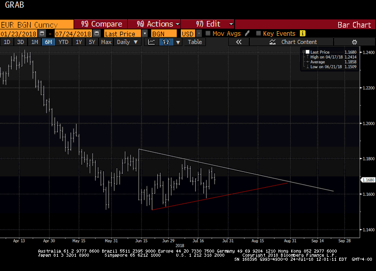
Great Graphic: Euro is Approaching Year-Long Uptrend
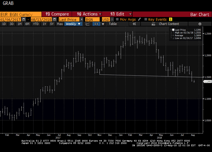
The year-long euro uptrend comes in near $1.1035, just below the August lows. The technical are fragile, but the euro is below its lower Bollinger Band. The fundamental driver seems to be the backing up of US rates, and widening premium over Germany.
Read More »
Read More »
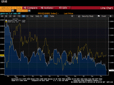
Great Graphic: US-German 2-Yr Differential and the Euro
The US premium over Germany is at its widest since 2006. This is despite a small reduction in odds of a hike in December. There are many forces are work, but over time, the widening differential will likely give the dollar better traction.
Read More »
Read More »
The Yen in Three Charts
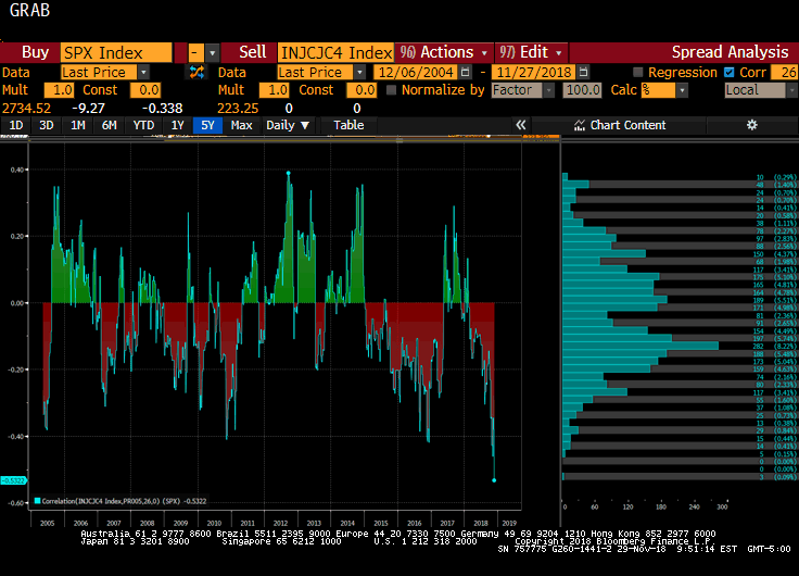
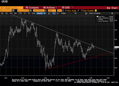
The dollar is taking out a several month downtrend against the yen. The correlation between the yen and the S&P 500 has broken down. The US 2-year premium over Japan has steadily risen.
Read More »
Read More »
Great Graphic: Growth in Premiums of Employer-Sponsored Health Insurance
Upward pressure on US consumer prices is stemming from two elements. Rents and medical services. Due to the differences the composition of the basket of goods and services that are used, the core personal consumption deflator, which the Fed targets, typically lags behind core CPI.
Read More »
Read More »
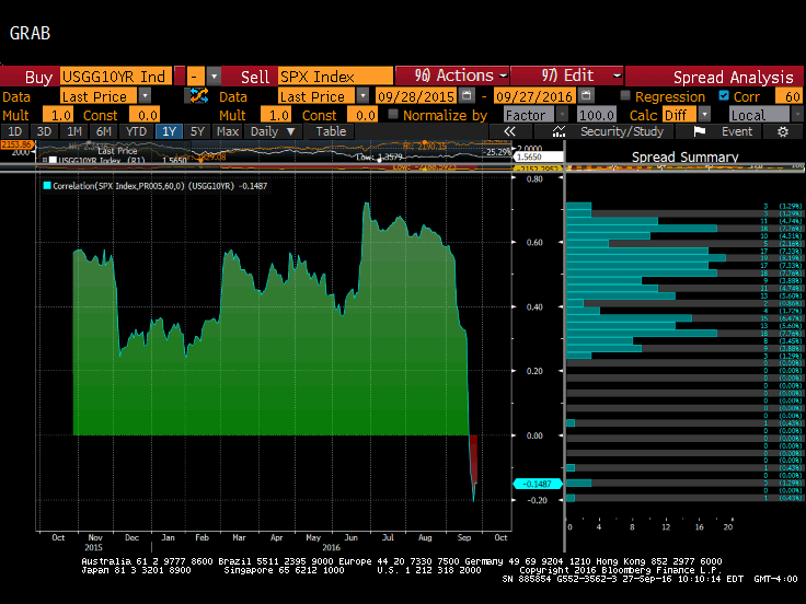
Great Graphic: Stocks and Bonds
The relationship between the change in Us 10-year yields and the change in the S&P 500 has broken down. The 60-day correlation is negative for the first time since late Q2 2015. It is only the third such period of inverse correlation since the start of 2015.
Read More »
Read More »
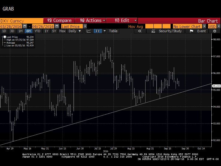
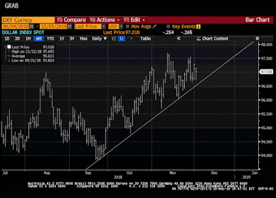
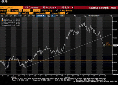
Great Graphic: Nearly Five-Month Uptrend in the Dollar Index Set to be Tested
DXY has been holding an uptrend since early May. It looks set to be tested near-term and technical indicators suggest it may not hold. Here are the two scenarios of penetration.
Read More »
Read More »
Great Graphic: Median U.S. Income per Presidents
Median household income was higher in 2015 than in 2008, but still below 1999 peak in real terms. The bottom fifth of households by income have just recouped what was lost. Income growth did best under (Bill) Clinton and Reagan, including for top 5%. Origin of strong dollar policy means it will not be used as a trade weapon and it hasn't since Bentsen.
Read More »
Read More »
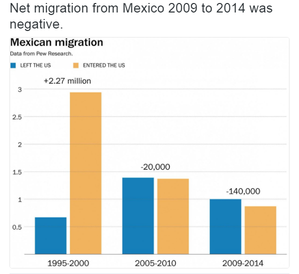
Great Graphic: Net Mexican Migration to the US–Not What You Might Think
Net migration of Mexicans into the US has fallen for a decade. The surge in Mexican migration into the US followed on the heels of NAFTA. Although Trump has bounced in the polls, and some see this as negative for the peso, rising US interest rates and the slide in oil price are more important drivers.
Read More »
Read More »
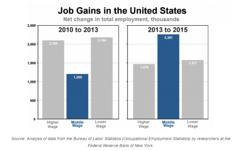
Great Graphic: What Kind of Jobs is the US Creating
The oft repeated generalization about the dominance of low paying jobs is not true for the last few years. This does note refute the disparity of wealth and income in the US. There is a restructuring taking place that favors educated and skilled workers.
Read More »
Read More »
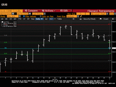
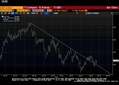
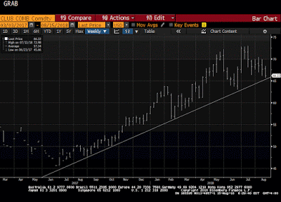
Great Graphic: Oil is Looking Crude
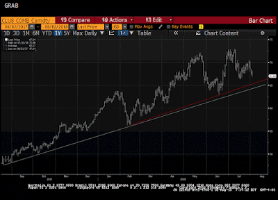
Oil is breaking down. Doubts are growing over output freezes while US inventories rise. The technicals are poor.
Read More »
Read More »
Great Graphic: Low Wages in US Rising
The bottom of the US wage scale is rising. The added wage costs are being blunted by less staff turnover, hiring and training costs. It is consistent with our expectation of higher price pressures.
Read More »
Read More »
Great Graphic: GDP Per Capita Selected Comparison
US population growth has been greater than other major centers that helps explain why GDP has risen faster. GDP per capita has also growth faster than other high income regions. The US recovery is weak relative to post-War recoveries but it has been faster than anticipated after a financial crisis and shows little evidence of secular stagnation.
Read More »
Read More »


