


Read More »


 On Swiss National Bank
  Main SNB Background Info


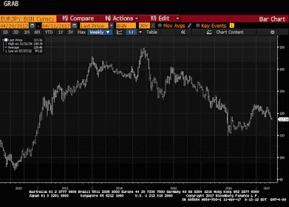
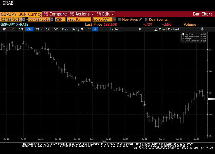 Great Graphic: Views Distill to Short Sterling Long Yen Opportunity
24 Sep 2019
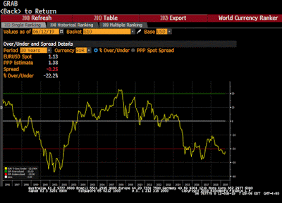 Great Graphic: Euro’s (OECD) PPP
12 Jun 2019
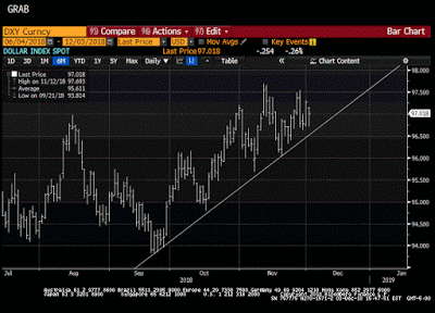 Great Graphic: The Dollar Index Climbs a Wall of Worry
4 Dec 2018
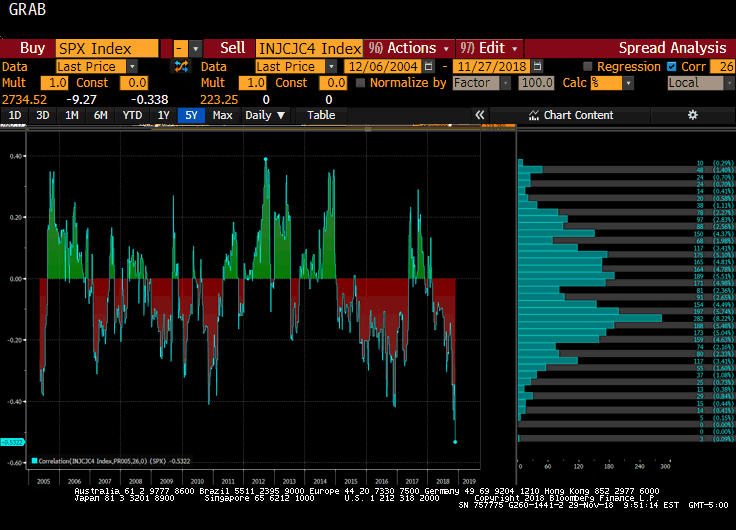 Great Graphic: Weekly Jobless Claims and the S&P 500
1 Dec 2018
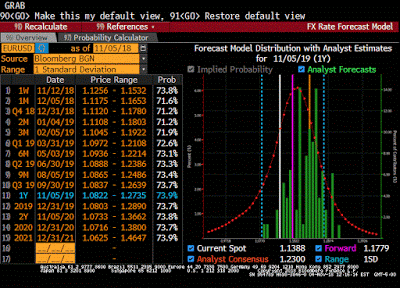 Euro and Yen Outlook
7 Nov 2018
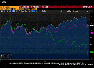 Great Graphic: What is Happening to Global Equities?
17 Oct 2018
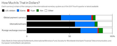 Great Graphic: The Dollar’s Role
6 Oct 2018
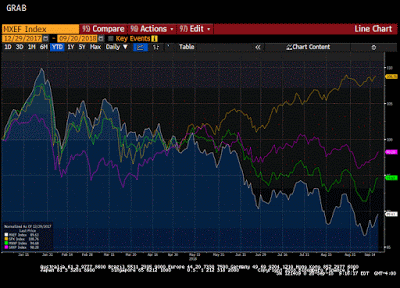 Portfolio Re-Balancing and the Dollar
22 Sep 2018
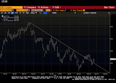 Great Graphic: Did the CRB Bottom?
12 Sep 2018
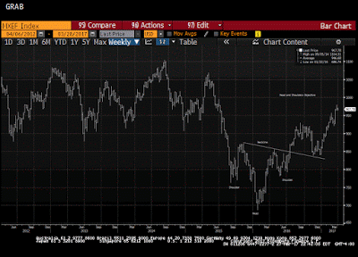
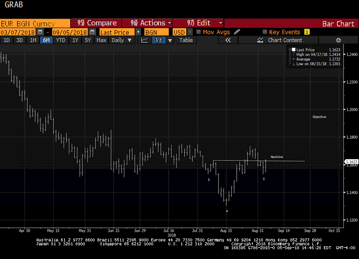 Great Graphic: Is that a Head and Shoulders Bottom in the Euro?
8 Sep 2018
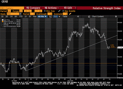 Great Graphic: Head and Shoulders Top in Dollar Index
21 Aug 2018
 Great Graphic: Crude Approaches Year-Old Trend Line
17 Aug 2018
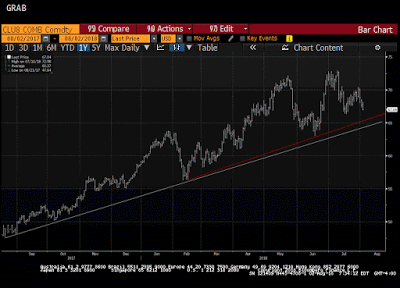
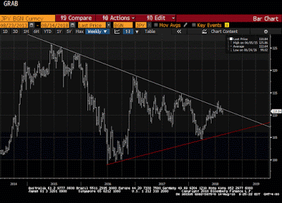 Great Graphic JPY Struggles at Trendline
16 Aug 2018
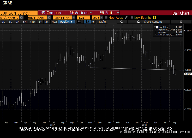 Great Graphic: Possible Head and Shoulders Top in Euro
14 Aug 2018
 Some Initial Consequences of Trade Tensions
8 Aug 2018
 Great Graphic: Is Something Important Happening to Oil Prices?
4 Aug 2018
 Great Graphic: USD Pushes Below CAD1.30
31 Jul 2018
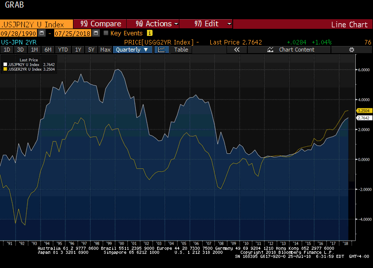 Great Graphic: US 2-year Premium Grows and Outlook for G3 Central Banks
26 Jul 2018
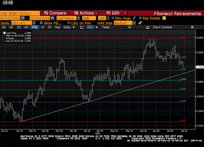
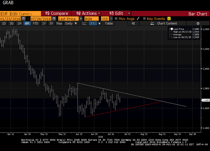 Great Graphic: Is the Euro’s Consolidation a Base?
25 Jul 2018
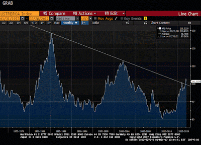
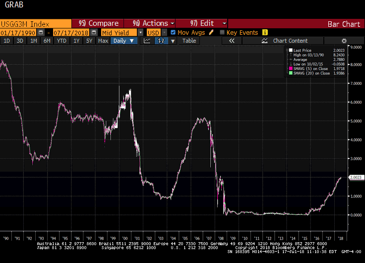 Great Graphic: Fed Raising Rates, but Yields Still Negative
18 Jul 2018
