Marc Chandler
My articles My offerMy siteAbout meMy videosMy books
Follow on:LinkedINTwitterSeeking AlphaAmazon
| This Great Graphic composed on Bloomberg shows the balance sheets of the Federal Reserve, the European Central Bank, and the Bank of Japan as a proportion of GDP.
The Federal Reserve ‘s balance sheet (as a fraction of GDP) is depicted in the green line. The primary reason it has drifted lower in the past few years is that the denominator, that is GDP has grown. Going forward, we suspect starting in October (announcement in September) the balance sheet itself will begin slowly shrinking in absolute terms not just as proportion of GDP. That means that the slight downtrend in the green line will become more pronounced. The yellow line is the ECB’s balance sheet. Early in the European crisis, the ECB’s balance sheet expanded (see 2011-2012), but then it fell back. It drifted lower in 2013-2014 and began growing again with under Draghi’s leadership. As a percentage of GDP, the ECB’s balance sheet is larger than the Fed’s ever was, and it has not peaked. The balance sheet continues to grow faster than the eurozone economy. We suspect that in September the ECB will announce that starting next year, it will slow its asset purchases, but extend them through H1 2018. The white line is the BOJ’s balance sheet. There was a gentle drift higher, but that is a reflection of “normal| policy and a weak economy. The acceleration is the BOJ arrows of Abenomics. As a percent of GDP, it is approaching 100%. It is four-times bigger than the Fed’s balance sheet as a proportion of GDP, and more than 2.5 times the ECB’s balance sheet. The Fed will, as Yellen said, begin shrinking its balance sheet “relatively soon.” The ECB appears set to begin a tapering operation that will continue to expand its balance sheet at a slower pace. The BOJ refrains from talking about an exit from its extraordinary operations for fear of confusing investors and sending the wrong signal.
|
Balance Sheets of the Federal Reserve, the European Central Bank and the Bank of Japan Compared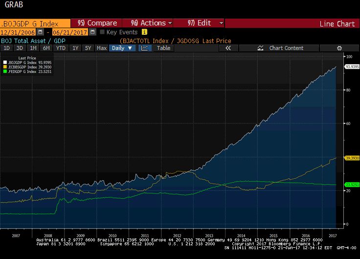 Wwhite line: BOJ's balance sheet, Yellow Line: ECB's balance sheet, Green Line: The Federal Reserve's balance sheet - Click to enlarge |
Full story here Are you the author?
Tags: #USD,$EUR,$JPY,balance sheet,central-banks,Great Graphic,newslettersent