Marc Chandler
My articles My offerMy siteAbout meMy videosMy books
Follow on:LinkedINTwitterSeeking AlphaAmazon
| The world looks like a mess. While the economy appears to be doing better, disparity of wealth and income has grown. Debt levels are rising. Protectionism appears on the rise. Global flash points, like Korea, Middle East, Pakistan, Venezuela are unaddressed.
At the same time, this Great Graphic tweeted by @DinaPomeranz, with a hat tip to @bill_easterly is a helpful corrective. The clear decline in hunger, poverty, illiteracy, child mortality and pollution is impressive. Moreover, the most serious financial crisis since the Great Depression is hardly detectable in this chart. It helps keep things in perspective. |
Progress 1990 - 2015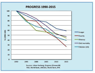 - Click to enlarge |
Full story here Are you the author?
He has been covering the global capital markets in one fashion or another for more than 30 years, working at economic consulting firms and global investment banks. After 14 years as the global head of currency strategy for Brown Brothers Harriman, Chandler joined Bannockburn Global Forex, as a managing partner and chief markets strategist as of October 1, 2018.
Tags: Great Graphic,newslettersent