Tag Archive: Great Graphic
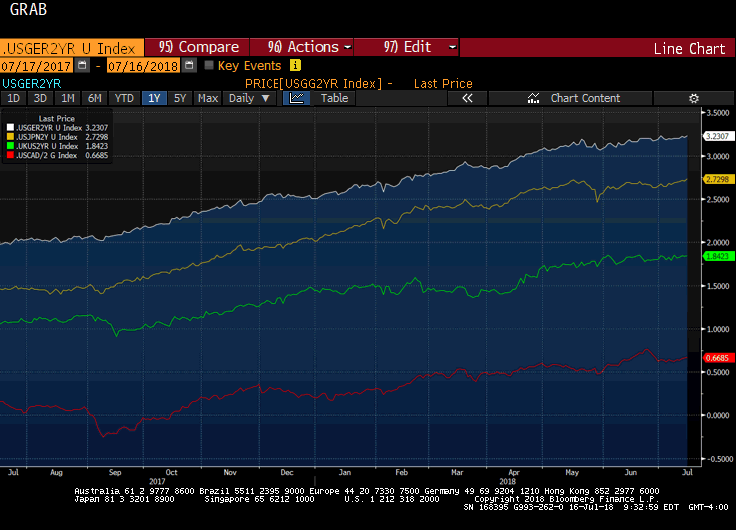
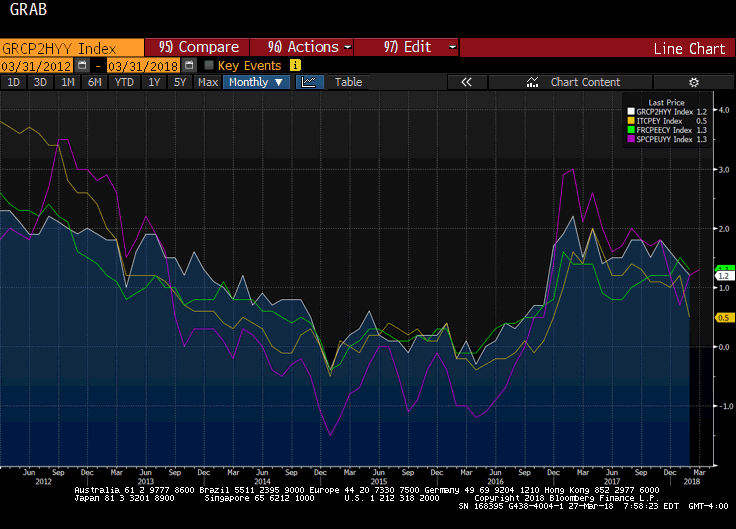
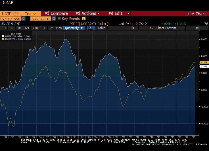
Great Graphic: Two-year Rate Differentials
Given that some of the retail sales that were expected in June were actually booked in May is unlikely to lead to a large revision of expectations for Q2 US GDP, the first estimate of which is due in 11 days. Before the data, the Atlanta Fed's GDPNow projects the world's biggest economy expanded at an annualized pace of 3.9% in Q2.
Read More »
Read More »
Great Graphic: Two Stories for Two Trend Lines
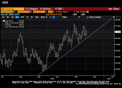
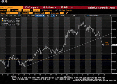
The Dollar Index made a marginal new high for the year at the end of June a touch below 95.55. It fell through the start of this week when it reached nearly 93.70. With the earlier gains, the Dollar Index briefly traded above the 61.8% retracement of the pullback (~94.85). A move now below 94.20 would be disappointing.
Read More »
Read More »
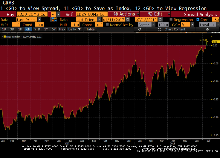
Great Graphic: Is Mr Market Thinking About the First Fed Cut?
The US economy is among the strongest among the large economies. Goosed by the never-fail elixir of tax cuts and spending increases, the US economy is accelerating. Nevertheless, we continue to see the fiscal boost as short-lived, and a recent Fed paper suggested that fiscal stimulus in an upswing may not have the same multiplier as during a downturn.
Read More »
Read More »
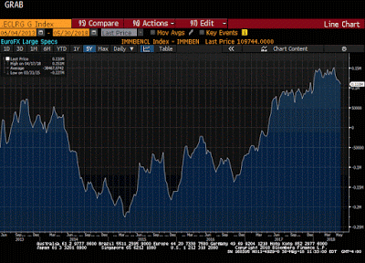
Great Graphic: Euro Bulls Stir but Hardly Shaken
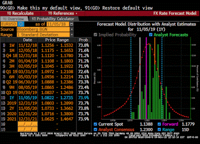
Euro has fallen 10.5 cents since mid-February. Net speculative longs in the futures market remain near record. Gross long euros have actually increased over the past month.
Read More »
Read More »
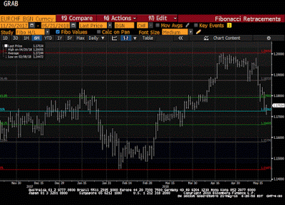
Great Graphic: Euro-Swiss Shows Elevated Systemic Risk
The Swiss National Bank's decision in January 2015 to remove the cap on the Swiss franc (floor on the euro) that it has set at CHF1.20 is seared into the memory of a generation of foreign exchange participants. It is not exactly clear where the euro bottomed in the frenzied activity that followed the SNB's surprise move. Bloomberg records the euro's low near CHF0.8520.
Read More »
Read More »
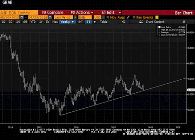
Great Graphic: Aussie Tests Trendline
It is not that the Australian dollar is the weakest currency this month. Its 0.4% decline puts it among the better performers against the US dollar. However, it has fallen to a new low for the year today. The losses have carried to a trendline drawn off of the early 2016 low near $0.6800.
Read More »
Read More »
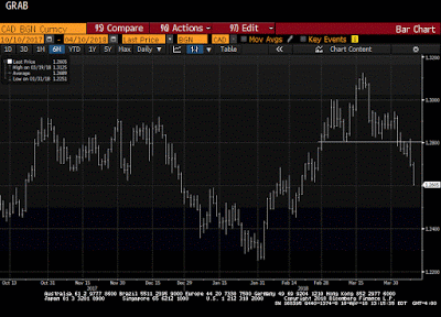
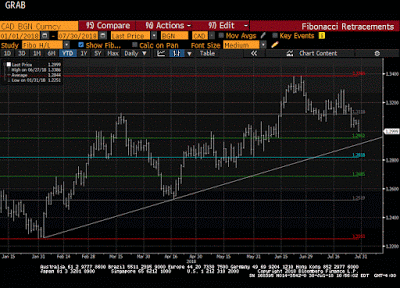
Great Graphic: Loonie Takes Big Step toward Technical Objective
For a little more than two weeks, we have been monitoring the formation of a possible head and shoulders top in the US dollar against the Canadian dollar. The neckline broke a week ago. It is not uncommon for the neckline to be retested after the break. That was what happened yesterday. The US dollar recorded an outside down day yesterday.
Read More »
Read More »
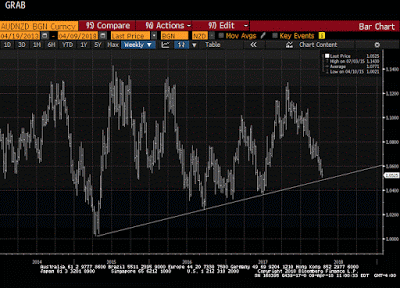
Great Graphic: Aussie-Kiwi Approaches Trendline
Today is the fifth consecutive session that the Australian dollar has weakened against the New Zealand dollar. It has now fallen to test a three-year old trendline that we show on the Great Graphic, composed on Bloomberg. The last leg down in the Aussie actually began last October, and through today's low, it is off by a little more than 7%.
Read More »
Read More »
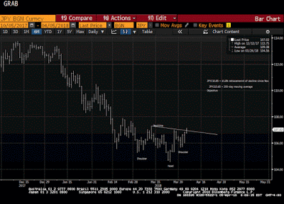
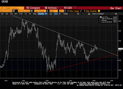
Great Graphic: Has the Dollar Bottomed Against the Yen?
The US dollar appears to be carving a low against the yen. After a significant fall, investor ought to be sensitive to bottoming patterns. The first tell was the key reversal on March 26. In this case, the key reversal was when the dollar made a new low for the move (~JPY104.55) and then rallied to close above the previous session high.
Read More »
Read More »
Great Graphic: EMU Inflation Not Making it Easy for ECB
The Reserve Bank of New Zealand is credited with being the first central bank to adopt a formal inflation target. Following last year's election, the central bank's mandate has been modified to include full employment. To be sure this was a political decision, and one that initially saw the New Zealand dollar retreat.
Read More »
Read More »
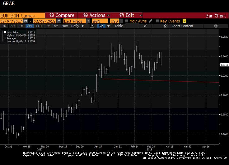
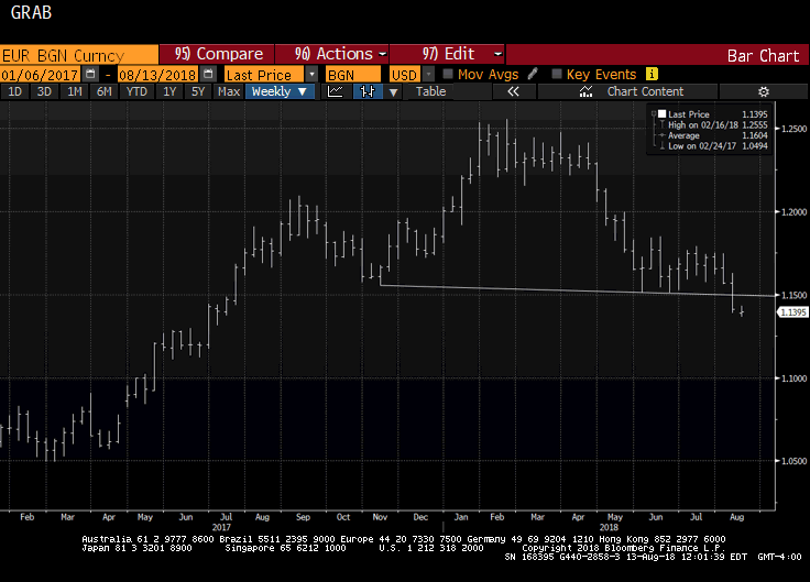
Great Graphic: Potential Topping Pattern for Euro
The euro appears to be potentially carving out a topping pattern. Recall that after correcting lower last September and October, the euro rallied for three months through January before weakening 1.75% in February. That was its biggest decline since February 2017. The euro's high print was actually on February 16 near $1.2555, when it posted a key reversal, which is when it makes a new high for the move and then closes below the previous day's low.
Read More »
Read More »
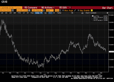
Great Graphic: Is the Canadian Dollar a Buy Soon against the Mexican Peso?
This Great Graphic composed on Bloomberg shows the Canadian dollar against the Mexican peso since the start of last year. There have been three big moves. The Canadian dollar trended lower against the peso as it corrected from the sharp sell-off induced in great measure to the candidate Trump's rhetoric against Mexico. However, shortly before the inauguration, the peso began recovering continued through H1 17.
Read More »
Read More »
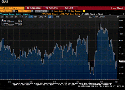
Great Graphic: Has Position Adjustment Begun in Treasury Futures?
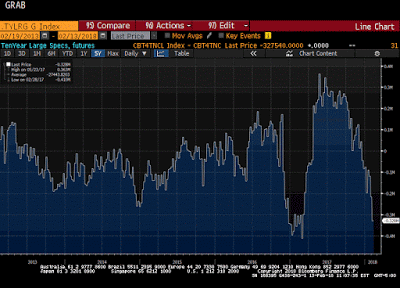
This Great Graphic from Bloomberg shows the net large speculative positioning in the 10-year note futures over the past five years. They began last year with a huge next short position of more than 400k contracts.
Read More »
Read More »
Great Graphic: S&P 500 vs Euro Stoxx 600 and Exchange Rates
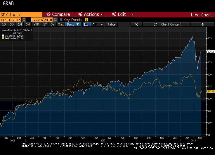
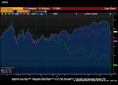
Today is an important day for equities. After a sharp sell-off earlier this month, stocks staged a recovery last week. The recovery has stalled near retracement objectives, which could be a potential turning point in the market. The Dow Jones Stoxx 600 peaked on January 23 and dropped about 9% through February 9. Through yesterday, it recovered 38.2% of its decline, poking a little above 381.00.
Read More »
Read More »
Great Graphic: Bears Very Short US 10-Year Ahead of CPI
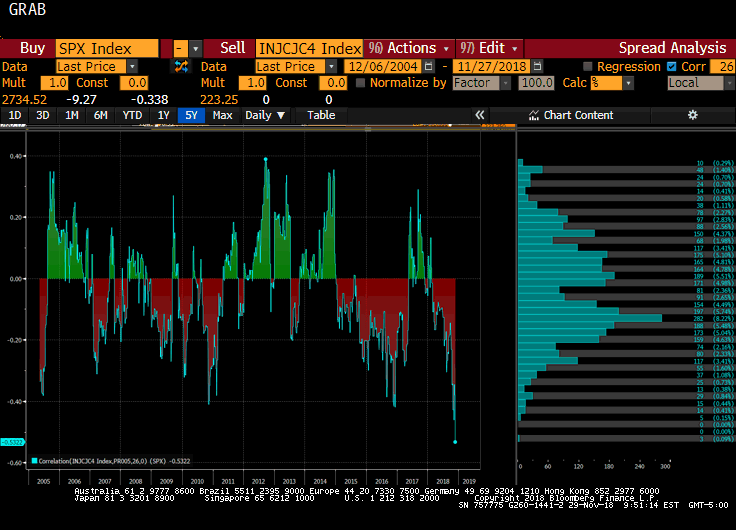
The US reports January CPI figures tomorrow. The market seems especially sensitive to it. The main narrative is that it is an inflation scare spurred by the jump in January average hourly earnings that pushed yields higher and unhinged the stock market. This Great Graphic comes from Bloomberg and is derived from data issued by the Commodity Futures Trading Commission (CFTC).
Read More »
Read More »
Great Graphic: Stocks and Bonds
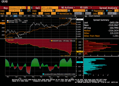
The relationship between stocks and bonds does not appear to have changed much. It is difficult to eyeball correlations. Question the meaning of a chart that has two time series and two scales and.
Read More »
Read More »
Great Graphic: FX Vol Elevated, but Still Modest
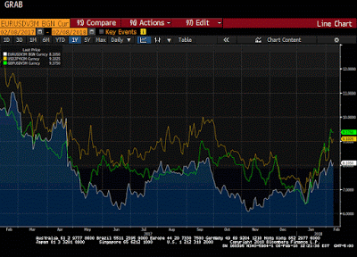
With the substantial swings in the volatility of equities that have captured the imagination of journalists and punished investors who bought financial derivatives that profited from the low vol environment, we thought it would be helped to look at the implied volatility of the leading currencies against the US dollar. The Great Graphic looks at the three-month implied volatility for the euro (white line), the yen (yellow line), and sterling (green...
Read More »
Read More »
Great Graphic: Major Currencies Year-to-Date
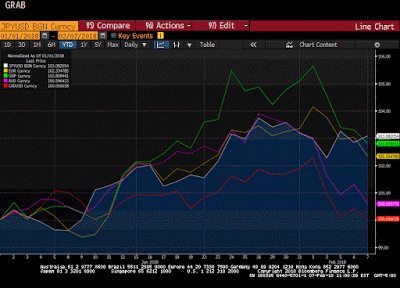
This Great Graphic was created on Bloomberg. It shows five major currencies against the US dollar this year. To avoid giving a misleading impression, the currencies are index to start this year at 100 and all the currencies are quoted in the European style of how many dollars the currency purchases. These kinds of charts are not so much for trading, but they help illustrate the relative moves that can be masked by nominal price changes.
Read More »
Read More »
Great Graphic: European Equities Lead Move
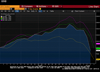
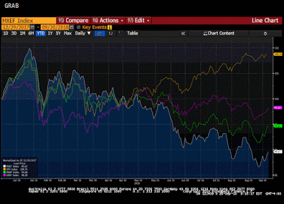
European equities peaked earlier and have fallen the furthest. MSCI EM equities faring the best, and as of now, they are still up on the year. MSCI Asia Pacific fell 3.4% today and is now down 0.33% for the year.
Read More »
Read More »
Great Graphic: Is Aussie Cracking?
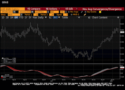
The Australian dollar bottomed in early December $0.7500 after having tested $0.8100 a couple of times in September. Since early December, however, the Australian dollar appreciated by nearly 6.5%. As it tested the $0.8000 area, the momentum faded.
Read More »
Read More »


