Of the economic releases of the past two weeks the one that got the most attention was the employment report. That report is seen by many market analysts as one of the most important and of course the Fed puts a lot of emphasis on it so the press spends an inordinate amount of time dissecting it. I don’t waste much time on it myself because it is subject to large revisions and has little predictive capability. In fact, about the only thing about the report that has any relevance is the sign – as in negative or positive. The magnitude really doesn’t matter much. So, just so I don’t upset any conventions let me state that the employment report released since my last update was positive. I think. How positive? I’ll let you know in a year or so when it is fully revised. Besides it was not the most important report of the last two weeks by a long shot.
I don’t look at the incoming data the way most people do. I don’t pay a lot of attention to the headlines for most reports because I don’t think it really tells you very much. If your reason for monitoring the economy is to, hopefully, have some warning of recession then watching the incoming reports probably won’t do you much good. There are very few individual reports that are highly correlated with the business cycle. And each cycle is a bit different so different metrics become more important. Rather than try to figure all that out, we use market indicators that have proven useful no matter the nature of the cycle. The yield curve and credit spreads tell you pretty much all you need to know. The Chicago Fed National Activity Index, a composite of 85 other indicators, gives a great overall view of the economy and also has a good track record for predicting recession. Watch those three things, ignore the rest and you’ll be way ahead of most investors.
But economic reports do add a richness to the analytical broth and I do read them. You often find meaning in the details that are much more useful than the headlines. The best recent example is the Consumer Price index released this past Friday. The CPI tracks the prices of an astonishing number of goods and services. The headline of the most recent report was not all that informative, although slightly less than expected at 0.1% for the month and 1.7% yoy. That isn’t a lot different than it was last month or the month before. But if you start scanning the list of individual items looking for outliers, sometimes you find interesting information.
Everyone knows that the price of cellular phone service is falling because it has been highlighted by the Fed and there have been numerous articles written about it. It is the excuse du jour for the Fed not hitting its 2% inflation target. You might even know that used car prices are falling pretty rapidly too, down 4.1% yoy due to the glut of cars coming off lease. But did you know that motor vehicle insurance is up 7.6% over the last year? Looking for an industry with pricing power? Or that tobacco and smoking products are up 7.1%, a testament to the power of nicotine addiction? Here’s one that hits close to home; bacon prices are up 6.3% over the last year. The bargain in pork is in pork chops, prices for which were down 7%. I guess with bacon the hot item these days – bacon in my Bloody Mary? really? – pork chops are in surplus.
From a macro perspective, several items caught my attention. New car prices are down 1.1% over the last year which is probably partially being driven by the drop in used car prices. But it also reflects reduced demand as new car sales have slid from the cycle high. The fact that prices are still falling would seem to indicate that the slowdown isn’t over. Another area that seems quite weak is household furnishings and supplies, down 1.7% yoy. Within that category: windows and floor coverings -4.6%, appliances -3.3% and clocks, lamps and decorator items -10.2%. It seems pretty obvious that housing is still having some problems (residential investment subtracted from Q2 GDP) and they are ongoing. Another one that may say something and may not – Lodging away from home, hotels and motels -3.1%. I’m not sure whether that is more Airbnb affecting supply or a lack of income growth affecting demand. A fall in airfares of 2.5% might point a bit more toward the latter.
Now isn’t that more interesting than saying consumer prices rose 1.7% over the last year? And doesn’t it provide more useful information? I think so but maybe that’s just me. You can find all manner of social trends in prices too. Cereal and cereal products – 2.2% equals gluten free trend. Fresh fruits and veggies +2.0%, canned -3.7%. Sports equipment – 2.9%; obesity epidemic. Beer, ale at home +1.6%; craft brews. Moving, storage and freight expense – 3.8%; reduced mobility. Here’s one last one that I found interesting – recorded music and music subscriptions +7.7%. Make of that what you will. I have some ideas on how that might be useful information.
As I and Jeff have talked about many times, income growth in this cycle has been rather below par and the latest report did nothing to change that reality. Personal income was unchanged on the month and up just 2.6% in the last year. The flat reading was due to a drop in Proprietors Income; wages and salaries, by contrast, were up 0.4%. One has to wonder what the impact of a rising minimum wage and healthcare costs is on that figure and why people continue to insist that free lunches are available for the demanding. Spending, what there was at +0.1%, came out of savings with the rate down to 3.8%, a number that has been falling since about 2015.
The rest of the reports from the last two weeks were about what you would expect after years of growth oscillating around 2%. Some good, some not so good, none really great, none really awful. The trend is nicely captured by the productivity figure which at 0.9% was better than expected – which says more about expectations than anything else. Low productivity growth is the bane of economic growth and we won’t escape it until company managements become more interested in investing in their businesses than whether their options are in the money and vested.
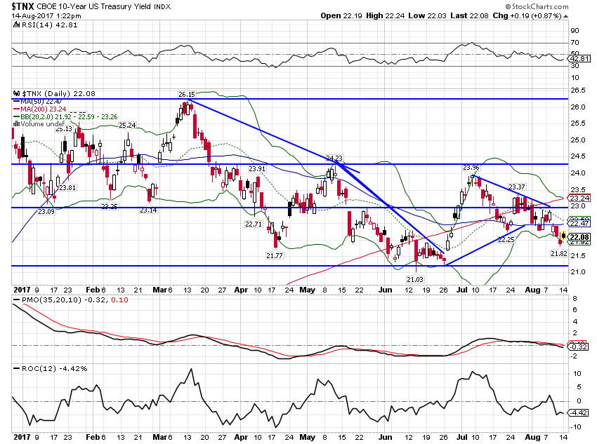
| On to our market indicators which show more of the same with a slight lean toward weakness in this period. The 10 year Treasury yield fell (bonds rose in price) by 10 basis points since the last update and looks ready to challenge the lows of the year. Not exactly a bullish economic stance. |
US 10 year Treasury Yield, Jan 2017 - Aug 2017(see more posts on U.S. Treasuries, ) |
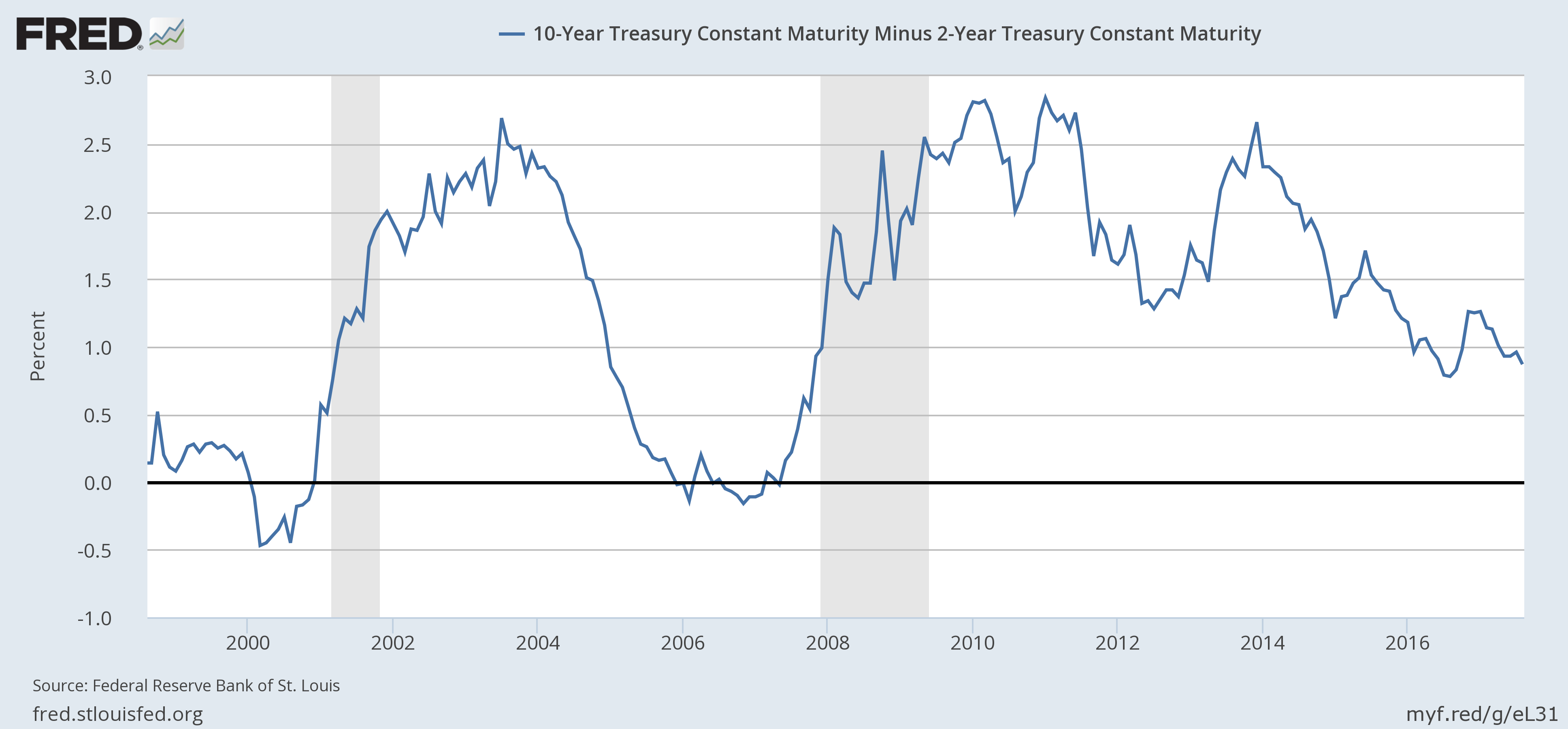
| The yield curve, as you might expect, flattened by 9 basis points. But it still isn’t flat and is not warning of imminent recession: |
US 10 Year Treasury Constant Maturity minus 2 Year Treasury, 1990 - 2017(see more posts on U.S. Treasuries, ) |
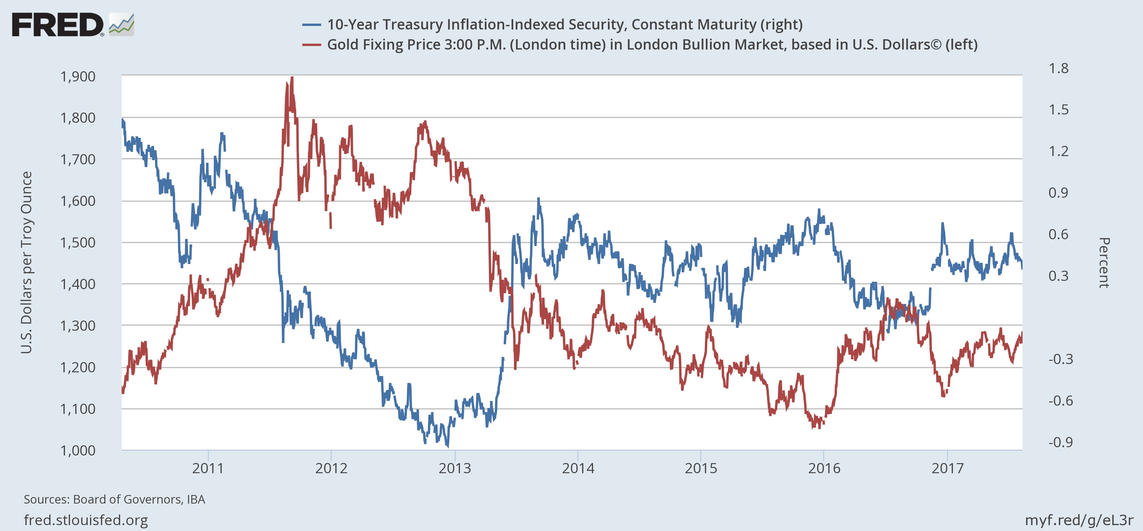
| 10 Year TIPS yields fell 8 basis points, indicating that real growth expectations are falling again: |
US 10 Year Treasury Inflation-Indexed Security, 2008 - 2017(see more posts on U.S. Treasuries, ) |
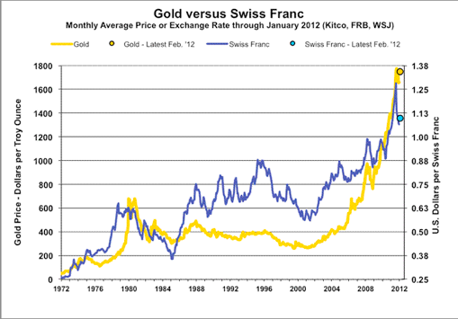
| One of the reasons we monitor real yields via the TIPS market is the impact on gold. Real yields and gold prices are inversely correlated; lower real yields means higher gold prices and both are an indication of weak and falling real growth expectations. Markets don’t always agree and we spend a lot of time looking for confirming signals like this. |
US 10 Year Treasury Inflation-Indexed Security, 2008 - 2017(see more posts on U.S. Treasuries, ) |
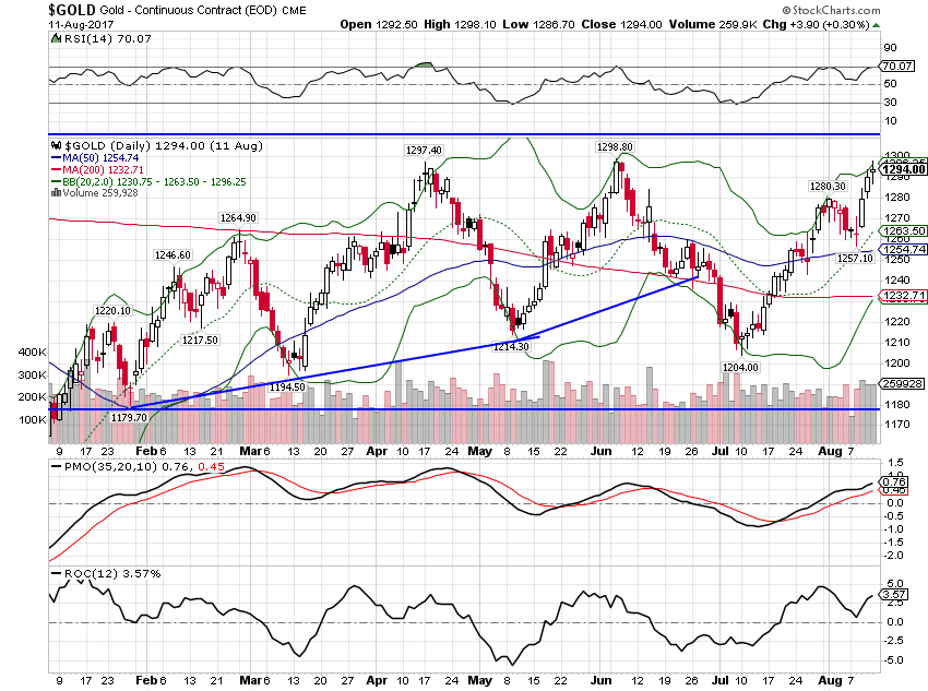
| Gold is, however, still locked into its recent trading range: |
Gold Daily, Jan 2017 - Aug 2017(see more posts on Gold, ) |
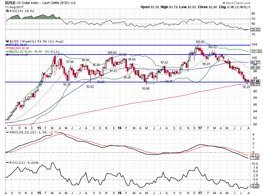
| That’s probably because the dollar is still hanging onto support by its fingertips. But if the dollar breaks lower from here it is probably heading for another 7% or so drop. Watch the TIPS market and gold for confirmation: |
US Dollar Index, Aug 2015 - 2017(see more posts on U.S. Dollar Index, ) |
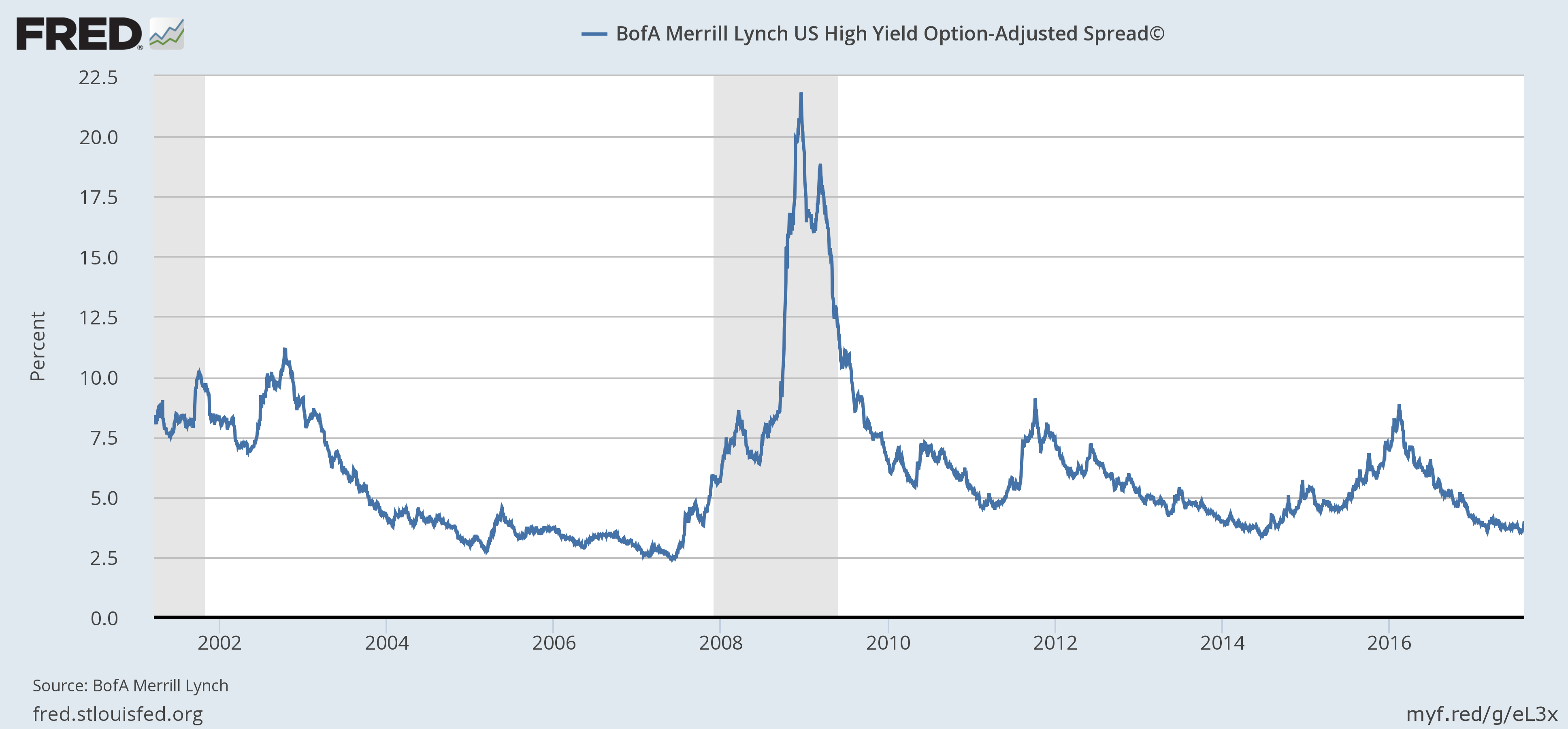
| Risk appetite waned a bit since the last update but the change in credit spreads (widened by 39 basis points) is small and doesn’t signal anything other than noise at this point: |
BofA Merrill Lynch US High Yield Option-Adjusted Spread, 2002 - 2017 |
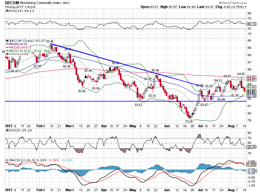
| Commodity prices pulled back with growth expectations: |
Bloomberg Commodity Index, Jan 2017 - Aug 2017 |
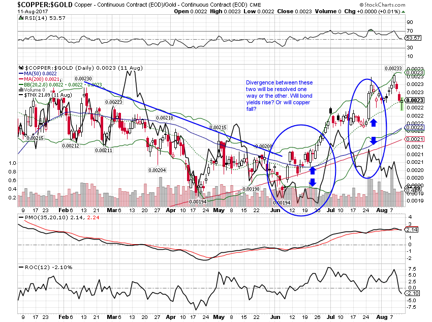
| The divergence between the copper:gold ratio and bond yields persisted though as copper prices remained fairly strong (at least compared to most other commodities): |
Copper and Gold Continuous Contract, Jan 2017 - Aug 2017 |
The mere fact that these two indicators have diverged tells us something – there is no market consensus on growth right now. The bulls and bears are pretty evenly matched. The bulls are pushing the copper:gold ratio higher while the bears are pulling bond yields lower. That probably won’t last much longer but which way it goes is lumped in with a whole bunch of other things we can’t predict. I’ll just say I’m hoping copper is right but I’m afraid bonds may have the better argument.
I haven’t spoken yet about the situation with North Korea. That’s mostly because I don’t think I have anything useful to contribute to that conversation. It is also because I don’t think it is anything that should affect your investments. If you change your investments every time some nut on the global stage says something stupid, you are never going to get any rest or return. I’ve seen articles this past week about what the market might do if we have a nuclear conflict. Really? Did someone really have to write that article? A better question is did someone really have to publish that article? Isn’t there any editorial discretion anymore? I understand some blogger putting that up for click bait but professional publications? Come on guys. You can do better than that.
The movements of the markets over the last two weeks tell a story of weakening growth and inflation expectations. Not a lot but enough to notice. That trend started before Donald Trump’s “fire and fury” remark. That trend started despite what most analysts are calling pretty good earnings reports – which might say more about the analysts than the earnings. Some of that market movement might be due to North Korea but certainly not all.
I said last week that a weaker dollar might extend this cycle even longer and I think that is probably true. But currency changes and associated capital flows take time to impact markets and economies. In the meantime, it looks to me like we may have seen the peak for the upturn that started last summer.
Despite that, I still see nothing in our market based indicators that warn of imminent recession. The yield curve is flattening but not flat. Credit spreads widened a bit but not enough to trigger any kind of action on our part. The three month average of the Chicago Fed National Activity index is still above recession levels. The Fed is about to pause rate hikes in favor of balance sheet changes and while I think shrinking the balance sheet has the potential to be more disruptive than rate hikes there is no market based evidence to support that view yet. Keep calm, carry on, chin up and all that. Try to ignore the idiot. Kim Jong-Un I mean.
Tags: Alhambra Research,Auto Sales,Bi-Weekly Economic Review,Bonds,commodities,Consumer Price Index,consumption,Copper,credit spreads,currencies,economic growth,economy,employment,Federal Reserve/Monetary Policy,Gold,Housing,inflation,Investing,newslettersent,Personal Income,real interest rates,recession,Savings Rate,stocks,TIPS,U.S. Dollar Index,U.S. Treasuries,US dollar,Yield Curve


