Found 1,387 search results for keyword: label
Dying men generate higher health costs
Both gender and location influence the cost of end-of-life healthcare in Switzerland, finds a study funded by the Swiss National Science Foundation. In their analysis of 113,277 people who died between 2008 and 2010, researchers studied regional variations in cost of care during the last 12 months of life in Switzerland. Per person, the mean cost of care during that final year was CHF32,500 ($33,540).
Read More »
Read More »
Great Graphic: Italy-It is Not Just about Legacy
A little while back I was part of a small exchange of views on twitter. It was about Italy. I was arguing against a claim that Italy's woes are all about its past fiscal excesses. It is not just about about Italy's legacy.
Read More »
Read More »
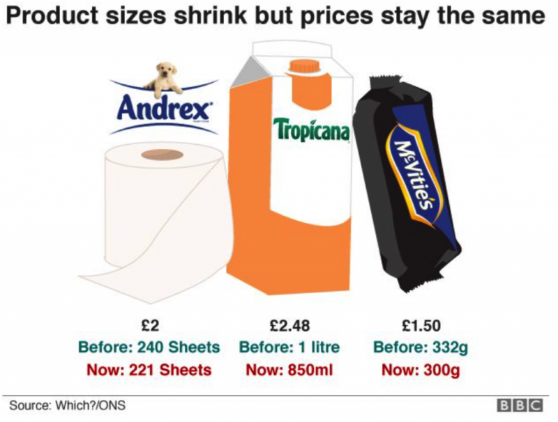
This Is Why Shrinkflation Is Impacting Your Financial Wellbeing
Shrinkflation has hit 2,500 products in five years. Not just chocolate bars that are shrinking. Toilet rolls, coffee, fruit juice and many other goods. Effects of shrinkflation been seen for “good number of years”. Consumer Association of Ireland. Shrinkflation is stealth inflation, form of financial fraud. Punishes vulnerable working and middle classes. Gold is hedge against inflation and shrinkflation.
Read More »
Read More »
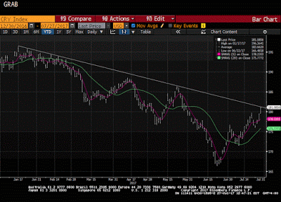
Great Graphic: CRB Index Hits 2017 Down Trendline
The CRB Index gapped higher today and it follows a gap higher opening on Tuesday, which has not been filled. Today's gains lift the commodity index to a trendline drawn off the January and February highs and catches the high from late May. It intersects today near 181.35 and the high has been a little over 181.17.
Read More »
Read More »
UN group demands reversal of Swiss minaret ban
Switzerland should take steps to ensure that people's initiatives do not contravene international law, the United Nations Human Rights Committee says. It notably called for the repeal of a Swiss vote banning the construction of minarets.
Read More »
Read More »
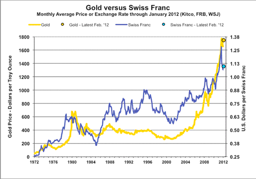
Great Graphic: What Is the Swiss Franc Telling Us?
Swiss franc weakness is a function of the demand for euros. SNB indicates it will lag behind the other major central banks in normalization process. Easing of political anxiety in Europe is also negative for the franc.
Read More »
Read More »
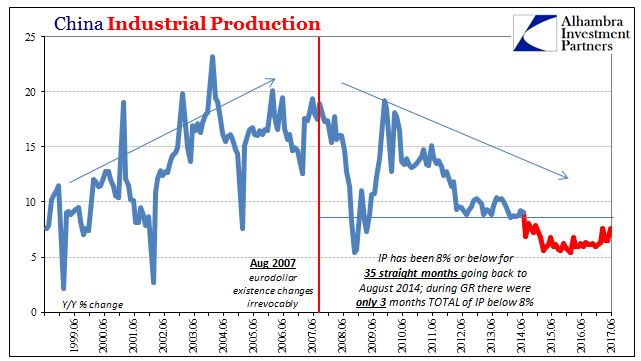
China’s Economy Shorthand the Largest Asset Bubble in Human History
The term “ghost city” is a loaded one, often deployed to skew toward a particular viewpoint. In the context of China’s economy, it has become shorthand for perhaps the largest asset bubble in human history. While that may ultimately be the case, in truth China’s ghost cities aren’t about the past but its future.
Read More »
Read More »
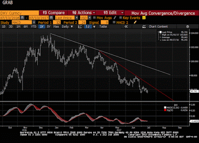
Great Graphic: Dollar Index Bottoming?
The Dollar Index set the year's high on January 3 a little above 103.20. Today it made a marginal new lows for the year at 95.464. The previous low, set at the end of last month was 95.47.
Read More »
Read More »
Victorinox named an official pocketknife supplier to US army
The US Defense Logistics Agencyexternal link (DLA), the Department of Defense’s largest logistics combat support agency, had indeed added the Victorinox knife to its list, a DLA spokesperson told the Swiss News Agency on Monday, confirming a report in the Luzerner Zeitungexternal link newspaper.
Read More »
Read More »
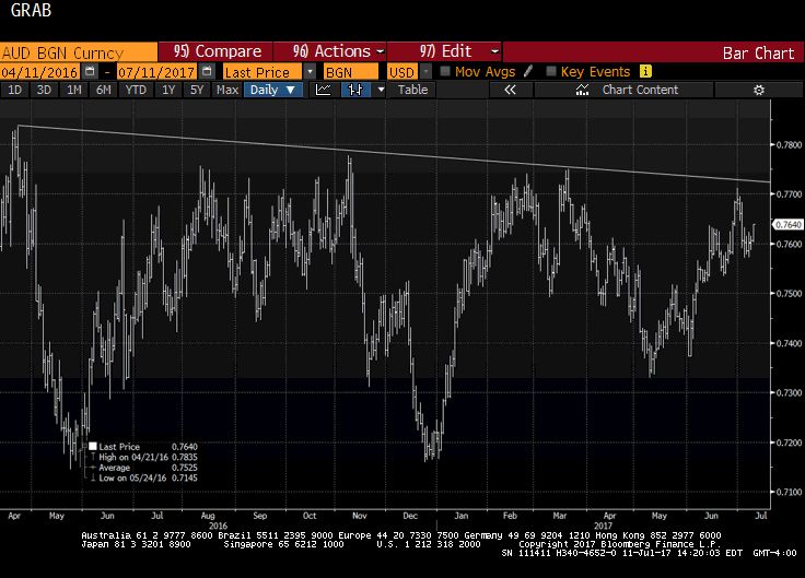
Great Graphic: Aussie is Approaching 15-month Trendline
This Great Graphic, made on Bloomberg, depicts the Australian dollar since April 2016. We drew in the trendline from that April high, through the November high and the March 2017 high. It nearly catches last month's high as well. It comes in now near $0.7725.
Read More »
Read More »
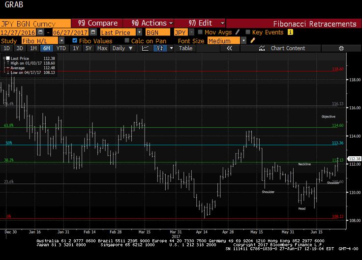
Great Graphic: Dollar Breaks Out Against Yen
The dollar is at new lows for the year against the euro and Swiss franc. Draghi's comments earlier that transitory forces are dampening price pressures were seen as broadly similar to the Fed's leadership's assessment about US prices. The implication is that the ECB will announce tapering its purchases as it extends them into next year.
Read More »
Read More »
Great Graphic: US Wage Growth Exceeds Productivity Growth
One of the longstanding challenges to growth US aggregate demand has been that wages have not kept pace with inflation and productivity. The decoupling appears to have taken place in the late 1960s or early 1970s depending on exactly which metric one uses.In my book, the Political Economy of Tomorrow, I argue the decoupling of men's wages from productivity and inflation made it possible and necessary for women to enter the workforce in large...
Read More »
Read More »
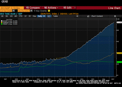
Great Graphic: Fed, ECB, and BOJ Balance Sheets
This Great Graphic composed on Bloomberg shows the balance sheets of the Federal Reserve, the European Central Bank, and the Bank of Japan as a proportion of GDP.
Read More »
Read More »
Great Graphic: Selected GDP Performance since 2008 and Policy
This Great Graphic was tweeted by Martin Beck, and it comes from Oxford Economics, using Haver Analytics database. It shows the relative economic growth since 2008 for the US, UK, Japan, and EMU.
Read More »
Read More »
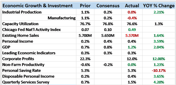
Bi-Weekly Economic Review: Has The Fed Heard Of Amazon?
The economic surprises keep piling up on the negative side of the ledger as the Fed persists in tightening policy or at least pretending that they are. If a rate changes in the wilderness can the market hear it? Outside of the stock market one would be hard pressed to find evidence of the effectiveness of all the Fed’s extraordinary policies of the last decade.
Read More »
Read More »
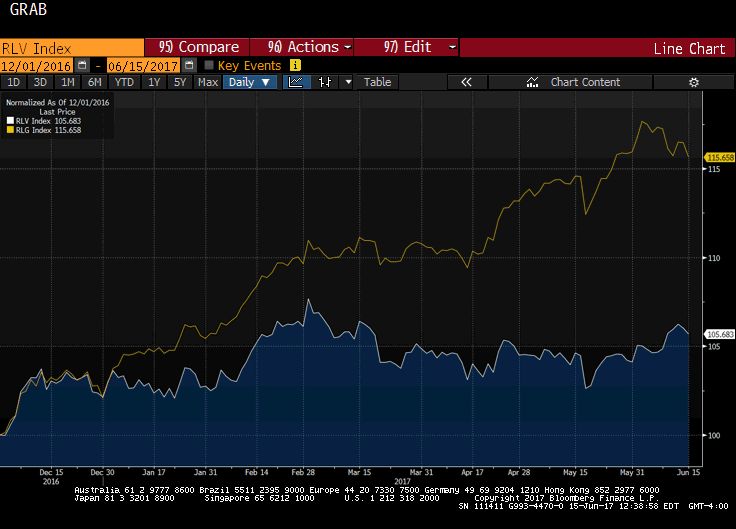
Great Graphic: Value vs Growth
This Great Graphic, created on Bloomberg show the performance of growth and value stocks since the start of December 2016. The yellow line is the Russell 1000 Growth Index. The white line is the Russell 1000 Value Index. The outperformance of the former is clear.
Read More »
Read More »
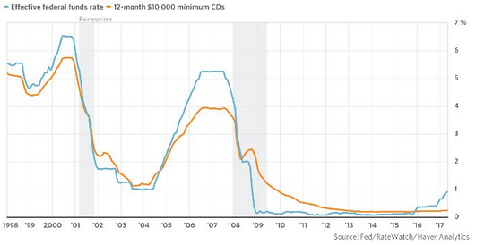
Great Graphic: Sticky Pass Through
This Great Graphic was posted by Steve Goldstein at MarketWatch. The blue line shows the effective Fed funds rate. The orange line depicts the average interest rate on a $10,000 one-year CD.
Read More »
Read More »
Parabolic Coin
When writing an article about the recent move in bitcoin, one should probably not begin by preparing the chart images. Chances are one will have to do it all over again. It is a bit like ordering a cup of coffee in Weimar Germany in early November 1923. One had to pay for it right away, as a cup costing one wheelbarrow of Reichsmark may well end up costing two wheelbarrows of Reichsmark half an hour later.
Read More »
Read More »
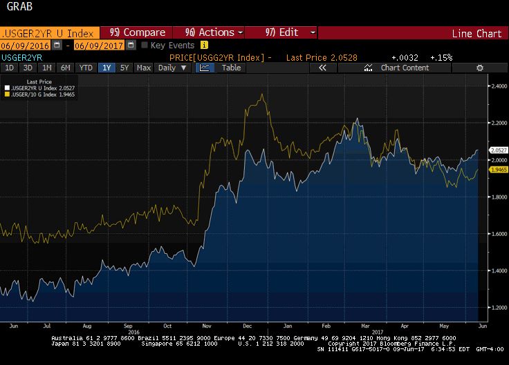
Great Graphic: Another Look at US-German Rate Differentials
This Great Graphic, created on Bloomberg, depicts the interest rate differential between the US and Germany. The euro-dollar exchange rate often seems sensitive to the rate differential. The white line is the two-year differential and the yellow line is the 10-year differential.
Read More »
Read More »


