Found 151 search results for keyword: label/Great Graphic
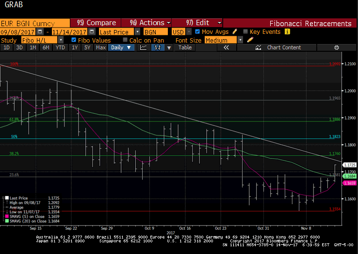
Great Graphic: Euro Approaching Key Test
Euro is testing trendline and retracement objective and 100-day moving average. Technical indicators on daily bar charts warn of upside risk. Two-year rate differentials make it expensive to be long euros vs. US. Beware of small samples that may exaggerate seasonality.
Read More »
Read More »
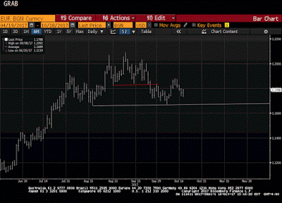
Great Graphic: The Euro’s Complicated Top
Euro looks like it is carving out a top. The importance also lies in identifying levels that the bearish view may be wrong. Widening rate differentials, a likely later peak in divergence than previously anticipated, and one-sided market positioning lend support to the bearish view.
Read More »
Read More »
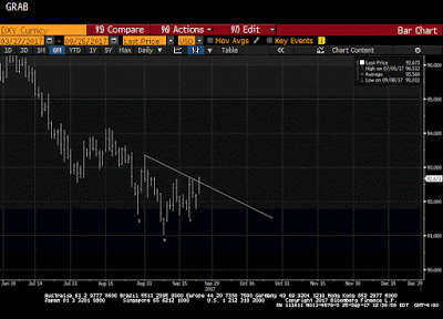
Great Graphic: Potential Head and Shoulders Bottom in the Dollar Index
This Great Graphic was composed on Bloomberg. t shows the recent price action of the Dollar Index. There seems to be a head and shoulders bottoming pattern that has been traced out over the last few weeks. The right shoulder was carved last week, and today, the Dollar Index is pushing through the neckline, which is found by connecting the bounces after the shoulders were formed.
Read More »
Read More »
Great Graphic: Young American Adults Living at Home
This Great Graphic caught our eye (h/t to Gregor Samsa @macromon). It comes from the US Census Department, and shows, by state, the percentage of young American adults (18-34 year-olds).The top map is a snap shot of from 2005. A little more than a quarter of this cohort lived at home. A decade later, and on the other side of the Great Financial Crisis, the percentage has risen to a little more than a third.
Read More »
Read More »
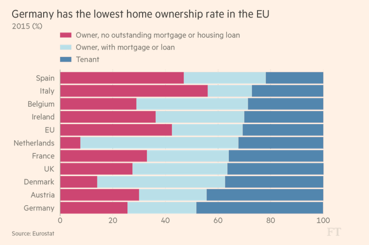
Great Graphic: Home Ownership and Measuring Inflation
Home ownership varies throughout the EU but is overall near US levels. Germany has the lowest home ownership, and Spain has the most. Italy has the least amount of mortgages. US include owner equivalent rents in CPI, the EU does not.
Read More »
Read More »
Great Graphic: Small Caps and the Trump Trade
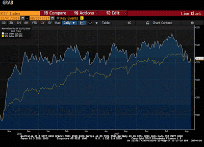
The Russell 2000, which tracks the 2000 smallest companies in the Russell 3000, is threatening to turn positive for the year. It had turned negative in the second half of last week. Many pundits saw its decline and the penetration of the 200-day moving average for the first time in over a year as a sign of an impending down move in the broader equity market.
Read More »
Read More »
Great Graphic: Italy-It is Not Just about Legacy
A little while back I was part of a small exchange of views on twitter. It was about Italy. I was arguing against a claim that Italy's woes are all about its past fiscal excesses. It is not just about about Italy's legacy.
Read More »
Read More »
Great Graphic: CRB Index Hits 2017 Down Trendline
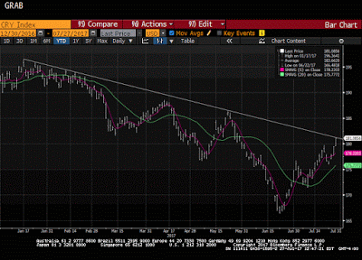
The CRB Index gapped higher today and it follows a gap higher opening on Tuesday, which has not been filled. Today's gains lift the commodity index to a trendline drawn off the January and February highs and catches the high from late May. It intersects today near 181.35 and the high has been a little over 181.17.
Read More »
Read More »
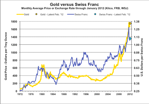
Great Graphic: What Is the Swiss Franc Telling Us?
Swiss franc weakness is a function of the demand for euros. SNB indicates it will lag behind the other major central banks in normalization process. Easing of political anxiety in Europe is also negative for the franc.
Read More »
Read More »
Great Graphic: Dollar Index Bottoming?
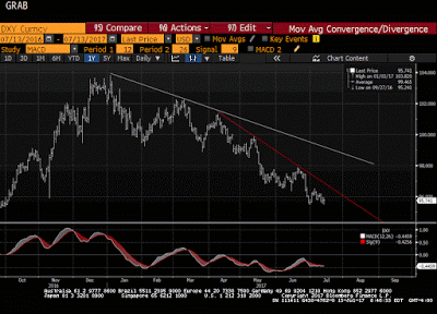
The Dollar Index set the year's high on January 3 a little above 103.20. Today it made a marginal new lows for the year at 95.464. The previous low, set at the end of last month was 95.47.
Read More »
Read More »
Great Graphic: Aussie is Approaching 15-month Trendline
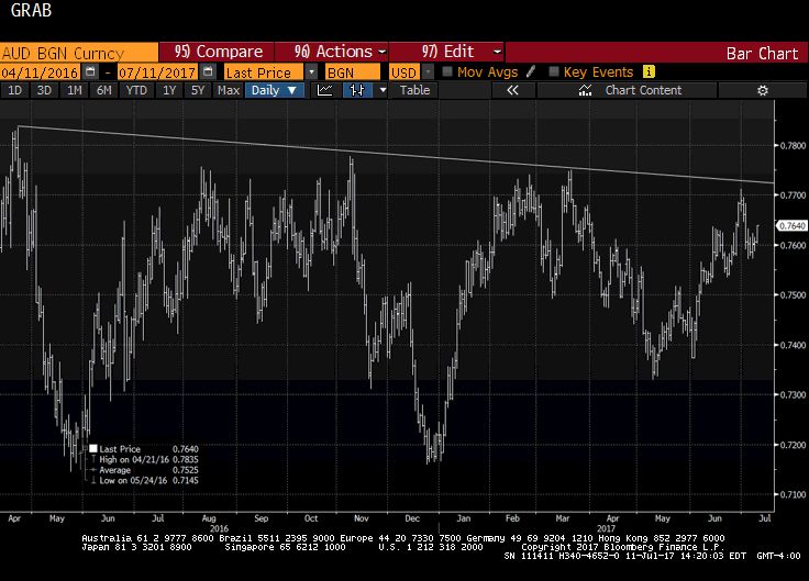
This Great Graphic, made on Bloomberg, depicts the Australian dollar since April 2016. We drew in the trendline from that April high, through the November high and the March 2017 high. It nearly catches last month's high as well. It comes in now near $0.7725.
Read More »
Read More »
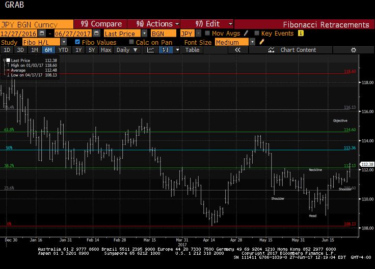
Great Graphic: Dollar Breaks Out Against Yen
The dollar is at new lows for the year against the euro and Swiss franc. Draghi's comments earlier that transitory forces are dampening price pressures were seen as broadly similar to the Fed's leadership's assessment about US prices. The implication is that the ECB will announce tapering its purchases as it extends them into next year.
Read More »
Read More »
Great Graphic: US Wage Growth Exceeds Productivity Growth
One of the longstanding challenges to growth US aggregate demand has been that wages have not kept pace with inflation and productivity. The decoupling appears to have taken place in the late 1960s or early 1970s depending on exactly which metric one uses.In my book, the Political Economy of Tomorrow, I argue the decoupling of men's wages from productivity and inflation made it possible and necessary for women to enter the workforce in large...
Read More »
Read More »
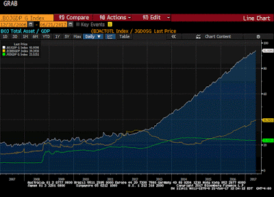
Great Graphic: Fed, ECB, and BOJ Balance Sheets
This Great Graphic composed on Bloomberg shows the balance sheets of the Federal Reserve, the European Central Bank, and the Bank of Japan as a proportion of GDP.
Read More »
Read More »
Great Graphic: Selected GDP Performance since 2008 and Policy
This Great Graphic was tweeted by Martin Beck, and it comes from Oxford Economics, using Haver Analytics database. It shows the relative economic growth since 2008 for the US, UK, Japan, and EMU.
Read More »
Read More »
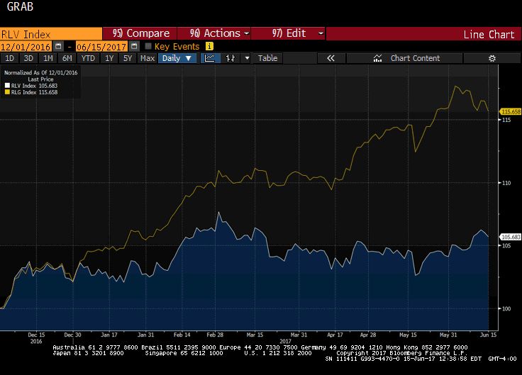
Great Graphic: Value vs Growth
This Great Graphic, created on Bloomberg show the performance of growth and value stocks since the start of December 2016. The yellow line is the Russell 1000 Growth Index. The white line is the Russell 1000 Value Index. The outperformance of the former is clear.
Read More »
Read More »
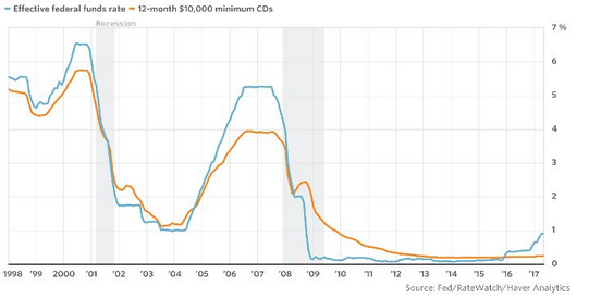
Great Graphic: Sticky Pass Through
This Great Graphic was posted by Steve Goldstein at MarketWatch. The blue line shows the effective Fed funds rate. The orange line depicts the average interest rate on a $10,000 one-year CD.
Read More »
Read More »
Great Graphic: Another Look at US-German Rate Differentials
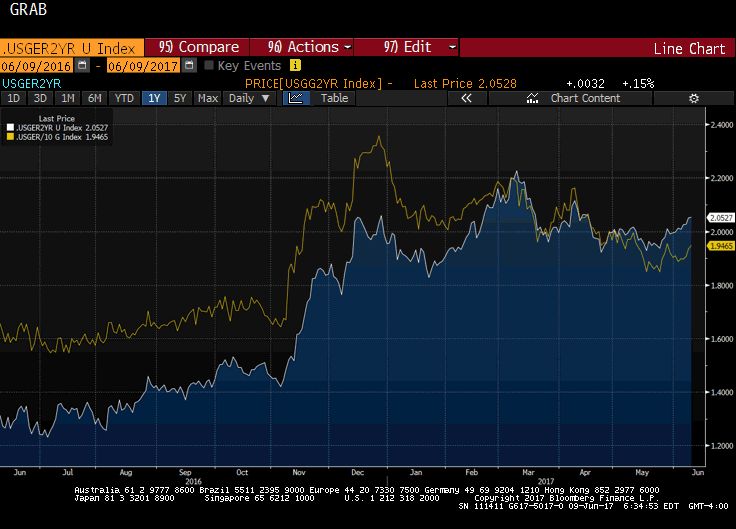
This Great Graphic, created on Bloomberg, depicts the interest rate differential between the US and Germany. The euro-dollar exchange rate often seems sensitive to the rate differential. The white line is the two-year differential and the yellow line is the 10-year differential.
Read More »
Read More »
Great Graphic: Don’t be Misled by Sterling Stability, Investors are Concerned
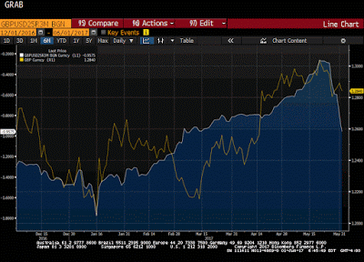
The Great Graphic, created on Bloomberg, shows the options skew (three-month 25 delta risk reversal) in the white line, and sterling is the yellow line. The takeaway is that the market appears to be more nervous than the relatively firm sterling in the spot market suggests. Typically, one might expect those with sterling exposure to sell calls (and receive funds) rather than buy puts (new expenditure).
Read More »
Read More »
Great Graphic: Iron Ore and the Australian Dollar
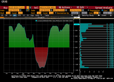
This Great Graphic, from Bloomberg, shows the correlation between the price of iron ore and the Australian dollar on a rolling 60-day basis over the past year. The correlation is a little more than 0.81. The relationship is the tightest since last August. This is purely directional.
Read More »
Read More »


