The Mother of All Blow-OffsWe didn’t really plan on writing about investor sentiment again so soon, but last week a few articles in the financial press caught our eye and after reviewing the data, we thought it would be a good idea to post a brief update. When positioning and sentiment reach levels that were never seen before after the market has gone through a blow-off move for more than a year, it may well be that it means something for once. |
|
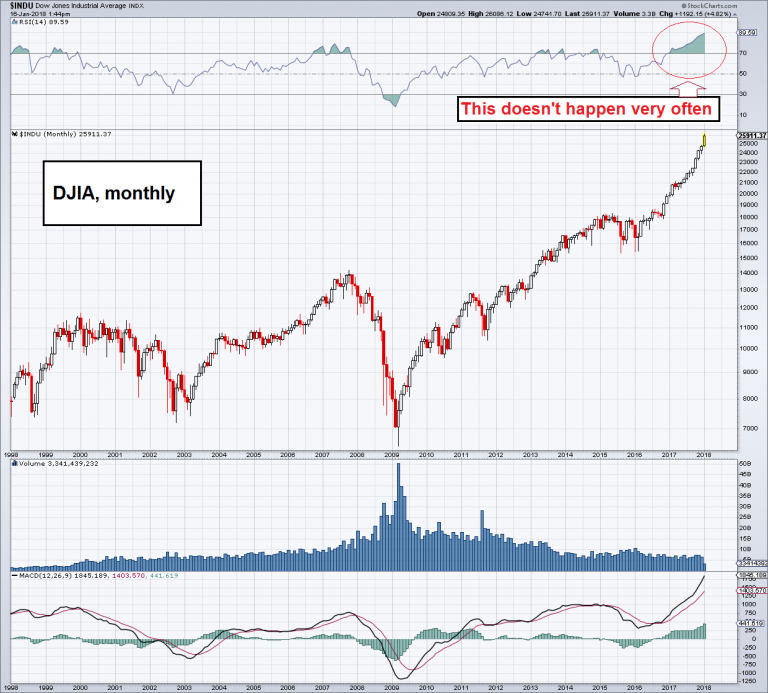
| Interestingly, the DJIA has fully participated in the blow-off this time, contrary to what happened at the end of the 1990s bull market and the first echo boom that ended in 2007. On the monthly chart the venerable Dow Industrials Average now sports on RSI of roughly 90, which is really quite rare.
If you think this looks like the exact opposite of what we have seen at the lows in 2009, you are entirely correct – it is indeed the opposite in every conceivable respect. In 2009 the news were uniformly bad; nowadays, we are flooded with good news on the economy and corporate earnings. In 2009 stocks were cheap – if not really historically cheap – now they are in many ways at their most expensive in history, particularly if one considers the median stock rather than just the capitalization-weighted indexes. |
Dow Jones Industrail Average Index, Monthly 1998 - 2017(see more posts on Dow Jones Industrial Average, ) |
Singing From the Same Hymn SheetWe recall that the reading of the Daily Sentiment Index of S&P futures traders stood at just 3% bulls on the day of the March 2009 low. Looking at sentiment data today, there are probably 3% bears left. What prompted us to take a closer look at the data was an article at Marketwatch about the positioning of Ameritrade customers – in other words, self-directed retail investors. The article is ominously entitled “Retail investor exposure to stock market is at an all-time high”. An all time high? Isn’t this supposed to be the “most hated” bull market ever? That hasn’t been true for quite a while actually. Ameritrade helpfully provided a chart of its “Investor Movement Index” (IM Index), which measures the aggregate stock market exposure of its clients. On the day we looked at the article, we quickly jotted down the titles of other articles Marketwatch suggested to its readers via embedded links. We suspected these might at least partly change after a while and wanted to preserve what we saw. The headlines were quite telling:
This is of course not what the people quoted in these articles said in previous years – least of all in 2009. The main point is of course their unanimity, which emerges only after a relentless march higher. For all we know, they could well be right – take for example the call for yet another 30% “melt-up”: it sounds crazy to us, but in a blow-off even a mere handful of weeks can make a big difference. One only has to recall the explosive run in the Nasdaq from November 1999 to March 2000 (it rose by 80% in that brief time period). |
Investor Movement Index, 2010 - 2017 |
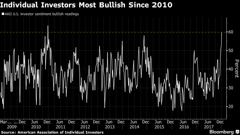
Investors Large and Small – All Are on the Same PageSo is this now the stage when “professionals” are distributing stocks to retail investors? Not really, actually. If anything, they are even more in love with stocks. Mish pointed out last week that hedges have become quite unpopular among fund managers – which is funny, because hedges have also become quite cheap. But it seems that few fund managers want to “risk” underperforming their benchmarks even by a few basis points, as that could well cost them customers (and bonuses). If the market crashes, they will all be in the same boat and will collectively point to the fact that “no-one could have seen it coming”. Also, it is after all OPM they are supervising – and isn’t it anyway a tradition that the customers shall remain yacht-less? This lack of demand for hedges was recently noticed by a quantitative analyst at Morgan Stanley as well, as Zerohedge reports. The man audaciously recommends buying a few puts for a quick pullback. It is well worth looking at the charts that go with the report – we rarely see all thoughts of downside potential abandoned so thoroughly. For instance, customer holdings of SPX calls reached the 100th percentile, and holdings of puts fell to the zero percentile. No further escalation is possible in this case – that’s it, basically. In other words, a new boundary for the bullish consensus among the firm’s clients has been set – it has never been where it is now. Customer demand for long S&P futures positions concurrently hit a new record high at Morgan Stanley as well. We want to keep our focus on individual investors though, mainly because they are normally rather cautious. If one looks at a long term chart of the AAII survey (American Association of Individual Investors), it usually shows a fairly sizable proportion of skeptical investors. They rarely go overboard collectively with foaming-at-the-mouth bullishness, but that has clearly changed. The chart below is from a Bloomberg article that appeared last week, entitled “Signs of Euphoria Are So High Investors Are ‘Having a Hard Time Imagining a Decline’”. We imagine that their imagination will soon be jolted back to life. |
U.S. Investor Sentiment, March 2009 - December 2017 |
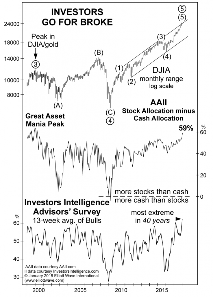
| Readings in the 60% to 70% area are traditionally peak levels for the AAII consensus. However, a somewhat deeper analysis shows that this reading masks the fact that the exposure to stocks among the survey respondents in terms of a percentage allocation is actually at a 17-year high (i.e., the highest since 2000).
The next chart has appeared in the monthly Elliott Wave Financial Forecast and depicts the gap between the stock and cash allocation of AAII respondents, as well as the 13-week average of the bullish consensus among investment advisors. The latter has reached a 40-year high. Note the contrast to the survey results recorded at the 2009 low, when the most popular stocks could be bought for a fraction of the prices they trade at today.
|
Sentiment Data |
In Part 2 we take a closer look at the “other side of the trade”, namely bears and short sellers, or rather, what is left of them. It is a sorry sight.
Charts by: StockCharts, AmeriTrade, Bloomberg, EWI
Full story here Are you the author? Previous post See more for Next postTags: Chart Update,Dow Jones Industrial Average,newslettersent,The Stock Market


