Pater Tenebrarum
My articles My siteAbout meMy videosMy books
Follow on:TwitterSeeking AlphaFacebook
Suspicion isn’t Merely Asleep – It is in a Coma (or Dead)There is an old Monty Python skit about a parrot whose lack of movement and refusal to respond to prodding leads to an intense debate over what state it is in. Is it just sleeping, as the proprietor of the shop that sold it insists? A very tired parrot taking a really deep rest? Or is it actually dead, as the customer who bought it asserts, offering the fact that it was nailed to its perch as prima facie evidence that what they are looking at is indeed, a late parrot, as deceased and expired as it can possibly be. We hereby submit that Polly, the “Norwegian Blue”, serves as a perfect stand-in for the risk perceptions of today’s corporate (and EM) bond buyers. Now, if Polly has in fact breathed her last, then we would have to assume she will be miraculously resurrected one of these days. Maybe she will come back as a slavering zombie, which would actually be quite fitting. If Polly is in a coma, she is bound to suddenly wake up one day, and we mean “suddenly” (as explained further below). One thing is certain though: just like the Terminator, Polly will be back.
|
Polly, we hereby rename thee “The Suspicion of Creditors”. |
Diverging Signals in a Giant Credit BubbleAlthough listed companies have amassed a lot of cash in the aggregate, Moody’s recently pointed out that the ratio of debt to cash has increased to levels that would normally indicate far higher expected corporate default rates and much wider credit spreads than are currently in evidence. To this one must keep in mind that just a small handful of listed US companies actually hold the vast bulk of said cash. As of mid 2016, just five US tech companies held more than one third of all corporate cash (AAPL, GOOGL, MSFT, CSCO, ORCL) – a share that has grown even further over the past year as far as we can tell. Apple alone has reportedly more cash on its balance sheet than eight entire industrial sectors. Note here that there is some disagreement over what should be counted as “cash”, but generally it is thought of as “cash an cash equivalents”, which include highly liquid short term investments such as US treasury bills and similar securities. In light of their liquidity and the existence of a well-developed repo market, one could well term these secondary media of exchange. |
High Yield Default Rate, Q4 1986 - Q2 2018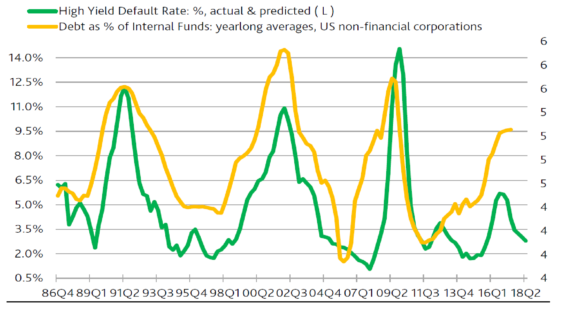 A long term chart by Moody’s depicting the non-financial corporate debt to internal funds ratio vs. actual and expected corporate default rates. - Click to enlarge Even ignoring the fact that the aggregate debt-to-internal funds ratio is actually a bit misleading in a sense, due to the concentration of cash holdings at just a few companies (most of which have very little debt to boot), the recent divergence in default expectations from the ratio is highly unusual. It is a good bet that this dichotomy will eventually be resolved by a rapid adjustment in expectations, since the underlying perceptions result to a great extent from self-reflexivity. In other words, the “predicted” portion of future default rates is eventually going to veer back up, because the “self-fulfilling prophecy” function embedded in this forecast will one day simply make a 180 degree turn (and people will long thereafter discuss the reasons for this surprising development no-one could see coming) |
| Moreover, technology companies tend not to be overly indebted, which means that the idea that the vast corporate debtberg is somehow offset by corporate cash holdings is extremely flawed (note also that according to the Fed’s most recent flow of funds data, total corporate liabilities are approximately 10.7 times larger than cash holdings, so depending on definitions, leverage is actually already a tad greater than depicted in the chart above). |
Total Leveraged Loan Issuance and Grade Gross Leverage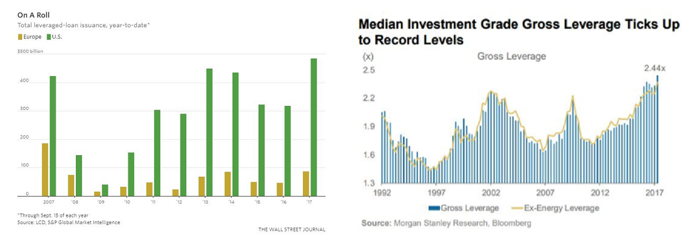 Left: issuance of leveraged loans (ytd. through September of each year); Right: median IG gross leverage. Both have recently hit new record highs - Click to enlarge |
| A plethora of data points suggests that we are currently experiencing one of the most manic credit bubbles in history. Below are several charts illustrating the situation. Note that these are just a few miscellaneous credit market-related data we have come across in recent weeks, the point is that they all send the same one-sided and clear message: Polly is comatose. |
Cov Lite Loans and Total Assets of High Yield Bond Funds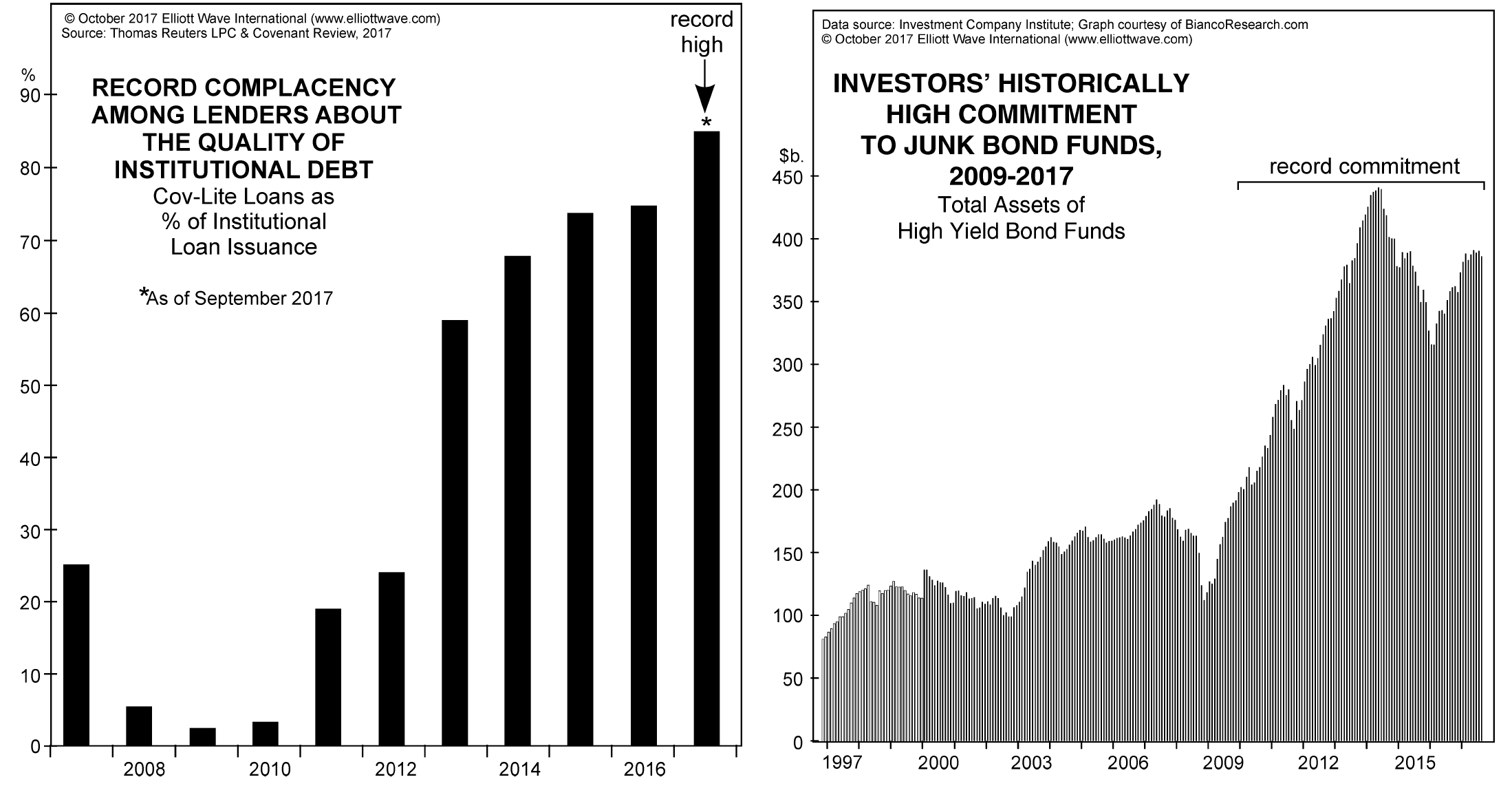 Left: percentage of “cov-lite” loan issuance reaches a fresh record high. - Click to enlarge Compare this to 2008-2010, when suspicion was wide awake. Loan covenants contained a variety of conditions that are attached to loans or debt securities in order to protect creditors, which “cov-lite” loans obviously lack (as an example, such conditions may include a commitment by the borrower to maintain a certain minimum net debt/EBITDA ratio, or limit dividend payments to a certain percentage of net earnings, etc., etc.). The surge in cov-lite issuance indicates that lenders no longer feel the need to discriminate, just as long as they can grab a little bit of yield. This is in no way different from the situation during the housing bubble. All that has happened is that the focus has shifted from real estate to corporate debt (and emerging market debt). Right: aggregate AUM of junk bond funds – needless to say, these are quite stunning figures. They also underscore another technical difference: these days investors bear the bulk of the risk, the banking system is so to speak only in second line, as it will be affected indirectly when push comes to shove (i.e., when Polly wakes up) |
| Credit spreads are also out of whack with other ratios that usually tend to lead them or coincide with them quite reliably (our friends at Variant Perception for example cite the flattening yield curve, the extent of global M&A activity, and the ratio of corporate cash flows to debt in this context). Why is this happening? What has made investors throw caution to the wind a mere decade after a system-threatening crisis?
As we have pointed out on several occasions in recent months, both narrow and broad true US money supply growth rates have declined quite precipitously over the past year, hand in hand with falling bank lending growth rates – a trend that has continued with verve in September. This has not yet affected the indicators that usually warn of imminent recessions though. Apart from credit spreads, some of these are: The action in the yield curve (required is a rapid reversal to steepening after a prolonged period of flattening – we believe based on historical data that an inversion is not necessary when coming out of a ZIRP regime), a downturn in real gross private domestic investment (which routinely precedes recessions), a decrease in PMI readings below the 50 level (we have some doubts about the validity of ISM data though, as they are diverging massively from Markit PMI data as well as the “hard data” releases from the manufacturing sector), a surge in initial claims (usually happens very close in time to the beginning of recessions, almost coincident with the stock market turning down). |
US Broad Money Supply, Total Bank Credit and Loans, Jan 2008 - 2017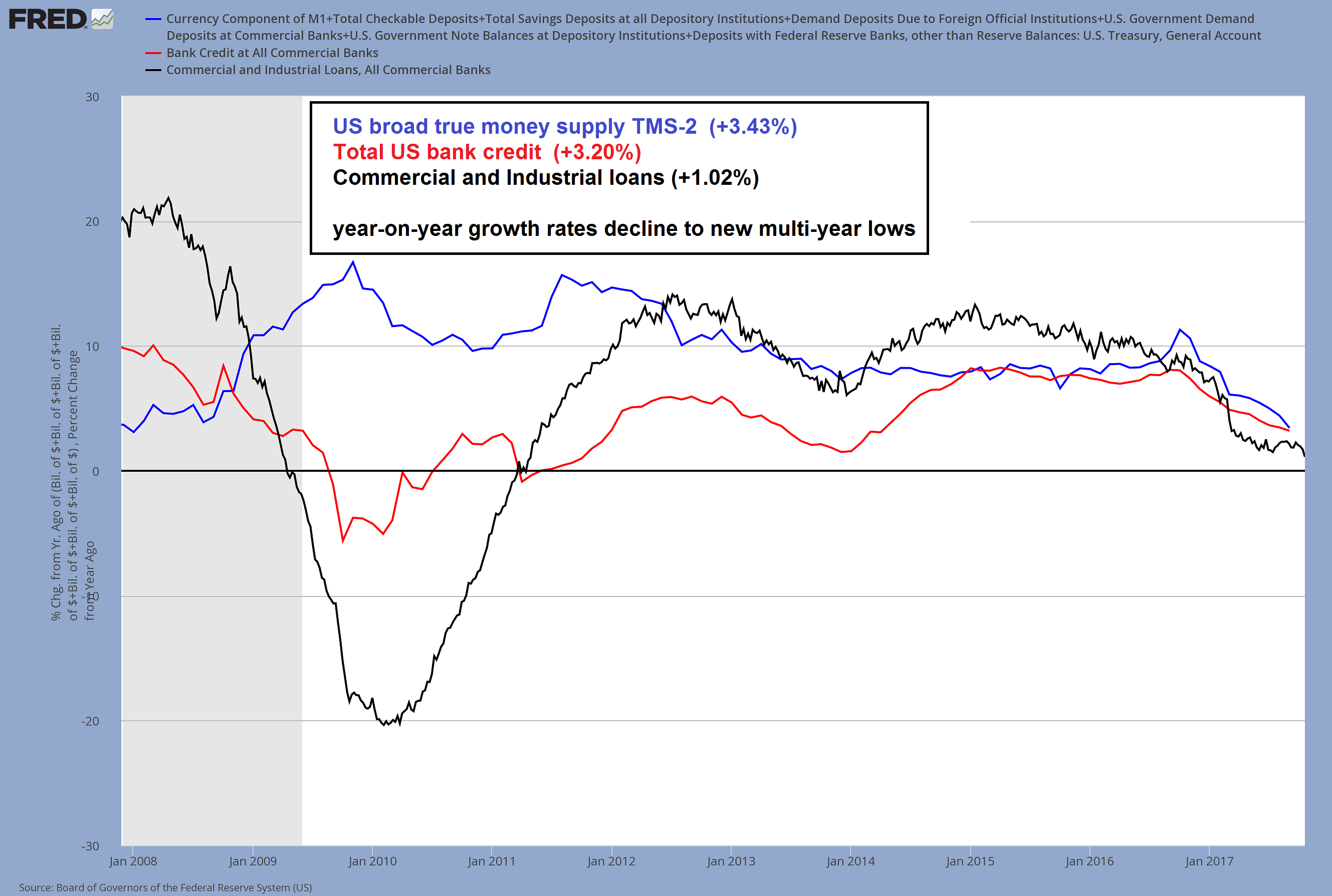 US money supply and credit growth has suffered a sharp decline since the interim peak in TMS-2 growth in November 2016 at 11.3% y/y (wasn’t there an election at the time? Honi soit qui mal y pense). - Click to enlarge It is absolutely certain that this will affect economic activity and free liquidity available to the financial markets with a lag. The current level of TMS-2 growth was last seen in the summer of 2007 and with the Fed bent on continuing its rate hike campaign and beginning “quantitative tightening” (albeit in microscopic steps), it seems highly likely that these trends will persist |
In the Mouth of MadnessThe fact that these indicators have not reacted yet to the sharp decrease in money supply and credit growth is undoubtedly affecting investor perceptions. Originally the massive “yield hunt” was triggered by the money supply expansion caused by the QE operations of central banks though – egged on additionally by certain targeted policies. For instance, up until recently the ECB expanded the scope of its QE program several times, inter alia adding purchases of investment grade corporate and agency bonds to its arsenal of interventions (agencies = euphemism for state-owned enterprises). With yields on government and investment grade corporate bonds declining to minuscule levels, investors were increasingly driven into low grade bonds so as to capture at least some yield. As usually happens in these situations, this trend has gone from astonishing, to extreme, to where it is now – completely, foaming-at-the-mouth insane. |
Euro Area Junk Bond Spreads, Sep 2012 - 2017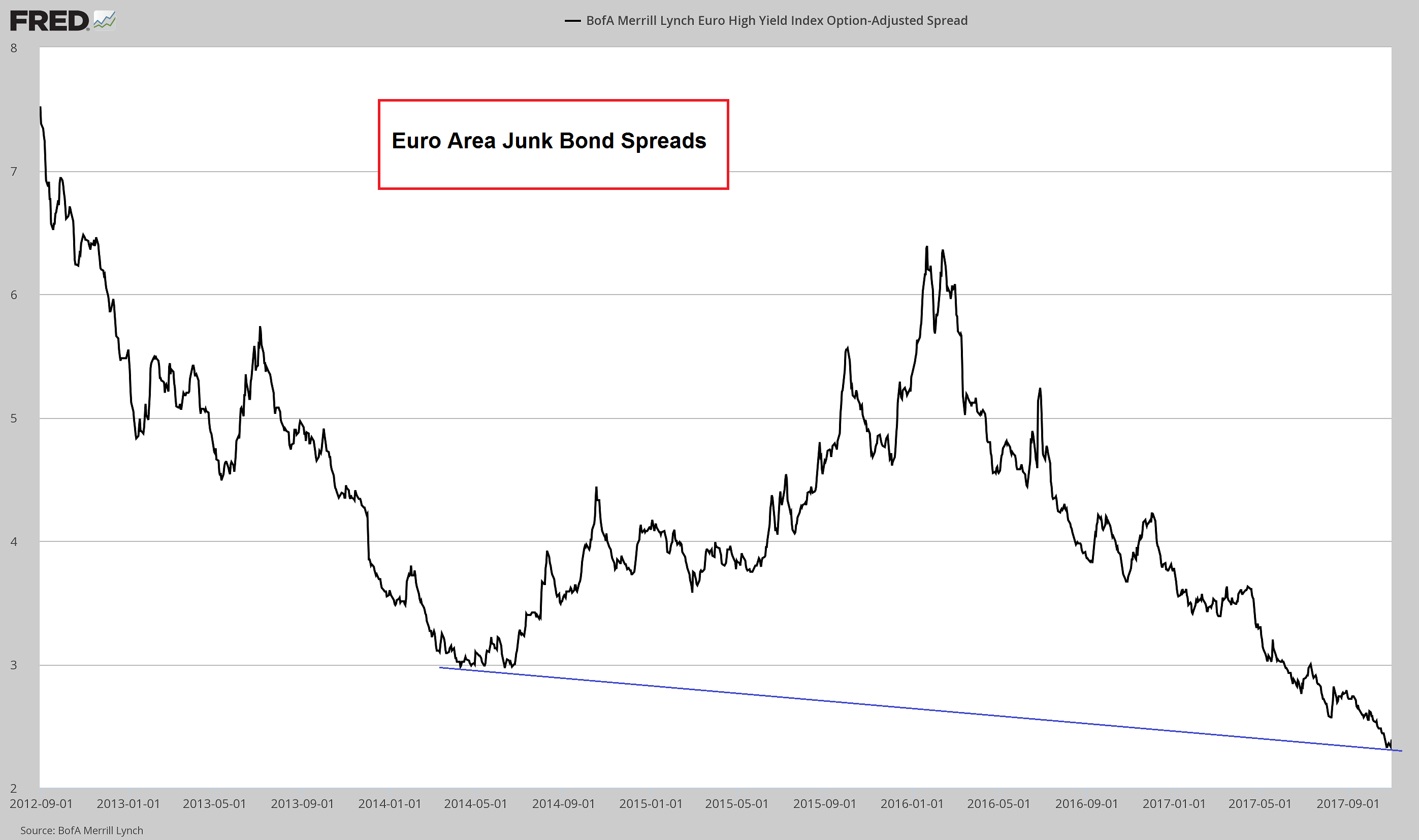 Euro area junk bond spreads – note that this tiny spread does actually not represent a record low – that was made in 2007. - Click to enlarge But nominal yields certainly are at record lows, as euro area benchmark government bonds (read: German Bunds) trade at absurdly low yields as well (a good sight below headline CPI rates). In one respect this spread is at a record low though. The Barclays Pan-European High Yield Index trades at a spread of zero basis points over US treasury bond yields. This is why we call this insanity: clearly anyone who believes European junk bonds should yield no more than US treasuries needs to have his head examined |
| There is a feedback loop between European and US financial markets, and clearly the action in European bonds has had some influence on the action in the US over the past two years or so (at times the vector points predominantly the other way, as e.g. during the oil patch troubles of 2014 – 2015). However, subtle divergences have recently emerged within various below investment grade rating classes (more on this further below).
Meanwhile, the ECB has finally managed to double the euro area money supply from its level of 2008 (!), with the y/y growth rate recently running at a still hefty ~10%. At its late October meeting the ECB decided to cut its monthly debt monetization volume in half though, which follows a previous cut from €80 billion to €60 billion per month. Hence, from January onward, the run rate will decline to €30 billion per month. With euro area M1 (very close to TMS) currently clocking in at approximately €7.70 trillion in toto, the prospective annual percentage addition to the money supply from QE alone will decrease to 4.67%. Bank lending to corporations is currently growing at slightly less than zero percent, consumer credit grows by ~5.9%, while total household liabilities are increasing at just 2.6% (these include mortgages). Unless this changes dramatically, money supply growth is set to slow significantly in the euro area as well. |
Euro Area Data, 1980 - 2018 Here are the euro area data mentioned above: Lending growth to non-financial corporations has just dipped slightly into negative territory again (corporate bond issuance is concurrently going gangbusters, but that has no effect on the money supply), consumer loans (excl. mortgages) are growing more vigorously, but they represent only a small amount, while growth in total household liabilities (the bulk of which consists of mortgages) remains subdued. - Click to enlarge Money supply inflation has nevertheless “gone parabolic” as a result of QE – but this driver is about to get kneecapped. Anyone who buys euro area junk bonds at the same nominal yield provided by US treasuries should close his eyes and imagine Dirty Harry asking him the famous question (sometimes the punks are lucky and don’t realize it, sometimes they aren’t and don’t realize it either; in the end that means they are unlucky every time) |
Keep Your Eyes PeeledAs mentioned above, credit spreads are normally one of the main indicators we watch as early warning signals of recession and pending stock market downturns. One has to be acutely aware though that the massive money printing exercises by the Fed, the ECB, the BoJ and the BoE in recent years have distorted the structure of relative prices in the economy enormously and have evidently produced a number of strange, unexpected effects (such as the dichotomy pointed out by Moody’s above). Thus one needs to exercise some extra caution, as it is quite possible that future developments will continue to diverge in a number of respects from historical experience. In short, we may not get the warnings we usually get before euphoria turns to panic. One also has to cast a wider net when attempting to interpret what often looks like contradictory data. Take for instance the indicators we enumerated above, all of which have a strong track record of leading both economic upswings and downturns. If we were to make some sort of index of this list, it would currently look “overbought” to the extent that we would think of it as a contrary indicator, albeit one with a very long lead time. On the other hand, looking at current sentiment and positioning data in the stock market (which show an unprecedented degree of euphoria), it is actually hard to imagine that there will be a “very long” lead time. Browsing through various indicators at the St. Louis Fed data base, we came across a US leading index calculated by the Fed that attempts to forecast the six month growth rate of the coincident index on a state-by-state basis (the US national index combines the data of the states). It contains a few additional data points apart from those making up the coincident index which are listed below the chart. Interestingly, this index does not look all that strong – in fact, it has turned down rather noticeably: |
US Leading Index, 1982 - 2016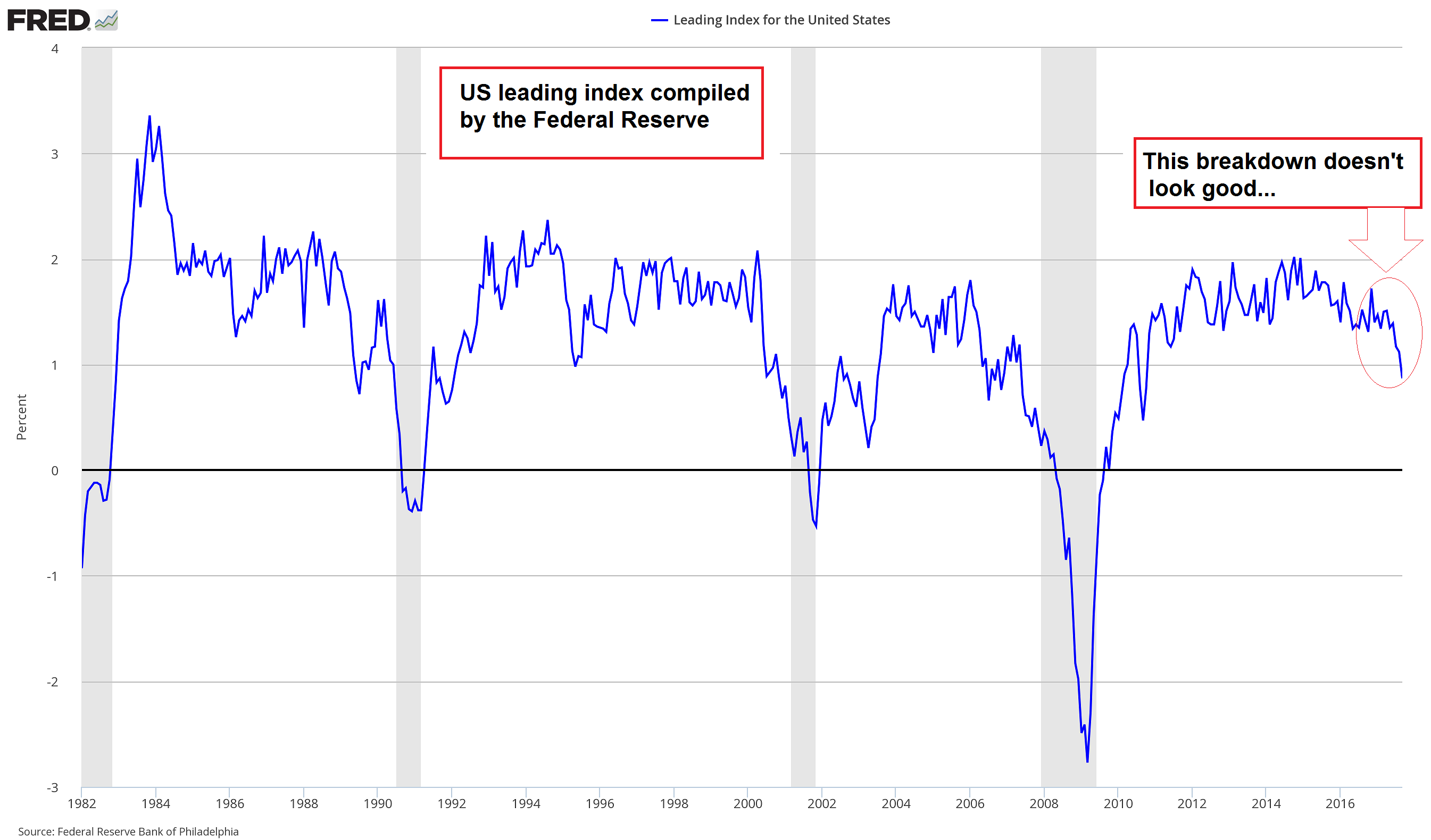 US leading index turns down (the above mentioned additions are: State-level housing permits [1 to 4 units], state initial unemployment insurance claims, delivery times from the Institute for Supply Management [ISM] manufacturing survey, and the interest rate spread between the 10-year Treasury bond and the 3-month Treasury bill) - Click to enlarge |
| Let us now take a close look at US high yield spreads (based on BofA/Merrill HY indexes). Currently they are just up a few basis points from their recent post GFC lows, but interestingly, the lowest grade bonds (rated CCC and below) have actually failed to make a new low for the move – this is the subtle divergence we alluded to above. |
US High Yield Option, May 2016 - Nov 2017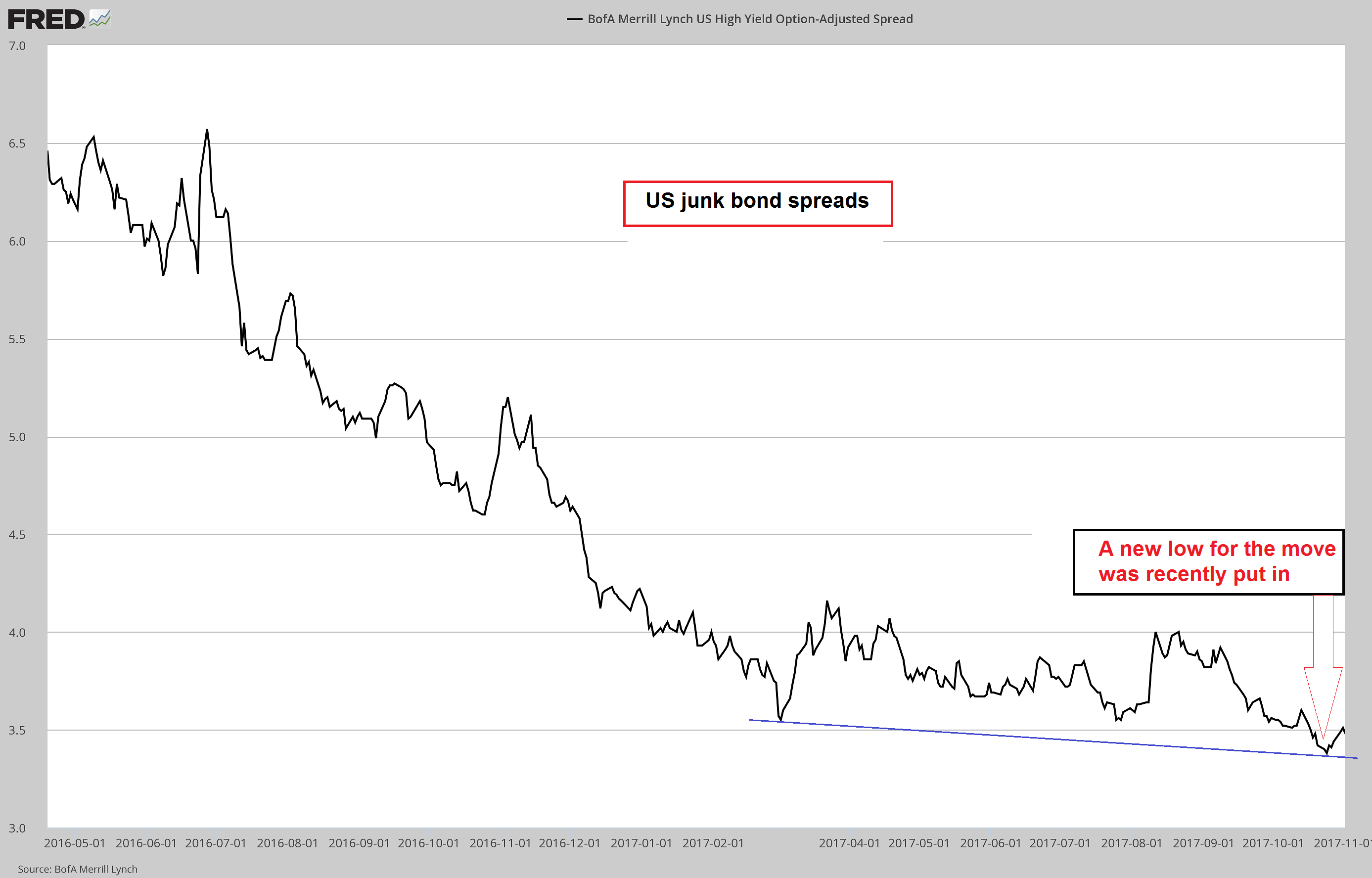 US high yield spread via BofA/ Merrill Lynch – the recent new low was put in slightly ahead of the new low in euro area junk bond spreads. - Click to enlarge Downside momentum in credit spreads was very strong when crude oil prices recovered from below $30 to more than $50, but it has recently waned noticeably |
| For comparison, here is the spread on CCC and below rated junk bonds: |
US High Yield CCC or Below Option, Apr 2016 - Nov 2017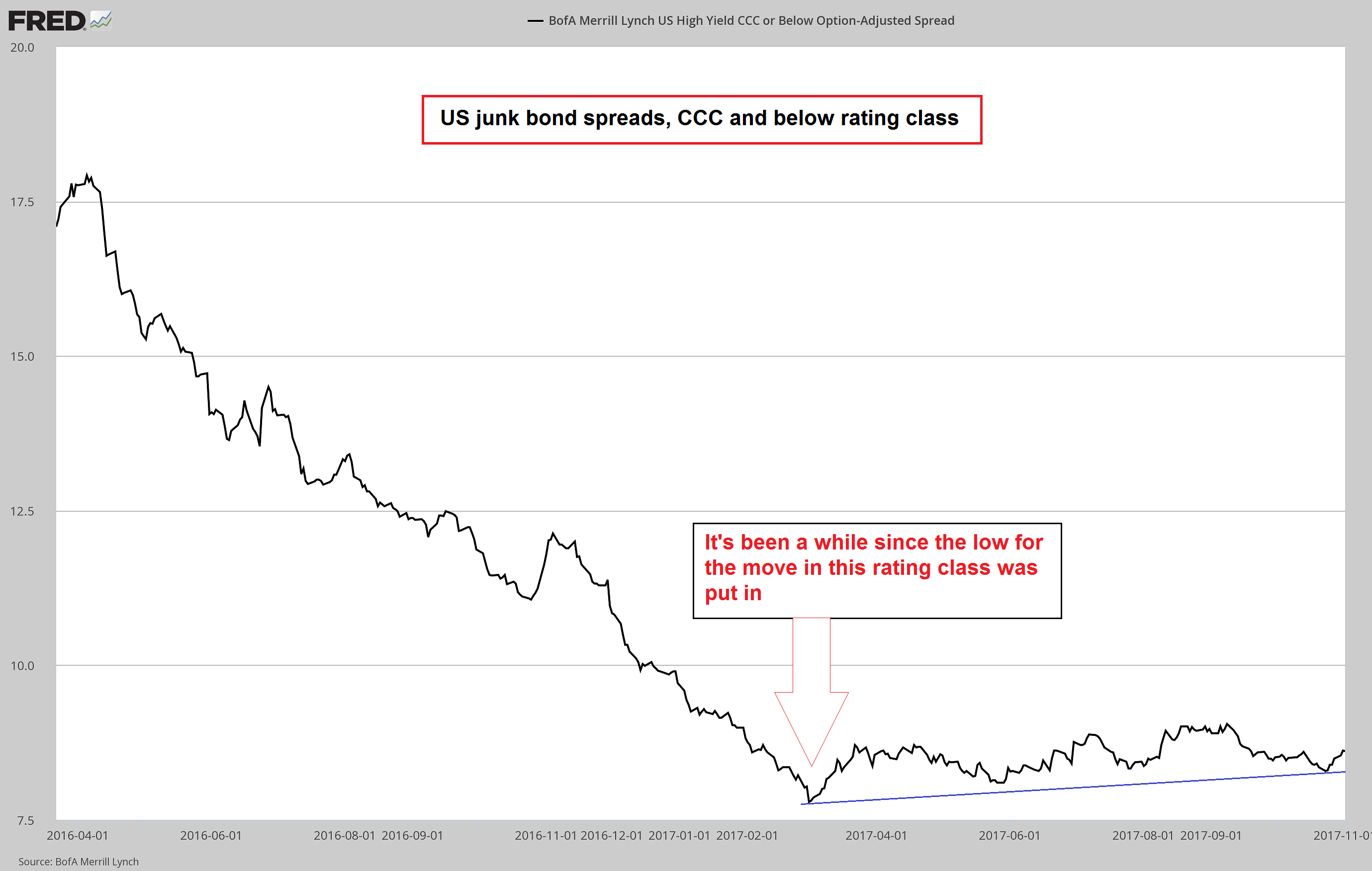 As illustrated here, the lowest grade junk bond spreads actually made their low back in March, i.e., there is now a bearish divergence with spreads on higher-rated junk bond in place. - Click to enlarge We cannot be sure that it will prove meaningful, but there is definitely a good chance it will. Also, we haven’t seen it mentioned anywhere else |
| A noteworthy aspect of the economic downturns following the peaks of the tech mania and the housing bubble was that they began very suddenly. Very few people actually expected such a swift change in fortunes. We still remember the CEO of a semiconductor firm quoted in the press in late 2000 describing the sudden drying up of orders as follows (we are paraphrasing): “It was as though someone had thrown a light switch”.
We took a look at past trend changes in junk bond spreads, which seem to follow a very similar script. After going sideways at very low levels or drifting lower with litte momentum and very little volatility for a long time, the trend suddenly changes – a small breakout above a previous interim high is usually all it takes to initiate the fireworks. Several expamples are shown below, starting with 2007: |
US High Yield Option, March 2007, Feb 2008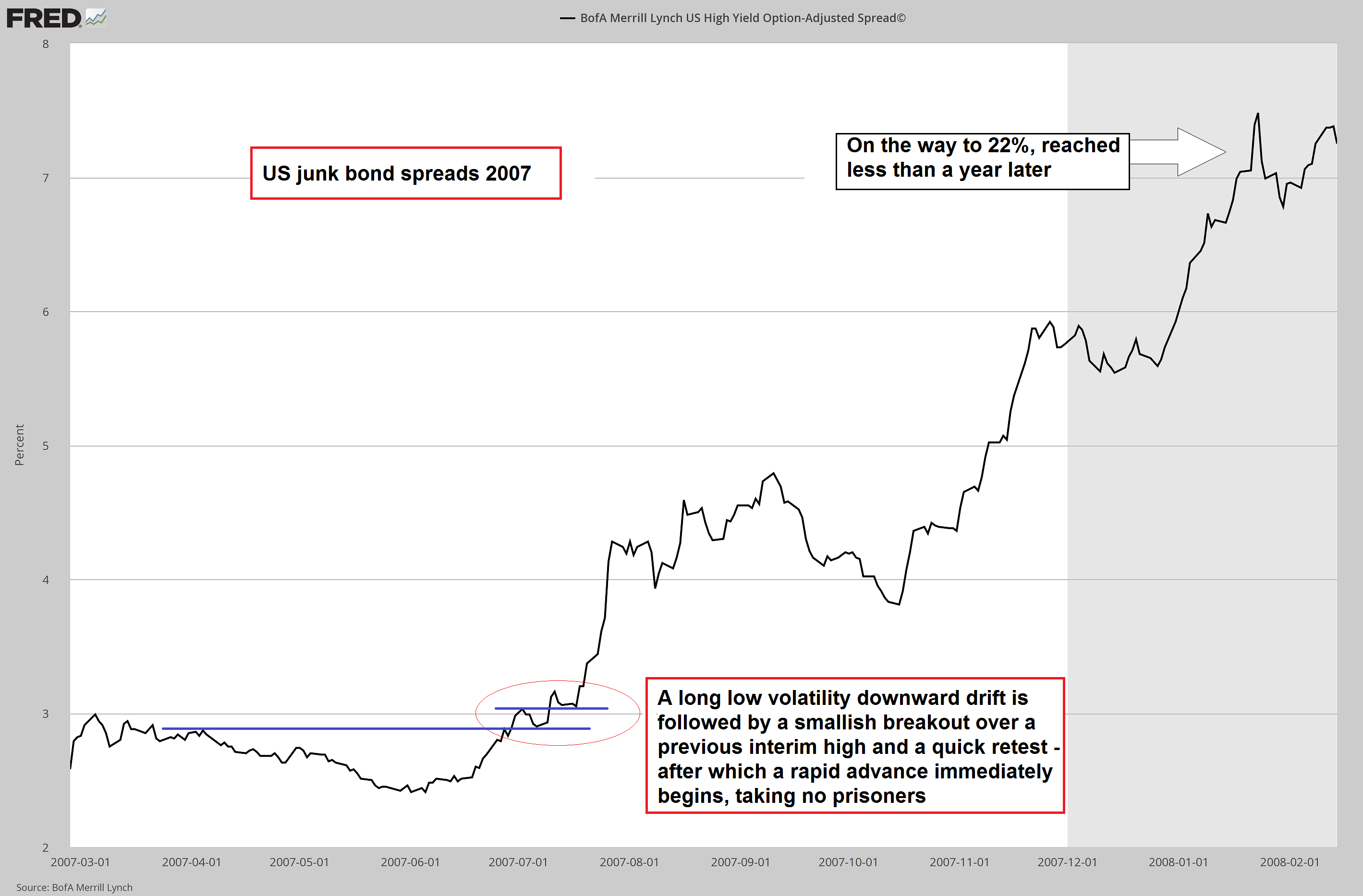 The 2007 trend change in credit spreads: sentiment in the market changed rapidly after the initial breakout - Click to enlarge |
| Here is what happened in 2011, as the euro area sovereign debt crisis came to a head with the evetual bailout of Greece and ending with Mario Draghi’s famous “it will be enough” speech before he revved up the printing presses in earnest: |
US High Yield Option, Jan 2011 - 2012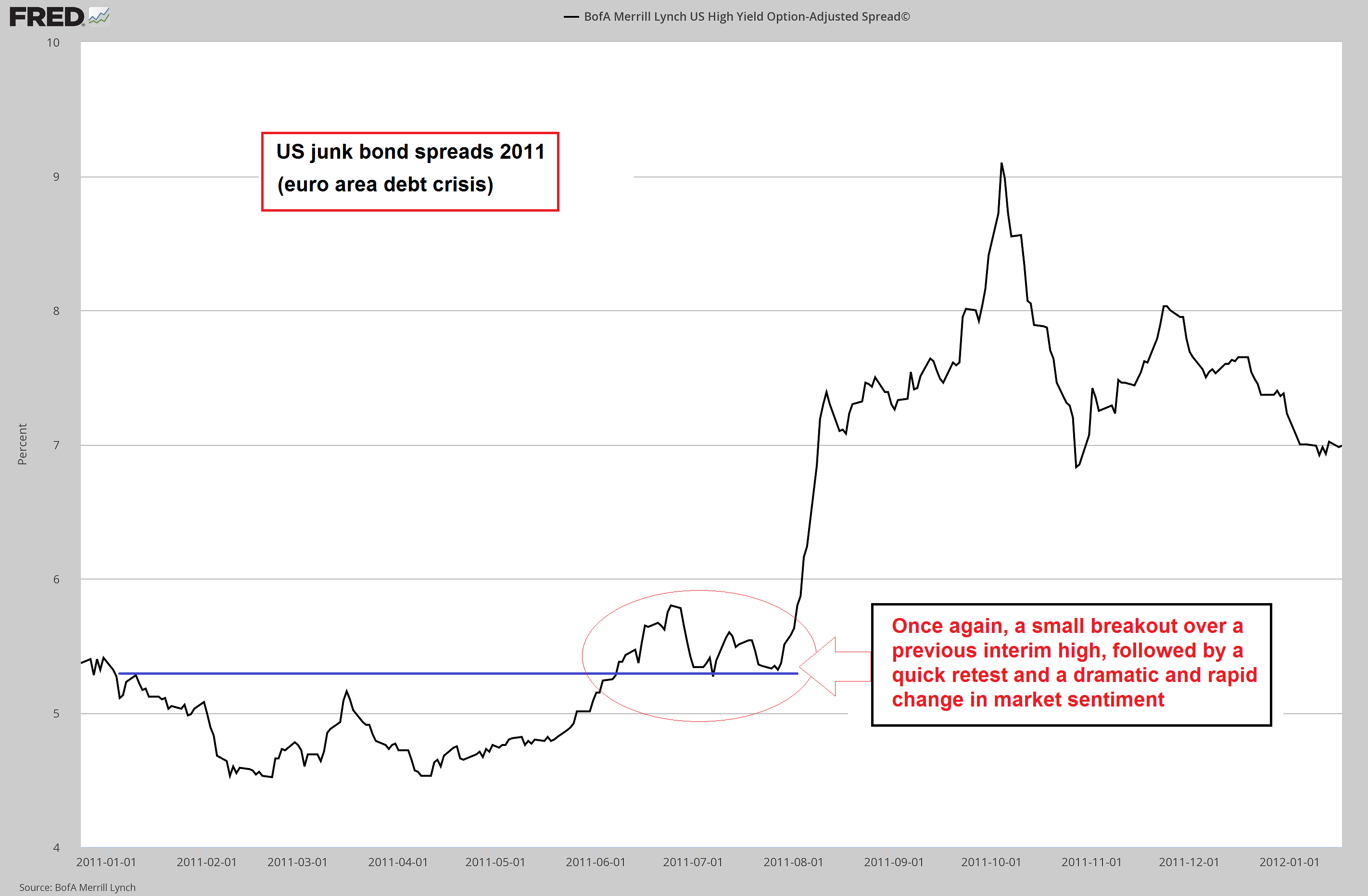 2011 trend change: once again, sentiment changes rapidly after a small at first unimportant looking breakout - Click to enlarge |
| The next chart shows the beginning of the surge in junk bond spreads in 2014 when oil prices began to decline. This trend was a bit more “muddled”, because it was focused on a specific sector of the economy and only partially propagated from there to the rest of the economy. But we can still discern the same pattern early on: the market’s assessment never changes slowly, it goes from sunshine to thunderstorm in an eyeblink. |
US High Yield Option, Jan 2014 - Nov 2015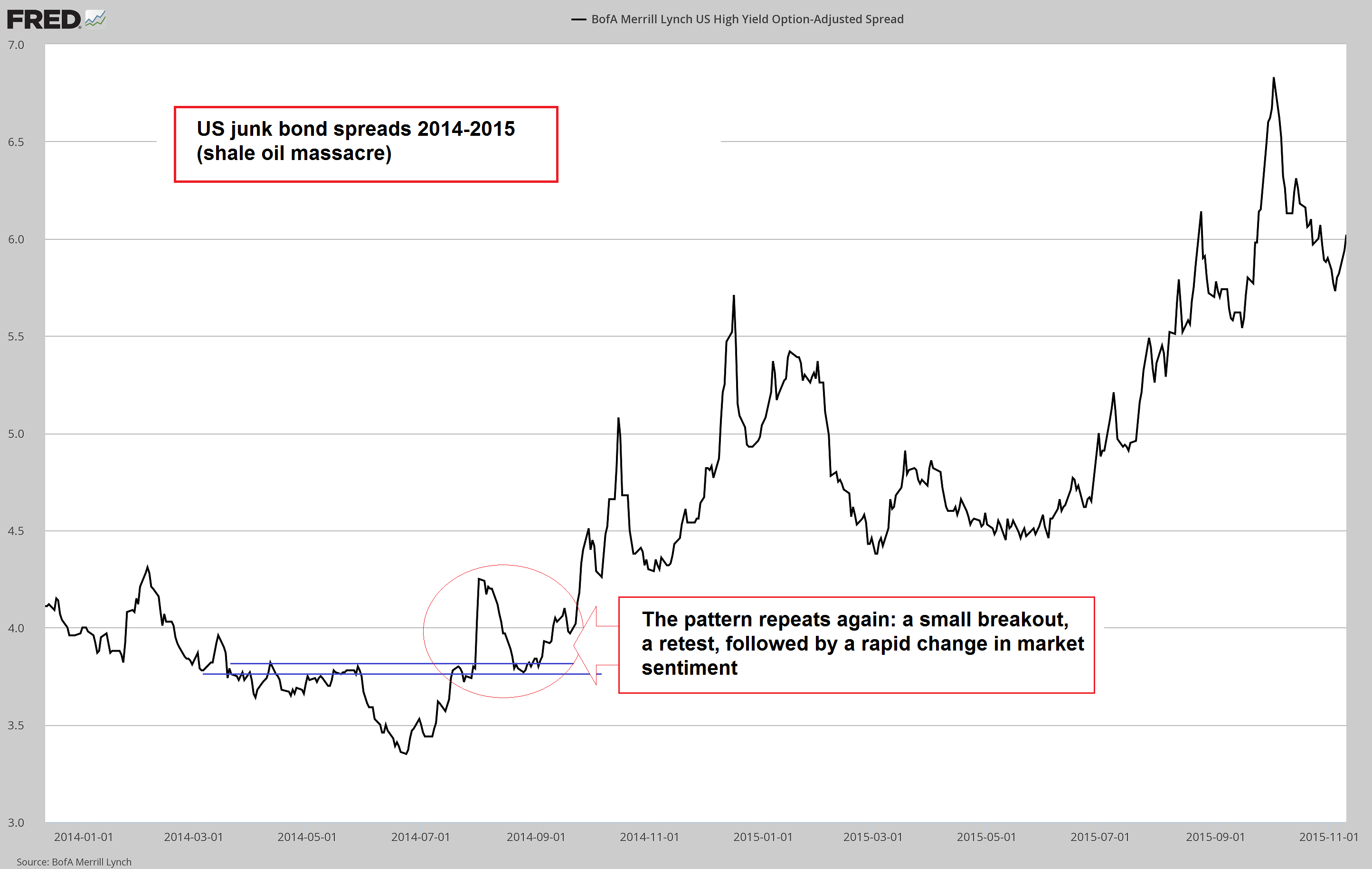 2014 oil sector troubles: once again sentiment changed in the blink of an eye - Click to enlarge |
| ConclusionWe think the past market behavior illustrated above – the sudden change in perceptions from the view that the economy is doing fine and low spreads should be regarded as the “new normal”, to the realization that a massive amount of capital consumption is on the verge of being unmasked – is going to be an important feature of the next trend change as well. We would even go as far as saying that some traditional warning signs may be absent this time around. We base this on the fact that a number of unusual divergences have been with us for some time now, with various data often seemingly contradicting each other, or let us rather say, failing to follow historically well-established correlations.
The reason why some historically well-established correlations are in some cases no longer detectable is that every slice of economic history is characterized by unique contingent circumstances. The current echo boom period differs markedly from previous post WW2 boom periods in that it was mainly driven by direct central bank intervention rather than inflationary commercial bank lending. Now that central banks are pulling back, money supply and credit growth are no longer boosted to the same extent as before. We believe one thing that is not going to be different is the effect this will eventually have on the echo boom. As we noted above, Polly is going to wake up, and she’s going to do so unexpectedly and quickly. Addendum: Bonus ChartBelow is a chart showing a recent update of assets held by the three largest central banks. As can be seen, the ECB and BoJ have done their best to catch up with the Fed, presumably in an effort to show that Ben Bernanke is not the only “hero” who knows how to find the “Ctrl P” combination on his keyboard (some more conspiracy-minded observers have suggested there might be coordination, in order to prevent one currency from losing too much value against the others, as that might actually draw JQ Public’s attention to the printathon. Considering they have regular meetings at the BIS far from public scrutiny all the time, this may not be too farfetched. Of course this is complete nonsense, as these people barely know each other). In both cases one can see that the momentum of asset additions has recently slowed a bit – the ECB has lowered its monthly purchase volumes, while the BoJ has adopted yield curve control, which can in theory both lead to larger or smaller monthly purchases, but appears to have resulted in a mild slowdown in purchases in recent months. |
FED, ECB and BoJ Assets, 2002 - 2016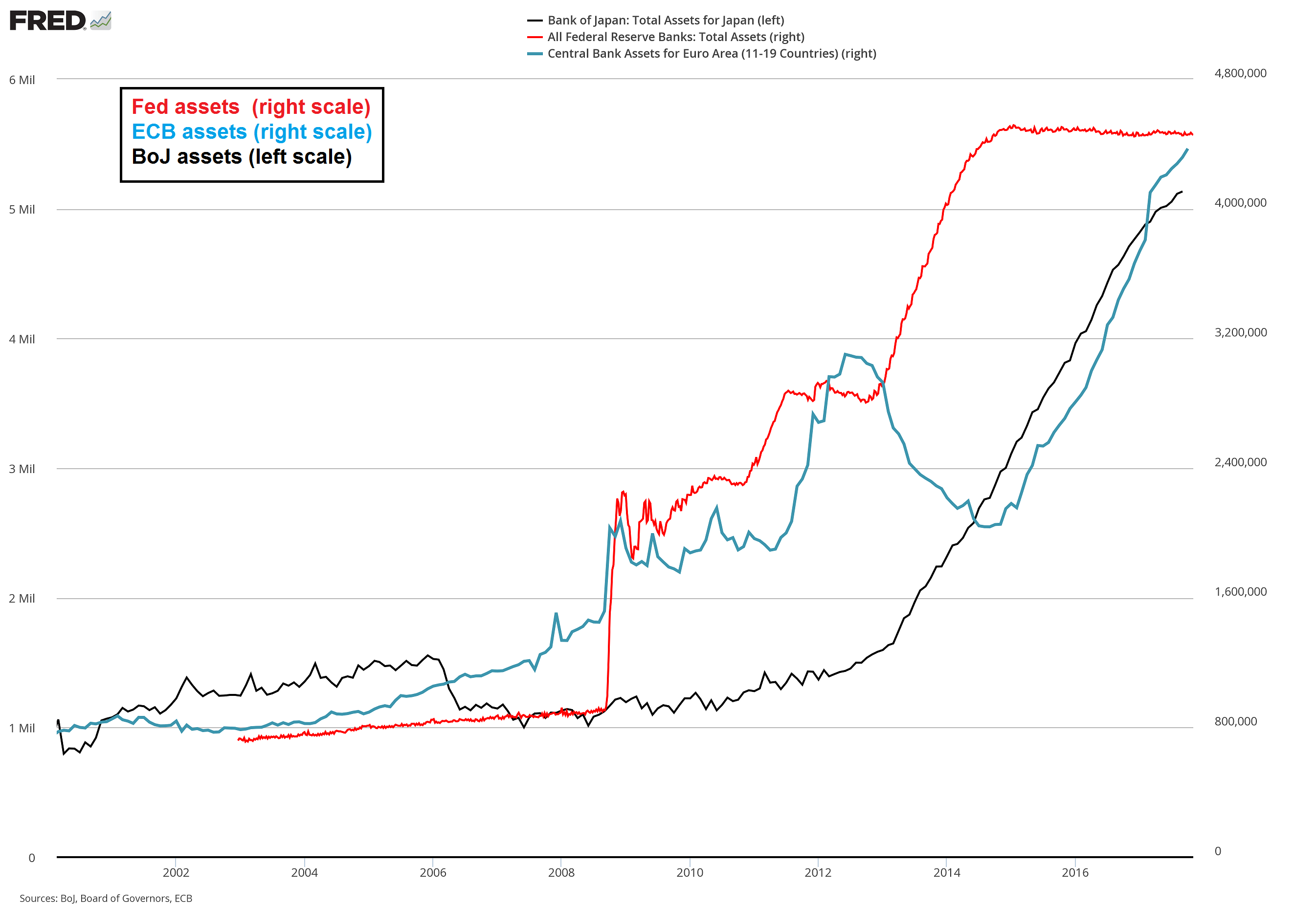 Assets held by the Fed, ECB and BoJ – the long term effects of this globally coordinated debt monetization orgy remain to be seen. - Click to enlarge Judging from their horrendous forecasting record, the bureaucrats responsible for this mad scramble have no special insights into this particular problem. Generally in such cases the hope is that by the time the long term effects arrive, the cause-effect vector will be sufficiently veiled by the passage of time. We already know that they brazenly disavow that there is any connection between their policies and the huge credit and asset bubbles they spawn (Ben Bernanke e.g. blamed “too lax regulations” in one of the most highly regulated sectors of the economy for the 2008 crisis. Massive surges in the prices of land and homes could not possibly have anything to do with the Fed’s interest rate policies – which were moreover allegedly sabotaged by those pesky Asian savers producing a “savings glut”) |
Tags: Chart Update,Credit Markets,newslettersent