


Marc Chandler
My articles My offerMy siteAbout meMy videosMy books
Follow on:LinkedINTwitterSeeking AlphaAmazon
 There is a common ploy used by many analysts and reporters that often simply does not stand up to close scrutiny, and would in fact be mocked in the university. The ploy is to take two time series and put them on the same chart but use different scales.
Such a ploy often is used to demonstrate a closer relationship between the two variables than is actually the case. A current example is a chart of the dollar-yen rate and Japanese stocks.
| Here is a Great Graphic that was in the Financial Times. It was created from a data base provided by Thomson Reuters. The chart begins at the start of 2013. That seems like a logical place to begin as Abe was elected at the end of 2012. However, what makes the 10,000 level of the Nikkei (left scale) be at the same level as JPY80 (right scale)? | 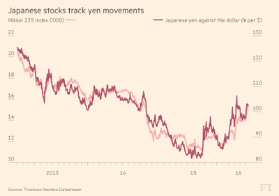 |
The truth is there is no compelling reason except it makes the chart more aesthetically pleasing and allows one to argue the closeness of the fit between the yen and Nikkei. Investing is many things, but it most certainly is not a beauty contest.
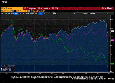
| Here is the same two time series indexed so that each starts at 100 at the start of 2013. It was created on Bloomberg. It shows that the relationship is not nearly as tight as is suggested by the first chart. This is important for investors. The relationship can inform investment strategies and hedging decisions. | 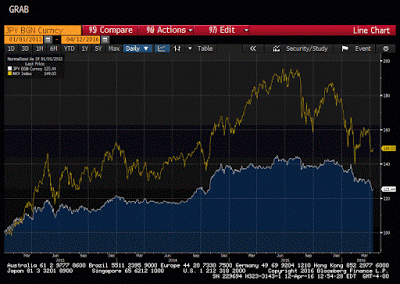 |
The first chart looks as if the Nikkei and yen have performed similarly. The lower chart demonstrates that this is not the case. Beware.
Implicit too in the sophistry is the idea that correlations can be eyeballed. Perhaps sometimes they can, but it reminds me of when I recently went canoeing. I stuck the oar in the water and looked down. It looked like the oar was bent. I quickly pulled the oar out of the water and found it was still straight and true.
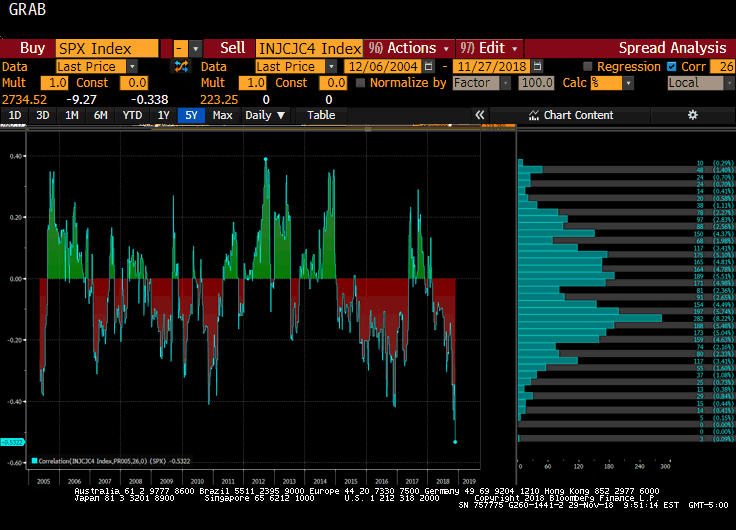
The correlation between the Nikkei and dollar yen moves around quite a bit, which is something else that the first chart does not seem to reflect sufficiently. The correlation between the percentage change in the Nikkei and the percentage change in the dollar-yen rate over the past 100 sessions is near 0.40. Last September was at the highest correlation of Abe’s tenure, near 0.63. Last June, this 100-day correlation (on the percentage change) dipped into negative territory.
It is said that Euclid once claimed that there was no royal road to geometry, which meant there was no shortcut. In my experience, the same is true about investment. There is no substitute for rigorous critical thinking, and doing one’s homework. Be suspicious of fallacious thinking regardless of the source or form.
He has been covering the global capital markets in one fashion or another for more than 30 years, working at economic consulting firms and global investment banks. After 14 years as the global head of currency strategy for Brown Brothers Harriman, Chandler joined Bannockburn Global Forex, as a managing partner and chief markets strategist as of October 1, 2018.
Tags: Correlations,Great Graphic,Japanese yen,newslettersent,Nikkei