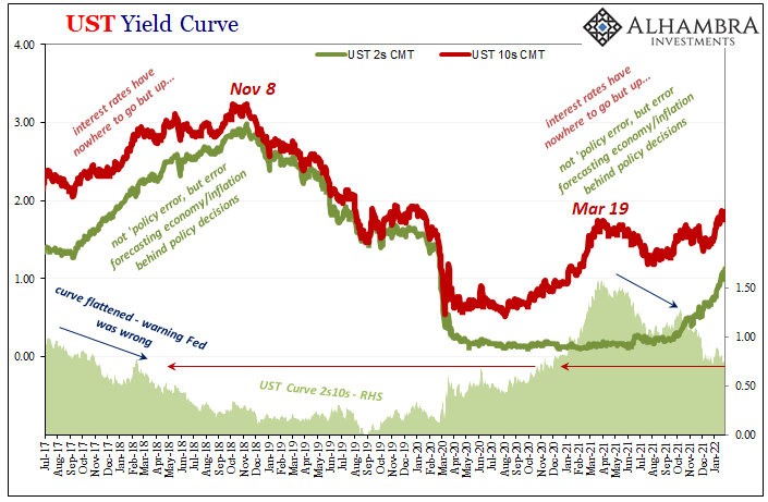
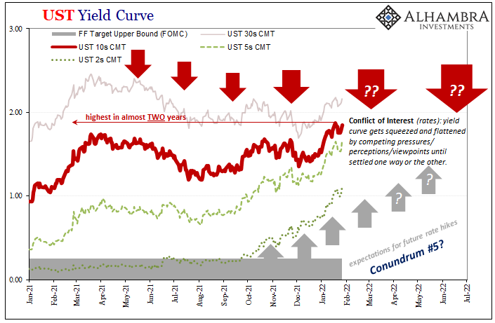
| It’s not hard to reason why there continues to be this conflict of interest (rates). On the one hand, impacting the short end of the yield curve, the unemployment rate has taken a tight grip on the FOMC’s limited imagination. The rate hikes are coming and the markets like all mainstream commentary agree that as it stands there’s nothing on the horizon to stop Jay Powell’s hawkishness.
And yet, on the other hand, growth and inflation expectations, the long end could not be more resolute that eventually policymakers are going to have to face what is already an incredibly high probability of authorities committing yet another awkward set of cumulative mistakes. |
|
| Over here, on this side of the divide, there’s China and now a flood of inventory rather than money.
This is all very familiar territory, an almost exact rerun of 2018. What’s unusual or different this time around isn’t encouraging, either. |
|
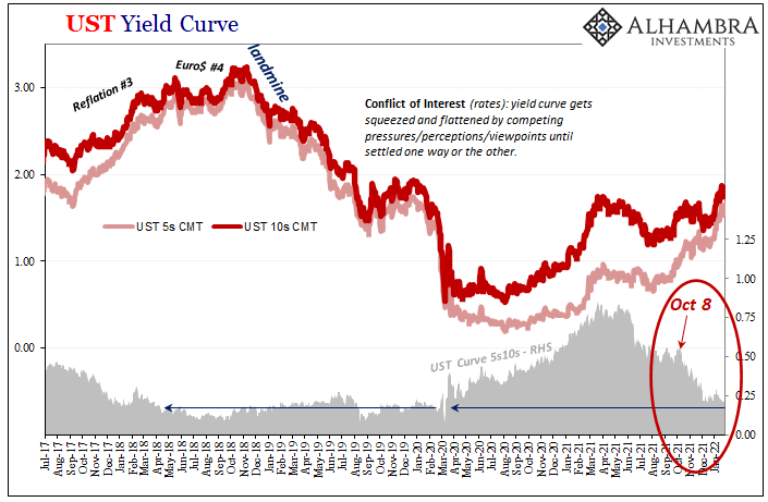
| To begin with, today with nominal rates up all across the curve on the FOMC’s announcements and projections, they were yet again higher more so in the front than the back. The crucial benchmark 10-year yield, for instance, it settled at 1.85%, up 7 bps on the day. The 5-year’s, it closed at 1.66% rising by 10 bps.
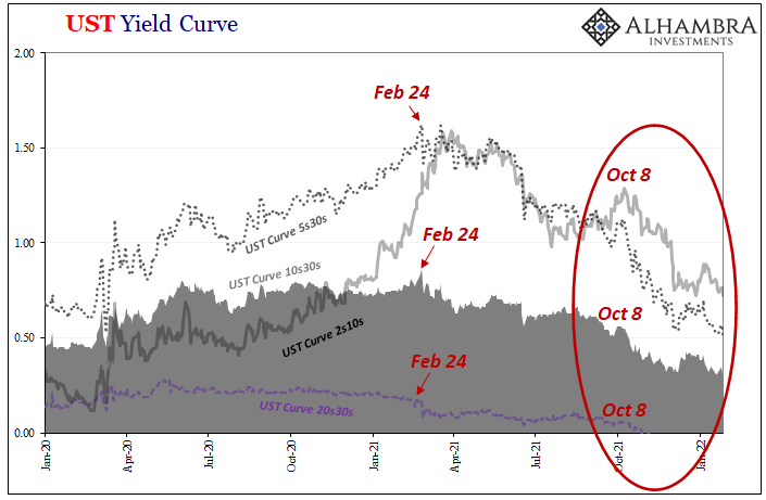
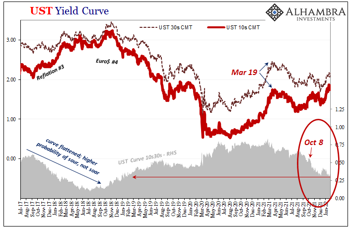
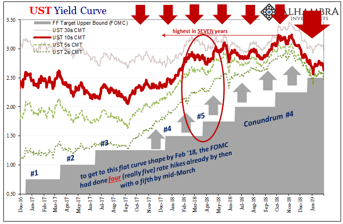
Therefore, the 5s10s calendar spread sunk by another trio of bps down to a minuscule difference of just 19 bps total. If the market was at all about to agree with the FOMC as to either growth or inflation let alone both, the long end would be rising quicker and go farther than the short end. The last time this particularly helpful part of the curve had been this flat (on the way down) it was the end of March 2018 (see: above). Same for pretty much everywhere else on the curve. The 10s30s, after the FOMC it was again at 31 bps which is the same as February 2018. Stretching out to the 5s30s, this part is now an even fifty which puts it in an equivalent shape also to March 2018. Even the wider and mainstream 2s10s flattened down to just 72 bps, same as February 2018. |
|
| This yield curve shape overall is priced like it is March 2018 all over again. Given how the entire world’s monetary, financial, and economic system fared from then on, this is not good sign at all.
And not just in comparison to what would happen after March 2018 but more so in the primary way in which this one is different from that one. Here’s the thing, the Federal Reserve had already raised their federal funds range four times (25 bps each) by February 2018, with a fifth undertaken right in mid-March. And I’m not even going to count the lone December 2015 hike for our purposes here, either. |
|
| In other words, to get the yield curve as flat as it is now (where it really counts), policymakers had conducted four to five rate hikes during the last cycle (Conundrum #4). To state the obvious, the curve is in the same general shape right without yet a single one from Powell!It isn’t scheduled until the next meeting in March 2022.
What that says is as little faith as the market had in globally synchronized growth by early 2018 (remember, flattening means more likely to sour than soar; increasingly flat means far more likely to sour), it has priced materially less faith, far more determined skepticism right now even though CPI rates are (currently) the highest in four decades and everyone absolutely convinced (in mainstream commentary, anyway) this is going to continue. It is going to continue…for a little while. The curve is not predicting imminent recession, only that the balance of risks throughout the world, including the FOMC’s US base, have decidedly tilted toward the unfavorable and disinflationary. Remember, too, the eurodollar futures curve wouldn’t invert until June 2018. The market has already priced this overall adverse probability distribution even before the Fed gets started. |
Full story here Are you the author? Previous post See more for Next post
Tags: bond yields,Bonds,currencies,Deflation,economy,Featured,Federal Reserve/Monetary Policy,FOMC,inflation,Interest rates,jay powell,Markets,newsletter,rate hikes,U.S. Treasuries,Yield Curve


