


Pater Tenebrarum
My articles My siteAbout meMy videosMy books
Follow on:TwitterSeeking AlphaFacebook
Unprecedented Extremes in Overbought ReadingsReaders may recall our recent articles on the blow-off move in the stock market, entitled Punch-Drunk Investors and Extinct Bears (see Part 1 & Part 2 for the details). Bears remained firmly extinct as of last week – in fact, some of the sentiment indicators we are keeping tabs on have become even more stretched, as incredible as that may sound. For instance, assets in bullish Rydex funds exceeded bear assets by a factor of more than 37 at one point last week. |
 Bullish investors had every reason to feel smug in recent months. - Click to enlarge And while there are a number of bears of varying degrees of prominence who have become cautious much too early (many of whom have fallen silent over the past year or so, but that is how it always works…), there are very few traders who are actively betting on a downturn. And yet, we know that the main bubble fuel – namely, broad true money supply growth – is faltering. |
| Last Friday, after discussing with friends of ours what the best way to play tail risk currently probably is, we updated a few of the charts we showed in those articles. More on the former topic follows further below, but first here are a few charts we made on Friday, just before the recent minor dip began – i.e., the charts are not showing this dip yet, but this is actually not relevant for our purpose. The first chart is a weekly chart of the DJIA as of Friday last week (we are focusing on the DJIA because it is the “bubble leader”). |
Dow Jones Industrial Average Index, Feb 2013 - 2018 A weekly chart of the DJIA as of Friday last week. - Click to enlarge To be perfectly honest, we are actually not 100% sure if a weekly RSI exceeding 92 is entirely “unprecedented”, although we strongly suspect it is. What we do know for certain is that it has not happened in at least 45 years. As noted in the insert, this manic RSI reading has coincided with DSI readings (daily sentiment index of futures traders) on stock index futures that were the exact opposite of the extreme DSI readings recorded at the low in March of 2009. |
| When it comes to charts, we like to keep things simple – cluttering them up with all kinds of oscillators and overlays is not really our thing. We do however traditionally use RSI and MACD as overbought/oversold indicators, mainly in order to spot divergences, which are often helpful for short to medium term timing. When we looked at longer term charts to see whether the DJIA had ever posted a weekly RSI above 92 before, it occurred to us that this was probably extremely rare for any stock market index.
It turns out we were right about that. As an example, when the great tech mania of the late 1990s topped out in March of 2000, the Nasdaq’s weekly RSI stood “only” at 84. In the DJIA, even the monthly RSI finally exceeded the 90 level last week – which we believe is a first as well: |
Dow Jones Industrial Average Index, 2003 - 2018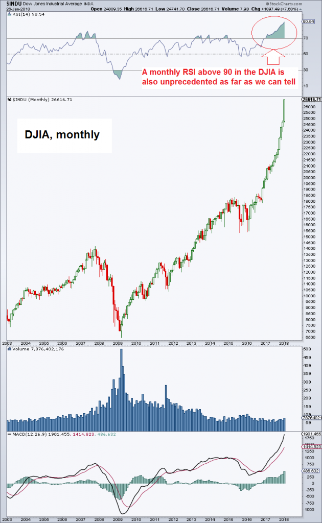 DJIA monthly – we are aware that it looks slightly less intimidating on a log chart. - Click to enlarge In view of the uniqueness of the situation, it should look scary though (in a number of ways valuations have never been more stretched, so this is not only an extraordinary juncture in technical terms). When we see charts like this one, we always wonder what people buying the top tick are actually thinking – that stocks are a bargain here? They control money, so they have to be thinking something, right? |
A Lone PrecedentAfter ascertaining that indexes are indeed almost never posting such extreme RSI readings in weekly and monthly time frames, we looked around to see if we could perhaps find a precedent anyway. In the end we actually did find one, even if it is not ideal as a comparison, namely the Shenzhen ChiNext Index in 2015. Unfortunately this index has very little in common with the DJIA beyond the ominous weekly RSI reading above the 90 threshold, but it is still interesting to see what happened to it after it had managed to attain such rarefied heights. As one would expectm it wasn’t pretty, but we are mainly interested in how precisely the reversal from euphoria to panic played out. |
Shenzen Chi-Next Weekly, Feb 2014 - 2018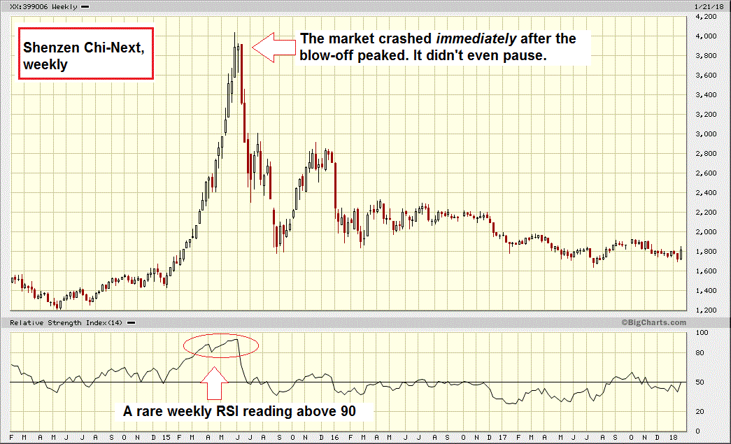 Shenzhen ChiNext, weekly – several things are worth noting: the weekly RSI peak was actually recorded in the week after the price peak, at a slightly lower high. - Click to enlarge As can be seen, just one week passed between the top and the first week of the crash (a 40% decline in four weeks and ultimately a 55% decline in three months surely qualifies for the moniker). On a more granular daily chart (see further below) one can see that this one week of hesitation during which a “hanging man” candle was built on the weekly chart, consisted of two big down days, a “pause day” and a three day rebound with waning momentum; and that was all she wrote. Also noteworthy: more than two years after crashing, the market remains 55% below its peak, and has intermittently traded at even lower levels. So instead of making a comeback, this market has apparently fallen into a state of long-term despondency. |
| We find this rapid reversal quite interesting, because it is something that almost never happens in stock markets either. Stocks usually tend to top out in lengthy “distribution” patterns (as rallies are driven by greed) while they often bottom in spike lows (as sharp downturns are driven by fear). The exact opposite behavior is usually observed in commodities, i.e., they tend to make spike tops, while bottoming patterns are usually tedious, lengthy affairs, with many false starts.
We are of course not saying that precisely the same sequence of events is going to happen in the case of the DJIA – normally we would actually deem this a highly unlikely prospect. But recall what we pointed out in December of last year when we pondered how the bubble might end. We conjectured that the handful of bigger corrections we have seen since the 2009 low are likely providing important clues. This applies particularly the May 2010 “flash crash” and the August 2015 mini-crash, which were evidently driven by market-immanent, structural issues. These structural issues remain with us. While the sharp three day decline in 2015 happened several weeks after a market peak, it started with very little warning from a level less than 5% below said peak (see the annotated chart). It was a highly unusual pattern. Our suspicion is that in some way, the reversal of the current bubble will also be marked by an unusual pattern. It may lack the “normal” warning signs, it may happen faster than generally expected – we obviously cannot know. We believe though that similar to the many unprecedented things have happened on the way up, we should expect to see unusual behavior on the way down as well. As an aside, whether this week’s dip is actually meaningful remains to be seen; keep in mind that what looks like a fairly large loss in terms of points by recent standards is really nothing special in percentage terms, so it may well mean absolutely nothing – but one should be on one’s toes and keep one’s eyes peeled anyway. |
Shenzen Chi-Next Daily in 2015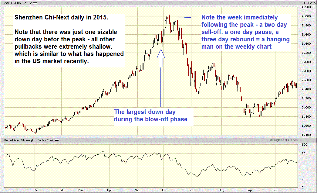 Here is the above mentioned close-up showing the daily action in the ChiNext Index during the 2015 blow-off and subsequent denouement. - Click to enlarge |
Addendum: Tail Risk PlayWe already remarked on the VIX at the end of our last article discussing the stock market. The VIX recently represented a fairly reasonable way of speculating on a correction (or something worse). If one wants to take advantage of tail risk potential with options – a low risk way of doing so – a blow-off represents a problem: since it is unknowable how far it will go, the strike prices of options one happens to buy too early will move further and further out of the money. Paying up for more time can mitigate this problem, but isn’t a truly satisfactory solution either. However, in recent months the VIX has stopped falling – it is no longer trending lower in a kind of mirror image of the market’s uptrend. For calls on the VIX that are bought near the lower end of its recent range, the danger that strike prices will move too far out of the money has become negligible. Of course, VIX options come with their own drawbacks and caveats. Moreover, selling volatility is still in fashion as far as we can tell, and any surges in the VIX will presumably tend to invite more of it. But one of these days this is no longer going to work and then such tail risk plays can pay off quite nicely. |
Volatility Index - New Methodology Index, Dec 2015 - Feb 2018 Since mid 2017 the VIX no longer makes lower lows – despite the market’s continued advance, it has transitioned from a downward trending channel that was operative for almost two years into a sideways channel. - Click to enlarge |
Full story here Are you the author?
Tags: Chart Update,newslettersent,The Stock Market


