Pater Tenebrarum
My articles My siteAbout meMy videosMy books
Follow on:TwitterSeeking AlphaFacebook
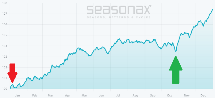
An Astonishing StatisticAs the final FOMC announcement of the year approaches, we want to briefly return to the topic of how the meeting tends to affect the stock market from a statistical perspective. As long time readers may recall, the typical performance of the stock market in the trading days immediately ahead of FOMC announcements was quite remarkable in recent decades. We are referring to the Seaonax event study of the average (or seasonal) performance across a very large number of events, namely the past 160 monetary policy announcements and the 10 trading days surrounding them. It looks as follows: |
S&P 500 Index, May 1997 - Dec 2017(see more posts on S&P 500 Index, ) We have highlighted the period of maximum profit over the past 20 years in dark gray, which is achieved over a holding period of 8 trading days and amounts to an average of 60 basis points. - Click to enlarge At first glance that may not look like much, but it actually works out to a 21.89 percent annualized gain, which exceeds the gain generated in the “rest of the time” by a vast margin. As the detailed returns in individual years at the bottom show, in some years particularly large gains were posted around FOMC meetings – these were as a rule associated with new cyclical bull markets just after the end of major bear markets. The largest losses were obviously primarily associated with bear market periods, but they are both much fewer in number than the gains and much smaller on average |
| It makes little difference if one extends the study to a 30 year time frame (or 240 events) – the return is almost the same, only the optimal holding period becomes 9 days instead of 8 trading days. The same holds if one compresses the study to 15 years or 120 events – the return and optimal holding period are equal to those of the 20 year study. If one compresses it further to just 10 years (or 79 events), the result actually gets better: the average return per event expands to 0.72%, boosting the annualized return to 27.10 percent.
Obviously, the smaller the sample size, the less statistical validity the result will have, but we have noticed that it often makes sense in seasonal studies to look at studies in shorter time frames as well. In fact, as long as a major market trend remains intact, “recency bias” will increasingly tend to hold sway. |
S&P 500, May 2007 - Dec 2017(see more posts on S&P 500, )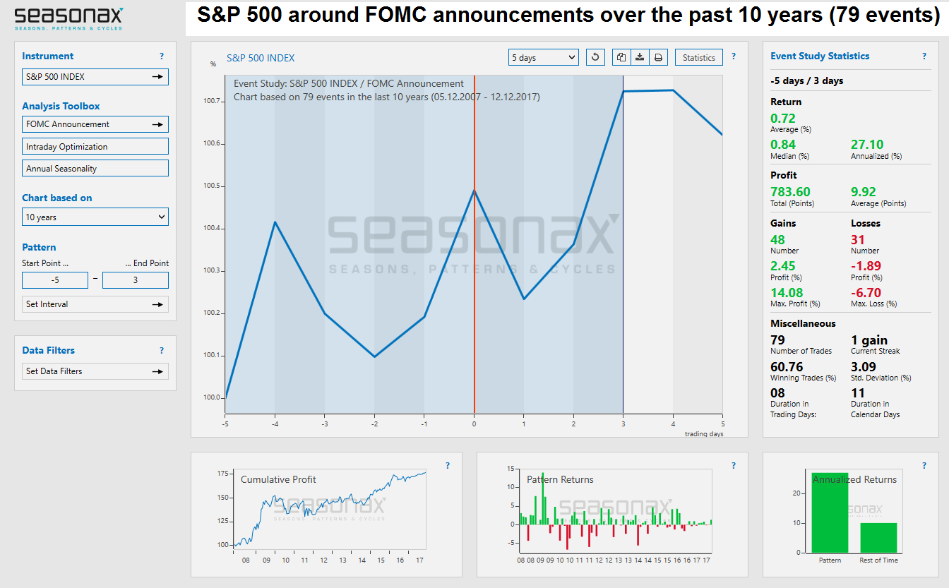 - Click to enlarge |
| When halving the number of events in the study, the result becomes even more impressive – obviously, this is mainly due to the strength of the post-GFC echo bubble – click to enlarge.
When the number of events included in the study is expanded to 700, or a 90-year time period, a significantly smaller average return of 0.38% is achieved (however, the median is higher at 0.50%, due to the proliferation of large gains in more recent decades). This is still an impressive 14.69 percent annualized, which beats the “rest of the time” gain handily as well. |
S&P 500 Index, Dec 1927 - 2017(see more posts on S&P 500 Index, )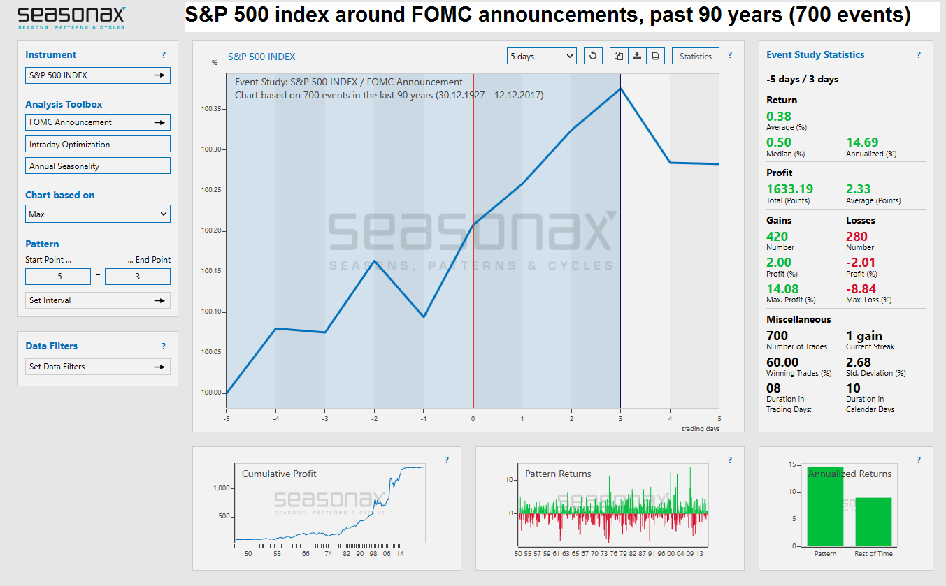 - Click to enlarge |
| Measured over a 90 year stretch (700 events), the average return declines to 0.38% for the 8 day holding period, but that still amounts to 14.69 percent annualized and handily beats the “rest of the time” gain in the index – click to enlarge.
The explanation for the much smaller “event return” over the 90 year stretch is that central bank intervention has become a great deal more important to financial markets since the adoption of the pure fiat money system in the wake of Nixon’s gold default in 1971. One only has to take a look at the long term trend in total US credit market debt to see why that is the case. |
Total US Credit Market, 1965 - 2017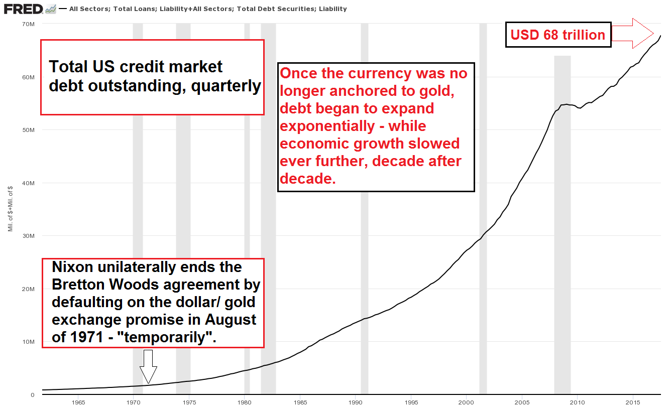 - Click to enlarge |
| As a result of the huge expansion in credit market debt once the pretense that governments were going to be keep their currencies sound was finally abandoned entirely, central bank decisions have become far more important to financial markets than they used to be.
It Gets Even Crazier…The upcoming FOMC announcement seemed a good opportunity to return to this topic, but what we are actually most eager to show is a chart that compares the cumulative gain one would have achieved if one had invested exclusively in the 2 days preceding every FOMC announcement (i.e., for the duration of the FOMC meeting) with the gain that would have been achieved by being invested exclusively on all other days. The total gain achieved by the SPX as such is shown as well: This chart is quite the stunner – and what makes it so stunning is that the risk-adjusted return when being exposed to the market over just 16 trading days every year is of course vastly superior to that of a buy & hold approach. One can safely ignore trading commissions, considering that discount brokers charge less than $5 per trade these days, regardless of size. One might object that the method fails to capture the microscopic dividend yield of the SPX, but consider the fact that the entire sum invested will be available for alternative purposes 336 days every year. Surely it won’t be too hard to make up for missing out on the current SPX dividend yield of 1.83%. There once was a time when dividends generated the bulk of long term stock market returns, but that was before the modern age of massive money supply and credit inflation. |
S&P 500 Index, 1998 - 2017(see more posts on S&P 500 Index, ) If one had been long the S&P 500 days exclusively over the 2 days of every FOMC meeting (while being out of the market the entire rest of the time), one would have achieved a capital gain almost equal to that of a buy & hold strategy. - Click to enlarge Since there are eight FOMC meetings per year, one would have been in the market for a total of just 16 days per year, or 320 days in 20 years. Being in the market exclusively over the rest of the time would have made no sense at all; the net gain achieved in this time period over the past two decades was negligible. In fact, most of the time one would have sported large paper losses. Obviously, a very big loss would have been made in real terms anyway |
ConclusionThe statistics discussed above are yet another (indirect) hint that broad stock market returns are largely dependent on monetary inflation and hence on the actions taken by central planners. Everything else is secondary. This strikes us as a rather deplorable state of affairs. In fact, it can be shown that prior to the institution of pure fiat money, the stock market delivered far larger returns in real terms than it has delivered ever since (this can be ascertained by comparing long term cumulative stock market returns in terms of gold). |
Dow Price in Dollars and Gold, 1800 - 2017 - Click to enlarge Robert Prechter of EWI published a chart that compares real returns in the stock market under a sound money regime with those achieved under the fiat money regime. |
The 1965 cut-off date was chosen on the basis that this was the year in which the last precious metals coins (silver dollars) were minted to serve as general media of exchange. Incidentally, this was also very close to the end of a major wave up in the stock market in nominal terms – click to enlarge.
However, we cannot change this, so our focus is mainly on making the best of the situation. Obviously, the information presented here can be used profitably if one employs it in a disciplined manner, with the caveat that even if the statistics show us high probability outcomes, there is no guarantee that market action won’t change in the future.
An important thing to keep in mind in this context is also that the behavior of the market around the FOMC announcement can be used as a signal. In other words, if the market’s behavior begins to deviate significantly from the statistical average and FOMC announcements begin to be associated with losses rather than gains, it will be a strong sign that the market’s character has changed from a bull to a bear market phase.
Full story here Are you the author?Tags: central banks,Chart Update,newslettersent,S&P 500,S&P 500 Index,The Stock Market