


Keith Weiner
My articles My offerMy siteAbout meMy videosMy books
Follow on:LinkedINTwitterSeeking AlphaFacebookAmazonGoogle +
Discounting the Present Value of Future IncomeLast week, we discussed the ongoing fall of dividend, and especially earnings, yields. This Report is not a stock letter, and we make no stock market predictions. We talk about this phenomenon to make a different point. The discount rate has fallen to a very low level indeed. Discount in stocks is how you assess the present-day value of earnings expected to occur in the future. For example, if the discount rate is 10%, then a dollar of earnings per share at Acme Piping next year is worth $0.90 today. At a 1% discount, it’s worth $0.99. As you look forward many years, the difference between these rates is very large. A buck of earnings at 10% discount = $1.00 + $0.90 + $0.81 + $0.73… = $10. At 1% discount = $1.00 + $0.99 + $0.98 + $0.97… = $100. A rising stock price is equivalent to a falling discount rate, assuming earnings are not growing commensurately. Our graph from last week shows that they aren’t. The idea of commensurate is important in economics. Any economist can paint a rosy picture by, for example, showing rising GDP. If you object that debt is rising with GDP, the economist switches to a chart of debt/GDP. He will tell you that the solution is to grow GDP with the right fiscal and regulatory policies. |
Corporate Debt Productivity, 1955 - 2015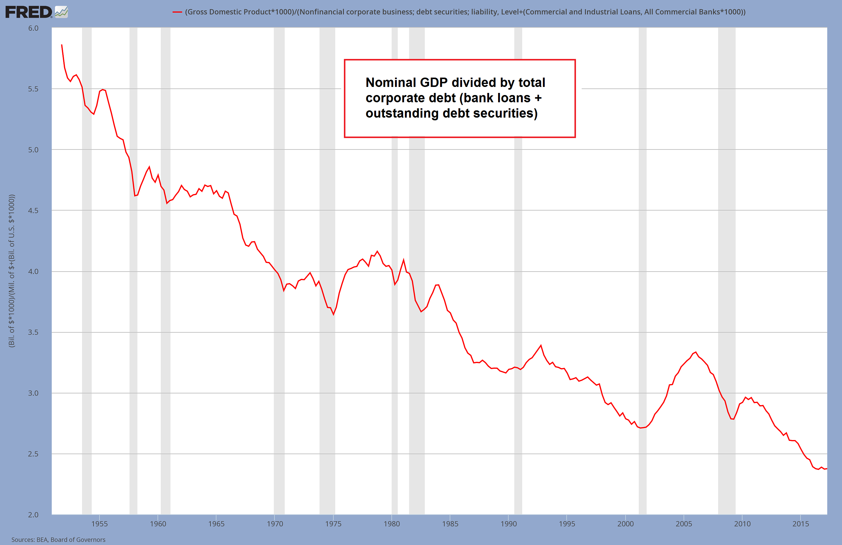 We add this chart to provide a slightly different perspective to the discussion that follows below (and the question raised at the end of the article). - Click to enlarge This is a very simple ratio chart, which focuses on non-financial corporate debt in particular, as neither consumer debt nor government debt can be considered “productive” by their very nature – the latter types of debt are used for consumption, which they “pull forward” (as an aside, we don’t believe there is anything wrong with consumer debt per se, but it is not “productive”). As the recommendations of Keynesians on combating economic downturns indicate, they have a slight problem with the sequencing of production and consumption. They favor measures aimed at boosting demand, i.e., they want to encourage consumption, which is tantamount to putting the cart before the horse. The chart above shows the ratio of GDP to total non-financial corporate debt – and obviously, GDP is not really an ideal measure for this purpose, as Keith also mentions below (GDP has many flaws, and its greatest flaw is the underlying idea that “spending” is what drives economic growth; not to mention that it seems not to matter what the spending actually entails – even Keynesian ditch digging or pyramid building would “add to GDP”, but would it represent economic growth? That seems a rather audacious assumption – in fact, it should be obvious that such activities would diminish rather than enhance society-wide prosperity). In that sense it would actually be more useful to compare corporate debt to gross industrial output (for the sake of completeness we add the chart in the addendum). We noticed though that it doesn’t make much of a difference in terms of the general trend, and we don’t have pre-2005 data for gross output, so we decided to go with GDP. This allows us to depict a very long-term chart of “debt productivity”. We should add that we believe this is quite a legitimate way of presenting it – Keith compares growth ratios, which seems to be very useful in highlighting business cycle fluctuations, but slighgtly less useful in showing the long term trend in the relationship between debt accumulation and economic output. |
Business Cycle OscillationsHowever, we can look at how much additional GDP is added for each newly-borrowed dollar. This is called the marginal productivity of debt. This shows a clear picture, a secular decline over many decades. To produce this graph, take change in GDP divided by change in debt. Several salient features stand out. One is the volatility in the early years of the series. Without digging deeper into this, we suspect this is at least partly due to errors in how the data is gathered. Two, the oscillations are the Federal Reserve’s business cycle! There is a peak every few years. If you picture a bureaucrat moving levers to control the economy, trying to boost at times, but not overcompensate, that’s not far off the mark. Three, this is a long-term falling trend. Everyone has seen graphs showing GDP growing. In fact, GDP is now 50 times greater than it was 65 years ago, at the start of the graph in 1947. However, debt has also been growing. GDP is not growing commensurately with debt. It is underperforming. Just a little bit each year, but over time it is profound. Up until around 1981 (an important date, as this is when the rising interest rate turned to falling—more on that below), the peaks were well over 70 cents of growth for every dollar borrowed. This is not good, by the way—it should be over a dollar. But it’s a damned sight better than what happened after that. From 1981 through just prior to the global financial crisis, marginal productivity of debt fell from over 70 cents to under a dime. A freshly borrowed dollar added less than 10 cents to the economy (by the way, we think GDP is a flawed measure of the economy, in the same way that the amount someone eats is a flawed measure of his wealth). Less than 10 cents on the dollar of borrowed money went into all the things included in GDP. That means that more than 90 cents went into something else. Four, post-crisis, the number had some wild oscillations, before coming back to Earth in 2012. GDP fell from an annualized $14.8 trillion in Q3 2008 to $14.3 trillion in Q2 2009. After that, GDP began rising. However, the debt lagged. Debt hit a high of $54.6 trillion in Q1 2009, then fell to a low of $53.8 in Q2 2010, before resuming its rise. A total of $800 billion went out of existence. Five, marginal productivity of debt appears to be at a higher level than it was pre-crisis. Part of the explanation may be changes in how the Bureau of Economic Analysis measures GDP. For example, in 2013 BEA announced that it would begin including film royalties and research and development. However, we suspect the majority of the change can be attributed to one factor: the consumption of capital. GDP is worse than useless as a measure, because it makes no distinction between spending your income, and spending your liquidated savings. Or spending someone else’s borrowed cash. This matters when the Fed incentivizes a great conversion of one party’s wealth into another party’s income (see Keith’s Yield Purchasing Power discussion for more about this idea. See also “Yield Purchasing Power: $100M Today Matches $100K in 1979” and “Introducing Yield Purchasing Power”, which includes a video presentation). |
Marginal Debt Productivity, Jan 1953 - 2017 Marginal debt productivity as a ratio of growth ratios in debt and economic output, which inter alia highlights the oscillations of the business cycle - Click to enlarge |
The Era of Falling Interest RatesIn 1981, a period of 34 years of rising interest rates came to an end. Interest began to fall. Each time the rate drops, it offers a greater incentive to borrow, and hence add to GDP. However, it also does something else. It increases the burden of those who borrowed previously. This is because the net present value of all future payments must be discounted by the current market interest rate. The rate at which the debtor borrowed is not a factor. Thus, the lower the rate, the higher the net present value. Falling interest rates have little impact on short-term bills. The real magic occurs on the long bond. A 10-year bond goes up a lot more than a 1-year bond (a 30-year bond would go up even more, but we will look at the 10-year note, being more common). The gain of the holder of an asset (including a bond or loan) is matched by the loss of the issuer. A change in interest rates is a zero-sum transfer of wealth. It is not entrepreneurial creation of wealth. However, as they say, every dollar spends the same. No one makes a distinction between dollars made from labor, rent, profit — or speculation. The drop in interest rates has two effects. The debtors become less inclined (and less able) to spend. And the asset owners, particularly those who finance their assets with short-term debt, are happy to spend more. So which of these opposing trends prevails? Let’s look at a long-term chart of marginal productivity of debt overlaid with interest on the 10-year Treasury bond. There appears to be no correlation during the period of rising interest rates. But starting in 1981, the change from rising to falling interest ushered in a new regime. After that point, not only do the two lines correlate, but even the zigs and zags match. It’s uncanny. |
Marginal Debt Productivity vs 10 Year Treasury Yield, Jan 1962 - 2016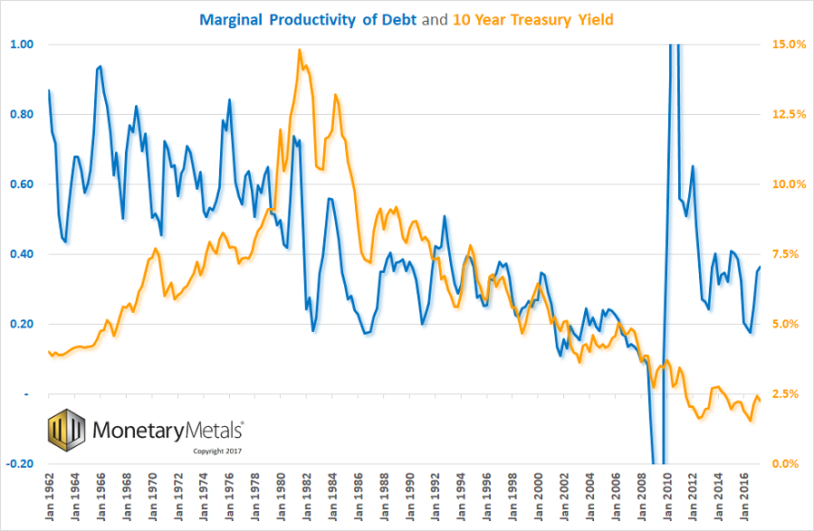 Marginal debt productivity vs. the 10-year treasury note yield - Click to enlarge |
Marginal UtilityLet’s introduce one more new idea, and we will tie it all together. Marginal productivity of debt is called marginal, because it looks at what is happening with the borrowed dollar right on the line between viable and nonviable. Marginal utility is one of the key concepts of the Austrian School discovered by Carl Menger (and also by Stanley Jevons and Leon Walras, unknown to each other at the time). Change occurs at the margin. For example, when the sales tax is hiked by 1%, there are TV interviews of people shopping in a mall. It’s pure propaganda. They show an affluent family buying an X-Box for their teenage son, saying the tax won’t change their buying behavior at all. Of course not! That wealthy video-game-buying family is not the marginal consumer! They should go to Walmart and ask the single mother of 3 kids, buying mittens for the youngest, if the tax means a more meager Christmas! It is the same with interest rates. The interest rate had been rising when Steve Jobs secured a loan of $250,000 in 1977, to get Apple Computer off the ground. Apple was not the marginal business, and this was not the marginal loan. It would not have mattered much if the Treasury rate was 7.4% or 10% (Apple paid more than the Treasury rate, of course). However, the borrower at the margin is the one who finds himself unable to borrow at the higher rate. The 1960’s and 1970’s was a period of destruction of heavy industry. Low-margin manufacturers could not justify borrowing to refresh their plant. So when it went end-of-life, they had to shut down (or move elsewhere where rates were lower or subsidized). The same analysis works when interest rates are falling. It is not who will stop borrowing as the rate goes up, but who will start borrowing or borrow more as it falls. What is the use of credit at the margin at 6% and what new uses will be found for credit at 3%? It should be obvious that the lower the rate, the less productive the credit. Back at the time Apple was founded, you had to have a highly productive business to justify borrowing. Today, interest on the 10-year Treasury is about 70% lower than it was in 1977. For business borrowers, the change as a percentage is larger. |
 From left to right: William Stanley Jevons, Carl Menger and Leon Walras, the fathers of the concept of marginal utility, which inter alia helped solve a question classical economists had grappled with for a long time, namely the value paradox - Click to enlarge It is no exaggeration to state that modern economic science began with this discovery (note: although Menger was the first of the three to publish, it is nowadays widely accepted that all three economists developed the concept independently at roughly the same time); marginal utility is to economics what Einstein’s relativity theory is to physics. |
Post Crisis JumpThis brings us back to the question of why does the marginal productivity of debt show a big increase after the crisis? As we said above, it may be partially due to changes in how GDP is measured (and if GDP can be over-reported, debt could be under-reported too). Another factor may be consumption of capital by speculators who own rising assets, and those whose incomes are tied to asset prices (e.g. CEOs, bankers, brokers, etc.) A third factor may be the extraordinary deficits of the government. These are all unsustainable trends. We believe there is something else. We will leave the question of what causes the higher level after 2010 open for now, and encourage readers to contact us with their thoughts on this. One thing is for sure, the relationship between falling interest and falling marginal productivity of debt did not come to an end in 2010. We are therefore not inclined to trust the graph after that date.
Addendum by PT – Bonus ChartsAs noted above, simple ratio charts of actual nominal dollar amounts may be all that is needed to depict the long-term trend in debt productivity – moreover, it seems to us that the focus should be on corporate debt for the reasons cited in the caption to the first chart. The next chart shows the ratio between gross industrial output and total non-financial corporate debt (note that gross output exceeds GDP by a sizable amount, as it includes activity in all stages of production, including production of intermediate goods; GDP assumes that the prices of final goods already “include” what was spent in production processes in the higher stages. Without going into details here, this is actually a logical fallacy. If we were an intermediate good, we’d feel insulted). |
Gross Output of All Industries, Q1 2005 - 2017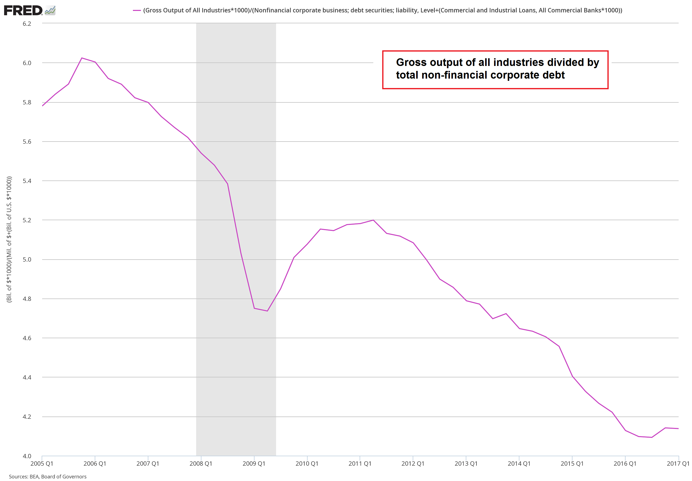 The ratio of gross industrial output to total non-financial corporate debt. Unfortunately we only have data going back to 2005, but as this small slice of history demonstrates, the trend is very similar to that of the GDP/ corporate debt ratio. - Click to enlarge |
| Lastly, here is a chart that compares GDP to total credit market debt. The latter series was discontinued by the Fed (we have no idea why, as continuing to publish it required no big effort), so this chart ends in Q2 2015. Still, the long-term trend is once again very similar. The growth in outstanding debt vastly exceeds the growth in economic output (and frankly, no-one should be surprised by this). |
Total Debt Productivity, 1950 - 2015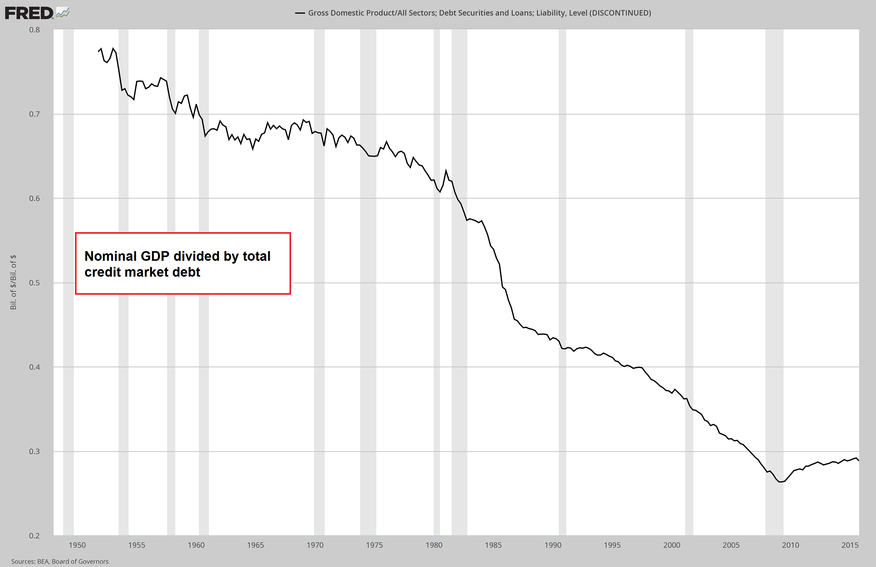 Nominal GDP to total credit market debt ratio. Interestingly, in line with Keith’s observations about the post-crisis era, we see here that the perennial downtrend was interrupted after the GFC – contrary to what can be observed when looking exclusively at corporate debt. - Click to enlarge This may provide a decisive clue: evidently the pause in the trend was created by the sizable decrease in consumer debt after the crisis. Consumer debt appears to have fallen sufficiently relative to GDP to more than make up for the continued increase in other types of debt. But as mentioned earlier, consumer debt as such cannot be considered to be productive, since it is obviously not invested in production. |
Full story here Are you the author?
Tags: newslettersent,On Economy


