


Keith Weiner
My articles My offerMy siteAbout meMy videosMy books
Follow on:LinkedINTwitterSeeking AlphaFacebookAmazonGoogle +
See the introduction and the video for the terms gold basis, co-basis, backwardation and contango.
Fundamental Drivers of Gold Prices[Ed. note by PT: we believe there is a lot less disagreement with Steve Saville’s approach than Keith assumes – we are adding comments in the chart captions below as well as an addendum and footnotes to illustrate what we mean – all our comments are marked with [PT] below – we have essentially made a discussion out of this week’s supply-demand report, as we believe these issues are of interest to all gold aficionados] Steve Saville wrote a post this week, in which he proposed a model that indicates the fundamentals of gold. According to him, these are: (1) the real interest rate, (2) the yield curve, (3) credit spreads, (4) the relative strength of the banking sector, (5) the US dollar’s exchange rate, (6) commodity prices, and (7) the bond/dollar ratio. Steve Saville’s fundamental gold price model (details see here) – this looks actually quite good to us. We follow the macroeconomic indicators it is based on as well – see e.g. “An Overview of Macroeconomic Gold Price Drivers” from mid April. As we understand it, the model is not trying to determine a specific gold price. It merely tries to show in if macroeconomic pressures are pointing toward a rising or falling gold price, and it seems to be doing that quite well. As Steve Saville mentions, the model is slightly leading the gold price (or at least has done so in recent years and on numerous previous occasions – that is not always the case as we have discussed in the past, see also our comment on the yield curve). Keith’s methodology of bringing the trading on gold futures into context with the spot market does the same most of the time (i.e., the fundamental price he derives is usually leading the market gold price). Both models are largely based on market-derived data, so this should be no surprise – we would assume they ultimately show the same forces at work. We consider him a friend, and certainly appreciate his view that when gold moves from an ETF to China or India, it has no effect on the price. However, we disagree with his fundamental model. Let’s do a quick rundown of these factors and move on to a broader point. |
US Gold Price vs Gold Fundatamentals, January 2011 - June 2017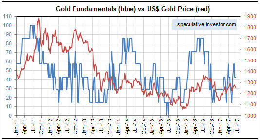 - Click to enlarge |
The Real Interest Rate.We have addressed this before, saying:
While we cannot speak for Steve Saville, we are well-acquainted with his views, and we believe he wouldn’t disagree with most of what Keith says here about real interest rates.* We cannot possibly “know” what the real interest rate is, since we can neither precisely quantify the loss of purchasing power of paper money (which is indeed influenced from both the money side and the goods side and can therefore not be “measured”), nor can we ascertain the natural interest rate with any precision. But what we can know is shown above: “a” real interest rate as determined by market forces, for which the yields on inflation-protected treasury securities serve as a proxy (if one deducts them from the yields on nominal t-notes, one arrives at the 5 year inflation breakeven rate). To be sure, what these yields tell us is only what the market expects future CPI to be. CPI in turn is certainly a flawed metric – just as Keith notes, it makes no sense to add up apples and oranges and derive an “average” from them. As you can see above though, there clearly is a fairly tight negative correlation between TIPS yields and gold (in order to make it easier to see, TIPS yields are inverted in the above chart – note that the scale on the left has to be multiplied by (-1) to make sense). Naturally, this correlation is by no means perfect and variable leads and lags can be observed over time – but it is strong enough to qualify for inclusion in a model, and it makes sense that the market uses it as one of the “inputs” determining the direction in which the gold price moves. This is on top of two other problems. We all learned in grammar school that you cannot add apples and oranges, but economics unteaches that and says you can average apples, oranges, gasoline, and rent. Except economists don’t agree on which prices should be included. There are many non-monetary forces pushing up consumer prices, such as taxes and minimum wages. Should one really try to adjust the interest rate every time some economically-illiterate city council decides to hike the minimum wages? We have written before that there is sometimes a correlation between (nominal) interest and gold prices, such as 1971 through 1980. Interest on the 10-year started January 1971 at 5.5% but by the end of 1980 hit 13.1%, or +138%. The price of gold started 1971 at $35, and hit $880 in 1980, or +2,329%. However, there are also times of inverse correlation. In 2000, the price of gold started around $282 and hit around $1,900 in 2011. This was a period of falling interest rates, down from 6% to 1.9%. Depending on whose data you use, the real interest rate trends look similar to nominal, rising rapidly through most of the 1970’s and falling after 1981. Most importantly, how does interest drive the gold price. And when we say how, we mean: what is the causal mechanism? We don’t see it (nor, by the way, do we believe that any investment necessarily goes up when government drives up costs and prices). |
Gold Price vs 5 Year Tips Yield, January 2013 - June 2017(see more posts on gold price, ) - Click to enlarge |
The Yield Curve.This is a very important indicator. It drives many behaviors, and consequently prices, in the economy. This is because when the yield curve flattens, banks’ margins are squeezed. When it inverts, banks are making a negative profit (i.e. loss) but still incur all the risks. Banks may be obliged to sell assets and shrink their balance sheets. If they have a lot of gold, then this could drive the price down. If not, then not. The yield curve was inverted in the run up to 2008 as we see in the graph below (and inversion lasted into 2009 on shorter maturities), and there was a 30% drop in the price of gold. |
Gold Fixing Price vs 10 - Year Treasury Constant Maturity, 1985 - 2017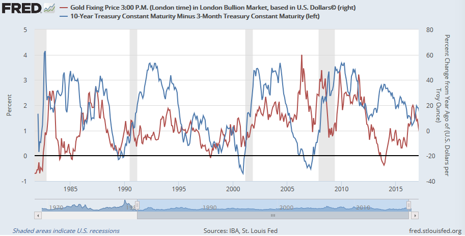 . |
|
We see periods of correlation, as the late 1980’s and periods of anti-correlation, as 2012 through present. It should be an interesting thing to watch now. As the Fed has been pushing up the Fed Funds rate, the 10-year yield has been falling. It seems likely to us that if the Fed persists on this impossible mission of trying to hike rates then it will cause a yield curve inversion. If that happens, something tells us that this time the gold price will not go down. |
Yield Curve, 1982 - 2017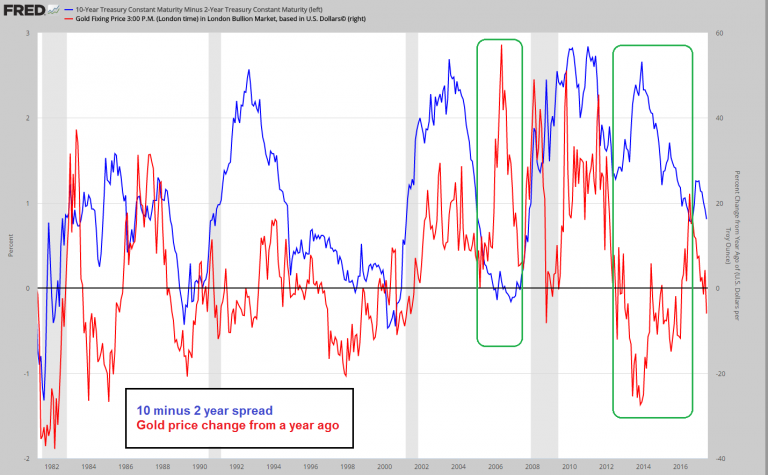 - Click to enlarge |
Credit Spreads.We assume he means the premium paid by low-quality borrowers above what the US Treasury pays. Like an inverted yield curve, rising spreads mean pressure on the banks. And like with curve inversion, it depends on how much gold the banks and other leveraged players are holding. Credit spreads – in this case, we have rather arbitrarily deducted the 5 year treasury note yield from the BofA Merill US high yield index yield – it is arbitrary because the shortest maturities of bonds in the index can in theory be as short as just over one year. We don’t know what the average duration of the bonds in it is, but for the purpose of illustrating the tightness of credit spreads, this method will do anyway. Their exposure these days is more likely to be indirect, through loans extended to other investors. But why are credit spreads important for gold prices? We think it is not so much a question of who holds what, but more one of economic confidence in general. Low credit spreads indicate economic confidence is high, which lowers to need to hold gold as insurance and vice versa (also, when economic confidence falters, central banks soon tend to intensify their monetary pumping). When credit spreads are as low as they are now, they actually become a bullish contrary indicator for gold (we believe so, anyway). Yes, there is fairly little recent correlation in evidence, mainly because the markets compartmentalized the shale oil debt crisis, which indeed failed to spread to other areas of the credit markets. The euro area debt crisis on the other hand was accompanied by a soaring gold price. We actually don’t believe that banks are as important with respect to this as they used to be, since they have vastly decreased their proprietary corporate bond portfolios due to new restrictive regulations.
|
Credit Spreads, January 2011 - June 2017(see more posts on credit spreads, )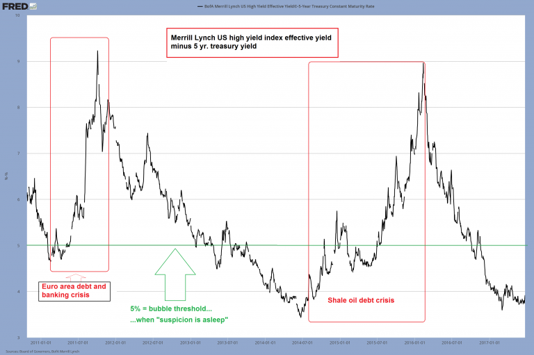 - Click to enlarge |
Relative Banking Sector Strength.We haven’t plotted it, but we assume bank stocks will outperform the broader stock market when the yield curve is steeping by way of falling Fed Funds rate. This is when the banks’ net interest margin is rising, and they are getting capital gains on their bond portfolio too. At the same time, credit spreads are narrowing, so the banks are getting capital gains on their junk bonds. We have taken the time to plot it though, because it seems the market’s assessment of the relative merits of banks has become quite closely correlated with the trend in the gold price. The correlation is a negative one, which is why we have inverted the gold price in the chart above so it can be more easily seen. Let us just say that we would not dismiss a correlation that is this pronounced. Similar to credit spreads, this is primarily a confidence indicator. |
![What Is the Fundamental Gold Price? Precious Metals Supply and Demand [extended version]](https://snbchf.com/wp-content/uploads/2017/06/6-BKX-SPX-ratio-vs.-inversted-gold-price.png) . |
The US Dollar Index.The way the world is supposed to work, according to the Treasury, is every day banks and corporations are supposed to borrow incrementally more, to buy commodities (i.e., inflation), speculative assets (i.e., the wealth effect), and to hire people and expand business (i.e., growth). Many of these speculative assets and businesses, are in other countries so other currencies go up. There is an additional bonus for all the dollar borrowers around the world. When their local currencies are rising, repaying dollar loans becomes easier for them. So there is less default risk and the credit system preserves the appearance of soundness for another day. There are times when this is bearish for the price of gold. After all, who needs a hedge against the financial system when it’s working as it’s supposed to do. And there are other times, when the price of gold rises. Such as 2009-2011, because of fears of inflation.
|
. |
| We are hard-pressed to find much correlation though we see one notable anti-correlation from around 1975-1978.
We are not so hard pressed to find it…:) – shown above is the inverted gold price vs. the US dollar index over just the past year. Most of the time, the US dollar and gold are negatively correlated in the short term. Often the negative correlation persists for several years in a row (see below), but it is occasionally interrupted by periods of positive correlation that appear on the scene either in transition periods (periods during which the trend in gold changes from bull to bear and vice versa, such as in the second half of 1979, the late 2000 to mid-2001 period or in much of 2011), or when one of the other gold price drivers predominates (2011 is a hybrid: the euro area crisis was both a transition, and a very good reason for gold and the dollar to rise in unison for a while). Whether one sees the negative correlation or not is largely a question of scale and time frame. Naturally, the dollar is in a permanent downtrend against gold in the very long term (along with all other fiat currencies), so if we look at a 40 year chart it almost looks like it is simply going down most of the time. |
US Dollar Index, July 2016 - June 2017(see more posts on U.S. Dollar Index, )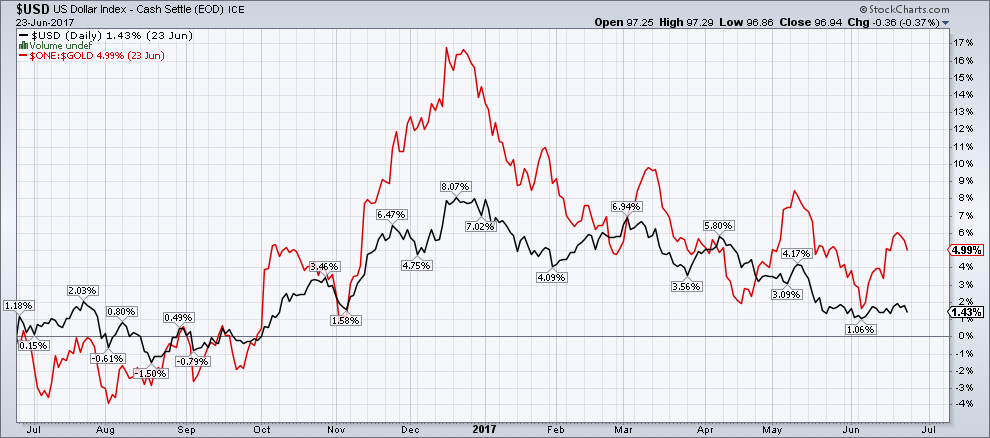 - Click to enlarge |
| To illustrate this point further, we have picked two lengthier time periods at random, with the gold price divided by 10 to make the trends stand out more clearly. No time series is inverted on these charts – as can be seen, there are at times phases when gold and the dollar indeed correlate positively, but most of the time they are moving in the opposite direction. Why is the US dollar the main currency “antagonist” of gold? We believe this is mainly due to its status as the senior reserve currency. Should it ever lose that status, its successor would become the main “gold antagonist” – unless it is succeeded by gold itself, then gold may well simply become our money again. As things stand though, the global monetary architecture rests on the fiat dollar as the main central bank reserve asset. Gold does inter alia reflect the state of confidence in this rickety construction. | Gold Fixing Price Compared - Click to enlarge |
Commodity Prices.This assumes that the price of gold goes up with inflation. At least raw commodity prices are a better measure than consumer prices, which are more subject to non-monetary forces. There is a popular belief—I saw it expressed as recently as Wednesday in my talk on the MM GOFO™ in London—that prices in gold terms are constant, a popular example being that Roman Senators paid the same amount of gold for a toga as a modern man pays for a high-end suit. Therefore by definition, if not by causal mechanism, if the prices of commodities are rising then so too must the price of gold. For the truth, we encourage everyone to browse Priced In Gold. To put this in perspective, the price has ranged below 1 gram per barrel to about 4.6g. That is a difference of 460% within an 8-year period – click to enlarge. |
Oil Price In Gold Terms, 1950 - 2017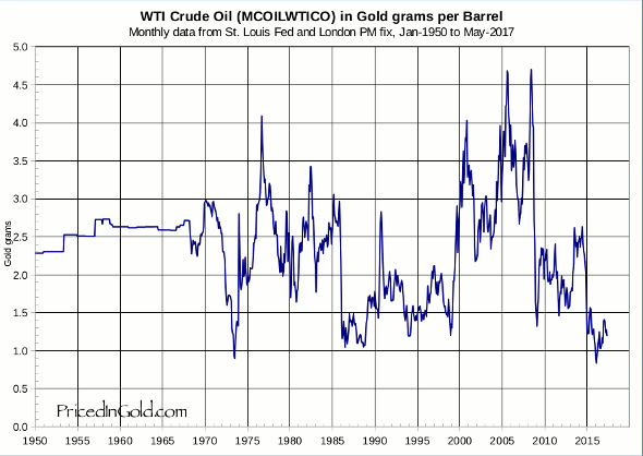 - Click to enlarge |
| Yet again, we can point to a slightly different perspective. This is a 30-year chart comparing spot commodities as a group against the spot gold price (one must avoid comparisons with indexes such as the CRB, which is influenced by the futures roll-over effect). While individual commodity prices can be very volatile when measured against gold, we think that is not what Steven Saville means. We rather believe he means the general tendency, depicted above, of the dollar prices of commodities as a group to move in the same direction as the dollar price of gold most of the time. One could of course say that this trend is largely a derivative of the trend of the US dollar. Several of the fundamental drivers on the list do overlap or interlock to some extent. Interestingly, the commodities group tended to outperform gold until the 2008 crisis, but the relationship has reversed ever since. We believe this is telling (in the sense that the market continue to be wary of the “grand monetary experiment”). |
Gold vs Spot Commodities, 1988 - 2017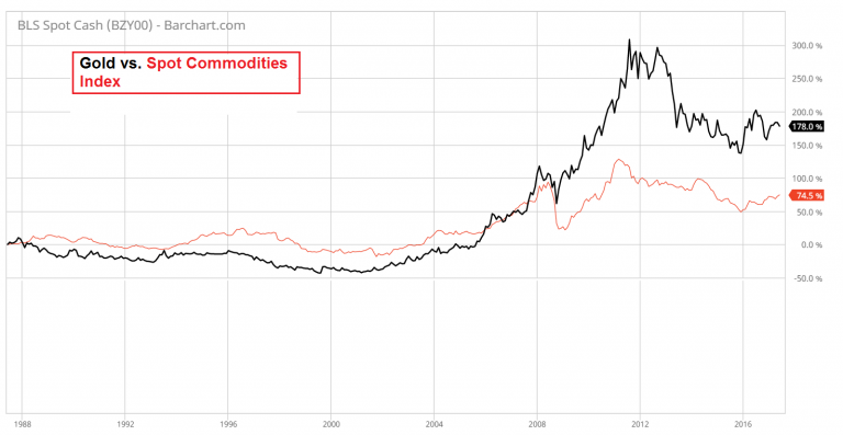 - Click to enlarge |
The Bond / Dollar Ratio.This will go up with falling interest rates and rising currencies. We have said our piece, above. He states his premise, “gold’s true fundamentals are measures of confidence in the Fed and/or the US economy.” It is far from clear to us that the price of gold is predominantly driven by confidence in the US. At times, for sure, but sometimes not. We would restate the above premise as “sometimes, the marginal gold market participants are those who worry about the US government / economy / dollar.” Nevertheless – the bond-dollar ratio and the gold price do correlate quite closely. Above we see their performance over the past year, but they are directionally well aligned over the long term as well.
|
Bond Dollar Ratio, July 2016 - June 2017(see more posts on U.S. Dollar Index, ) - Click to enlarge |
|
In the longer term, gold has noticeably outperformed the bond-dollar ratio (particularly since 2008, which for obvious reasons remains an important cesura) but they have continued to trend by and large in the same direction over the entire time frame shown above. Note that in recent times (since the late 2015 low in gold), the correlation has become much tighter again. That definitely makes the ratio worth watching. Contrast that with the Monetary Metals fundamental indicator. We are not trying to find proxies for gold demand, nor factors that have correlated. We are measuring gold abundance and scarcity as they exist right now, in the market. How do we do that? We carefully measure the effect of the speculators who use leverage to buy futures, and back this out of the price. What is left is the price at which metal would clear today. Would clear, if it wasn’t going into, or coming out, of carry trades. |
Dollar Bond, 2003 - 2017 - Click to enlarge |
Addendum by PT
Reading our comments, you might think we are completely at odds with Keith, but we don’t believe so. As we noted above, we think there are actually not as many fundamental differences as it appears. To be clear, we have watched the method Keith uses to determine gold and silver fundamentals for a long time and we think it is a perfectly legitimate and highly original approach (which is why we republish the Monetary Metals supply-demand report regularly here – we believe it is very useful).
It is a methodology based on market-derived data and sound principles – though it remains to be seen whether it works as well as it has so far if we reenter a world that resembles the 1970s more than the 2000ds, but that is a bridge we’ll cross if we ever get there. The difference is mainly that Keith studies the actions of futures speculators relative to those of physical gold buyers and holders, whereas the macro-drivers Steven Saville uses in his model are referring to why these groups act in a certain way (note though that the data are likewise market-derived; what one can have opinions about is how useful they are).
When we see that physical gold demand from “hoarders” increases – whether it is reservation demand or outright buying (most of it is reservation demand) – the questions is: why does that happen? Why do people decide to raise or lower their reservation price? That is what the macro-economic drivers are all about.
Clearly, we all agree that jewelry demand, annual mine supply, central bank purchases and sales, or gold moving from A to B are de facto irrelevant, or at best of marginal relevance to gold’s price trend. It cannot be otherwise: after all, one of the reasons why gold is the premier monetary commodity it its vast above-ground stock (puny compared to the stock of fiat money, but vast relative to that of all other commodities).
Given that gold is not the generally used medium of exchange at present, it competes with other currencies and investment assets. And in this context, it is gold’s quality as the “money of final redemption”, the money that is no-one’s liability and doesn’t rely on anyone’s promises that makes it desirable. All the macro-economic indicators are in some way related to this basic idea (that includes real yields – given that fiat money is inherently more risky to hold, its attractiveness can be increased if it offers a sufficiently high real yield).
Lastly, it should be clear that the various fundamental drivers of the gold price will almost never be all aligned in the same direction. There will always be some that are either in a neutral or bearish position while others are in a bullish position. The gold price tends to exhibit the strongest trends when a majority of them is pointing in the same direction. It should also be noted that the market assigns different weights to these drivers at any given time. One must always have an open mind with regard to that, in the sense that what the market considers particularly important can change.
Footnotes:
* Real interest rates do exist, regardless of whether we can quantify them with precision, and the markets do express an opinion on what they are – regardless of whether their assessment is correct or not at a given point in time. Gross market rates consist of three components: the originary interest rate, an entrepreneurial (or risk) premium and a price premium. The price premium accounts for the estimated future loss of the currency’s purchasing power. As Mises notes in Human Action, what represents a “low”, “high” or merely “normal” interest rate depends on the interest rate incorporating a positive price premium – its nominal height is irrelevant in that sense:
“Public opinion has definite ideas about a “normal” rate, something between 3 and 5 per cent. When the market rate rises above this height or when the market rates-without regard to their arithmetical ratio-are rising above their previous height, people believe that they are right in speaking of high or rising interest rates. As against these errors, it is necessary to emphasize that under the conditions of a general rise in prices (drop in the monetary unit’s purchasing power) the gross market rate of interest can be considered as unchanged with regard to conditions of a period of a by and large unchanging purchasing power only if it includes a by and large adequate positive price premium. In this sense, the German Reichsbank’s discount rate of 90 per cent was, in the fall of 1923, a low rate – indeed a ridiculously low rate – as it considerably lagged behind the price premium and did not leave anything for the other components of the gross market rate of interest.”
** It becomes inherently less risky to hold fiat money if it offers a positive real yield. That is why the real interest rate (or the market perception of what constitutes the real interest rate) is important for the trend in gold prices. Gold as an investment asset competes with other investment assets. If they offer a return that is high enough to compensate for the higher risk of holding them, more funds will be allocated to them and the reservation demand for gold will tend to decline.
*** There is more to discuss in connection with the yield curve, but this comment is already long enough as it is. We will return to the topic on occasion. We do currently agree with Keith that it is probably a less important factor in driving the gold price and that one would do better to watch what currently works best.
**** Consider what has happened since early 2008: the domestic supply of US dollars has increased by more than 140% (we believe the global supply may have increased even more, but cannot prove it). Meanwhile, the global supply of gold over the same time period has increased by a mere 13.32%. And so it goes… regardless of short to medium term gyrations, an ever greater supply of dollars is chasing an ever smaller – on a relative basis – supply of gold. As long as human beings value gold as a monetary asset, that is all it takes for the gold price in dollar terms to continually ratchet higher over the long term.
Fundamental DevelopmentsLast week, the price of gold was up three bucks, and that of silver 2 cents. The gold-silver ratio fell a smidgen. As always, we are interested in the fundamentals. And by fundamentals, we mean supply and demand conditions measured in the market. But first charts of their prices and the gold-silver ratio. |
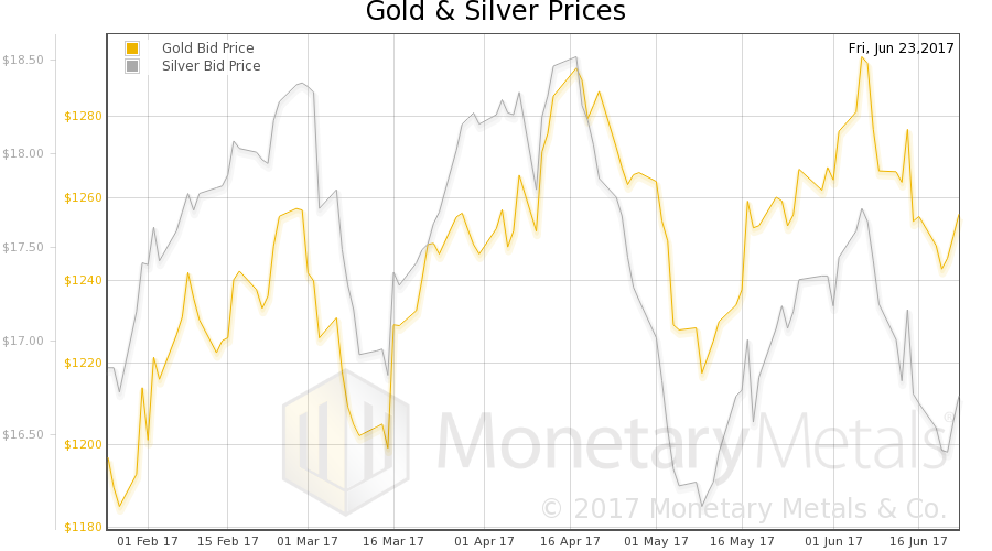 - Click to enlarge |
| Next, this is a graph of the gold price measured in silver, otherwise known as the gold to silver ratio.
|
Gold: Silver Ratio, February 2017 - June 2017(see more posts on gold silver ratio, )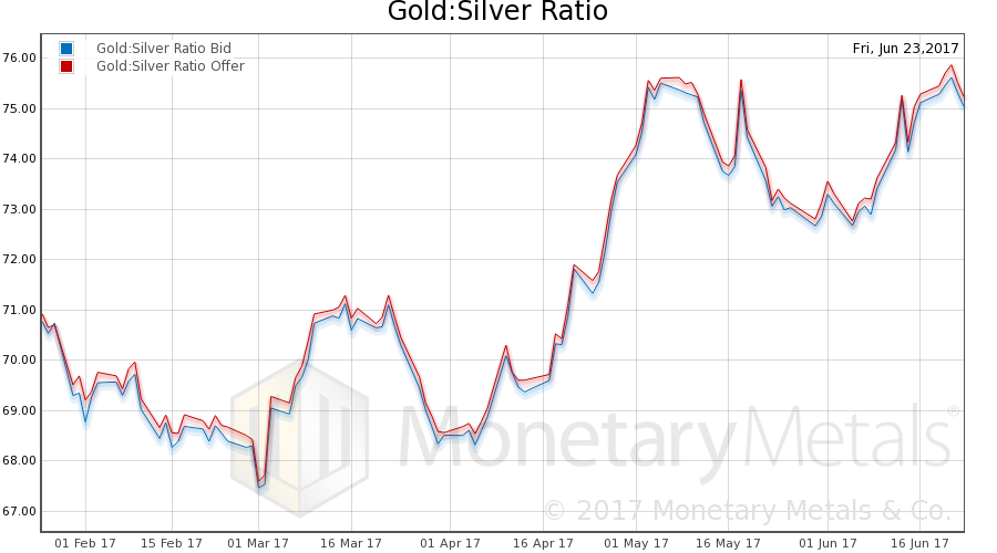 - Click to enlarge |
Here is the gold graph. |
Gold Basis (near contract), February 2017 - June 2017(see more posts on gold basis, )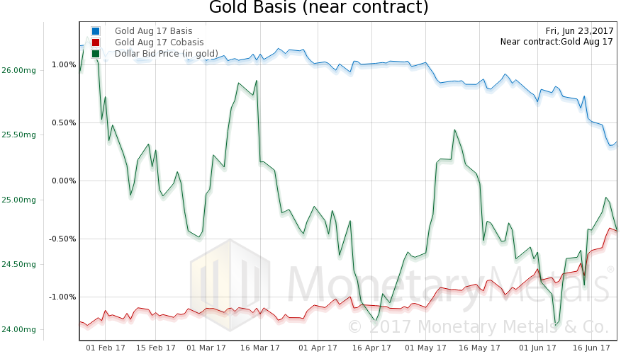 - Click to enlarge |
| We had a slightly falling price of the dollar (the mirror image of the rising price of gold). The abundance rose (the basis) and the scarcity decreased (the co-basis). All by small amounts.
Our gold fundamental price fell about $7 (chart here). Now let’s look at silver. |
Silver Basis (near contract), February 2017 - June 2017(see more posts on silver basis, )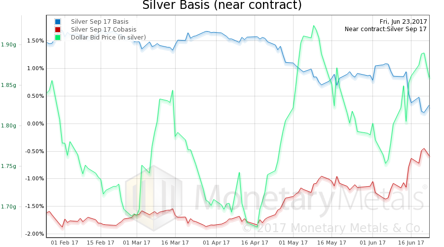 - Click to enlarge |
Full story here Are you the author?
Tags: Chart Update,credit spreads,Gold and silver prices,gold basis,gold price,Gold prices,gold silver ratio,newslettersent,Precious Metals,silver basis,U.S. Dollar Index