Lance Roberts
My articles My offerMy siteAbout meMy videosMy books
Follow on:TwitterSeeking AlphaFacebookAmazon
The stagflation narrative dominating financial social media isn't completely wrong. That's what makes it so dangerous. After more than 30 years of managing client portfolios through actual inflationary cycles, not watching them on YouTube, I've learned that the most damaging investment advice isn't built on outright lies. It's built on partial truths, stretched past the point where the data still holds.
If you haven't read Commodity Supercycle: The Enemy Of The Bull Thesis (Part 1), it is an important primer to today's discussion.
Let's dig in.
The doomers have legitimate inputs. Supply chains are genuinely under pressure, and the dollar currently faces real structural headwinds. Central banks have been buying gold at a historic pace. Equity valuations in certain segments are stretched, and every one of those observations is defensible. However, the leap from those observations to "sell everything, go all-in on commodities, bonds are dead forever, the great reset is here," is where the analysis ends and the storytelling begins.
I want to do two things here. First, I'll score the stagflation narrative claim-by-claim. We will give credit where it's earned and expose where the logic collapses. I'll lay out what a sound investment framework actually looks like when the data, not the narrative, drives the decision. Moreover, why the boom-bust nature of commodity markets and the AI-driven capex cycle both fundamentally change where allocations belong.
The Stagflation Narrative Spreading Across Social Media
Spend an hour on X, and you'll encounter some version of the same script.
- The Federal Reserve has destroyed the currency.
- The 1970s are back, only worse.
- Commodities are going to surge for the next decade.
- Gold is the only real money.
- Bonds are a guaranteed way to lose purchasing power.
- Anyone still holding a diversified portfolio is either naive or not paying attention.
The 1970s comparison is the narrative's analytical spine. Commodity prices surged for the better part of a decade while equities went nowhere in real terms. Gold went from $35 an ounce to over $800, and the people who held hard assets looked prescient for years. It's a compelling story, with the added appeal of casting the narrator as the maverick who sees what the establishment refuses to acknowledge.
Here's the problem.
The 1970s worked the way they did because of structural economic conditions that no longer exist. Both the boom-bust nature of commodity cycles and the emergence of the AI-driven capex boom create dynamics that the doomer framework fails to incorporate.
Before I take this apart, I want to be clear about something. The inputs behind the stagflation narrative deserve serious consideration. As such, dismissing them entirely would be just as intellectually sloppy as swallowing them whole.
As I laid out in Part 1 of this series, supply inelasticity is real. More than a decade of ESG-driven capital discipline, underinvestment in exploration, and production curtailment has left several commodity markets unable to respond quickly when demand rises. That constraint doesn't vanish because we want it to. It gives the commodity cycle real legs, supporting the bull thesis for select commodities over a meaningful but finite window.
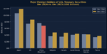
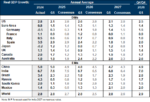
The dollar does face genuine headwinds. Structural fiscal deficits, a Federal Reserve with a long track record of accommodation, and geopolitical pressure on the reserve currency system are all real concerns. JPMorgan projects gold at $5,000 per ounce in 2026, as central bank accumulation runs at roughly 585 tonnes per quarter. There are also pockets of equity valuations that are stretched enough to carry real multiple-compression risk if earnings disappoint.
So the inputs are legitimate. Therefore, there is a version of the commodity trade, sized correctly and timed with discipline, that makes sense right now. The doomer narrative isn't wrong about the forces in play. It's wrong about what those forces mean, how long they last, and how to construct a portfolio around them.
Where the Narrative Falls Apart
The entire doomer framework rests on one foundational assumption: the 1970s stagflation cycle will repeat itself. Therefore, a 1970s portfolio, heavy on commodities, short on bonds, light on equities, will produce 1970s results. Unfortunately, that assumption doesn't survive contact with the structural differences between the two economies.
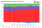
The U.S. economy in the 1970s was built on manufacturing, which accounted for roughly 25% to 28% of GDP. Most crucially, it had a large unionized workforce with cost-of-living clauses written directly into labor contracts. When commodity prices rose, wages rose automatically. In other words, rising costs triggered wage increases, which sustained purchasing power, which kept spending alive even as prices climbed. That feedback loop extended the cycle for years.
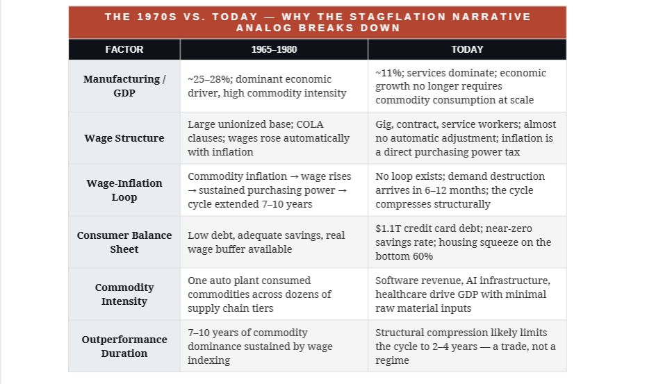
The U.S. economy today is roughly 70% to 75% services, and manufacturing accounts for approximately 11% of GDP. The COLA-adjusted workforce is gone. Therefore, when commodity prices rise today, the increase doesn't trigger wage catch-up. Instead, it functions as a direct tax on purchasing power, and consumers absorb it immediately. What took years to produce meaningful demand destruction in the 1970s now shows up in six to twelve months.
“The 1970s cycle ran on wage indexing. Without it, commodity inflation becomes a demand tax, and demand destruction arrives fast. That is the analytical flaw at the core of the doomer stagflation narrative.”

The Inflation Sequence
The doomer version of the stagflation narrative treats the inflation phase as permanent. It isn't. It's a phase inside a sequence, and the sequence has a specific ending that the all-in commodity thesis is completely unprepared for.
- Commodity prices rise. Input costs surge.
- Consumers carrying record debt loads pull back.
- Business investment contracts.
- Growth slows.
- The Fed pivots.
- Rate cuts follow.
- Bond prices rise.
In other words, the same event that terminates the commodity rally launches the bond recovery.
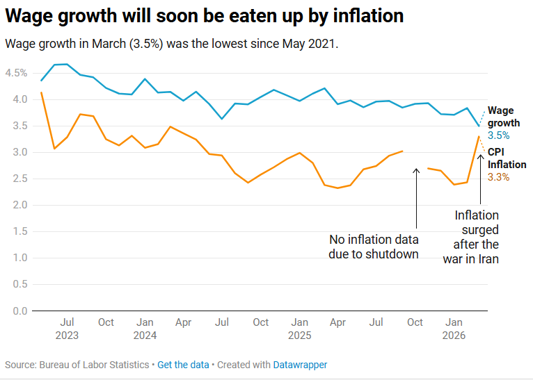
We saw this exact sequence in compressed form between 2022 and 2024. Commodities surged amid the Russia-Ukraine shock and pandemic-related supply chain disruptions. Bonds had their worst calendar year in modern history. The doomers called it permanent. Then growth wobbled, the Fed pivoted, and by 2024 intermediate Treasuries had recovered sharply while commodity prices corrected from their peaks. The people who abandoned bonds entirely after 2022 missed a significant rally and held concentrated commodity exposure through the drawdown.
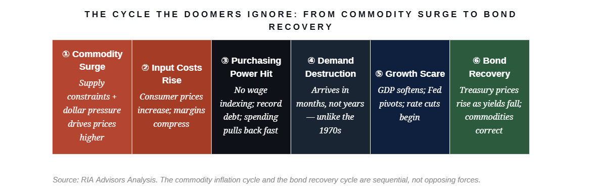
The doomer stagflation narrative is built to profit from Phases 1 and 2, but it has no plan, framework, or exit discipline for Phases 3 through 6. That is where the damage happens.
The Gold Logic and the Bond Mistake
Gold deserves a real discussion, because this is where the doomer stagflation narrative contains its most glaring internal contradiction. Own gold, the argument goes, because the dollar is collapsing and you need to escape a failing monetary system.
Gold is priced in dollars and traded in dollar-denominated markets. Its entire value proposition is measured against the purchasing power of the US dollar. When someone argues that the dollar is collapsing and the solution is a dollar-denominated asset, the argument refutes itself. Central banks buying gold aren't abandoning the monetary system; they're diversifying their reserve compositions within it. The Chinese People's Bank is reducing its concentration in dollar-denominated Treasuries, specifically, but that is a rotation within the system, not an escape from it.
Gold earns a real place in a sound portfolio as a hedge against policy error, inflation (which is what the debasement argument refers to), and geopolitical stress. A 5% weighting of a portfolio allocated to gold, sized appropriately for its volatility, is a defensible position backed by institutional demand data. 50% of a portfolio concentrated in gold because the financial system is "about to collapse" is speculation with an apocalyptic narrative.
The bond mistake is where the most retail damage has been done. The doomers drew a permanent conclusion from 2022's historically bad bond year. What they missed is that the inflation phase that crushed bonds in 2022 is the same mechanism that eventually forces the Fed to cut rates, which drives bond prices higher. Walking away after the loss and missing the recovery is the most expensive way to be partially right.

I've been doing this long enough to know that the most dangerous market narratives are the ones that are right about enough to feel credible all the way through. The stagflation narrative qualifies. Here is every major doomer claim, scored against what the data actually shows.


High Prices Cure High Prices
There's a mechanism the doomer stagflation narrative never seriously models, and it's the most reliable force in commodity markets: high prices cure high prices. When commodity prices rise far enough, they do three things simultaneously.
- They incentivize new supply investment
- Activate marginal producers who couldn't profitably operate at lower price levels (increasing supply)
- And they accelerate demand substitution as consumers and businesses find alternatives.
The ESG and underinvestment thesis that Part 1 establishes is real and important, as it delays the supply response and extends the cycle beyond what a typical demand shock would produce. But it doesn't eliminate the supply response. It sets the clock to a longer timer. The critical insight for portfolio construction is that the timer runs at different speeds for different commodities, and that determines how much of each you should own and how tightly you need to manage the exit.
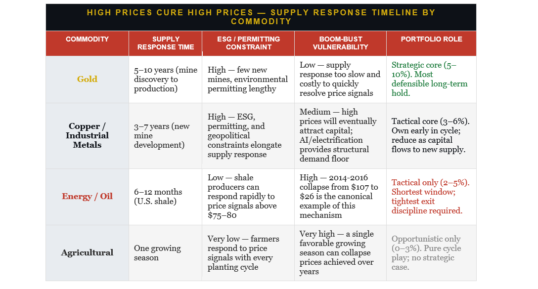
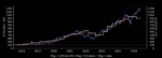
The 2011 oil market is the canonical example, as West Texas Intermediate Crude traded around $100 per barrel for three consecutive years. During that stretch, the price level didn't feel unsustainable to the doomers of that era, either, and peak oil narratives were everywhere. Then, oil producers, directly incentivized by those high prices, flooded the market with supply. By early 2016, WTI was trading at $26. The doomers who held concentrated energy positions through that collapse, because the "structural case was intact," experienced the full arithmetic of boom-bust without a framework for managing it.
CONSISTENCY WITH PART 1 The ESG and underinvestment constraints that Part 1 identifies extend the supply response timeline, but they don't eliminate it. Gold has the longest clock. Energy has the shortest. That difference in supply response curves should directly determine relative position sizes and exit discipline.
Investment Strategy For Today's Environment
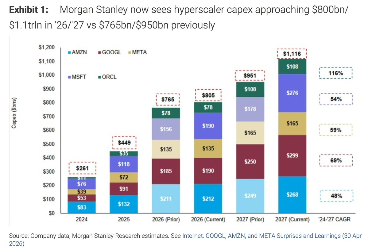
The doomer stagflation narrative misses a second major dynamic entirely: the AI-driven capital expenditure cycle running through the U.S. economy creates a domestic earnings multiplier that didn't exist in prior stagflation episodes. Microsoft, Oracle, Google, Amazon, and Meta alone are spending hundreds of billions on AI infrastructure that will approach $1.1 trillion by 2027. That capital flows directly into semiconductors, power infrastructure, and data center supply chains, which in turn creates a domestic growth differential with no comparable international analog.
That "multiplier effect" is critical to this story as discussed previously in "The Deficit Narrative May Find Its Cure In AI."
The American Society of Civil Engineers (ASCE) estimates that every $1 billion in infrastructure investment creates 13,000 jobs and adds $3 billion to GDP over a decade. Therefore, if the U.S. invests $1.8 trillion in AI infrastructure by 2030—plausible given the $500 billion energy need, $300 billion for data centers (150 new centers at $2 billion each), and $200 billion for chip production—GDP could rise by $5 trillion over 10 years, or roughly $300 billion annually. However, that $1.8 trillion is only the beginning. McKinsey & Company expects spending to reach $6 trillion by 2030, just 5 years from now, equating to $18 trillion in economic growth.
That effect was already evident in the Q1-2026 GDP report, where nearly 75% of the 2% annualized growth rate was attributable to business investment in data centers. Currently, the U.S. is projected to grow at roughly 1.8% to 2% in 2026, while Europe struggles to hold 0.5% to 0.8%, and China manages a structural property and debt overhang. That earnings growth differential is real and durable throughout the buildout. The previous case for rotating toward international equities on valuation grounds has also weakened considerably. While European equities ran hard in 2024 and Indian equities now trade at multiples rivaling those of U.S. mid-caps, the broad international valuation discount has compressed.
That said, the AI capex argument carries two important constraints.
- First, the earnings are highly concentrated in roughly 8 to 12 companies. The rest of the S&P 500 still faces the same multiple compression risk in a stagflationary environment described in the article. Therefore, owning the broad index is not the same trade as owning the direct beneficiaries.
- Second, the capex cycle carries borrowed-demand risk, as these companies pull years of infrastructure investment into a compressed window. When capex growth plateaus, the GDP contribution reverses. The 1990s telecom buildout produced genuine earnings growth in infrastructure, yet ended in a brutal equity cycle when spending decelerated.
The framework that holds together across all of these dynamics, the commodity boom-bust cycle, the structural compression of demand destruction, the AI capex differential, and the bond recovery sequence, requires four separate allocation legs, each sized for its own cycle duration and exit trigger.

THE REVISED FRAMEWORK The doomer stagflation narrative gets the commodity direction right for the first leg and wrong about the duration, the differentiation by commodity, the bond thesis, and the domestic equity landscape transformed by the AI capex cycle. Own what the data supports. Exit on the supply response clock, not the narrative.
Conclusion
Fear is a durable marketing strategy. The stagflation narrative will keep finding new audiences because it wraps legitimate macro concerns inside an emotionally satisfying story, a villain, a hero, and a clear trade. The people selling it know that partial truths are more persuasive than outright falsehoods. They also know that by the time the cycle turns and the narrative fails, their followers will attribute the losses to bad luck rather than bad analysis.
I've watched this play out repeatedly in commodity markets, from the commodity supercycle of 2007 to 2009 to the metals boom of the early 2000s to the oil market in 2011 to 2014. Every time, the same pattern: a legitimate supply constraint, a genuine price move, a narrative that extrapolated the trend into permanence, and then the eventual supply response that high prices had been quietly incentivizing all along. The cycle doesn't announce its end. It just ends.
The commodity cycle developing now is real, and the AI-driven domestic growth differential is real. However, the bond recovery that follows demand destruction is also real. A portfolio that acknowledges all three, with targeted U.S. growth exposure in the AI infrastructure beneficiaries, U.S. value for the commodity cycle with a domestic earnings anchor, commodity and gold exposure sized by supply response clock rather than apocalyptic conviction, and intermediate bonds providing ballast, is built to survive the full sequence.
That's the difference between investing in a cycle and betting on a narrative.
SOURCES
1. J.P. Morgan Global Research, “A New High? Gold Price Predictions,” 2026. jpmorgan.com/insights/global-research/commodities/gold-prices
2. Bureau of Economic Analysis, Historical GDP by Industry; Federal Reserve Bank of St. Louis (FRED), Manufacturing Value-Added as a Share of GDP, 1960–1980. fred.stlouisfed.org
3. Bureau of Economic Analysis, GDP by Industry, 2024. bea.gov
4. Federal Reserve Bank of New York, Center for Microeconomic Data, Household Debt and Credit Report, Q4 2024. newyorkfed.org
5. Bloomberg, U.S. Aggregate Bond Index total returns, calendar year 2022.
6. London Bullion Market Association (LBMA), Gold Price data, 2024–2025. lbma.org.uk
The post The Stagflation Narrative: What Doomers Get Wrong – Part II appeared first on RIA.
Full story here Are you the author?You Might Also Like
2026-04-24
Every few years, someone discovers that the United States government owes a very large amount of dollars and concludes that Rome is about to fall. A recent piece in RealClearMarkets by Nash, Thomas, Lang, and Rastin does exactly this. They rely on the Roman Empire’s collapse and the Weimar Republic’s hyperinflation as cautionary parallels to …
 The Dollar’s Plumbing: Conspiracy Vs. Data
2026-03-20
Every few months, a headline appears declaring that the U.S. dollar’s reign as the world’s reserve currency is over. China is dumping Treasuries. Central banks are hoarding gold. The BRICS are building a new monetary order. The sanctions that froze $300 billion of Russia’s reserves in 2022 proved, the argument goes, that dollar-denominated assets are …
 Economic Sentiment Belies Strong Economic Estimates
2026-02-27
Economic growth metrics for the United States have recently shown surprising resilience; however, consumers’ economic sentiment has not. According to the Bureau of Economic Analysis’s advance estimate, real Gross Domestic Product expanded at an annualized rate of just 1.4%, well below expectations and a steep drop from the 4.4% pace in the third quarter. However, …
 Mainstream Expectations: Hope Vs. Potential Risk
2026-01-30
Mainstream expectations, those from Wall Street, economists, and corporate strategists, have congealed around a bullish economic outlook for 2026. Most forecasts project stronger economic growth, with contained inflation, and continued investment in technology and capital expenditure. As such, many institutional investors interpret this as a year of opportunity for markets and corporate earnings.That was a …
2025-12-19
Over the last couple of years, inflation alarmists such as Paul Tudor Jones, James Grant, and Jeff Gundlach have all said that inflation is returning with force. In different ways, they each stated that they would not own Treasury bonds due to the expectation that inflation would rise as the dollar declined due to the …
 Does AI Capex Spending Lead To Positive Outcomes?
2025-12-12
As someone who views corporate finance through a pragmatic lens, I’ve been closely watching the current surge in capital expenditures (capex) tied to artificial intelligence (AI). The question I’m addressing here is this: when a company spends massive amounts of free cash flow and takes on increasing debt, in this case for AI CapEx, does …
Tags: Economics,Featured,newsletter