Pater Tenebrarum
My articles My siteAbout meMy videosMy books
Follow on:TwitterSeeking AlphaFacebook
The Big PictureThe diverging performance of major US stock market indexes which has been in place since the late January peak in DJIA and SPX has become even more extreme in recent months. In terms of duration and extent it is one of the most pronounced such divergences in history. It also happens to be accompanied by weakening market internals, some of the most extreme sentiment and positioning readings ever seen and an ever more hostile monetary backdrop. |
 Who’s who in the zoo in 2018 - Click to enlarge |
| The above combination is consistent with a market close to a major peak – although one must always keep in mind that divergences can become even more pronounced – as was for instance demonstrated on occasion of the technology sector blow-off in late 1999 – 2000.
Along similar lines, extremes in valuations can persist for a very long time as well and reach previously unimaginable levels. The Nikkei of the late 1980s is a pertinent example for this. Incidentally, the current stock buyback craze is highly reminiscent of the 1980s Japanese financial engineering method known as keiretsu or zaibatsu, as it invites the very same rationalizations. We recall vividly that it was argued in the 1980s that despite their obscene overvaluation, Japanese stocks could “never decline” because Japanese companies would prop up each other’s stocks. Today we often read or hear that overvalued US stocks cannot possibly decline because companies will keep propping up their own stocks with buybacks. Of course this propping up of stock prices occurs amid a rather concerning deterioration in median corporate balance sheet strength, as corporate debt has exploded into the blue yonder (just as it did in Japan in the late 1980s). The fact that an unprecedented number of companies is a single notch downgrade away from a junk rating should give sleepless nights to fixed income and stock market investors alike – as should the oncoming “wall of maturities”.
|
Wall of Maturities, 2018 - 2027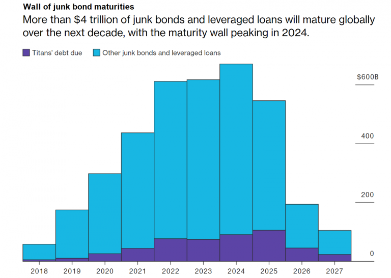 A giant wall of junk bond maturities is looming in the not to distant future. Unless investors remain in a mood to refinance all comers, this threatens to provide us with a spot of “interesting times”. Something tells us that “QT” could turn into a bit of a party pooper as the “Great Wall” approaches. - Click to enlarge It should also be mentioned that past stock market peaks as a rule coincided with record highs in buybacks. This indicates that record highs in buybacks are mainly a contrarian indicator rather than a datum providing comfort at extreme points. |
| Of course, what actually represents an “extreme point” can only ever be known with certainty in hindsight, as extremes tend to shift over time – particularly in a fiat money system in which the supply of money and credit can be expanded willy-nilly. What can be stated with certainty is only whether the markets are entering what we would call dangerous territory.
From an anecdotal evidence perspective the continued existence of curmudgeons like us who are aware of the above and are pointing out that this is a dangerously overstretched market may actually be a good reason to believe it will become even more overstretched. When the bubble pops one of these days, we may superficially look like the proverbial stopped clock that finally showed the right time – note though that our views on the big picture and our short term tactics are two different cups of tea. After all, we even trade cryptocurrencies, which are well beyond fundamental analysis – this is to say, we don’t believe it is possible to assign a “proper” valuation to them. We don’t know if a Bitcoin is worth nothing (that seems unlikely though) or a million dollars. What we do know is that it is a market that is extremely suitable for short term trading based on technical analysis. In terms of long term investment strategies we prefer methods that eschew market timing altogether. We mainly rely on a specially adapted version of the permanent portfolio (which is extensively discussed in Austrian School for Investors, a book we modestly contributed to and warmly recommend, mainly for the contributions of the other authors). Moreover, the “big picture” can only be judged once the cycle has fully run its course.
|
Dollar Value of Share Repurchase Announcements, 2009 - 2018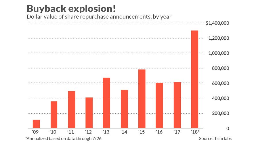 Stock buybacks are zooming to unprecedented heights - Click to enlarge |
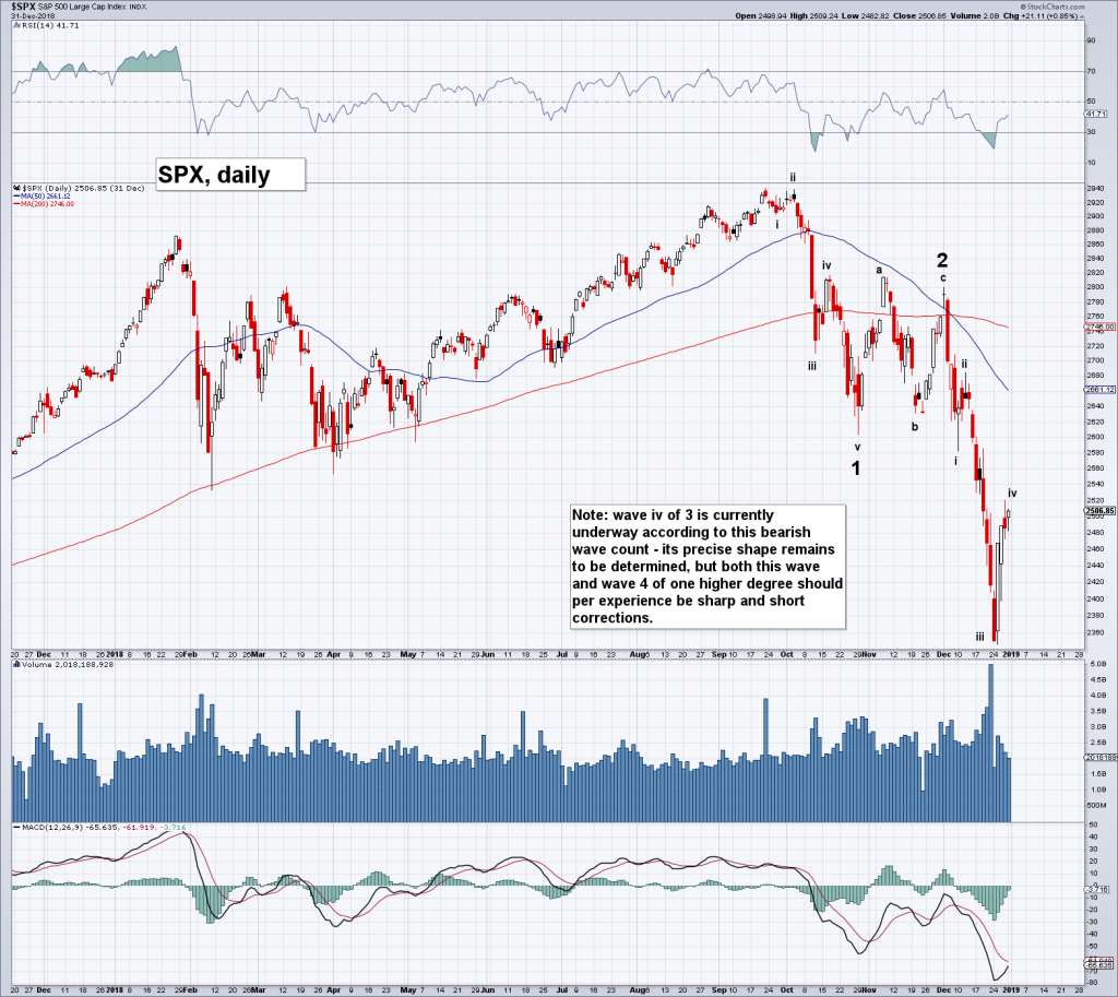
Diverging Indexes and Major Stock Market TopsIn view of the growing intra-market divergences mentioned above, we decided to create a few comparison charts which show three major market indexes on occasion of major stock market peaks of the past three decades, plus one additional indicator, namely the spread between 2- and 10-year US treasury yields as a proxy for the yield curve. The indexes are the Dow Jones Industrial Average (DJIA – not really an index, but a price-weighted average), the NDX (a proxy for big cap technology stocks) and the NYSE Composite (NYA – a proxy for the broad market). We have chosen three major turning points, namely the 1987, 2000 and 2007 peaks, which we compare to today’s situation. |
DJIA, NDX and NYA Indexes, Daily May 2018 - Jul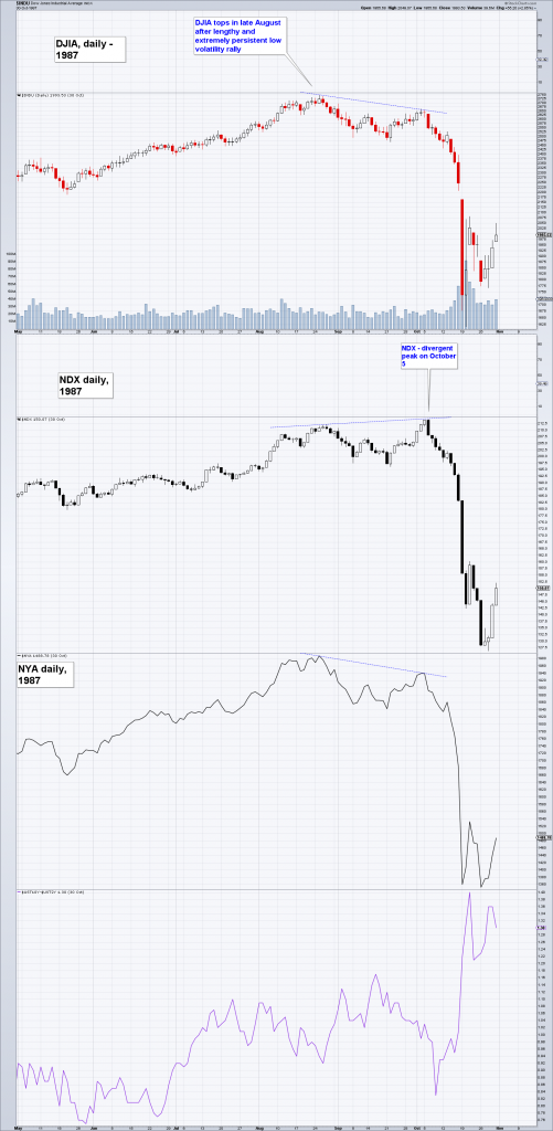 The charts follow in chronological order, starting with 1987. - Click to enlarge |
| The 1987 top: the DJIA and the NYA topped at the same time and also and made a secondary lower high concurrently, but the NDX diverged from them by making a higher high on occasion of the secondary peak – this is par for the course at major market peaks. Interestingly the crash of 1987 did not presage an imminent recession. A recession occurred much later (in 1990), but by that time the market had already regained the losses it had suffered in the crash. Note that the yield curve did not invert prior to the crash – in fact, the low of the 2-10 spread was at a relatively high 75 basis points – the spread did explode to 140 basis points as the crash unfolded, but it provided no actionable advance warning. So much for the theory that “nothing bad can happen before the yield curve inverts”. |
DJIA vs NDX vs NYA in 2000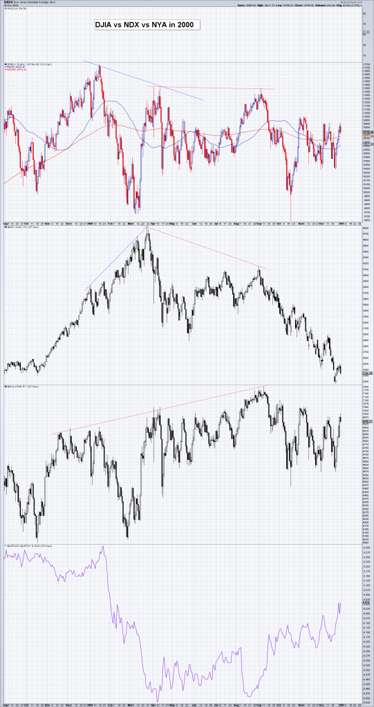 The flame-out of the tech mania in early 2000. Once again there was a divergence between the peaks in DJIA and NDX, but it was extremely large on this occasion. - Click to enlarge |
| After its initial 36% crash in April of 2000 the NDX proceeded to lose a rather disconcerting 83% of its value over the next two years. At the peak, the NYA diverged from both DJIA and NDX, but in this case by being the last index to top out. The reason for this was in our opinion that value stocks had already declined for more than two years by the time the mania peaked, and there was a big rotation from growth to value when the Nasdaq crash began, as value stocks were genuinely cheap at the time. The yield curve had inverted rather dramatically, but it gave no advance warning – rather, the lowest point of the 2-10 spread – a negative -52 basis points – coincided perfectly with the low of the initial crash wave in the NDX. |
DJIA vs NDX vs NYA in 2007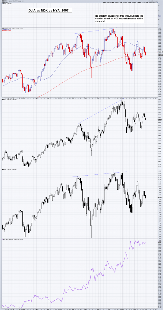 The 2007 market peak was a bit trickier, as there was actually no outright divergence between the three indexes. - Click to enlarge |
| However, at the secondary peak in early October the NDX outperformed the other indexes substantially, as the “flight to fantasy” (i.e., into the most overvalued market sectors) we always see at major peaks was once again in full swing. This time the yield curve did provide an advance warning: the 2-10 spread had inverted and bottomed in late 2006 already, and was expanding noticeably by the time equities made their top. We believe this happened because the recession in the housing sector had started in 2006 already, around the time the Bank of Japan cut its balance sheet by 25% almost overnight as it reversed its previous “QE” policy. The bond markets evidently sensed that this would eventually lead to broad-based recession which would force the Fed to abandon and reverse its baby-step tightening policy.
There is once again a major divergence between DJIA/NYA and the NDX, which is outperforming the former two quite noticeably since the late January peak and has streaked to new highs. The deterioration in market internals is highly reminiscent of that seen on occasion of previous market tops, as an ever smaller number of big cap stocks – mostly in the tech sector – is driving the advance. The so-called FANG stocks (FB, AMZN, NFLX, GOOGL) currently trade at around 9 times revenues, the highest ever. Including AAPL they now represent around 11% of the S&P 500 index – which recently reached an interim high while only 3% of its components actually made a new high. The 2-10 spread has recently made a low at a positive 24.7 basis points and has since climbed to 32 basis points. Similar to 1987 and 2000 we do not expect a major advance warning from this indicator, especially in view of the fact that a ZIRP regime has been in place for several years. Japan serves as a historical example: the last 5 recessions and bear markets in Japan all started without a preceding yield curve inversion. The last time a major market peak in Japan was preceded by an inverted yield curve was in 1989. How will the 2018 divergence between the indexes play out? We cannot be certain, but we do believe it represents a major warning sign. Keep in mind that it is not necessary for a recession to be imminent: a very overvalued and over-loved market with weak internals can crater at any time, it does not have to presage a recession. As an aside, there is a major difference between the year 2000 peak and the current situation: while growth has vastly outperformed value in both eras, this time value stocks are definitely not cheap. Rather, the “everything bubble” has pushed the valuations of almost all sectors to extremely lofty levels. There may well be rotation, but it probably won’t be as pronounced as it was after the top of the tech mania in 2000. An equal opportunity massacre seems far more likely this time around. |
DJIA vs NDX vs NYA, daily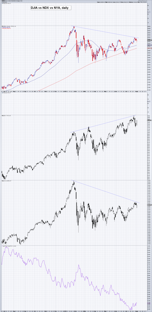 And here is finally today’s situation (read here why we call it the “echo bubble” – explanation at the end of the article). - Click to enlarge |
Measures of GiddinessWe mentioned extremes in sentiment and weak internals above and wanted to show a few pertinent examples. The charts below illustrate why there is good reason to be concerned about the divergences that have developed in recent months. |
NYSE Available Cash Negative Record, 1994 - 2018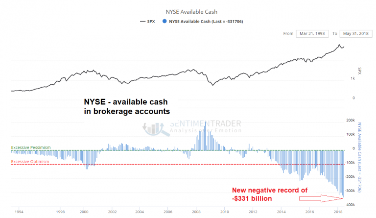 This chart mirrors margin debt – it shows “available cash”, which has recently reached a record negative USD 331 billion. Obviously, conviction is stronger than ever (note the positioning of the “excessive optimism” line). - Click to enlarge |
| Small Trader Call Buying |
Small Trader Call Buyingm, Jan 2013 - Jul 2018 Purchases of calls by small traders (newly opened positions) have exploded to new highs – and the recent peak actually diverged from the SPX (though not from the NDX, which may be more relevant in this case). If there is a “wall of worry”, this group of traders does not see it. - Click to enlarge |
| Rydex Leveraged Bull Bear Ratio |
Rydex Leveraged Bull Bear Ratio, Oct 2015 - Jul 2018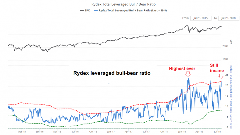 The RYDEX leveraged bull-bear asset ratio has made a new high at 24 in late January and has put in peaks above the 20 level two more times since then. - Click to enlarge |
| Look at where the ratio stood in late 2002 when AMZN could be bought for $5 (in words: half a sawbuck). They sure hated it in late 2006, when sell recommendations actually exceeded buy recommendations – it traded at $25 at the time. Well, they really love it at $1,740 (current level $1,830 – still getting the same amount of love). |
AMZN Buy Sell Ratio, 1998 - 2018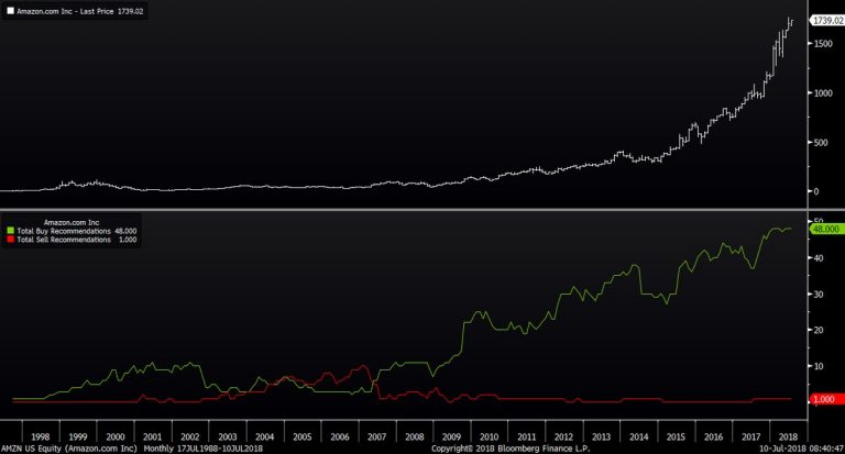 The number of buy and sell recommendations on AMZN (we found this chart also via sentimentrader). The ratio is currently 48:1, which in a sense is an improvement, as there were zero sell recommendations previously. - Click to enlarge |
| Equity Money Market Asset Ratio |
Equity Money Market Asset Ratio, 1986 - 2018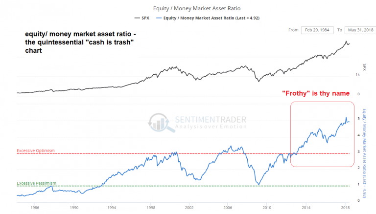 Cash is trash: the ratio of US equity market capitalization to money market assets has recently left the solar system and has now reached the Oort cloud. It certainly does not look as if anyone is worried about the possibility of a stock market downturn. - Click to enlarge |
| We could continue along this line ad nauseam, but you probably get the drift by now. Lastly, here is an update of a chart we frequently show because it has been quite useful in the past, the SPX new high-new low percentage index. It remains extremely weak and is only a small step away from giving a new sell signal – which is quite astonishing considering the strength in the index: |
New Highs and New Lows Percentage Index, May 2011 - Aug 2018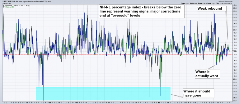 New high-new low percentage index – we have left our annotations from the last update on the chart, which point out that the market failed to reach “oversold” status in the February decline. The rebound has been very weak and is a strong hint that another decline is in the offing (compare to the situation prior to the sell-offs in August 2015 and January-February 2016). - Click to enlarge |
ConclusionThe conclusion from all this is obviously that risk is currently very high. Of course risk also spells opportunity, and anyone who has to have exposure to the stock market should at least consider hedging it while hedges can still be had for a song (which invariably is the case just before things go awry). We leave you with one last chart that shows a fundamental datum – year-on-year growth of US federal tax revenues. Note that this shows the situation until the end of Q1 2018, this is to say prior to the tax cut taking effect. It flies into the face of the “strong economy” narrative and indicates to us that much of the economy’s strength was probably based on government spending. A more comprehensive list was provided by Northman Trader from whom we have pinched the chart of buybacks shown above – as he puts it:
Addendum: as we have found out in the meantime, withholding tax reductions resulting from the tax cut started in mid February already, which has definitely contributed to the decline. Nevertheless, growth in tax receipts had already decreased to just 0.55% in Q4 2017 and has been in a downtrend since peaking at 21.23% in Q2 2013, so the tax cut has merely exacerbated a trend that was already well underway. |
Federal Tax Receipts,YoY 1994 - 2018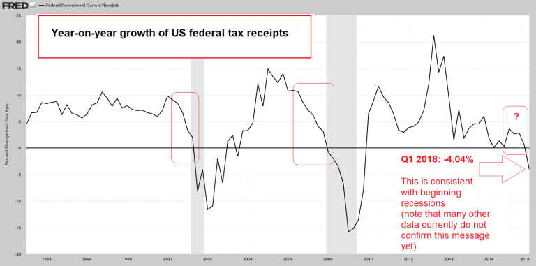 Negative growth in federal tax receipts is normally associated with the onset of recessions rather than economic booms. This datum is clearly at odds with the “strong economic expansion” narrative. - Click to enlarge |
| Charts by: Trim Tabs/Northman Trader, Bloomberg, stockcharts, sentimentrader, St. Louis Fed |
 Modern-day hi-tech bear hunt… - Click to enlarge |
Full story here Are you the author?
Tags: Chart Update,newslettersent,The Stock Market