Pater Tenebrarum
My articles My siteAbout meMy videosMy books
Follow on:TwitterSeeking AlphaFacebook
A Beginning Shift in Gold FundamentalsA previously outright bearish fundamental backdrop for gold has recently become slightly more favorable. Ironically, the arrival of this somewhat more favorable situation was greeted by a pullback in physical demand and a decline in the gold price, after both had defied bearish fundamentals for many months by remaining stubbornly firm. |
 The eternal popularity contest… - Click to enlarge |
| The list of gold fundamentals that have improved is short, but at least there is now such a list:
Credit spreads strike us as the most important of these factors as proxies for the trend in economic confidence. Here is what the situation in European junk bond spreads and US corporate BBB spreads looks like at the moment: |
European high yield spreads and US BBB spreads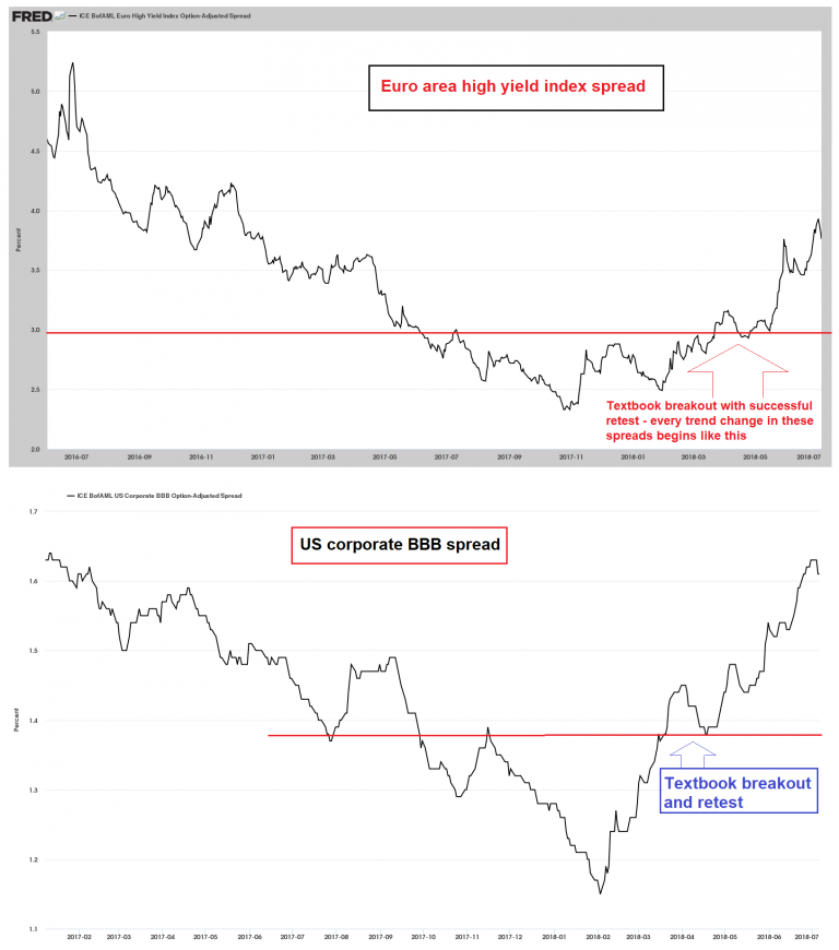 European high yield spreads and US BBB spreads: textbook upside breakouts - Click to enlarge |
| Examples of historical trend changes in credit spreads and how they played out can be reviewed here: “Credit Spreads: the Coming Resurrection of Polly”. The last three charts in this article show credit spreads turning up after having been stuck at extremely low levels for extended time periods. These charts explain why we are referring to the moves shown above as “textbook” upside breakouts.
The growth rate of the US federal debtberg strikes us as fairly important for the gold price as well. Empirically it often appears to be a major driver, although it could of course be argued that rapid surges in budget deficits and the federal debt are simply symptoms of the type of fundamental backdrop that is traditionally favorable for gold. What makes the recent trend particularly interesting is actually the fact that the prevailing economic environment is normally not associated with declining tax receipts and sharp increases in federal debt – on the contrary. And yet, federal tax receipts were down 4.5% y/y in Q1, continuing the weakness in evidence since Q4 2015. |
Federal debt and federal tax receipts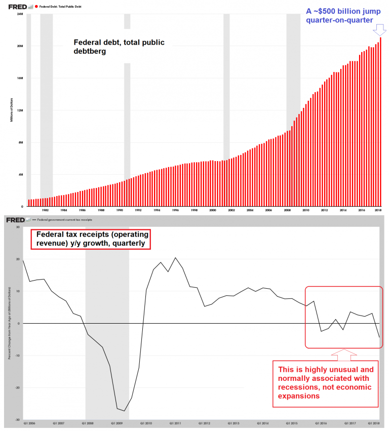 - Click to enlarge Federal debt and federal tax receipts – the former has resumed growing by leaps and bounds, while growth in the latter has turned negative again in Q1 2018 to the tune of -4.5% y/y – and that was before the tax cuts came into force. |
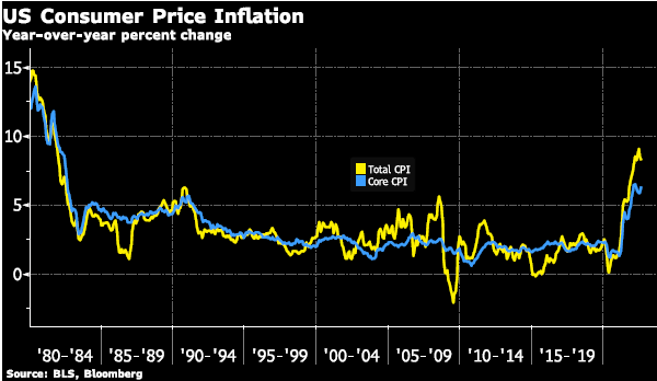
Real Interest Rates and the “Inflation” QuestionAs our readers are no doubt aware, actual inflation – i.e., the growth rate of the money supply – has slowed rather noticeably. This is normally considered gold bearish, but just as gold bottomed and turned up with the beginning of the rate hike cycle (normally also held to be bearish) it started to firm shortly after the downtrend in the true money supply growth rate got underway. There is no need to rehash in detail why this happened – the short version is: the gold market appears to be leading future changes in economic conditions and monetary policy by uncommonly long time periods in recent years (this has been the case since 2005). It seems to be more sensitive and forward-looking than any other market in this respect. It seems that market participants are anticipating the lagged effect of slowing money supply growth on risk assets and the economy and the eventual (inevitable) response of monetary authorities. Along similar lines, when “QE3” was announced in 2012, the gold price started to decline in anticipation of the eventual end of debt monetization by the Fed and the beginning of a new tightening cycle – and yet, it still took more than three years before the first rate hike was actually implemented. Regardless of the length of this lead time, gold prices definitely respond strongly to real interest rates, or let us rather say, to market perceptions about real interest rates. |
 The time shortly before inflation expectations change. |
| Investors express their views on future changes in CPI through the prices they are prepared to pay for TIPS (inflation-protected treasuries). Since they are market-driven, TIPS yields are the best real interest rate measure at our disposal. Not surprisingly, there is normally a strong negative correlation between the gold price and 5-year TIPS yields.
In the chart below we have inverted the TIPS yield in order to make it easier to see what has recently happened: There is another, less future-oriented way of looking at real interest rates, which consists of simply comparing the level of short term rates administered by the Fed to the most recent y/y rate of change in CPI. While this approach has many flaws, it shows how “far behind the curve” Fed policy is in the here and now relative to CPI. Moreover, it allows for comparisons with data of the more distant past, when TIPS didn’t exist yet. |
TIPS yield vs Gold 2012-2018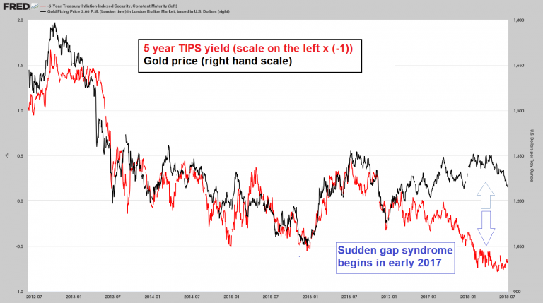 - Click to enlarge After maintaining a near perfect negative correlation for quite a long time (depicted as a positive correlation above via inverting TIPS yields – note that the TIPS scale to the left has to be multiplied by [-1] to make sense), gold prices and real interest rates part ways in early 2017. Recently the gap has narrowed a bit, as both TIPS yields and the gold price have declined. Still, this particular indicator actually remains bearish at this point. |
A Tale of Two ErasThe chart below compares two eras – in particular the time period from 2010 until today (which obviously includes the 2011 – 2015 cyclical bear market in gold) and the 1970s gold bull market. Both are juxtaposed with the “real” federal funds rate (defined as the nominal FF rate minus CPI). The charts reveal an interesting parallel: both during the 2011-2015 bear market and the 1974 to 1976 mid-cycle bear market, the “real” FF rate first reached deeply negative levels close to the peak, and then rose until it briefly eclipsed or touched the zero line. Both bear market periods incidentally generated almost identical losses (-45.5% in 2011-2018, -46% in 1974-1976). |
Two eras compared: gold price vs. the “real” federal funds rate 2010-2018 and 1970- 1980.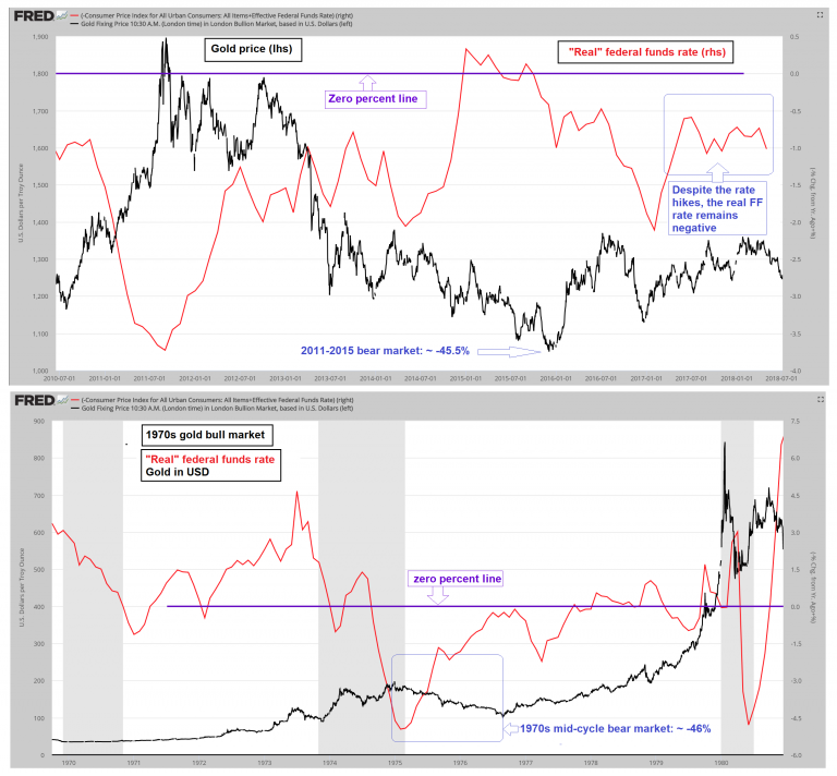 - Click to enlarge |
| It is worth noting that the fundamental backdrop for gold became progressively less supportive for gold between 1976 and 1980, especially compared to the first bull market phase. And yet, the run-up in gold prices only became “parabolic” in 1979-80, with gold stocks ultimately projecting even bigger gains. Their peak lagged the top in the gold price by almost 8 months: the Barron’s Gold Mining Index only topped out in September 1980, while gold concurrently made a lower high (at $720 vs. the $850 peak of January 1980).
The enthusiasm that characterized the secular gold price peak of 1980 was far more pronounced than that seen at the 2011 top, which looks more like a cousin of the 1974 mid-cycle peak to us. The divergence with gold stocks is particularly telling: in 1980 the more speculative part of the gold universe only topped after the more conservative one. This is precisely the behavior we tend to see around major stock market peaks as well. These are usually marked by the more speculative Nasdaq stocks topping well after the DJIA and/or the broad market. While we would caution that things don’t always have to play out the same way, all of this suggests to us that the probability that the secular bull market in gold still has further to go remains relatively high. |
 At major bubble peaks, the irrationality of the herd tends to become palpable… |
Charts by: St. Louis Fed, cartoons by Hedgeye
Full story here Are you the author?
Tags: Chart Update,newslettersent,Precious Metals