Pater Tenebrarum
My articles My siteAbout meMy videosMy books
Follow on:TwitterSeeking AlphaFacebook
Moribund MeanderingEarlier this week, the USD gold price was pushed rather unceremoniously off its perch above the $1300 level, where it had been comfortably ensconced all year after its usual seasonal rally around the turn of the year. For a while it seemed as though the $1,300 level may actually hold, but persistent US dollar strength nixed that idea. Previously many observers (too many?) expected gold to finally break out from its lengthy consolidation pattern, but evidently the intense patience training session for gold bugs is set to continue for a while longer. |
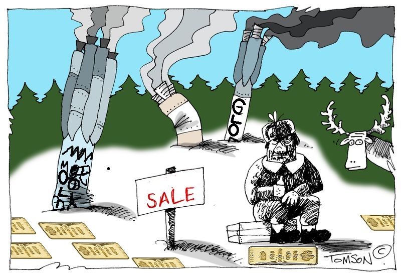 Luckless gold bug surrounded by false starts, with his only friend, a startled moose. - Click to enlarge |
| The above mentioned seasonal rally started from the second higher mid-December low since the beginning of the current Fed rate hike cycle. So far, gold seems to be doing the same thing at every December rate hike anniversary – it declines into a mid December low, and then rallies sharply as soon as the Fed announcement hits the wires (the sequence of lows since the first rate hike was: 2015: $1,045; 2016: $1,124; 2017: $1,238).
The fact that the gold price was almost $200 higher at the start of the seasonal rally than two years earlier was certainly encouraging – but although this year’s rally in gold was just as lively as the 2016-2017 turn-of-the-year advance, silver and precious metals stocks failed to properly mirror it (and obviously, it was a far cry from the early 2016 rocket ride). This was a bit surprising: as we noted shortly after the December rate hike in Patterns, Cycles and Insider Activity (see part 1 and part 2 for the details), both gold stocks and silver had a lot going for them early this year. The former had seen an unprecedented surge in insider buying, while futures speculators abandoned the latter with, well, abandon. Given their exceedingly poor record when reaching positioning extremes, it was fair to expect that the strongest seasonal month of the year for silver (namely January) may turn out to be particularly strong this year. It obviously wasn’t – although silver moved higher by slightly more than $2, this move fell well short of the $3 rally (from almost the same starting point) in the same time period a year earlier. For quite some time, the HUI and XAU indexes have mimicked the silver price rather than the gold price; their performance in the strong seasonal period was therefore disappointing as well. Since then, it has become even more so. The chart below shows the gold price and the HUI Index over the past year – we have penciled in several bearish and bullish divergences. |
Gold vs HUI, Dec 2016 - May 2018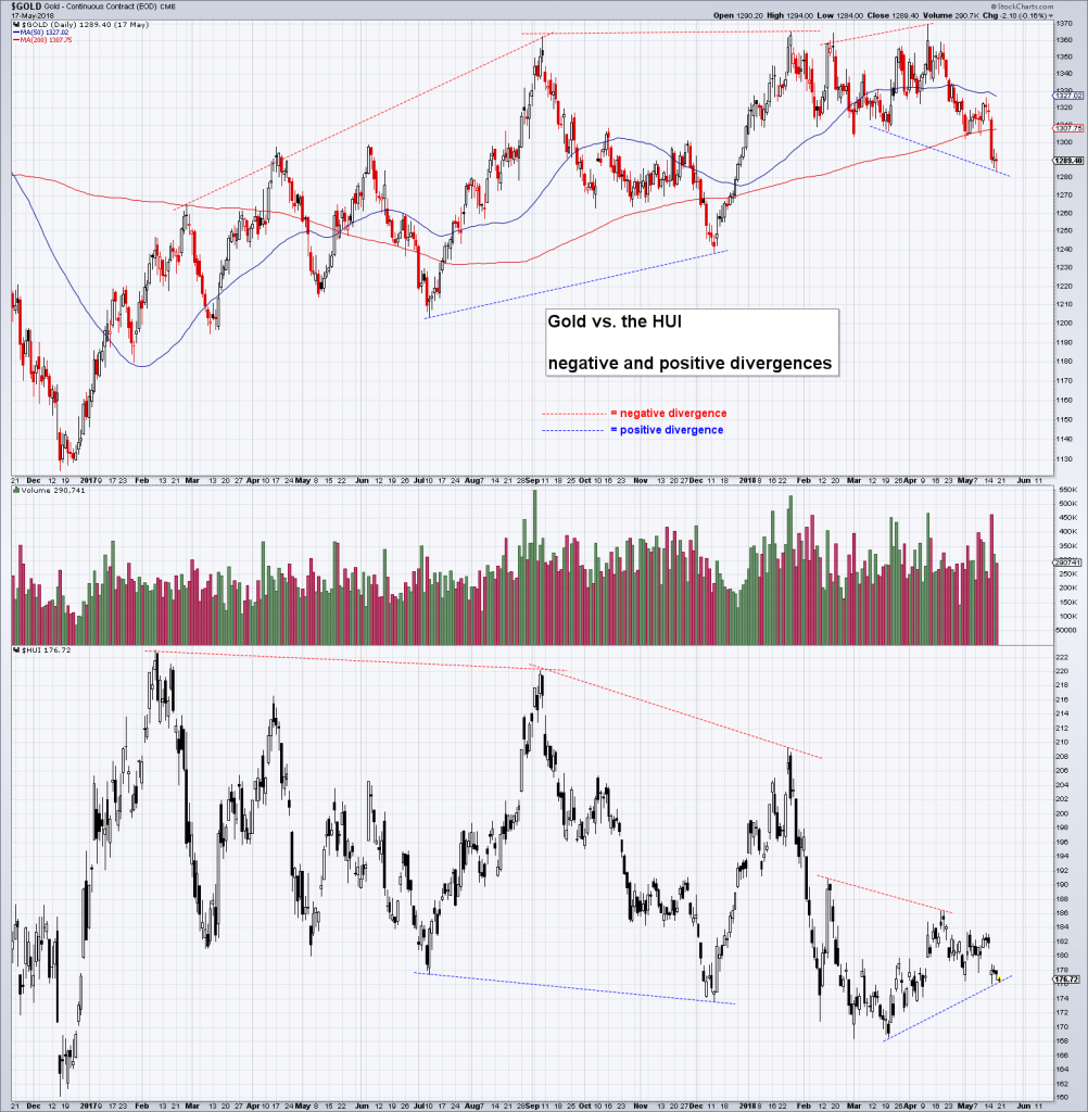 First the HUI put in a rather glaring negative divergence against gold between February and early September 2017 – the two seasonal high points of that year. - Click to enlarge This was followed by a positive divergence relative to the early July low and the mid-December rate hike low (note here that it doesn’t matter whether the HUI makes a higher or lower low relative to gold – it is only important that two lows diverge against each other). After the weak seasonal rally from mid-December 2017 to late January 2018 (it didn’t even make it into early February, which it normally “should have” done) the HUI lost even more relative strength. In fact, its relative strength vs. gold has been nothing short of dismal. The only good thing we can glean from this chart at the moment is that the most recent downswing in gold has actually generated a positive divergence with the HUI. For now, anyway – we cannot be certain yet that it will hold. |
| In late October of last year the HUI-gold ratio broke through a support level that held from late 2016 until then – and has yet to regain it. It may not feel like it, but the ratio has actually begun to improve since making a low in mid March. It is now back at the low it reached in late 2000, after a 20 year bear market (seriously).
One tidbit worth mentioning is that there continues to be a rather wide dispersion of performance within the gold sector. Some stocks behave in line with how one would expect them to behave in light of a fairly strong gold price, while others underperform quite excessively. Company-specific developments are driving these performance differences in most cases, but they often seem way too large relative to the underlying fundamental data or relative to guidance. It seems possible that the quarterly re-weighting of indexes and ETF components is exacerbating the situation due to the huge increase in passive investment strategies (re-weightings may have a more noticeable effect on stocks in this relatively small and illiquid sector than on stocks with a big market capitalization and a lot of trading volume). Regardless of the reason, it is clear that the performance dispersion within the sector since the mid 2016 interim peak has expanded quite a bit. |
HUI:Gold Ratio, Jun 2015 - 2018 The sharp increase in the HUI-gold ratio in early 2016 was supported by strength in silver, and a decidedly more bullish macro-economic fundamental backdrop for gold than the one in place currently. - Click to enlarge The main point is though that expansions in the ratio are bullish, while contractions are bearish. The conclusion in context with the current situation is: the fact that the “support shelf” of the 2016-2017 period has given way is negative, but a minor positive signal has developed fairly recently, as the ratio has begun to recover – something that hasn’t been much remarked upon as far as we know. Admittedly, it is not much of a recovery yet and it may well turn out to be a temporary fluke, but one always has to consider such things in context. Gold’s slide below the “psychological” 1300 level has received a lot of attention, but this contradictory move hasn’t. Information that is not getting much attention often turns out to be important (what everybody knows already is usually not worth knowing and vice versa). |
Macro-Fundamentals ConundrumSlightly over a year ago, we discussed the macro-economic drivers of the gold price, noting that most of them were either neutral or bearish at the time (this was in early April 2017 – see: An Overview of Macroeconomic Price Drivers). This has not changed – on the contrary, most of these indicators look even more bearish today. Take for example real interest rates – or rather, our best market-based proxy for real interest rates, the TIPS yield: |
5 Year Tips Yield and Gold Price, May 2013 - 2018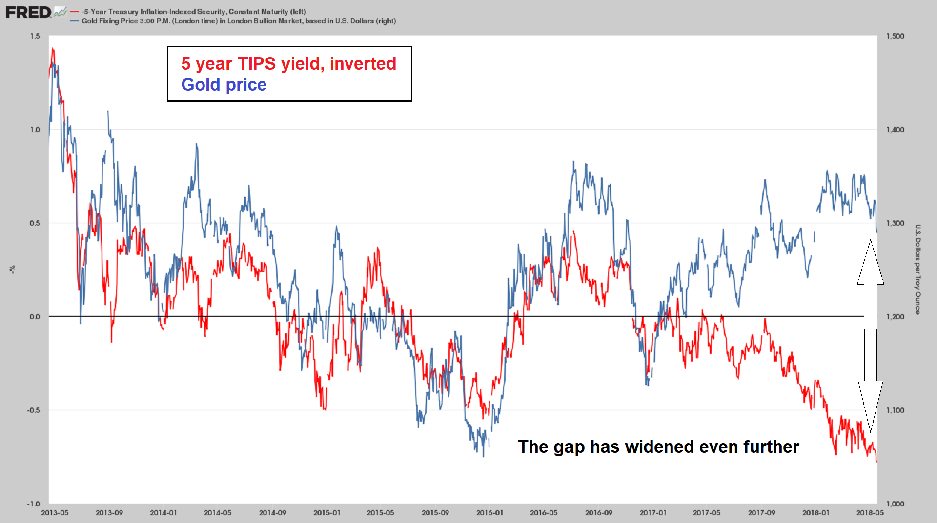 Inverted 5-year TIPS yield vs. the gold price (note: the scale for TIPS yields on the left hand side must be multiplied with [-1] to make sense; currently the yield is at a positive 78 basis points). - Click to enlarge For a very long time these two data series were extremely well aligned – but they have begun to drift apart quite noticeably since early 2017. |
| Other macro-economic drivers of the gold price such as credit spreads, the steepness of the yield curve, risk asset price trends, the BKX-SPX ratio (as a proxy for faith in the solvency of the banking system) or money supply growth are all gold-bearish at the moment. The trend in commodity prices – surprisingly – remains somewhat constructive, but not wildly so (and it stands on shaky ground in view of the strengthening US dollar).
Moreover, to the extent that firm commodity prices can be said to be indicative of strong economic confidence, one could even call their strength somewhat detrimental at the moment. Certainly all indicators of economic confidence exhibit a lot of strength: faith in monetary authorities has been fully restored, as has the belief that excessive government debt poses no threat whatsoever (apart from “special cases” on the outermost periphery, such as Venezuela). At this point, the only trend we can discern that is unequivocally gold-bullish (for now) is the re-acceleration in the US federal deficit. Apart from this, only the downtrend in the US dollar appeared to be supportive for a while, but even that has now changed. In fact, the recent bout of gold weakness was no doubt largely triggered by US dollar strength. Here is a brief look at the technical picture: |
US Dollar Index, Jun 2013 - 2018(see more posts on U.S. Dollar Index, )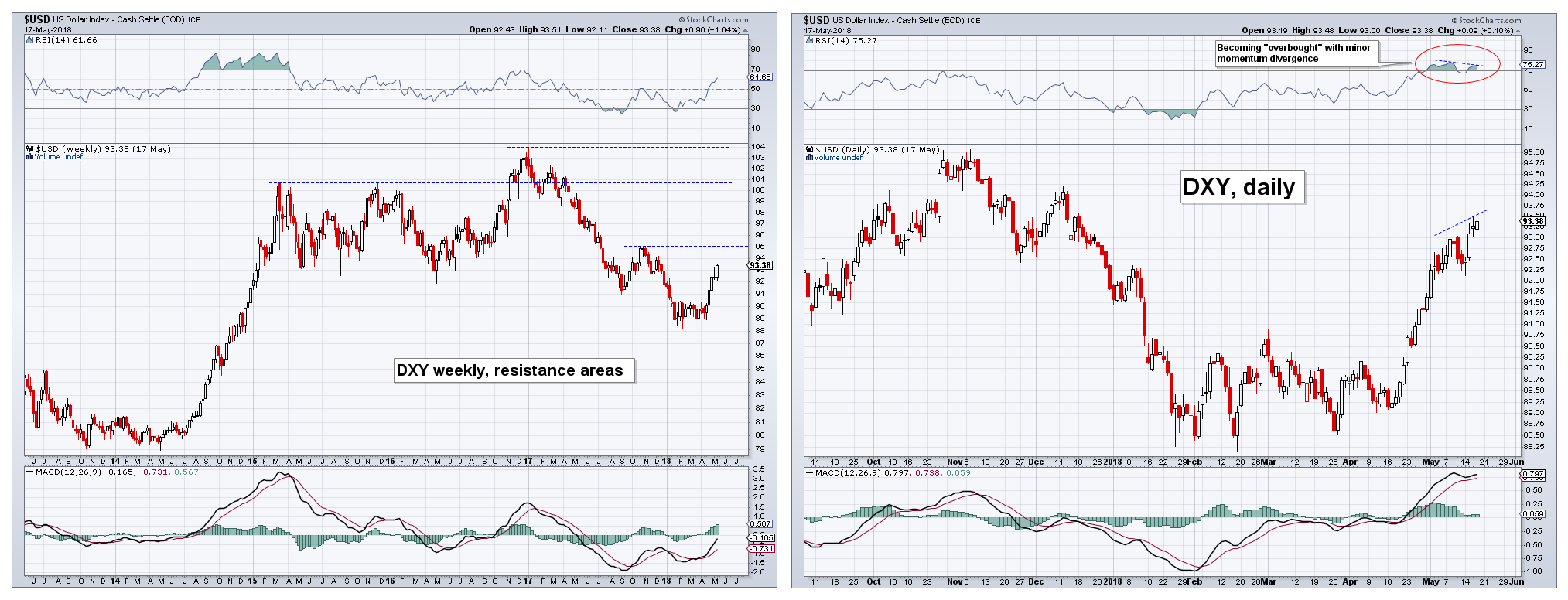 Dollar Index, DXY: On the weekly chart on the left, it seems that there is more room to run, at least until resistance near the 95 level comes into play. - Click to enlarge On the daily chart DXY seems short term overbought and a small momentum divergence has emerged. In terms of futures positioning, the previously extremely large speculative net long positions in the euro and speculative net short positions in DXY have declined a bit in recent weeks, but not by as much as such a move would normally suggest. Positioning data in precious metals futures look actually significantly more constructive by comparison. |
| It is obvious from a fundamental perspective that the US dollar enjoys a large and growing advantage in terms of its interest rate differential vs. euro and yen. Money supply growth is decelerating in all major currency areas, but the deceleration is most pronounced in the US (the Fed has a head start in this respect as well). On the other hand, price inflation in CPI terms is strongest in the US as well, which detracts from the interest rate advantage.
Moreover, since euro and yen both are likely used as funding currencies for carry trades, any wobbles in risk assets are bound to lead to unexpected bouts of strength in them. Japan and the euro area are net external creditors and financial market and/or economic problems are occasionally prone to provoke repatriation flows – which are sometimes quite persistent (recall that the yen has often defied conventional wisdom regarding the effect of rate differentials in the past). A potentially interesting development is the recent weakness in various emerging market currencies. The plunge in the Argentinian peso and the Turkish lira has “infected” other EM currencies. These currencies have begun to weaken across the board, though not all to the same extent. What makes this interesting is that it is very often a late stage phenomenon (i.e., it tends to happen at the tail end of dollar rallies), which tends to culminate in blow-off moves and the emergence of crisis conditions in various countries. Very often gold will weaken as these moves play out and reverse course sharply thereafter. Obviously, there is no guarantee that things will play out in the same manner every time, it is just something that has frequently happened in the past. |
Argentine peso and Turkish lira, 2007 - 2017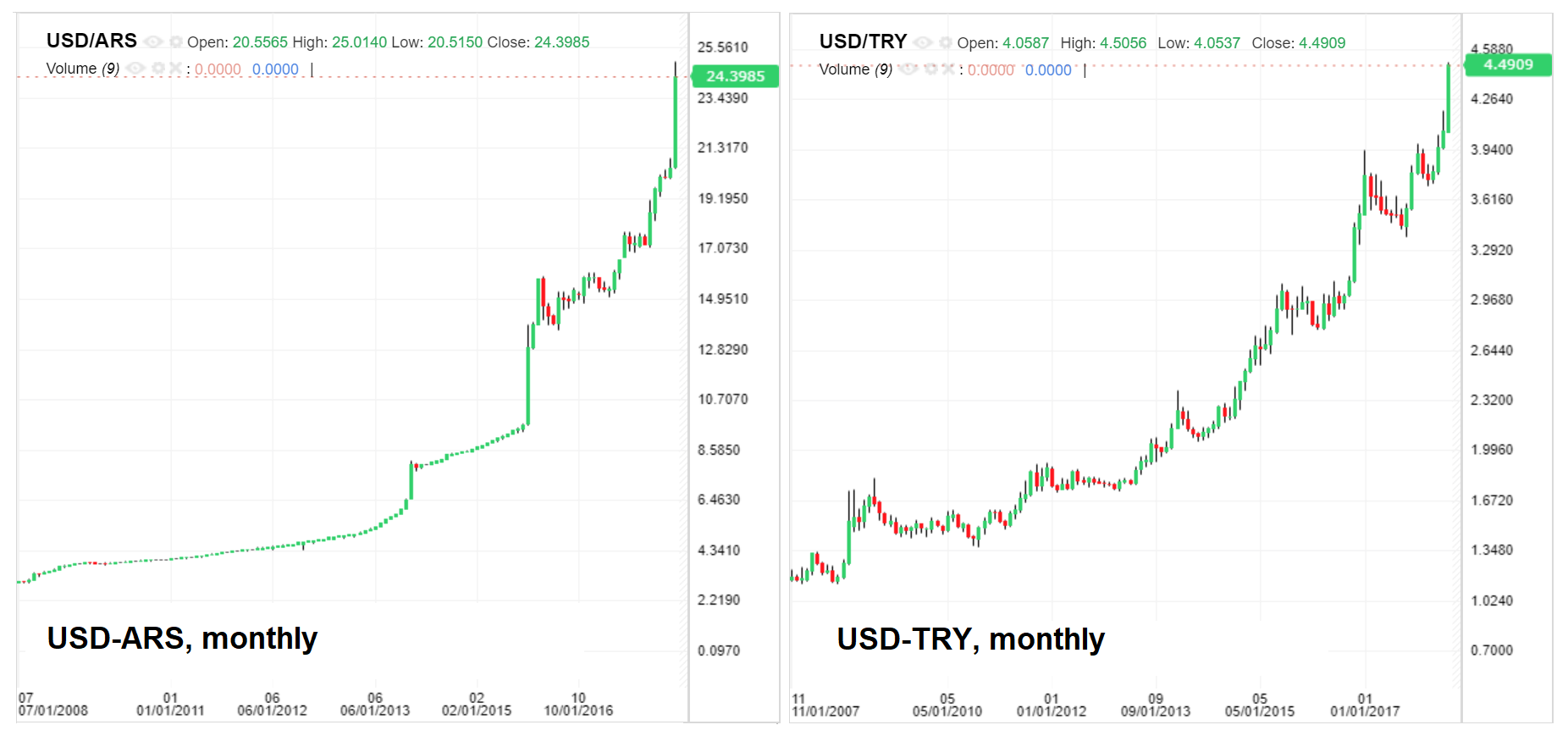 Argentine peso and Turkish lira – while these are essentially perennial collapse currencies, the recent acceleration in their demise is noteworthy. - Click to enlarge |
| One could probably state in summary, that there is very little to lend support to gold at the moment – and yet, as Keith Weiner points out regularly of late, all indications are that gold hoarders are actually quite busy hoarding. His calculated theoretical “fundamental price” (which is based on comparing futures with spot prices, and determining the profit from entering carry trades or doing the opposite) has moved well above the market price this year.
Recently the gap between the two prices has in fact widened to a rarely seen extent (a quick glance at a longer term chart suggests that a roughly similar difference was only seen in late 2007 and on two occasions in 2008 – early 2016 came close): |
Gold Fundamental Price, Jul 2015 - Apr 2018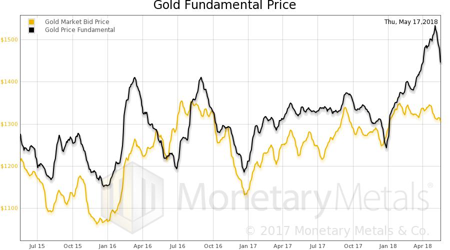 Fundamental vs. market price – a wide gap has opened up this year. - Click to enlarge |
What to make of this seeming contradiction between the signals from macro-economic drivers and the actions of market participants? Note here that the “theoretical” fundamental price is derived from the activity of market participants just as the market price obviously is. The only answer that makes sense to us is that market participants (particularly those buying and selling physical gold) “see” something that is not evident in the data yet.
This has been going on for quite some time, and perhaps they will change their mind again, but why should they? After all, one can make an educated guess as to what makes people want to hold gold, and if anything, the possible reasons have become more rather than less relevant. Lastly, on occasions when the fundamental/market price spread has widened as much as it recently has, the theoretical price has tended to lead the market price.
Next: A Closer Look at Positioning
Things become even more interesting when looking at recent positioning data in precious metals – we will inter alia look at those in the next post, which should be published shortly. We will also discuss the odd HUI-silver correlation mentioned above in more detail. Stay tuned.
Full story here Are you the author?Tags: Chart Update,Gold prices,newslettersent,Precious Metals,U.S. Dollar Index