Pater Tenebrarum
My articles My siteAbout meMy videosMy books
Follow on:TwitterSeeking AlphaFacebook
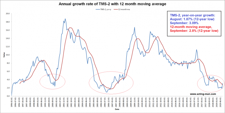
Money Supply and Credit Growth Continue to FalterThe decline in the growth rate of the broad US money supply measure TMS-2 that started last November continues, but the momentum of the decline has slowed last month (TMS = “true money supply”). The data were recently updated to the end of April, as of which the year-on-year growth rate of TMS-2 is clocking in at 6.05%, a slight decrease from the 6.12% growth rate recorded at the end of March. It remains the slowest y/y growth since October of 2008, when the Fed had just begun to pump quite heavily. |
 US money supply and credit growth keep slowing.US money supply and credit growth keep slowing. |
| The monthly y/y growth rate of M1 fell rather more sharply in April, from 8.76% to 7.07% (the most recent weekly annualized growth rate is lower at 6.80%). The composition of M1 is close to, but not quite equal to narrow money AMS (or TMS-1) – in particular, it does not contain the balances held at the Treasury’s general account with the Fed.
As a result, the growth rates of the two measures have drifted apart more sharply since 2016 than they usually do, as there were huge swings in the Treasury’s general account from mid 2016 to early 2017. These swings were very likely connected with money market funds moving large amounts of dollars from the euro-dollar market into treasury bills. Reports by the Treasury Borrowing Advisory Committee suggest that the topic was on the agenda for a while. The surge in demand from MM funds may well have been accommodated by an increase in debt issuance, which the growing cash hoard mirrored. |
Monthly y/y growth rates of TMS-2 and M1 2007-2017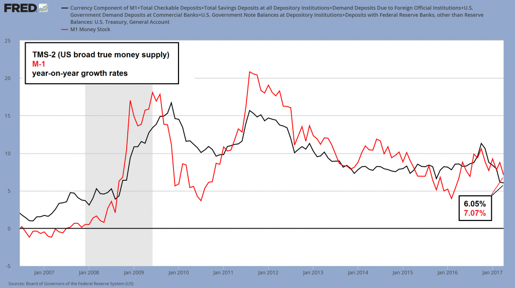 Monthly y/y growth rates of TMS-2 and M1 – TMS-2 growth remains at the lowest level since October 2008. - Click to enlarge |
| One reason to look at M1 as well is that it shows a slowdown in growth even without taking the above mentioned fluctuations in Treasury deposits into account (these remained at odds with deposit money growth even when the treasury drew its balances down again in Q1 2017; we have yet to find out why, but the fact is that there was no commensurate increase in deposit money at US banks).
A continued slowdown in bank credit growth is undoubtedly the culprit. The next chart compares weekly y/y M1 growth with the y/y growth rate of commercial and industrial loans (which is also made available weekly) as of the first week of May. C&I lending grew at 2.01% according to the latest reading, which represents a new post GFC recovery low. Total bank credit growth kept declining as well, but growth in business loans is in our opinion the most important component of bank lending growth. |
Weekly y/y growth rate of M1 and commercial & industrial loans 2008-2017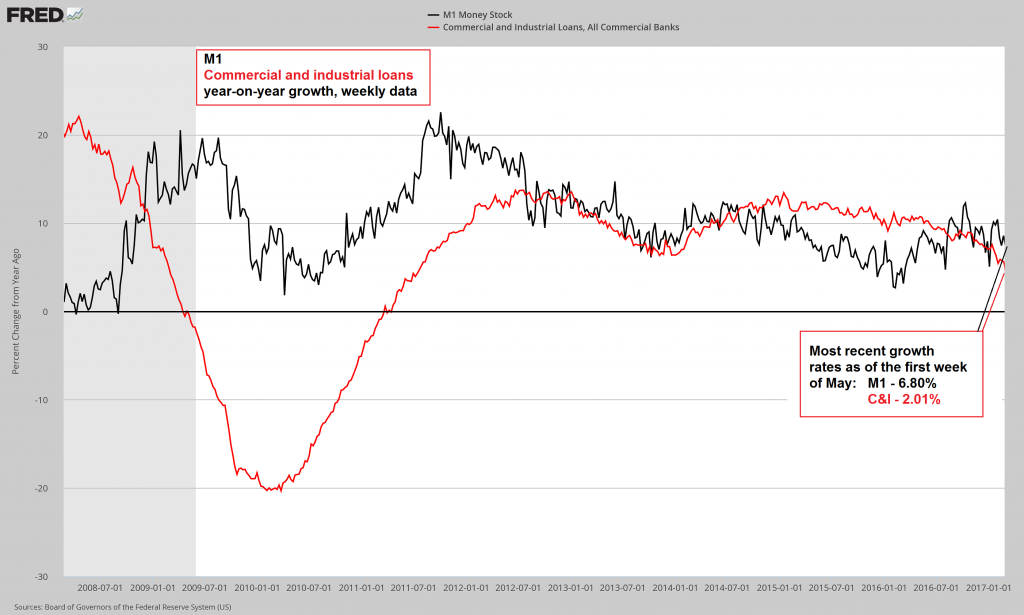 Weekly y/y growth rate of M1 and commercial & industrial loans – the latter has hit a new post GFC recovery low of 2.01%. - Click to enlarge |
| The next chart shows the ratio of capital goods vs. consumer goods production, a rough measure of which parts of the production structure tend to be stronger magnets for investment (the usual caveats regarding the flaws of such statistical aggregates apply). The ratio remains elevated, but it has faltered after peaking in 2014, in line with the tapering/ end of QE3 and the subsequent collapse in oil prices – which evidently had a sizable effect on capital goods production. |
Capital vs. consumer goods production. 1994-2017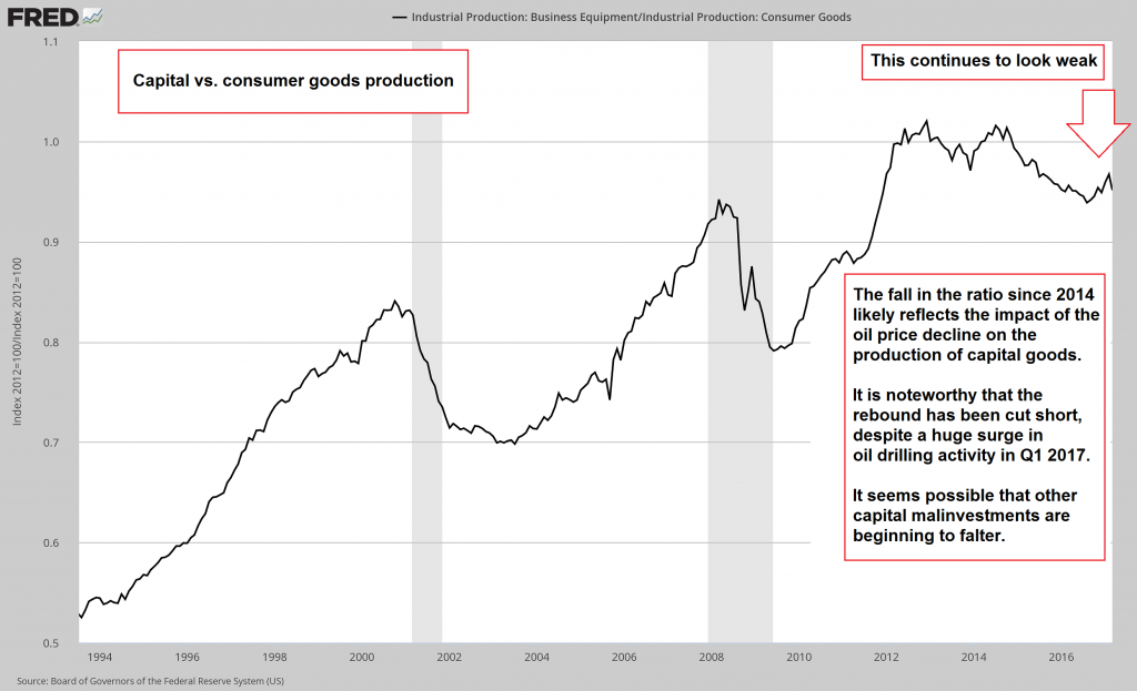 - Click to enlarge
Recessions are characterized by sharp downturns in this ratio, as malinvestments are liquidated. As a rule, these are concentrated in the higher order stages of the production structure. The downtrend since 2014 was relatively mild, but the recent recovery seems to be faltering already – in spite of a big surge in oil drilling-related investment in Q1. If money supply growth keeps slowing down, an accelerated decline in the ratio will eventually take hold. These phases are usually associated with sharp declines in asset prices. |
A Really Good Reason for ConcernNormally the above data points would not give cause for a lot of concern regarding the timing of the next boom-bust tipping point just yet. There is one major reason though why they should, apart from the ominously sharp decline in federal tax receipts we have shown here. The effect of the post GFC money supply expansion on asset prices was extreme (note: the cumulative increase in TMS-2 since early 2008 amounts to roughly 140%). That introduces a vulnerability that might otherwise not exist, mainly because economic confidence is very closely correlated with asset prices. The following chart from John Hussman illustrates the situation. In terms of the median price/revenue ratio of S&P 500 components, the stock market is currently more overvalued than ever. The current S&P 500 trailing P/E ratio of roughly 24 is certainly not threatening the record high established at the peak of the tech mania in 2000, but in terms of the indicator shown above, valuations have moved well beyond good and evil. “Where precisely is that?”, we hear you ask. Before we get to that, we want to briefly comment on what else the above chart tells us. |
S&P 500 Index components, median price/revenue ratio.(see more posts on S&P 500 Index, )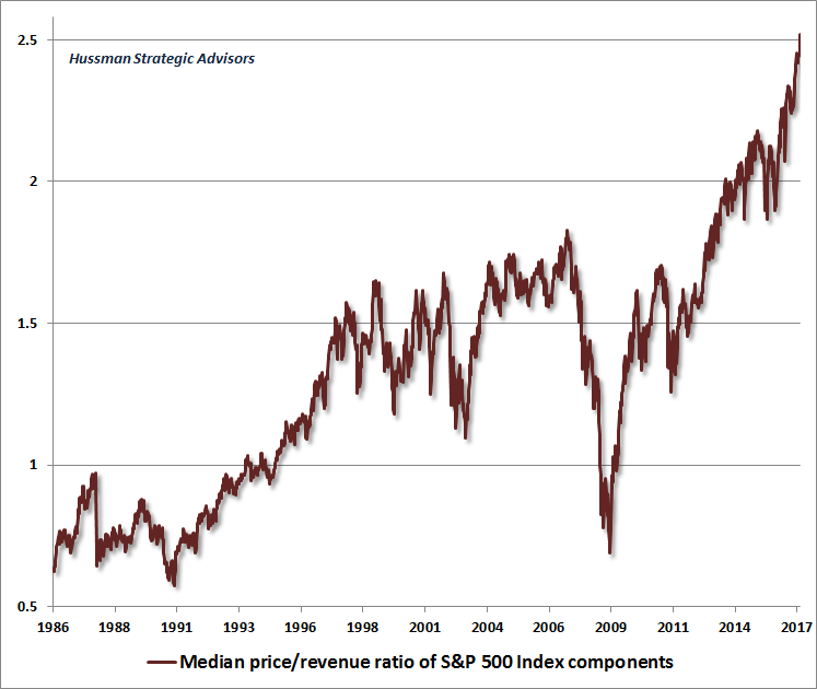 - Click to enlarge The extreme overvaluation at the peak in 2000 in terms of the P/E ratio was caused by a relatively small number of big cap tech stocks. The chart above inter alia suggests that overvaluation is far more widespread this time – there will hardly be anything worth “rotating” into once a decline in stock prices begins. |
Mean and Reversion-ProneThe fact that the SPX trailing P/E ratio is historically extremely elevated, but still a good sight below its year 2000 record high of ~46, while price/ revenue ratios have streaked to a comparatively much higher level, indicates that profit margins are at an extremely high level as well. Profit margins tend to fluctuate, i.e., they are the kind of datum that mean-reverts with unwavering regularity. Reportedly there is growing belief in a “new era” bereft of the mean-reversion concept, which we think can be safely dismissed. As John Hussman notes in this context:
This has of course happened many times in the course of market history, and every time someone came forward to explain to the investoriat why higher profit margins (and by implication significantly overvalued stock prices) would be permanent this time. Usually these explanations were provided shortly before it turned out they were not permanent after all. Assuming that this historical tendency remains operative – and there is no good reason to expect otherwise – feeling “comfortable” with a trailing P/E ratio of 24 and a Shiller P/E ratio of ~29 strikes us as quite audacious. The latter by the way represents a new high for the move, exceeded only by the feverish readings taken at the 1929 and 2000 peaks (~32 and 44). In fact, very high profit margins make an overvalued market even more dangerous, precisely because they won’t stay where they are. So where is the realm that is “beyond good and evil”? Much of our understanding of higher dimensional environments was unfortunately lost when we slipped on an Enrique surface in spite of its Ricci flatness. An entire canonical bundle of it – trivial, but useful – fell into a six-dimensional Calabi-Yau manifold, where it is busy conjecturing ever since. Sadly, it is fated to eventually decompose. But here is a wild guess anyway. Stock market valuations have reached the dimension in which this guy lives: Some of our readers surely remember the clown with the hard to pronounce name, who reportedly lives in a higher-dimensional space beyond human ken. That is where the stock market’s median price/revenue ratio now lives as well. It is to be feared that it will one day return to Earth with thud. |
 |
Conclusion
Slowing money supply and credit growth and historically extremely high stock market valuations far more often than not turn out to be uneasy bedfellows. In fact, usually the latter will eventually fall out of bed. Circumspection remains advisable.
Charts by: St. Louis Fed, John Hussman
Full story here Are you the author?
Tags: Chart Update,newslettersent,On Economy,S&P 500 Index