The payroll report disappointed again, though it was deficient in ways other than are commonly described. The monthly change is never a solid indication, good or bad, as the BLS’ statistical processes can only get it down to a 90% confidence interval, and a wide one at that. It means that any particular month by itself specifies very little, except under certain circumstances. This month just happens to be one, pointing in the direction of more useful interpretation.
At just +98k, the headline change in the Establishment Survey was about half of what was expected. In contrast to last month, such a low delta is meaningful in only one respect – given the confidence interval the BLS cannot say with significance that the payroll report for March 2017 was even positive. It still may have been lackluster or even a good one, but it also may have been negative.
| It is therefore consistent with the rest of our economic findings. Though there is some improvement in certain areas, it isn’t meaningful so as to indicate what everyone seems to think it does. Instead, the US economy remains weak even if this year’s weakness isn’t as immediately dangerous as last year’s. The payroll reports fall well within that range, especially when viewed beyond a single month.
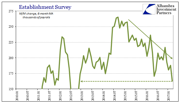
Because of that 98k as well as a -38k revision to last month (February 2017), the 6-month average of estimated payroll gains is now just 163k. That is 102k per month less on average than the estimated peak in the middle of 2014, a serious indicated slowdown. It is also the lowest average gain in four and half years, going all the way back to late 2012 and the initial slowdown. |
Payrolls Establishment Survey 2010-2017 |
| Though there are all kinds of discontinuities (population figures) and irregularities (SNAP) with the labor force estimates, cutting through them there does not seem to be much enthusiasm for entering the labor market (apart from regulatory changes to SNAP). The lack of acceleration of new entrants is consistent with both the currently weak state as well as its chronically weak post-crisis baseline. |
Payroll Averages 2010-2017 |
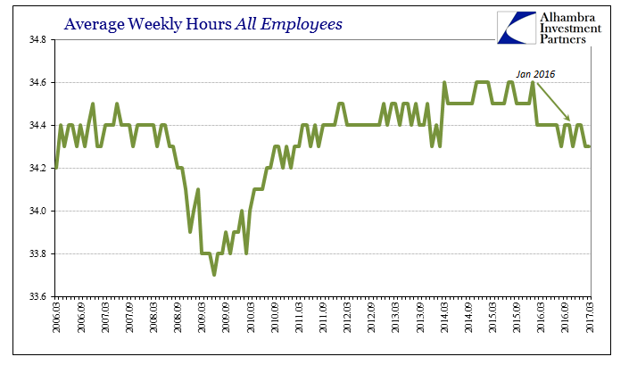
| Going back to January 2016, the BLS estimates that total hours worked on average have decelerated and not as yet recovered. The weekly figure suggests in March another month below the bottom end of the range established back in 2012, a range only violated twice (Dec 2013 & Feb 2014) before last summer. |
Average Weekly Hours All Employees 2006-2017(see more posts on U.S. Average Earnings, ) |
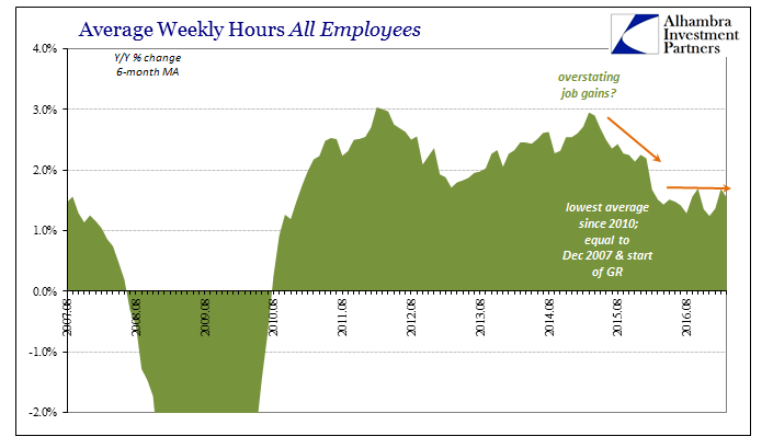
| Year-over-year, total hours increased just 1.4%, slightly less than the average of the past year which is itself among the lowest since 2010.
There can be little doubt now that despite the unemployment rate the labor market under the “rising dollar” slowed considerably, meaning the economy under it was severely and negatively affected. Though jobs and payrolls are often a lagging economic indicator, it has been more than a year since the worst of “global turmoil” which should have been sufficient calendar space for payrolls to by now turnaround. Because they continue to suggest further weakness we can reasonably assume that nothing meaningful has changed overall. |
Average Weekly Hours All Employees 2007-2017 |
| The unemployment rate fell to 4.5% in March, however, which only shows that it is of a different world entirely. It was the least proportion of official unemployment since before the start of the Great “Recession.” As is usually the case, there is elsewhere no sign of that being a meaningful condition. Not only have the other labor market statistics comported with other accounts corroborating softness, wages and earnings remain stagnant despite what should be, if 4.5% was real, the complete end of “slack” in the labor force.
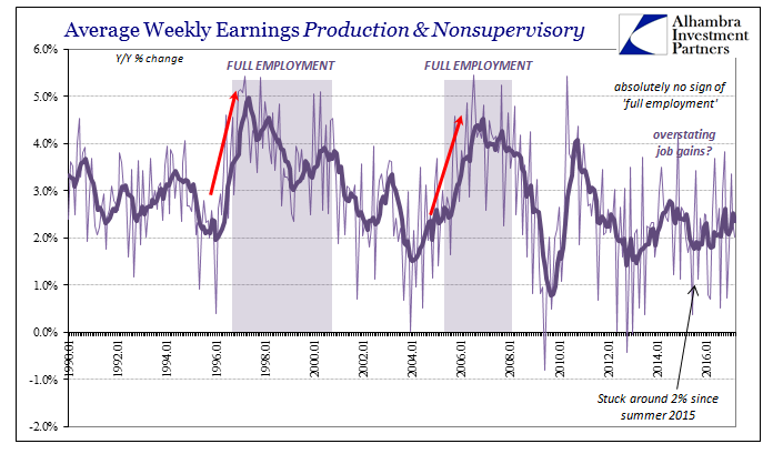
Average weekly earnings of production and non-supervisory employees rose just 2% nominally in the latest month, which is all but assured to be another negative in “real” terms once the CPI estimate for March is released. In nominal terms, weekly earnings continue on in the 2% to 2.5% range prevailing since 2015, showing no correlation whatsoever to the unemployment rate nearing and now firmly at so-called full employment. |
Average Weekly Earnings Production and Nonsupervisory 1990-2017(see more posts on U.S. Average Earnings, ) |
| This contrasts sharply with prior experience, which was one reason why economists and policymakers were so hopeful and optimistic in late 2014. As the unemployment rate fell closer toward 5%, they fully expected to see earnings accelerate as you see above at those prior times; average weekly earnings in the middle 1990’s jumped up to almost 5% growth, whereas in the middle 2000’s it was 4% to 4.5% growth. There is an enormous difference between 2.5% and 4.5%, let alone between 2% and 5%.
The combined view of even the Establishment Survey along with wages and hours shows pretty conclusively that the unemployment rate was the wrong horse to bet. This should not have been any surprise, however, as the participation problem was known and well-documented going further back than 2014. That policymakers emphasized the unemployment rate anyway over so many compelling and contrary indications (that now includes the Establishment Survey of all things) shows that they did so based not on scientific principles but instead ideological ones tied especially to assumptions about QE (meaning their own “heroic” role and continuing political influence). |
Employment Population Ratio, Unemployment Rate compared(see more posts on U.S. Employment Change, U.S. Unemployment Rate, ) |
| It is yet another angle demonstrating that QE wasn’t ever “stimulus” nor even “money printing”, for if it was there would be some sign somewhere that it was. The labor statistics particularly as they are against the unemployment rate also argue quite consistently against the “skills mismatch” explanation of drug addicts and retirees. If the unemployment rate does not indicate full employment, as it surely does not, then there must continue to be considerable slack in the labor market. And if slack remains there must be “some” reason for it to still remain after nearly a decade, one that is relatively easy to pinpoint once you stop viewing bank reserves as money. |
Accounting for All Labor |
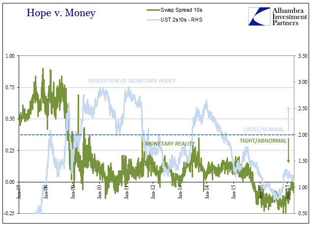
| The payroll report was quite disappointing but only in the sense of the unemployment rate which wasn’t. The 98k headline is merely relevant insofar as it suggests a continuation of conditions in the labor market like those of 2015 and 2016. Three months into 2017, and already a year past the worst of the “rising dollar”, there is yet anything upon which to base “reflation” apart from now very strained hope. |
Hope vs. Money 2007-2017 |
Tags: average weekly earnings,average weekly hours,currencies,depression,earnings,economy,employment,establishment survey,Federal Reserve/Monetary Policy,hours worked,household survey,jobs,labor force,Labor Market,Markets,newslettersent,payrolls,QE,U.S. Average Earnings,U.S. Employment Change,U.S. Unemployment Rate,Unemployment,unemployment rate,wages


