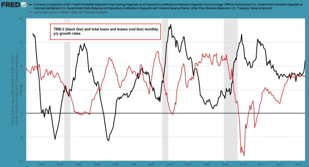
A Very Odd Growth Spurt in the True Money SupplyThe growth rates of various “Austrian” measures of the US money supply (such as TMS-2 and money AMS) have accelerated significantly in recent months. That is quite surprising, as the Fed hasn’t been engaged in QE for quite some time and year-on-year growth in commercial bank credit has actually slowed down rather than accelerating of late. The only exception to this is mortgage lending growth – at least until recently. Growth in mortgage loans is still very slow though, especially compared to historical growth rates. It cannot really account for the recent surge in money supply growth either. Usually lending by commercial banks will tend to lead growth in the broad true money supply, but this lead-lag relationship has become a lot less straightforward after the 2008 financial crisis (in fact, it actually reversed for a while). As a result of the Fed’s heavy debt monetization activities, the pace of money supply growth is nowadays influenced directly by two major sources. Prior to the crisis, the Fed would mainly affect commercial bank lending growth by setting overnight interbank lending rates (i.e., the federal funds rate) and maintaining its rate target by supplying or occasionally draining reserves. QE by contrast creates new deposit money directly (as well as bank reserves to the same extent), which adds to the fiduciary media commercial banks conjure into being by means of fractionally reserved lending. QE has fundamentally altered the way the system functions – this remains the case even now, with the Fed’s QE type activities reduced to reinvesting the proceeds from maturing bonds. |
TMS-2 and Total Loans and Leases YoY change |
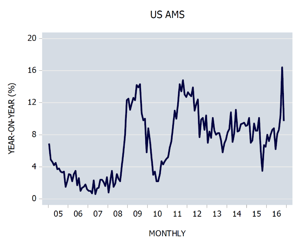
| The growth rate of the more volatile narrow money supply measure AMS (adjusted money supply) calculated by Dr. Frank Shostak has recently even spiked to a new high (it has decreased a bit again since the end of October). Its greater volatility relative to the broader measure TMS-2 is mainly due to the fact that it doesn’t include savings deposits.
Savings deposits that can be withdrawn on demand are the largest component of TMS-2 and their growth rate as a rule exhibits greater inertia than that of many other components. Obviously this is reflected by the lower volatility of overall TMS-2 growth rates (note: de iure, banks could invoke fine print which allows them to delay payment of money in savings deposits by up to 30 days. This doesn’t happen in practice though, as a bank doing so would very quickly find out what a bank run feels like). For a detailed list of the components included in different “Austrian” money supply measures and a succinct explanation of these measures were created and are superior to official money supply aggregates, see our friend Michael Pollaro’s excellent summary here. Michael provides a number of links to the associated academic literature as well for readers inclined to delve more deeply into the subject. Naturally we were curious to find out what was going on, so we took a close look at individual components of the money supply aggregates and various bank credit measures. We suspected that the recent growth spurt very likely had something to do with the new money market fund regulations that have recently come into force. It seems this is indeed the case. We already observed a similar oddity after the end of “QE2”. Commercial bank lending growth had turned positive again following an outright credit contraction phase during the recession, but its growth rate had begun to flatten out. With the Fed no longer monetizing $60 bn. per month, it stood to reason that money supply growth would slow down quite sharply. Instead, it started moving sideways at a historically still very high level. A major reason for this were the actions of regulators. The FDIC had instituted a temporary blanket deposit guarantee, i.e., it guaranteed deposits without size limit at the time. This attracted large amounts of dollars that were previously deposited in accounts located in Europe. |
Money AMS Monthly |
| These inflows boosted demand deposit growth at US based banks just as QE2 ended in mid 2011. As the euro area debt crisis moved into its acute phase in the second half of 2011, there was a strong incentive for holders of large dollar deposits in Europe to shift their funds to accounts with US domiciled banks where they would be insured.
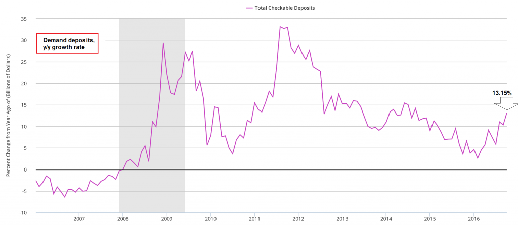
Note in this context that the deposit money components of the money supply aggregates we discuss here consist only of domestic deposit money. Currency is the only component of the aggregate money supply that includes dollars regardless of where in the world they are currently located. The y/y growth rate of demand deposits has indeed shot up to a new interim high in recent months (13.15%). Once again, this cannot possibly account for an acceleration in TMS-2 growth from around 8% to more than 11% by itself, or for the concurrent spike in AMS growth to more than 16%. The same is true of other large money supply components. Savings deposits grew by 7.7% y/y as of the end of October and currency grew by 6.15%. As it turns out, another component that is shared by TMS-2 and money AMS is the main culprit behind the recent surge in money supply growth rates. For many decades this component has been so small, one could almost safely ignore it – not anymore. |
Total Checkable Deposits |
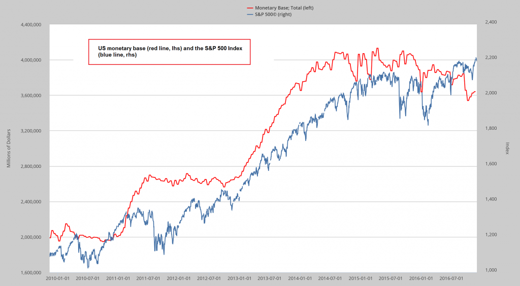
A Noteworthy Shift in Fed LiabilitiesMany of our readers are probably keeping an eye on the monetary base – after all, in recent years the S&P 500 Index has displayed a strong correlation with the monetary base. As John Hussman once pointed out, the correlation between the US monetary base and the price of beer in Iceland was even stronger. In view of QE a strong case can be made though that the surge in base money and the concomitant rally in stock prices was not just a coincidence. It is time to become a bit more cautious about looking at the monetary base as a leading (or sometimes coincident) indicator of stock prices. As the chart above illustrates, base money and stocks have recently parted ways. The monetary base has in fact declined quite a bit. As of October, it was shrinking at an annualized rate of -12.31%. By contrast, stock prices have recently reached new highs. They may well “follow” the base again, but there are reasons to believe that the correlation is no longer as strong as it once was. |
Base Money and SPX |
| The monetary base consists of currency and bank reserves – and only currency (excl. vault cash) is regarded as part of the money supply, as bank reserves on deposit with the Fed are for all practical purposes “outside” of the economy. Since outstanding currency is consistently exhibiting positive growth rates (most recently 6.15% y/y), a 12.31% y/y decline in the monetary base indicates that bank reserves must have fallen rather precipitously. They have indeed done so – reserve balances are currently down by -21.5% y/y.
Normally, the monetary base roughly mirrors the asset side of the Fed’s balance sheet. One would therefore expect that assets held by the Fed should reflect the decline in the monetary base. We know however that the Fed’s current policy is to reinvest all proceeds from maturing bonds in its asset portfolio, so why should the portfolio shrink? Its size has in fact remained quite stable. The next chart shows a comparison of assets held by the Fed and bank reserves: |
Fed Assets and Reserve Balances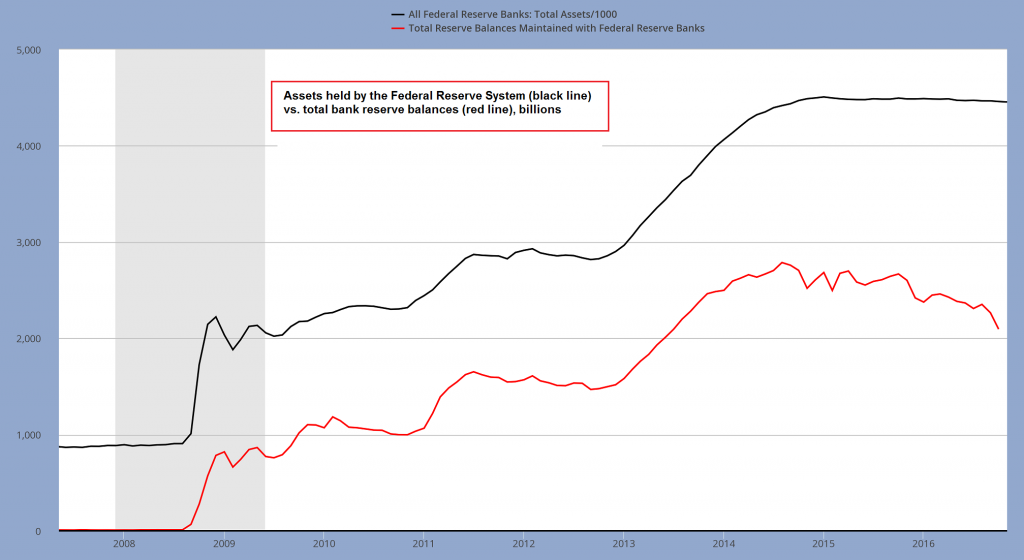 Fed assets (black line) vs. bank reserves (red line). Reserves are down some $700 billion from their 2014 peak, while the Fed’s asset portfolio has remained steady. Incidentally, the decline in bank reserves has pushed the percentage of covered money substitutes from a peak of approximately 31% to 19% (cover consists of bank reserves plus vault cash – the latter currently amounts to $70 billion). - Click to enlarge |
| The growth in outstanding currency definitely cannot account for this discrepancy. This suggests that something else has happened on the liabilities side of the Fed’s balance sheet – something must have taken the place of bank reserves.
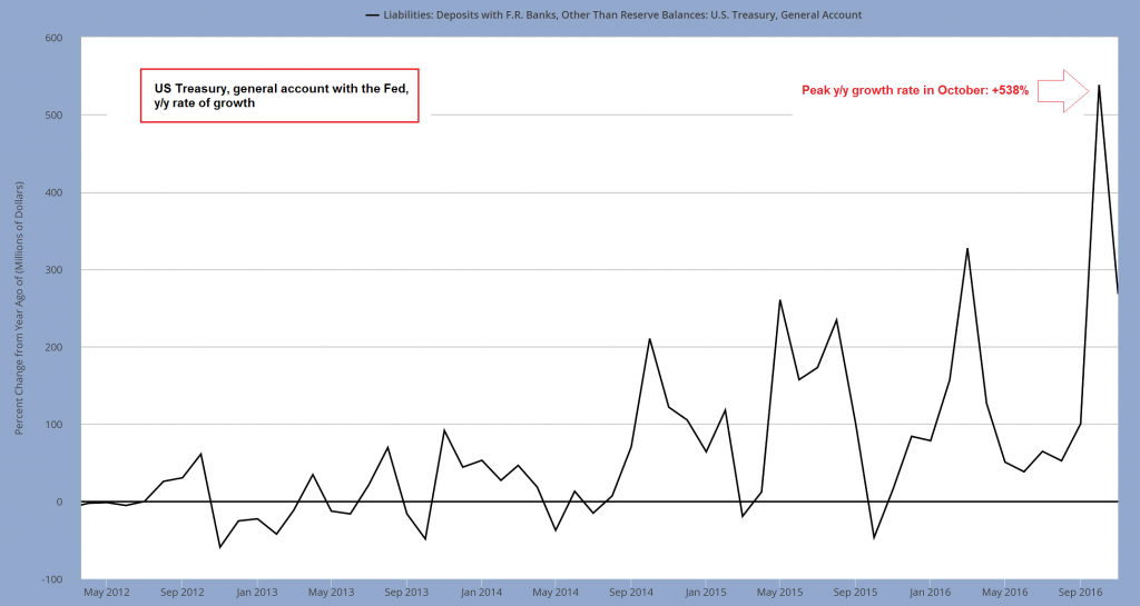
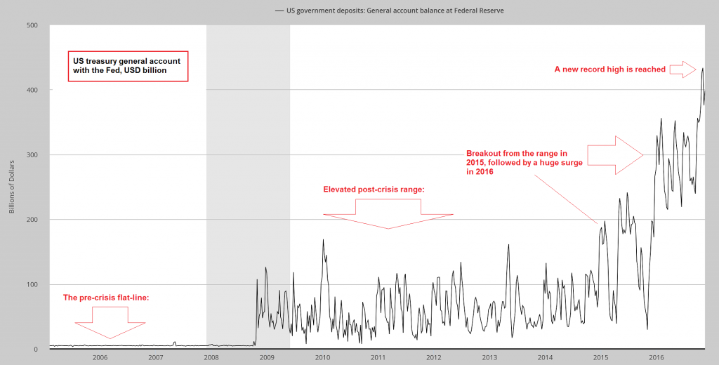
Not to worry, the line item “losses due to the Treasury” has not been activated yet (this is the accounting fudge the Fed intends to employ in order to avoid formal insolvency should the value of its securities portfolio decline precipitously). Nevertheless, the Treasury is involved. In October the monthly annualized growth rate of the Treasury’s general account with the Fed peaked at a stunning 538%. A long term chart of the absolute size of the Treasury’s account with the Fed (see further below) shows why this item could essentially be ignored prior to the financial crisis and why this is definitely no longer the case. As a rule, the Treasury spends money as fast as it gets it in. Quite precise “just-in-time” budgetary planning takes place, with the Treasury Borrowing Advisory Committee (TBAC) holding regular meetings to help putting it into effect. The TBAC inter alia issues detailed recommendations regarding quarterly funding schedules. There was presumably never a need to hold very large cash balances, considering that redemption dates are set in stone and that much of the government’s spending is of the “non-discretionary” auto-pilot sort. |
Treasury General Account Monthly Rate of Change |
| and relative to government revenues (the peak was reached in early 2000, as the government stockpiled banknotes due to the “Y2K” computer scare).
They were never of even remotely comparable size to the amount currently held in the general account though, and nowadays these deposits are tiny. At last count they amounted to a mere $1.4 billion. The important thing from an analytical perspective is this: while bank reserves are not considered part of the money supply, the funds deposited in the Treasury’s general account at the Fed most assuredly are money. As the official definition of the general account has it:
As an aside to this, the Treasury also holds deposits and note balances with commercial banks. Once upon a time these were much larger than they are today, both in absolute terms (emphasis added). |
US Treasury General Account LT |
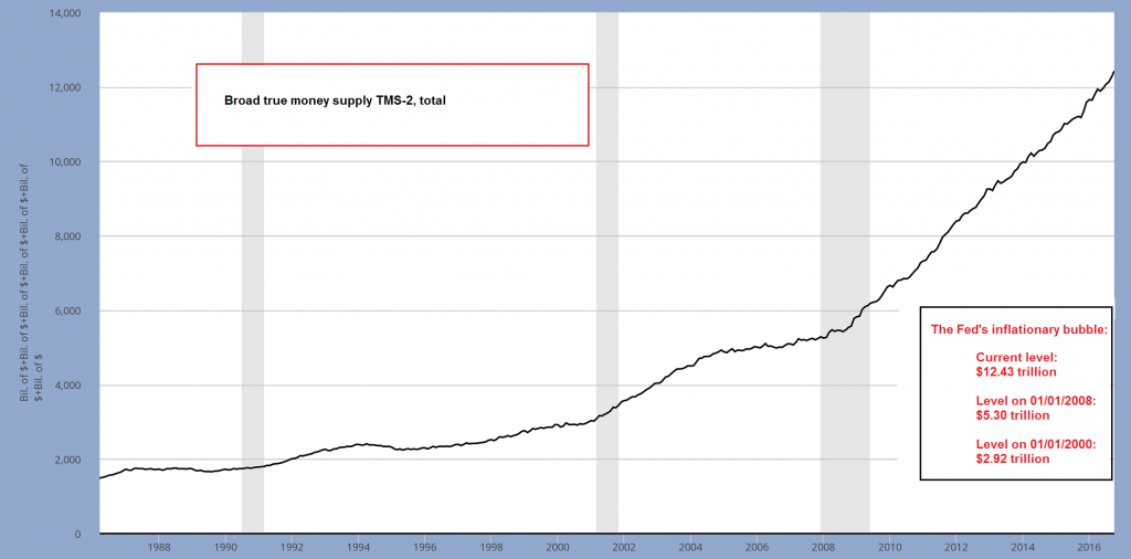
TransformationIn short, the shift in the Fed’s liabilities has involved a transformation, as a result of which there is now considerably more money in the economy than there would have been otherwise. According to the TBAC funding plans for Q1 2017, the cash balance in the general account is expected to decline by roughly $300 billion to around $100 billion at the end of Q1. As the Treasury spends this money, it will flow into various demand deposit accounts at commercial banks. So while the balance in the Treasury’s general account will decrease, this will be offset by an increase in demand deposits (note: we are not so sure this planned decrease in the general account balance will actually happen). Demand deposits are money substitutes that are partly covered and partly uncovered. The uncovered portion represent “circulation credit” or fiduciary media. As noted above, the current ratio between deposit money according to the TMS-2 definition and bank reserves plus vault cash indicates that around 19% of all outstanding money substitutes in the US are currently covered. Regardless of their precise status though (which usually only becomes obvious when a bank run is underway), these money substitutes can be and are used to effect final payment for all goods and services traded in the market. They are therefore money (or money “in the broader sense”, as Mises put it). |
TMS-2 |
Conclusion and Preview of Part 2
As we will show in Part 2, there are implications beyond the fact that previously inert excess reserves have been transformed into money. In Part 2 we will discuss what exactly has driven the recent shift in Fed liabilities and show why all of this is symptomatic of a further expansion of Anglo-Saxon central banking socialism all over the world.
The so-called “capitalist” Western world has never been further removed from free banking than it is today. The implications are dire, but this outcome was always preordained from the moment a central bank-directed fractionally reserved fiat money system was instituted.
On a more general level, these developments incidentally show that the so-called “mixed economy” was always unsustainable. One day we will have to to decide whether we want central planning or a free market, whether we should adopt capitalism or socialism – we cannot have both.
Charts by St. Louis Federal Reserve Research, Dr Shostak/ Applied Austrian School Economics
Full story here Are you the author? Previous post See more for Next post
Tags: central banks,Chart Update,newslettersent


