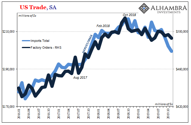
Head Fake Theory Confirmed?This is a brief update on our last overview of economic data. Although we briefly discussed employment as well, the overview was as usual mainly focused on manufacturing, which is the largest sector of the economy by gross output. |
|
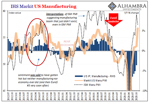
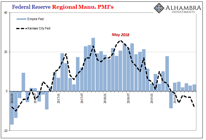
National ISM Manufacturing New Orders vs. Industrial ProductionReaders may recall that we have pointed out for some time that there was quite a large gap between the data reported in regional Fed manufacturing surveys and the national ISM survey. With the release of unexpectedly weak ISM data in August, this gap has begun to close noticeably (“unexpectedly” is meant to indicate that it wasn’t expected by the consensus of mainstream economists). Both manufacturing and services ISM data were weak, but we will focus on the manufacturing survey. Readers may recall a chart from our last update provided by our friend Michael Pollaro, which shows the behavior of the ISM survey’s new orders index vs. the annual rate of change of industrial production lagged by six months. Just prior to the last two recessions, the two data series developed in a manner that looked very similar to the recent pattern. In particular, there was brief recovery in new orders in both cases just before the economy fell into recession. Michael wondered whether the bounce in new orders in the ISM survey earlier this year was a comparable “head fake” in light of the weakness in most regional Fed surveys. Below is an updated chart that shows the current situation. Unless the August decline in the ISM survey is a fluke, it seems to lend support to the “head fake” theory: |
|
Money Supply Growth Remains StrongNaturally, there remains the caveat that money supply growth (in terms of the broad true money supply TMS-2) remains at a quite brisk 8.4% y/y as of July. The annual growth rate of M1 (an imperfect proxy for the narrow true money supply) has slowed again tough, after rising rapidly between February and May. In the post GFC cycle it has shown a tendency to lead TMS-2. We continue to believe that the money supply growth threshold that has to be undercut to trigger a bust is higher than used to be, but we can neither say what the precise level is likely to be, nor has this suspicion been proven yet. We believe this to be the case because the economic recovery has been and continues to be very weak, while structural economic imbalances keep growing due to loose monetary policy having been in place for such an unusually long time. |
 YoY growth rates of TMS-2 and M1 – click to enlarge. As of July, TMS-2 (black line) is growing at 8.4% y/y, and M1 (red line) at 6.3% y/y. Since the GFC M1 growth has tended to lead TMS-2 growth near inflection points, but the recent move is still too small to be meaningful (late last year it looked like a meaningful slowdown may be developing, but M1 growth accelerated again between February and May this year). |
Capital Goods OrdersWe want to show one more chart sent to us by Michael, namely the annual rate of change in new orders for non-defense capital goods (excl. aircraft) compared to unfilled orders and inventories. Growth of new orders for capital goods has been stuck in negative territory since late 2014, after fluctuating around the zero line over the preceding two years. It certainly looks like a rather persistent malaise. Some of this is no doubt tied to the energy sector’s problems, but the fact remains that readings like the current ones are usually associated with economic downturns rather than recoveries. In spite of the negative growth in this indicator (which is confirmed by negative growth in total business sales that has persisted since January of 2015), our chart depicting the ratio of capital vs. consumer goods production remains at a very elevated level. This shows that on a relative basis, too many factors of production are drawn toward the higher stages of the production structure – a nigh unavoidable effect of monetary pumping. We suspect that the longer this continues, the more serious the bust will be when it finally arrives. |
Year-on-year growth in new orders for non-defense capital goods (red line), unfilled orders (blue line) and inventories (gray area). This looks like a “slow motion recession”. |
Conclusion
The brief bounce in various manufacturing-related data since the beginning of the year seems to be over for the time being. Fed district surveys have weakened again (some of them quite sharply) and have now been joined by the ISM survey as well (the ISM August headline reading was below 50, which denotes contraction).
This is remarkable in view of the fact that TMS-2 is still growing at more than 8% year-on-year while lending to corporations remains the fastest growing type of bank credit. This confirms indirectly that much of the debt incurred by corporations is used for financial engineering purposes. All in all the US economy continues to look quite vulnerable to us.
Charts by: Michael Pollaro, St. Louis Feeral Reserve Research
Full story here Are you the author? Previous post See more for Next post
Tags: newslettersent,On Economy,U.S. Industrial Production (ZH),U.S. ISM Manufacturing PMI


