Marc Chandler
My articles My offerMy siteAbout meMy videosMy books
Follow on:LinkedINTwitterSeeking AlphaAmazon
 I was canoeing recently. When I looked that oar in the water, it looked bent. It wasn't my equipment, and I am a novice. I cursed to myself and quickly pulled the oar from the water. I smiled. It was not bent. It was an optical illusion.
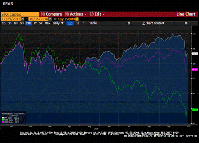
There is a chart that is making the rounds. It shows the S&P 500 moving in tandem with the Shanghai Composite. I have tried to recreate the Great Graphic on Bloomberg.

It does look like a good fit. but do no be misled. The two different scales can distort what is actually taking place. Sometimes it is helpful to have two scales for two time series. Context matters.
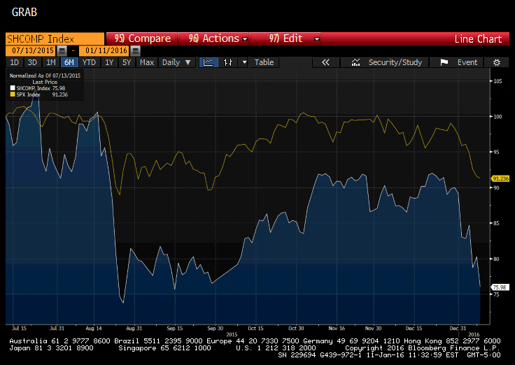
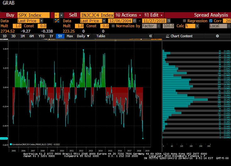
In this display of the data, which is used to make an argument, it appears the moves are of the Chinese and US stocks are similar.
This is not a particularly robust argument. It is comparing apples and oranges. To look at the data more rigorously, which as investors we want, the two-time series ought to be normalized. In effect both are turned into an index and start at 100. Here is what the two-time series really look like.
The starting point is the same--six months ago. It shows that when the Shanghai Composite fell 25% through late-August, the S&P 500 fell less than half as much. It shows that the S&P 500 retested that July high in October and November while the Shanghai Composite was unable to recoup much more than half of its decline.
More recently, while the S&p 500 has lost almost 10% from its recent peak, the Shanghai Composite has nearly twice as much. Correlation is one type of covariance of two-time series. It is a quantitative relationship that cannot be eyeballed. A graph of two variables with two scales can show nearly anything one wants. It is not very persuasive.
It is also true that the correlation is not very stable. Consider the 60-day rolling correlation of the value of the S&P 500 and the value of the Shanghai Composite. This correlation measure captures the directional co-movement of the two markets. It was above 0.87 as recently as s mid-December. The correlation fell to almost 0.3 as of the middle of last week.
The 30-day correlation risks too small of a sample size. The correlation was inverse for most of December and has shot up to almost 0.75 today. From late-August through early-October and then against in late-October and through the first part of November, the 30-day correlation of the level of the S&P and the level of the Shanghai Composite was above 0.8.
For investors, the correlation of the returns of both time series is more significant. This can be found by running the correlation on the basis of percentage change. Over the past sixty days, the correlation of the percentage change in the S&P 500 and the percentage change in the Shanghai Composite is near 0.21. It was stable a little above 0.4% from late August through most of November. It dipped into negative territory in early December before rebounding last week.
He has been covering the global capital markets in one fashion or another for more than 30 years, working at economic consulting firms and global investment banks. After 14 years as the global head of currency strategy for Brown Brothers Harriman, Chandler joined Bannockburn Global Forex, as a managing partner and chief markets strategist as of October 1, 2018.
Tags: Great Graphic