George Dorgan
My articles My siteAbout meMy videosMy books
Follow on:LinkedINTwitterSeeking Alpha
CFA SocietyEconomicBlogs
The U.S. housing market is the main driver for risk on/off movements and therewith implicitly of the gold price. We state charts, e.g. Shiller Home Price Index and U.S. New Home Sales statistics, arguments in favour of a housing recovery and the counter-arguments.
Most recently many asset managers moved out of gold (e.g. Pictet) The reason was that they believe in a sustained U.S. recovery based on more local oil production thanks to the new fracking techniques and in a recovery of the U.S. housing market.
Pictet did not mention that there is a third important reason: Due to less construction activities and funds leaving e.g. China and Brazil, GDP growth in emerging markets has slowed down and therefore global demand of oil and other commodities is weaker. Cheaper oil and gas prices, however, are good for the U.S. consumer and bad for the correlated gold price. On the contrary, Bernanke confirmed that QE3 is unlimited, which is again good for the gold price. When you read this article you will understand why the Fed thinks that U.S. housing needs unlimited assistance.
Take your time to scroll down to see also the counter-arguments from Hugh Smith and Chris Martenson.
Is U.S. Housing really Recovering?
Arguments from Global Economic Intersection,
an independent agency that evaluates U.S. home prices and sales.
February 25, 2013
Case-Shiller home price index has shown year-over-year price improvement for the last seven months. The National Association of Realtors and CoreLogic have reported year-over-year home price gains since April 2012. Note the caveats section at the end of this post.
S&P/Case-Shiller Home Price Indices Year-over-Year Change


New home sales data for January 2013 was definitely better than last month’s data. We are now seeing one terrible month, and one unbelievably good month.
- January 2013 was the best January since 2008;
- Last month’s data was terrible, and this month’s data is outstanding. Averaging out the data, the 3 month rolling average is at the levels seen in the last 12 months.
- The headline seasonally adjusted numbers say new home sales are up 15.6%, andEconintersect‘s analysis is even better.
Econintersect Analysis:
- sales up 22.3% month-over-month
- year-over-year sales up 34.8%.
- sales down 7.3% month-over-month
- year-over-year sales up 28.9%
- market expected annualized sales of 375K to 383K (actual was 437K – seasonally adjusted)
The quantity of new single family homes for sale is now well below historical levels.
Seasonally Adjusted New Homes for Sale

As the sales data is noisy (large monthly variations). The graph below shows the growth trend line although noisy appears to be flat.
Year-over-Year Change – Unadjusted New Home Sales Volumes (blue line) with zero growth line emphasized (red line)

The headlines of the data release:
Sales of new single-family houses in January 2013 were at a seasonally adjusted annual rate of 437,000, according to estimates released jointly today by the U.S. Census Bureau and the Department of Housing and Urban Development. This is 15.6 percent (±18.9%)* above the revised December rate of 378,000 and is 28.9 percent (±21.7%) above the January 2012 estimate of 339,000.
Unadjusted New Home Sales Monthly Volumes In Thousands

The median sales price of new houses sold in January 2013 was $226,400; the average sales price was $286,300.
Unadjusted Median New Home Sales Price

The seasonally adjusted estimate of new houses for sale at the end of January was 150,000. This represents a supply of 4.1 months at the current sales rate.
Seasonally Adjusted – Number of Months of Supply of New Homes at Current Rate of Sales

The unsold supply of new homes has returned to pre-crisis levels.
Caveats on Use of New Home Sales Data
This data is compiled by sampling, and historically has little revision. This data is based on contracts signed – not actual properties conveyed.
As in most US Census reports, Econintersect does not agree with the seasonal adjustment methodology used and provides an alternate analysis. The issue is that the exceptionally large recession and subsequent economic roller coaster has caused data distortions that become exaggerated when the seasonal adjustment methodology uses several years of data. Further, Econintersect believes there may be a New Normal seasonality and using data prior to the end of the recession for seasonal analysis could provide the wrong conclusion. (see Zerohedge’s critique).
Econintersect determines the month-over-month change by subtracting the current month’s year-over-year change from the previous month’s year-over-year change. This is the best of the bad options available to determine month-over-month trends – as the preferred methodology would be to use multi-year data (but the New Normal effects and the Great Recession distort historical data).
With new home sales at 25% of past rates, whatever your interpretation of the new home sales data is not significant enough to matter. Also the data is distorted by the first home buyer’s stimulus which required contract signing before 30 April 2010 – causing a data bubble and subsequent trough. In spite of Econintersect‘s reservations about the efficacy of seasonal adjustment at the present time, it is interesting to look at the deep history of the seasonally adjusted data.
The broad bottoming process for new home sales in 2010 may not be confirmed or denied for another year or more. The critical factor will be whether the one-year positive trend can continue as year-over-year comparisons will no longer be against the very low sales after the collapse of the tax credit stimulus micro-bubble.
The seasonally adjusted new home sales rate is the lowest it has been for 50 years and has been at that level for almost two years. At the beginning of 1963 the U.S. population was around 188 million. With annual new home sales averaging around 550,000 per year in 1963, the extreme depression in the new home market is evident. In 1963 the rate of new home sales was about 290,000 per 100 million of population. In 2011 the number is about 100,000 per 100 million.
It is more informative to look at these changes over the nearly fifty-year history. The following graph shows new home sales normalized to population from from St, Louis Fed:
Seasonally Adjusted New Home Sales Ratio to Population

The same data is plotted below to include the average for the entire period and two moving averages (graph updated through October 2011):
 The bottom line is that the new home market is in an extreme depression and the apparent bottoming process has been dragging on for two years, if in fact the bottom has been reached. Recent review of the Fed 2011 stress tests for banks has a new recession scenario that would see home prices decline another 20% from here. It is unlikely that the attempts to complete a bottom here could hold under those conditions. Econintersect analysis of recession indicators is still not seeing the start of new U.S. recession, however. We can only hope that outlook continues.
End of Extract From Global Economic Intersection
Counter-arguments from Chris Martenson and Charles Hugh Smith
Given the preponderance of housing in bank assets, household wealth, and the perception of wealth, the key policies of Central Planning largely revolve around housing: keeping interest rates (and thus mortgage rates) low, flooding the banking sector with liquidity to ease lending, guaranteeing low-down-payment mortgages via FHA, and numerous other subsidies of homeownership.
At least three aspects of this broad-based support are historically unprecedented:
1) The purchase of $1.9 trillion of mortgage-backed securities (MBS) by the Federal Reserve.
The Fed purchased $1.1 trillion in mortgages in 2009-10 and it recently launched an open-ended program of buying $40+ billion in mortgages every month. Recent analysis by Ramsey Su found that Fed purchases have substantially exceeded the announced target sums; the Fed is on track to buy another $800 billion within the next year or so. This extraordinary program is, in effect, buying 100% of all newly-issued mortgages and a majority of refinancing mortgages.
Never before has the nation’s central bank directly bought almost 20% of all outstanding mortgages this raises the question: Why has the Fed intervened so aggressively in the mortgage market? There is no other plausible reason other than to take impaired mortgages off the books of insolvent lenders, freeing them to repair their balance sheets.
Regardless of the policy’s goal, the Fed now essentially controls a tremendous percentage of the mortgage market….
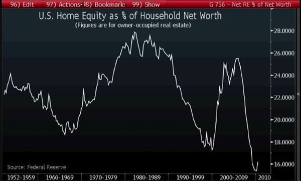
While housing has recovered to 2010 levels, what is not visible is the collapse in housing’s share of net worth displayed in this chart:
Are you the author?2) After the insolvency of the two agencies that backed many of the mortgages originated in the bubble years (Fannie Mae and Freddie Mac), the minor-league backer of mortgages (FHA) suddenly expanded to fill the void left by Fannie and Freddie.
Many of these mortgages require only 3% down in cash, just the sort of risky “no skin in the game” mortgages that melted down in 2008.
Given this mass issuance of low-collateral loans to marginal buyers, it is no surprise that the FHA will soon require a taxpayer bailout to cover its crushing losses from rising defaults.
In 2010, 97% (!!) of all mortgages were backed by government agencies, an unprecedented socialization of the mortgage market. (Source)
This raises two questions: Where would the mortgage and housing markets be if Central Planning hadn’t effectively socialized the entire mortgage market? What will happen to the market when Central Planning support is reduced?
The Foundation of Housing: Debt and Federal Subsidies
(..omitted..)
Housing equity as a percentage of total net worth declines when the stock market rises strongly while housing gains at a much lower rate (for example, during the Bull markets of 1952-1968 and 1982-2000) and rises as stock equity falls (for example, 1969-1981) while housing rose. In the 2001-2008 era, both equities and housing both climbed sharply, but since housing is the larger share of most households’ net assets, housing’s rise overshadowed the expansion of stock net worth, causing home equity to rise as a percentage of total net worth.
The collapse of the housing bubble and the stock market pushed home equity as a percentage of net worth to new lows. The subsequent doubling in the stock market has had little effect on the bottom 90% of households, as the top 10% of households own 85% to 90% of all stocks. (Source)
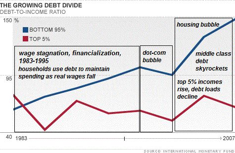
In broad brush, the wealth of middle class of homeowners has been influenced by four trends:
- The stagnation of real income
- A rapid rise in mortgage and other debt
- The use of debt to fund consumption
- The collapse of housing equity as the basis of debt-based consumption
In other words, Federal subsidies and Federal Reserve policies enabled a vast expansion of debt that masked the stagnation of income. Now that the housing bubble has burst, this substitution of housing-equity debt for income has ground to a halt.
This created a reverse wealth effect: The 70% between the bottom 20% and the top 10% have seen their net worth plummet while their debt load remains stubbornly elevated.
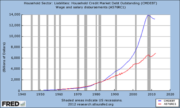
Americans saw wealth plummet 40 percent from 2007 to 2010, Federal Reserve says. (Source)
This chart is nominal rather than real (adjusted), but the relative expansion of debt is clearly visible:
Tags: home prices,U.S. Case Shiller Home Price Index (Macro)