Tag Archive: Great Graphic
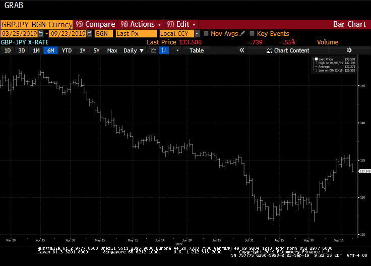
Great Graphic: Views Distill to Short Sterling Long Yen Opportunity
We have argued that the road to an orderly Brexit remains arduous and that sterling had entered an important technical area ($1.2500-$1.2530). At the same time, see the dollar as having approached the upper end of its broad trading range against the yen. One of the important drivers lifting the dollar was the dramatic rise in US yields.
Read More »
Read More »
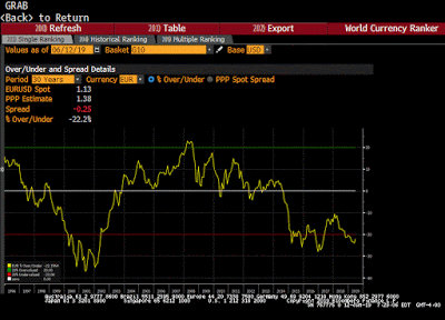
Great Graphic: Euro’s (OECD) PPP
US President Trump recently bemoaned the fact that the euro is undervalued. While his critics complain that he is prone to exaggeration, in this case, the euro is undervalued. This Great Graphic a 30-year chart of the euro has moved around its purchasing power parity as measured by the OECD. Currently, the euro is about 22% undervalued, and it has been cheap to PPP since for the past five years.
Read More »
Read More »
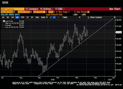
Great Graphic: The Dollar Index Climbs a Wall of Worry
To be sure, the Dollar Index is not the dollar. It is not even a trade-weighted measure of the dollar. Two of America's largest trading partners, China and Mexico, are not represented. It is heavily weighted to the euro and currencies that move in its orbit, like the Swiss franc Swedish krona, and arguably the British pound.
Read More »
Read More »
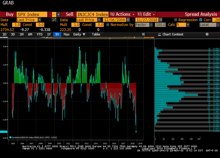
Great Graphic: Weekly Jobless Claims and the S&P 500
The softer than expected PCE deflator today plays into the dovish market mood. There may be little that can resist it until next Friday's employment data, which should be another robust report with hourly earnings holding above 3% year-over-year. Last November, average hourly earnings rose by 0.3%. As this drops out of the year-over-year comparison, even a healthy bounce back from the 0.2% drop skewed by the hurricane will be needed just to hold...
Read More »
Read More »
Euro and Yen Outlook
Broadly speaking, the risk is that the dollar's cyclical advance is not complete. The drivers will likely remain in place through at least the middle of next year. Additional gradual interest rate hikes by the Federal Reserve and a favorable policy mix underpin the dollar.
Read More »
Read More »
Great Graphic: What is Happening to Global Equities?
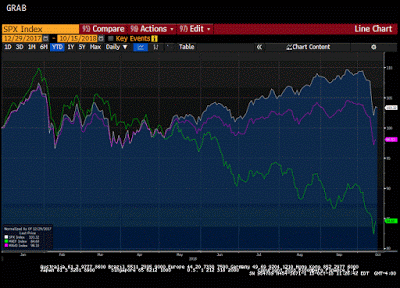
The decline in the global equity market is the most serious since the February and March spill. In this Great Graphic, the white line is the S&P 500. With the setback, it is up a little more than 8% for the year. It managed to recover fully from the sell-off earlier in the year.
Read More »
Read More »
Great Graphic: The Dollar’s Role
This Great Graphic comes from Peter Coy and team's article in Business Week. It succinctly shows three metrics for the internationalization of domestic currencies: global payments, international bonds, and foreign exchange reserves. It does not strike me as surprising, and the role of the euro as a payments currency reflects its role in intra-European trade.
Read More »
Read More »
Portfolio Re-Balancing and the Dollar
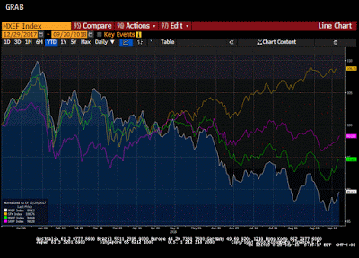
Boosted by tax reform, deregulation, and strong earnings growth, US equities have motored ahead, leaving other benchmarks far behind. As the Great Graphic here shows, most of the other benchmarks are lower on the year. The S&P 500 (yellow line) is up 8.8% for the year before the new record highs seeing seen now, while the Dow Jones Stoxx 600 from Europe (purple line) is still off 1.7%.
Read More »
Read More »
Great Graphic: Did the CRB Bottom?
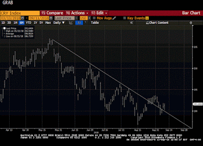
The CRB index has been trending lower since late May. It fell nearly 10% to retrace 50% of the rally come June 2017. This Great Graphic shows the 4 1/2 month trendline. It had been violated in late August but fell back under it at the end of last week.
Read More »
Read More »
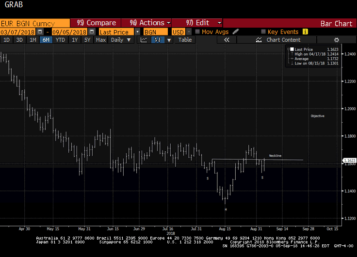
Great Graphic: Is that a Head and Shoulders Bottom in the Euro?
The euro recorded the low for the year so far on August 15 near $1.13. We had been anticipating a corrective phase for a couple days before the low was recorded. Recall that the previous Friday, August 10, all the major currencies, but the Japanese yen and Canadian dollar were beyond their Bollinger Bands. The euro recovered toward $1.1735 on August 28, stopping shy of our initial objective of $1.1750.
Read More »
Read More »
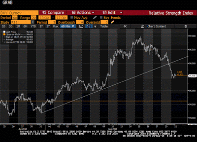
Great Graphic: Head and Shoulders Top in Dollar Index
This Great Graphic depicts what appears to be a head and shoulders top in the hourly bar chart of the Dollar Index. The neckline is found near 96.00 and rotating the pattern along it produces a measuring objective near 95.00. The bearish pattern was formed in the last few days, and the Dollar Index was resting near the neckline before Trump's comments gave it the push.
Read More »
Read More »
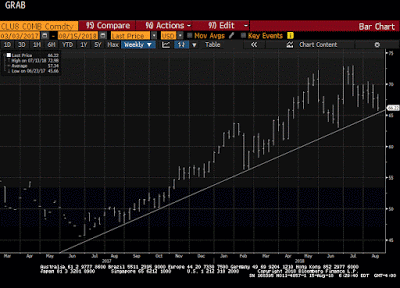
Great Graphic: Crude Approaches Year-Old Trend Line
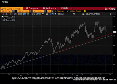
Crude oil has been climbing a trendline for the past year. This Great Graphic depicts this trend on a weekly bar chart. Depending exactly the line is drawn, it comes in now near $65 a barrel. The technical indicators are consistent with further losses.
Read More »
Read More »
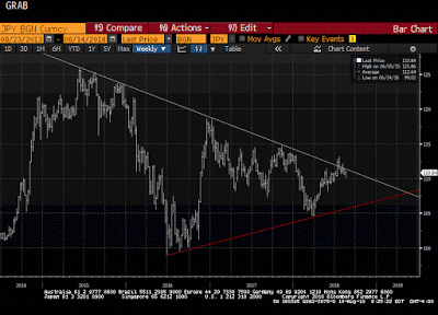
Great Graphic JPY Struggles at Trendline
This Great Graphic is a weekly bar chart of the dollar-yen exchange rate. It shows a three-year downtrend line (white line). The US dollar had popped above it last month, but this proved premature and has not closed about it for a month. The trendline is found near JPY111.55 now.
Read More »
Read More »
Great Graphic: Possible Head and Shoulders Top in Euro
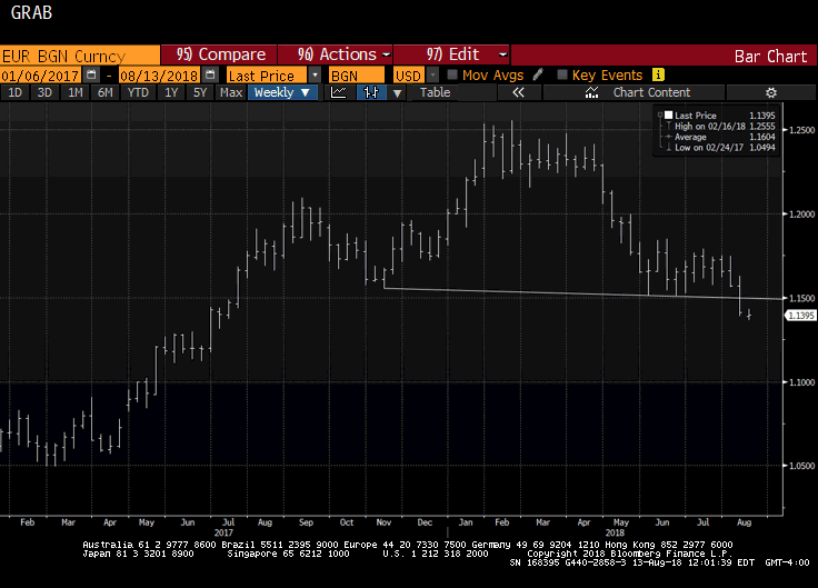
The euro appears to have carved out head and shoulder top. As this Great Graphic depicts, the euro was sold through the neckline at the end of last week and is 1% below it today. It is not unusual for the neckline to be retested. It is found near $1.15. It also dovetails with our near-term caution given that the euro is likely to close below its Bollinger Band for the second consecutive session (~$1.1440).
Read More »
Read More »
Some Initial Consequences of Trade Tensions
The Trump Administration argues that other countries have been taking unfair advantage of the US on trade for years, and what many are calling a trade war is really only the US finally saying enough. The US has taken many several countries, including China, to the WTO for trade violations and wins the vast majority of cases it has brought.
Read More »
Read More »
Great Graphic: Is Something Important Happening to Oil Prices?
Oil prices are weaker for the third straight day and are off in four of the past five sessions, the poorest run in two months. Supply considerations may threaten a year-old trend line. OPEC and non-OPEC, essentially Saudi Arabia and Russia are making good on their commitment to boost output, and US oil inventories unexpectedly rose.
Read More »
Read More »
Great Graphic: USD Pushes Below CAD1.30
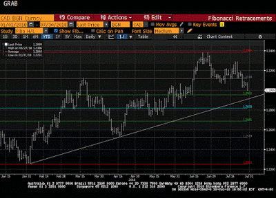
For the first time since mid-June, the US dollar has traded below CAD1.30. The greenback is weaker against all the major currencies. However, for the most part, it is still in well-worn ranges, which makes the breakdown against the Canadian dollar even more notable. It is not clear that today's break will be sustained. Indeed, we lean against it.
Read More »
Read More »
Great Graphic: US 2-year Premium Grows and Outlook for G3 Central Banks
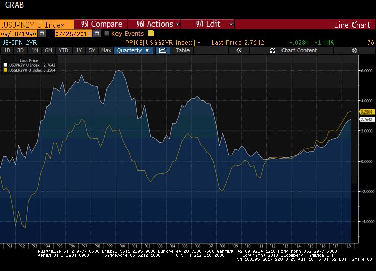
A cry was heard last week when President Trump expressed displeasure with the Fed's rate hikes. Some, like former Treasury Secretary Lawrence Summers, claimed that this was another step toward becoming a "banana republic." Jeffrey Sachs, another noted economist, claimed that "American democracy is probably one more war away from collapsing into tyranny."
Read More »
Read More »
Great Graphic: Is the Euro’s Consolidation a Base?
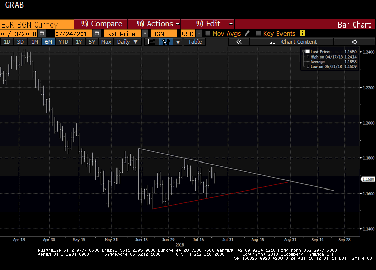
Speculators in the futures market are still net long the euro. They have not been net short since May 2017. In the spot market, the euro approached $1.15 in late-May and again in mid-June. Last week's it dipped below $1.16 for the first time in July and Trump's criticism of Fed policy saw it recover. Yesterday it reached $1.1750 before retreating. On the pullback, it held the 61.8% retracement of the recovery (~$1.1640).
Read More »
Read More »
Great Graphic: Fed Raising Rates, but Yields Still Negative
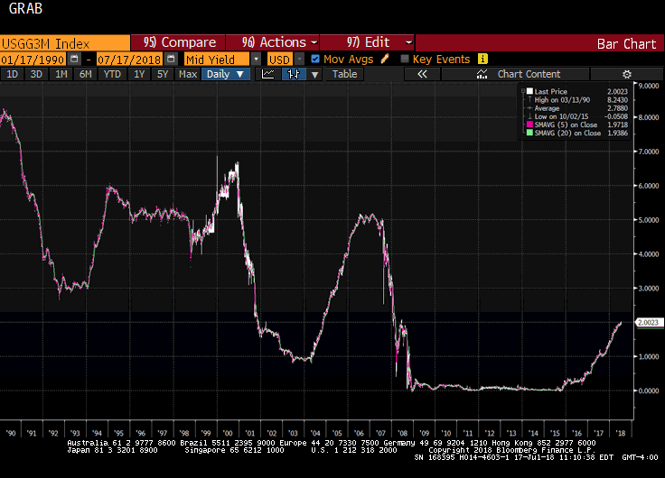
The yield on the 3-month US Treasury bill is pushing above 2% today for the first time since 2008. The yield had briefly dipped below zero as recently as late 2015. Although today's yield seems high, this Great Graphic shows the nominal generic three-month yield going back to 1990. Then the three-month bill yielded 8%. The peak in the last cycle (2006-2007) was a little above 5%.
Read More »
Read More »


