Iffy Looking ChartsThe stock market has held up quite well this year in the face of numerous developments that are usually regarded as negative (from declining earnings, to the Brexit, to a US presidential election that leaves a lot to be desired, to put it mildly). Of course, the market is never driven by the news – it is exactly the other way around. It is the market that actually writes the news. It may finally be time for a spanking though. |
|
| Now that we have said this, we have probably jinxed it for the bears, as the market may resolve to go straight up. Still, we had so say something, simply because we don’t like the look of the charts below. They look iffy, and it probably won’t take much for an unraveling to get going.
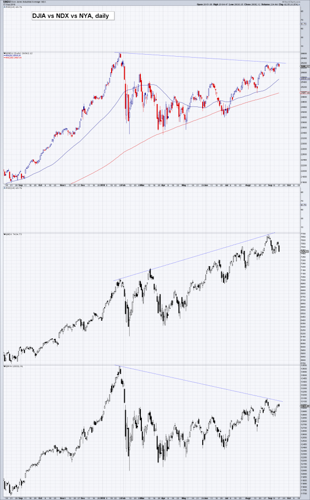
Admittedly, Thursday’s daily candle looks like another short term reversal is in the works. On the other hand, both the S&P 500 Index and the Dow Jones Industrial Average have broken out to the downside from the triangles they have recently built. If we were long this market, we wouldn’t like the looks of this even if another short term reversal were to occur: |
S&P 500 and DJIA – we think this doesn’t look particularly good. Ever since suffering a bad hair day in early September, the market has meandered in a tight range, building a triangle a little below the immediately preceding trading range. It has now broken slightly below the triangle’s lower boundary. The break is not yet decisive, but we have a feeling the calm may be deceptive. |
| Since speculators hold enormous short positions in VIX futures, volatility ETFs like VXX are home to staggering short positions as well (occasionally even exceeding the number of outstanding shares) and a lot of systematic trading is in fact tied to the behavior of volatility measures, one always needs to keep an eye on the VIX and other volatility indicators. Similar to the indexes, the VIX has recently produced a (so far tentative) breakout of its own: |
The VIX has been moving up lately and is approaching a first major level of “resistance”, indicated by the blue dotted lines (we are not sure such terms are really applicable to volatility measures, but then again, the VIX is a tradable instrument). If the VIX were break above the 20-21 area, it would likely lead to an increase in selling pressure from volatility targeting systematic strategies. The more important zone of resistance is the one above that though, between 26-28. Traders should make a note of these levels. The red dotted lines indicate the recent “mini breakout” level. |
| Lastly, here is an updated chart of sentimentrader’s “smart/dumb money confidence spread”. This indicator is calculated based on the positioning data of different groups of traders, which are designated “smart” or “dumb” based on what is known about their historical timing skills.
As you can see, there is a certain pattern observable near extreme lows in the indicator and market peaks: first, the spread makes a low, then the indicator begins to move up and the market peaks with a lag. Shortly thereafter, the market usually tends to suffer a sharp short term decline. |
The smart/dumb money confidence spread. What we wanted to show here is that after the spread reaches an extreme low (=extreme dumb money confidence), there tends to be a variable (but often quite short) time lag between that point in time and the next short term market peak. |
Conclusion
The data in this post are all from Thursday’s close, so by the time you read this, things may already look quite different again. Our general point should nevertheless survive: even if the market bounces back into the trading range defined by the triangle boundaries, it will remain quite vulnerable. From a technical perspective, this will only change once it manages to exceed its previous highs.
We think it is actually time for the market to at least deliver a little scare – as we have noted previously, there is a lot of complacency out there (see “Bubble Dissection” for the details). In particular, holding cash reserves is extremely unpopular at the moment, while leverage is near historical extremes. There is obviously very little concern about the market’s downside potential and that is usually the time when the market likes to remind people that it still exists.
Charts by: StockCharts, SentimenTrader
Full story here Are you the author? Previous post See more for Next post
Tags: newslettersent,The Stock Market


