Jeffrey P. Snider
My articles My offerMy siteAbout meMy videosMy books
Follow on:LinkedINTwitterSeeking Alpha
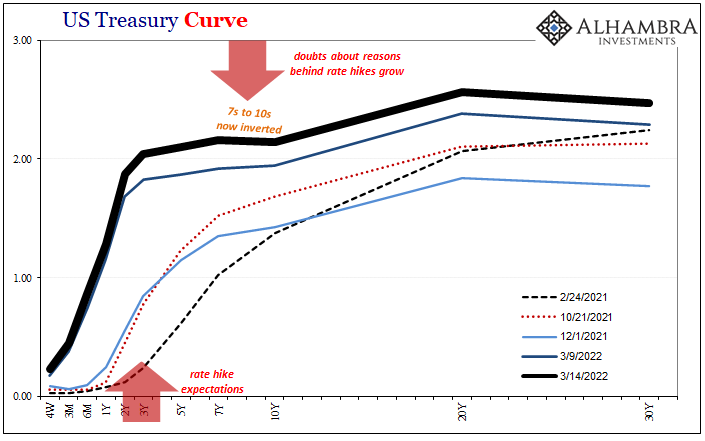
| With the 7s10s already inverted, and the 5s today mere bps away, making a macro case for the distortion isn’t too difficult. Despite China’s “upside” economic data today, even the Chinese are talking more about their downside worries (shooting/hoping for “stability”) than strength. In the US or Europe, no matter the CPIs in either place there are cyclical (not just inventory) warning signs all over the place.
Aside from these economic concerns, is there a pure money case to be made for these curves, the yield curve, weirdly-shaped as it is, along with the very heavy inversion to eurodollar futures? |
 |
| Deflationary potential ever since the first crisis back in 2007 has largely been about collateral, first starting as scarcity and then if left unchecked becoming a destructive shortage. It would make sense, therefore, if we’re looking for that potential to do so from the collateral frame of reference.But apart from T-bill yields as they might relate to RRP or similar, what other kind of evidence can we find for collateral scarcity, perhaps worse? Repo fails is one, though less of one since 2018.
Fortunately, there are other data points we can use to partially (anyway) uncover the shadow collateral environment, two series in particular provided to us by, believe it or not, our good friends at the Federal Reserve. The “central bank” keeps tabs on triparty repo reported to them by dealers in addition to its own securities lending practices. Beginning with the latter, the Fed does lend securities (mostly USTs) from SOMA out to dealers (for a fee). Unless you work at the Federal Reserve, no surprise there’s a pretty solid relationship between the level of business at their securities lending window and what we can identify in markets and other data as collateral problems (which makes this all the more frustrating how policymakers flat out refuse make use of their own data). |
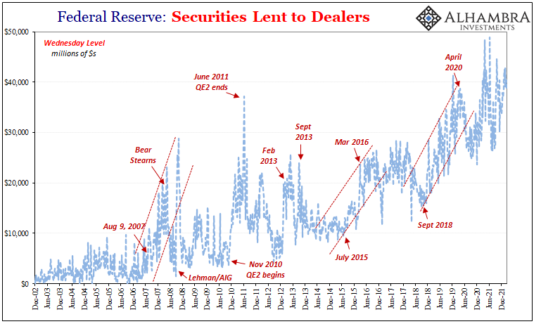 |
| It’s not a perfect one-to-one, but bears more than a passing resemblance to periods of shortages and correlates closely enough with them.
To begin with, securities lent to dealers before around late July 2007 was practically nothing. Suddenly, around August 9 (again, there aren’t any coincidences here), dealers turned more and more to the Fed as collateral chains collapsed around them. By the time Bear Stearns would get knocked out (by a collateral call, of course) in March 2008, desperate dealers had borrowed about $20 billion in SOMA stuff. Unheard of – for the time. This was by no means sufficient to close the massive collateral chasm in the marketplace, but it shows just how bad conditions had become that dealers were left with few options apart from this one they’d much rather avoid. As if to punctuate the matter, securities lending would spike from the week Lehman/AIG hit the tape in mid-September 2008 until the end of that October – the same time, you’ll note, as the worst global monetary panic since the Great Depression (also, importantly, the same time as bank reserves skyrocketed uselessly, too). In November 2010, from the moment QE2 began buying up USTs all the way until QE2 ended at the end of June 2011, dealers were borrowing collateral back from the Fed as QE2 had stupidly removed a huge chunk of available securities (including on-the-run). Euro$ #2 would sadly begin during these same months (to be clear, I’m not claiming QE2 caused Euro$ #2, but it left the system far more fragile for when it did happen). |
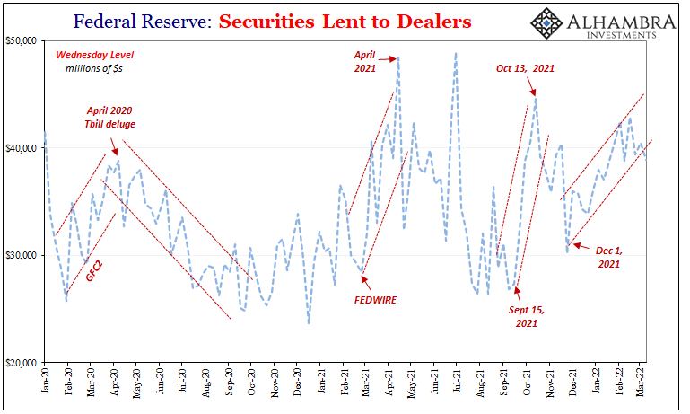 |
| Collateral problems were indicated in February 2013 (when yet again the Fed, now QE4, was buying up on-the-run USTs) and then again later in the year, particularly August and September (when eurodollar futures would stop “celebrating” and start pricing for what would become Euro$ #3).
Another sharp spike in securities lending activity by the summer of 2015 into 2016, which included August 2015 and the dollar shortage-inspired crash in CNY and the rest of the worst of Euro$ #3. Despite a deluge of Tbill issuance to begin 2018, by September there was another noticeable uptick, larger than anything before, in dealers scrambling to secure collateral by borrowing it from the Fed. That year’s landmine followed closely afterward, taking place entirely during the sharp break upward shown above. To sum up: the more desperate dealers are for collateral, the more they will hold their noses and go begging at the Fed’s window. Doing so never solves the private market’s shortage, rather it ends up being another solid indication of how bad that shortage must have become. Focusing in on the past couple years, and again the trends match other data. First a slight rise in Fed securities lending during GFC2 (why wasn’t it so much more? Save that for another time), then falling sharply after another Tbill deluge beginning April 2020, the latter the natural response to the massive fiscal deficit created by the CARES Act. More relevant to our current position, and curve shapes, Fedwire. Yet again, late February 2021 spilling over into March. |
 |
| In the aftermath of that accidental trip and then the immediate consequences from it in the “bad” 7-year note auction the following day, as nominal Treasury yields topped out in March there was a serious increase in collateral borrowing from the Fed at the same time; as repo fails jumped, too. |  |
| The same would repeat in tandem September and October 2021, followed by the final jump in dealers borrowing SOMA securities which began the week of December 1 – yep, the very same when eurodollar futures first inverted.
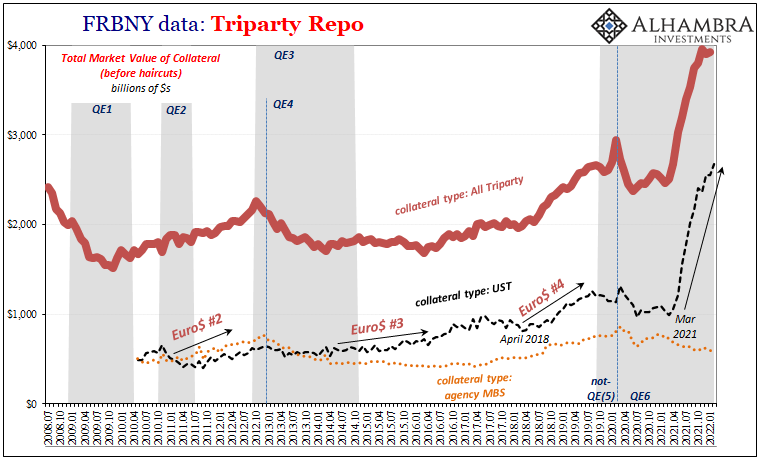
From the perspective of this Federal Reserve data – its own activity! – there are these consistent indications of collateral scarcity/shortage which might in good part be behind the ugly and odd curve shapes. Compelling enough on its own, but this is just another piece of overwhelming market and data evidence for deflationary potential: others include more Fed-collected data such as USTs owned by foreign official holders but in custody of FRBNY which tend to “disappear” whenever these collateral shortages show up. Also swap spreads, even the US$ exchange value itself. Tomorrow, I’ll go over the second data of the Federal Reserve’s collateral series – triparty repo. Wouldn’t you know it, this one more than hints at huge demand for USTs going back to…March 2021. |
 |
Tags: Bonds,collateral,collateral scarcity,collateral shortage,currencies,economy,Featured,Federal Reserve/Monetary Policy,federal-reserve,Markets,newsletter,repo,Securities Lending,U.S. Treasuries,Yield Curve