We have been writing on the flaws in GDP: that it is no measure of the economy, because it looks only at cash and not the balance sheet, and that there are positive feedback loops.
“OK, Mr. Smarty Pants,” you’re thinking (yes, we know you’re thinking this), “if GDP is not a good measure of the economy, then what is?!”
The National Balance Sheet
In the first part of this series, we introduce some concepts from accounting: cash basis and balance sheet. This approach would logically suggest that we look at the national equity account. Any accountant can tell you that assets = liabilities + equity. Or, to restate it, equity = assets – liabilities. So in this approach, we should add up the value of the assets. That is daunting, but it should be possible for a government agency with sufficient resources. And add up all the liabilities, which should be easier.
There’s just one problem. What do we mean by the value of the assets? They are constantly going up, in the regime of falling interest rates since 1981 (the asset price is inverse to the interest rate, a topic we’ve addressed in other articles). We have this problem even if we look at the proper book value, i.e. the price paid by each owner and not mark-to-market.
It is important to realize that when interest drops, assets are revalued higher by a process of arbitrage. That is, their prices go up. However, this gain is illusory. There is not more capital, or wealth created. The central bank cannot print wealth, but it can make asset prices go up.
This dooms any attempt to use this accounting identity to measure the economy.
The Fed is Not in Control Either
As an aside, we should make it clear that the central bank has less control than it seems. A case in point is occurring right now. The interest rate on the 10-year Treasury has had an epic collapse. In about 8 months, it has lost almost 40%, going from 3.2% to 2%. However, during this time the Fed has held to a posture of possible rate hikes.
The Fed Fund Rate, meanwhile, has held steady around 2.4%. So the overnight rate dictated by the Fed is above the rate set in the market (such as it is) on the 10-year bond. While the Fed might like to hike rates (inflation expectations, full employment, blah blah blah), the market is pushing in the other direction. The market will win.
One can think of the falling interest rate as the juice being sucked out of the economic corpus, like a vampire sucking blood from a living person. Something is going away, and as it does, the demand for credit (and capacity to service debt) goes with it. The net result is that demand for new credit is soft, except on a downtick in interest rates.
This comes back to Keith’s theory of interest and prices. The falling cycle (interest and prices) occurs when interest > marginal productivity. This is what it looks like. When the rate drops, it gets below some businesses’ threshold and they borrow. Unfortunately, they use the borrowed funds mostly to increase capacity and thus push down productivity of capital further. It’s a ratchet.
Untangling Positive Feedback
Moving on to the second part, we look at a few positive feedback loops. That is, GDP begets GDP. Consumers borrow to go on a vacation, and the cash they borrow (which is somebody else’s wealth) goes to airlines, hotels, restaurants, and casinos as revenues. They in turn by airplanes, beds, stoves, and ceramic chips. Those companies receive revenues, and so on. There are other feedback loops too.
This suggests an idea. What if we could separate out consumption fueled by income vs consumption fueled by borrowing? Conceptually, that would be elegant. It would give us a measure not subject to the monetary debasement of the central planners.
However, there is no way to do this. As we saw in the second part, there are multiple positive feedback loops, and they are tangled together.
There might be another way. As we said above under the Fed is Not in Control, the juice is being sucked out of the economy. Its capacity to service the debt—i.e. pay interest—diminishes as the national balance sheet is depleted, as people borrow to consume, that is consume capital.
The interest rate itself might be a good starting point. As it falls, it is telling us about the increasing scarcity of capital. But unfortunately, there is a rising cycle too. When interest is skyrocketing, that does not mean the economy is growing, it simply reflects the harm of the central bank via a different ratchet effect. So we cannot use the interest rate itself as a measure.
Marginal Productivity of Debt
So how do we synthesize these ideas into a measurable number?
Although there may be more and more dollars’ worth of capital (due to falling interest rates), real wealth is actually diminishing as it is consumed. People may borrow to consume, but each iteration of the process will generate less GDP. Each squeeze of the capital base, will extract less juice.
This brings us back to a concept we’ve discussed extensively in the past: Marginal Productivity of Debt (MPoD). Now, we look at it again under a different light.
To recall, MPoD tells us how much GDP is added by each freshly-borrowed dollar. If we borrow $10,000 to pay for a Vegas vacation, that adds $10,000 to GDP (and more via the various feedback loops discussed previously). However, once borrowed and spent, the debt remains as a drag, a dead weight.
For example, if Johnny Fastlane borrows another $1,000 to pay the interest on the $10,000, that does not add to GDP. If Bacchus Feast borrows $1,000,000 to expand and attract more customers like Mr. Fastlane, that adds $1,000,000 to GDP. However, particularly as Mr. Fastlane bogs down with his debt service, Bacchus and its competitors soon realize that there is not a growing number of diners. The extra capacity serves, not to add more customers, but to bring margins down.
By these and many other mechanisms, the GDP juice squeezed out of each new borrowed dollar diminishes. An extra bonus, GDP might be expected to grow if the population grows, but MPoD removes this from consideration. It shows us—especially over longer periods of time—something much closer to the real picture of growth or shrinkage of the productive capacity of the economy.
If the juice is indeed being sucked out of the economy, we should expect to see that in the measure of how much juice we get per dollar of squeeze.
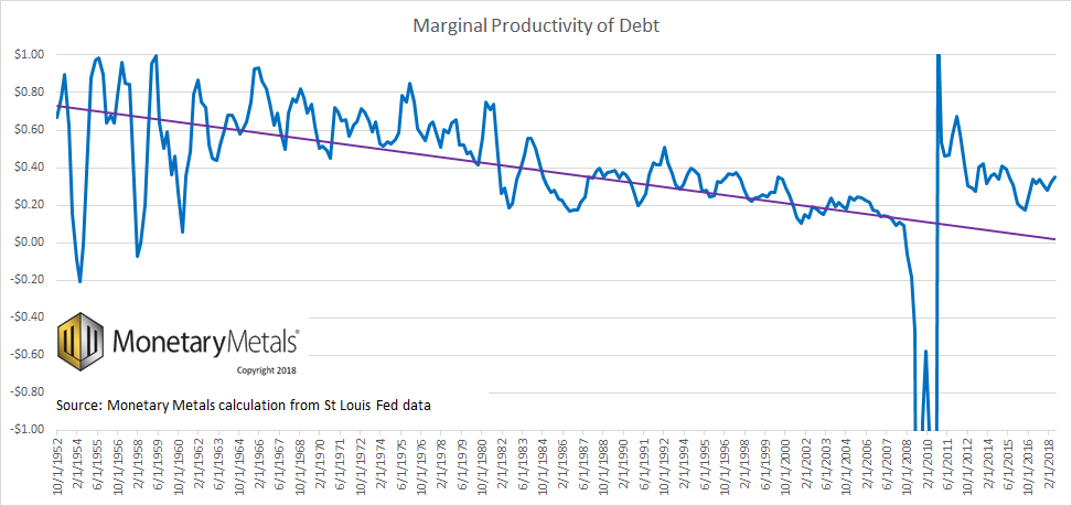
| Here is a graph we printed in March (not updated, due to Keith’s travel schedule).
It paints a bleak long-term picture, as the graph goes back many decades (the oldest data set we can find begins in 1950). Ignoring here (we have discussed it in the past) the incredible anomalies around the global financial crisis, we can see that despite the incredible growth in GDP—it’s grown about 50% since the depth of the crisis—debt has at least kept pace with it, if not gotten ahead of it. Going forward, if we had to bet on GDP racing ahead of debt or debt reasserting itself again, our money would be on the debt. |
Marginal Productivity of Debt, 1952-2018 |
Inconvenient Truth
It is a curious that, if you Google the term “marginal productivity of debt”, our articles dominate the first page of search results (including syndication on other sites). We did not coin the term or develop the concept. It has been around a long time. Keith Weiner is not the biggest or most famous name in economics. What gives?
MPoD is telling a story that is not in tune with the message (we can think of less kind words than this) promoted by the government and mainstream media. The monetary system is failing. Those who finance, own, and pilot the RMS Titanic do not wish to think that their ship is headed for the iceberg of capital depletion. Those who are employed in the lucrative field of deck-chair rearrangement do not wish to be reminded that their efforts are for naught.
Politicians tinker with spending at the margin. The Fed plays at setting the interest rate. Economists debate the rules by which the Fed plays. Critics of the regime fret only about the inflation so called that we are not having.
But the real story is writ large on that chart. It is an unpleasant one. It allows us to predict years in advance the catastrophe that, when it happens, they will say “no one could have predicted it”.
This is why we are doing what we are doing. To try to avert this coming Armageddon. It cannot be averted so long as we retain the irredeemable dollar. The only way to avert disaster is to transition to the gold standard. The only way to transition is to draw gold out of private hoards. And the only way to do that is to pay interest.
Supply and Demand Fundamentals
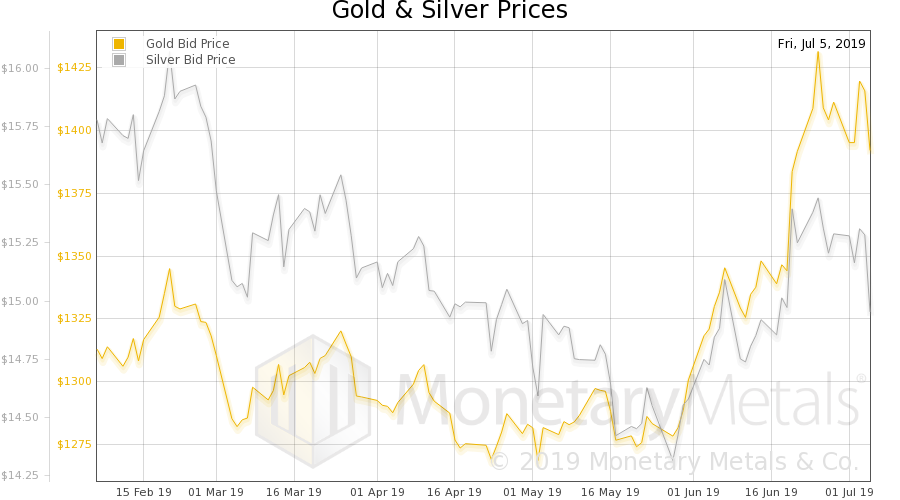
The prices of the metals fell, with that of gold -$9 and silver -$0.32. Of course, it was a week of stock market exuberance. Why would anyone want to own money, or seek safety when the Fed can seemingly push interest down / assets up indefinitely? As the old TV ad for Lotto proclaimed “you gotta be in it, to win it!”
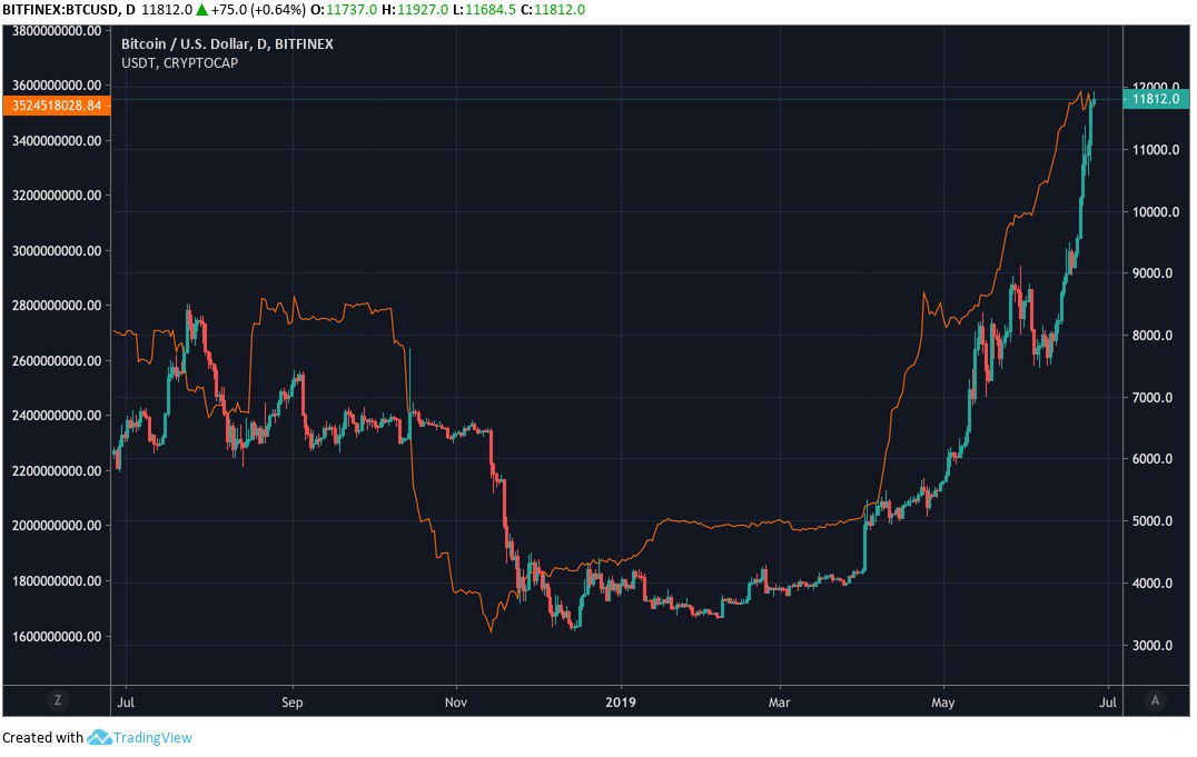
| In the meantime, we saw a fascinating graph comparing the bitcoin price to the market cap of USD Tether. We are not entirely sure what to make of it, but it suggests that the more dollars which pour into tether, the more the price of bitcoin is pushed up.
Now, we are not experts in the mechanics of bitcoin much less Tether. But this does not strike us as organic demand for bitcoin, based on growing evidence that bitcoin will become money. It smells to us like either some kind of arbitrage, or like a way to use Tether as a cheap way to fund a speculation. This is a question that will most likely have to be answered by the Bitcoin and Tether Supply and Demand Report. In other news, Deutsche Bank is laying off 18,000 people and restructuring. Other layoffs are surely coming to other major corporations, not to mention the perennial money-losing enterprises. Will this be the signal for everyone to pile into gold and silver again? One reason for caution is the incredible switch from depression to mania in the space. Nearly everyone is convinced this is the breakout. That gold is going to rocket higher. Where is that wall of worry that bull markets, especially in the early stage, are supposed to climb? On the other hand, as of the previous Report, the fundamentals of gold—if not silver—kept getting stronger. Monetary Metals is excited to be bringing the first gold bond to market. Please contact us if you are interested in investing. |
Bitcoin / USD(see more posts on BTC-USD, ) |
Gold and Silver PriceNow let’s look at the only true picture of supply and demand for gold and silver. But, first, here is the chart of the prices of gold and silver. |
Gold and Silver Price(see more posts on gold price, silver prices, ) |
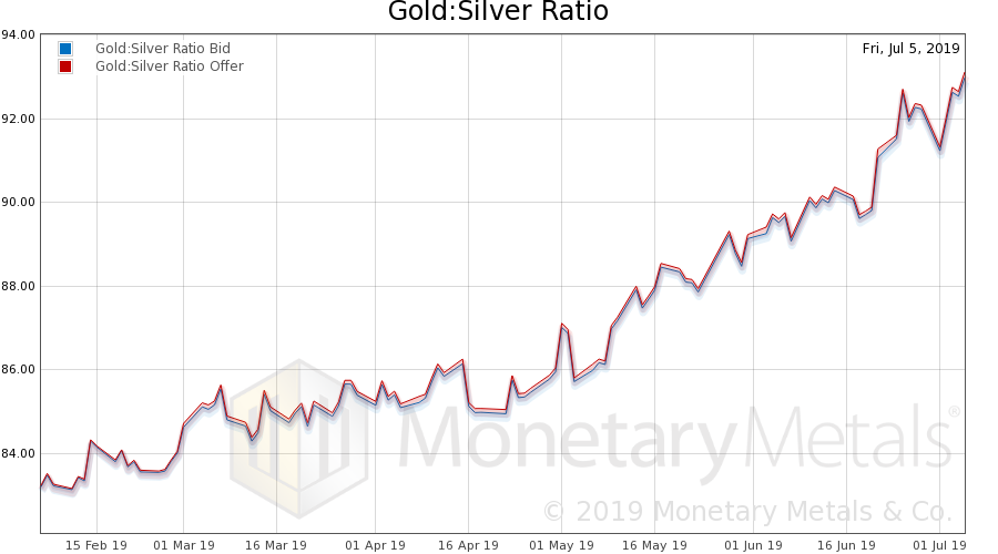
Gold: Silver RatioNext, this is a graph of the gold price measured in silver, otherwise known as the gold to silver ratio (see here for an explanation of bid and offer prices for the ratio). The ratio rose further. |
Gold: Silver Ratio(see more posts on gold silver ratio, ) |
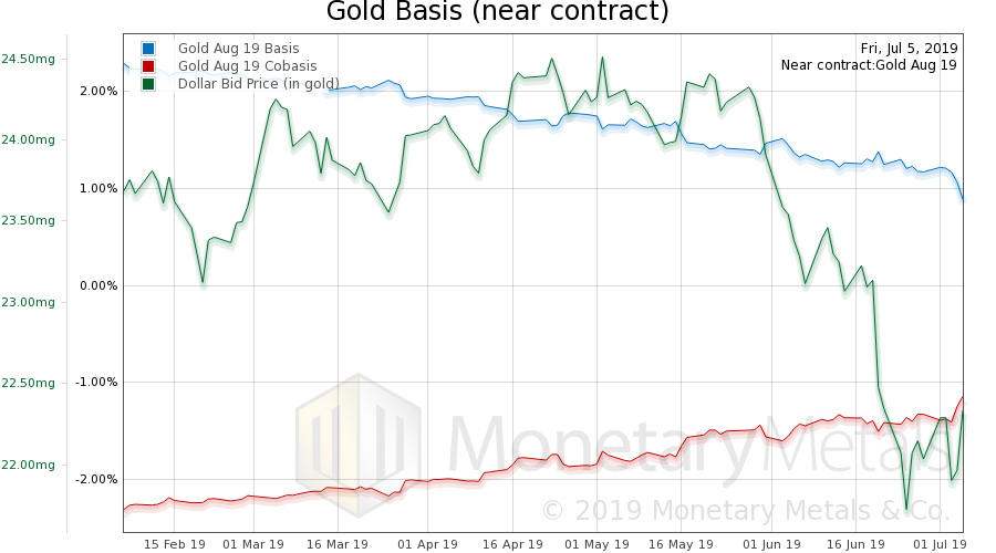
Gold Basis and Co-basis and the Dollar PriceHere is the gold graph showing gold basis, cobasis and the price of the dollar in terms of gold price. There we see an upturn in the scarcity of gold (i.e. cobasis) as the dollar strengthens (i.e. the price of gold, in dollars, drops). But not that much. The Monetary Metals Gold Fundamental Price fell $43 to $1,419. |
Gold Basis and Co-basis and the Dollar Price(see more posts on dollar price, gold basis, Gold co-basis, ) |
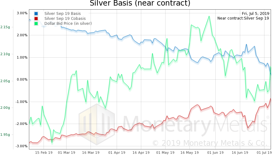
Silver Basis and Co-basis and the Dollar PriceNow let’s look at silver. With silver, we can see the scarcity continuing to follow the dollar price. That is, silver becomes scarcer when it sells, and more abundant when it is bid up. The Monetary Metals Silver Fundamental Price fell back 30 cents to $15.44. Although the market gold-silver ratio rose, the Monetary Metals calculated fundamental gold-silver ratio fell a point to 91.9. |
Silver Basis and Co-basis and the Dollar Price(see more posts on dollar price, silver basis, Silver co-basis, ) |
© 2019 Monetary Metals
Full story here Are you the author? Previous post See more for Next postTags: Basic Reports,BTC-USD,capital consumption,dollar price,GDP,gold basis,Gold co-basis,gold price,gold silver ratio,marginal productivity of debt,newsletter,silver basis,Silver co-basis,silver prices


