| Every year, Ronald-Peter Stoeferle and Mark J Valek of investment and asset management company Incrementum put together the report In Gold We Trust – 160-plus pages of charts and thoughts, mostly gold-related, on the state of the world’s finances.
There’s so much to look at and consider. It’s a sort of digital equivalent of a coffee-table book. Yesterday I got an email from them, containing a “best of” – a compendium of some of the best charts from this year’s report. I thought in today’s Money Morning, we might flick through some of them… Commodities are very cheap compared to stocksFor those of you who have been, like me, despairing of the gold price these last five years, this first chart shows the average annual price of gold for each year. Suddenly the last five years don’t feel quite as bad. In the mid-$1,200s is sort of normal (since 2008, at least). |
Average Annual Gold Price in USD, 1971 - 2017(see more posts on gold price, )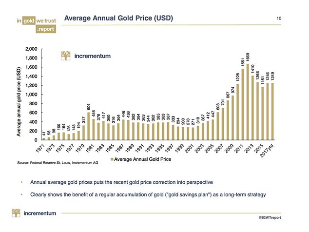 - Click to enlarge |
| This next chart got me very excited. It shows the ratio of the Goldman Sachs commodities index to the S&P 500 – the ratio of commodities to stocks, in other words.
Commodities are as cheap on a relative basis as they were in the late 1990s and at the beginning of the 1970s. In other words, very cheap indeed. I’m quite bullish on industrial metals and energy at present. I think such “late cycle” assets will do well in a stock bull market which is mature and, probably, a lot closer to the end than the beginning of its cycle. I don’t, however, think that commodities are the irresistible bargain they were in 1999. The chart above, however, would suggest otherwise. It is screaming, “buy commodities, sell stocks”. The inference is that there is some inflation around the corner. |
GSCI / S&P 500 Ratio, 1971 -2017(see more posts on S&P 500, )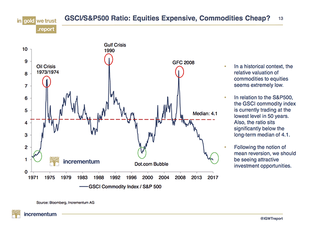 - Click to enlarge |
Could a US recession be around the corner?Here’s one for the contrarians: in a recent Bloomberg survey, not one economist out of 89 expects a US GDP contraction in 2017, 2018 or 2019. Meanwhile the Vix (the index of volatility) is at all-time lows. There is, in short, a heck of a lot of complacency out there. |
Expected GDP Growth, 2017 - 2019(see more posts on U.S. Gross Domestic Product, )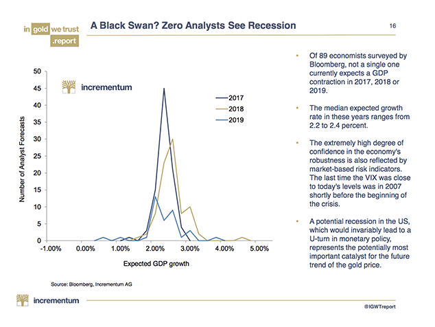 - Click to enlarge |
| Are we now in a rate-hiking cycle? In the US we seem to be, even if interest rates now stand at only 1.25%. The Bank of England meets next week. Inflation, as judged by the Consumer Price Index (CPI) – the Bank’s target measure – came in at 3% yesterday, the last report before the Bank’s meeting. Surely even Mark Carney has to put up rates now.
That could be a significant turning point. According to this next chart, 16 of the last 19 rate rise cycles have led to recessions. |
US Recessions and Effective Federal Funds, 1914 - 2014 - Click to enlarge |
| That doesn’t necessarily mean that interest-rate rises cause recessions – often it’s the over-expansion caused by the loose monetary policies which preceded the rate rises – but nevertheless there does seem to be some kind of relationship. Perhaps more rate rises could result in the recession that nobody is forecasting.
Following on from that, the next chart hints that all is not as well with the economy as we might believe. As someone who did a show at the Edinburgh Festival on tax and is now writing a book on the same subject, any cool tax charts are bound to get the blood flowing, and this is no exception. The S&P 500 may be rising – but gross tax revenues aren’t. The amount of tax being paid, whether on a personal or corporate level, is indicative of how much people are earning and how much economic activity is taking place. Tax receipts are in decline. The omens are not good. You could draw the same chart for net corporate tax receipts. The pattern is the same. It’s another hint that the economy is not faring quite as well as the stockmarket suggests it is. |
S&P 500 vs Gross Tax Receipts, 2005 - 2017 - Click to enlarge |
What if gold were money again?Finally some charts for the hard money advocates. The first shows, basically, the ratio of the money supply – ie, the amount of money that has been printed – compared to savings. The higher the blue bar, the less money is being saved. If the narrative of this chart is believed, this is not going to end well – although I stress that you could have made the same point in 2014, 2015 and 2016 , so perhaps we will be making the same observation for another three years. Lastly, some simultaneously sensible yet ridiculous projections of the gold price in the future. During the 1980 Iranian hostage crisis, gold went to $850 an ounce – for a day. On that day – 21 January – the US dollar was, effectively, fully backed by gold. At $850 an ounce, the market value of the 260 million ounces of gold owned by the US and mostly stored in Fort Knox (don’t mention the audit) reached $221bn. Yet only some $160bn paper dollars were in issue. |
U.S. Money Supply vs Savings Ratio, 1964 - 2017 - Click to enlarge |
| So US gold was actually worth 140% of US paper. So low was confidence in the dollar (indeed all paper money at the time), that the US had, in a way, been put back onto a gold standard. One Zurich banker declared: “The US Treasury is once again solvent, thanks to the high price of gold”.
Many gold bugs – including yours truly at one stage – were waiting for that day to come again. Because money supply and debt are so high, central banks will lose control, confidence will be lost and gold will soar as a result. I now see such a scenario as most unlikely – though I stress it has happened many times before, so there’s no reason it can’t happen again. And in such a light, we consider the table below. There are all sorts of different measures of money supply. M0 and M1 are basically cash and other money equivalents that are easily convertible into cash. M2 is M1 plus short-term time deposits in banks and money market funds. M3 is M2 plus longer-term time deposits and money market funds. The exact definitions vary from country to country. The following table shows what price gold would be if it were equivalent to 20%, 40% or 100% of the various measures of US money. |
Gold Backing of US Monetary Aggregates - Click to enlarge |
| In the event of some kind of fiat crisis akin to that of 1980, the numbers start getting pretty big. 140% of M1 – the intraday 1980 number – would give us a gold price somewhere near $18,000. Nice work if you can get it. Although I imagine bitcoin will get to $18,000 long before gold does.
But this all makes the assumption that, at some stage, prevailing attitudes to gold – that it is an analogue relic in a digital world – will change. And that it will be ascribed some kind of value as money in extremis. I’m not so sure that day will ever happen, or at least not in the near term. Others will disagree. In any case, the main takeaways from the charts are then that both gold and commodities are cheap, relative to both money supply and to stockmarkets; and that, based on tax receipts, contrarian forecasting and rate cycles, some kind of contraction is more likely than many think. Food for thought, I think you’ll agree. |
S&P 500 Price to EBITDA, 1990 - 2019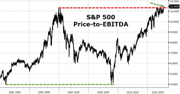 - Click to enlarge |
Full story here Are you the author?Tags: Daily Market Update,gold price,newslettersent,S&P 500,S&P 500,U.S. Gross Domestic Product