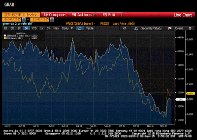
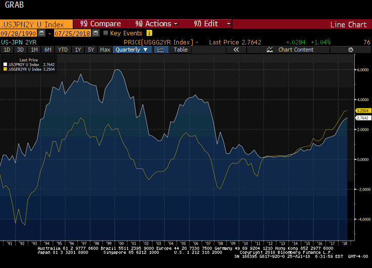
This remains one of my favorite Great Graphics that illustrate the divergence theme that I think is the main driver of the euro-dollar exchange rate. Composed on Bloomberg, it shows two time series. The first (white line) shows the German two-year yield minus the US two-year yield. It bottomed near -80 bp in mid-October and slid persistently through last Wednesday to hit reach almost -138 bp.
The second time series (yellow line) shows the euro. It too peaked in mid-October near $1.15. It was sold to $1.0525 shortly before the ECB meeting last Thursday.
After the ECB announcement, the two-year differential fell to 126 bp and then a little more before the weekend, despite a healthy US jobs report. As the German discount fell, the euro rallied to almost $1.10. The rate differential stopped at the 23.6% retracement objective while the euro’s bounce carried to almost the 50% retracement target (~$1.1010).
The correlation between the level of the interest rate differential and the level of the euro over the past sixty days appears to be the highest since at least 2000 at 0.952. It is awkward to take a percentage change of a percent, but if we conduct the correlation on the basis of the change in both time series, the correlation is lower at 0.672 but is also the highest since at least 2000.
That both time series are correcting and remain highly correlated, suggest the divergence meme is alive and well. We continue to caution against what we suspect is a naive assumption that the divergence meme is completely discounted when the market appears so focused on the Fed’s lift-off next week, it has yet to assess more than a 40% chance of a second hike late in Q1 16.
Tags: Great Graphic


