Found 151 search results for keyword: label/Great Graphic
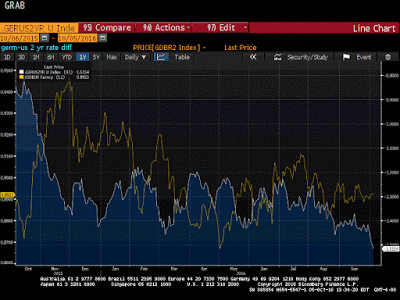
Great Graphic: US-German 2-Yr Differential and the Euro
The US premium over Germany is at its widest since 2006. This is despite a small reduction in odds of a hike in December. There are many forces are work, but over time, the widening differential will likely give the dollar better traction.
Read More »
Read More »
Great Graphic: Growth in Premiums of Employer-Sponsored Health Insurance
Upward pressure on US consumer prices is stemming from two elements. Rents and medical services. Due to the differences the composition of the basket of goods and services that are used, the core personal consumption deflator, which the Fed targets, typically lags behind core CPI.
Read More »
Read More »
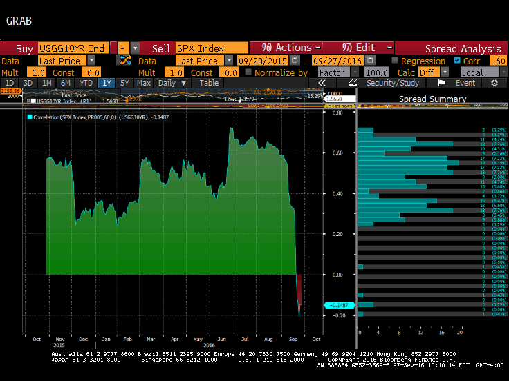
Great Graphic: Stocks and Bonds
The relationship between the change in Us 10-year yields and the change in the S&P 500 has broken down. The 60-day correlation is negative for the first time since late Q2 2015. It is only the third such period of inverse correlation since the start of 2015.
Read More »
Read More »
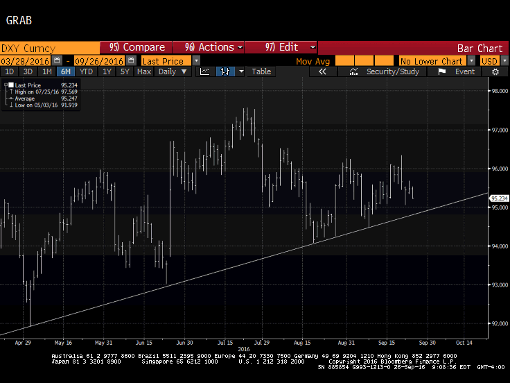
Great Graphic: Nearly Five-Month Uptrend in the Dollar Index Set to be Tested
DXY has been holding an uptrend since early May. It looks set to be tested near-term and technical indicators suggest it may not hold. Here are the two scenarios of penetration.
Read More »
Read More »
Great Graphic: Median U.S. Income per Presidents
Median household income was higher in 2015 than in 2008, but still below 1999 peak in real terms. The bottom fifth of households by income have just recouped what was lost. Income growth did best under (Bill) Clinton and Reagan, including for top 5%. Origin of strong dollar policy means it will not be used as a trade weapon and it hasn't since Bentsen.
Read More »
Read More »
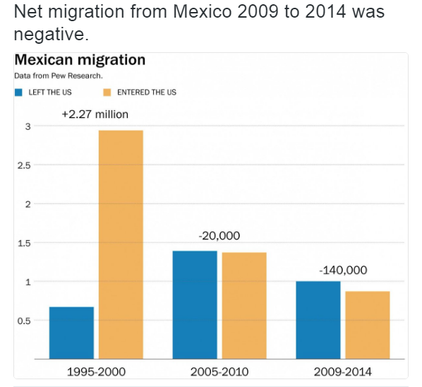
Great Graphic: Net Mexican Migration to the US–Not What You Might Think
Net migration of Mexicans into the US has fallen for a decade. The surge in Mexican migration into the US followed on the heels of NAFTA. Although Trump has bounced in the polls, and some see this as negative for the peso, rising US interest rates and the slide in oil price are more important drivers.
Read More »
Read More »
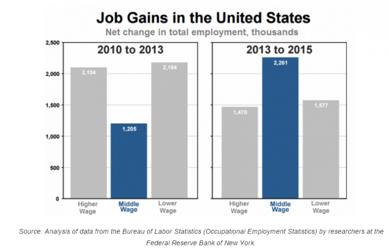
Great Graphic: What Kind of Jobs is the US Creating
The oft repeated generalization about the dominance of low paying jobs is not true for the last few years. This does note refute the disparity of wealth and income in the US. There is a restructuring taking place that favors educated and skilled workers.
Read More »
Read More »
Great Graphic: Low Wages in US Rising
The bottom of the US wage scale is rising. The added wage costs are being blunted by less staff turnover, hiring and training costs. It is consistent with our expectation of higher price pressures.
Read More »
Read More »
Great Graphic: GDP Per Capita Selected Comparison
US population growth has been greater than other major centers that helps explain why GDP has risen faster. GDP per capita has also growth faster than other high income regions. The US recovery is weak relative to post-War recoveries but it has been faster than anticipated after a financial crisis and shows little evidence of secular stagnation.
Read More »
Read More »
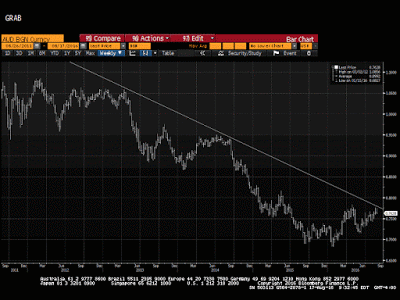
Great Graphic: Aussie Tests Three-Year Downtrend
The Australian dollar's technical condition has soured. Market sentiment may be changing as the MSCI World Index of developed equities posted a key reversal yesterday. It is not clear yet whether the Aussie is correcting lower or whether there has been a trend change.
Read More »
Read More »
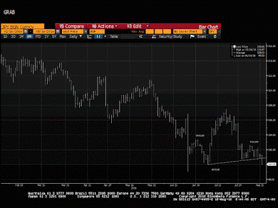
Great Graphic: Dollar-Yen–Possible Head and Shoulders Continuation Pattern
This technical pattern is most often a reversal pattern, but not always. It may be a continuation pattern in the dollar against the yen. It highlights the importance of the JPY100 level and warns of risk toward JPY92.50. It aligns well with the sequence of macro events.
Read More »
Read More »
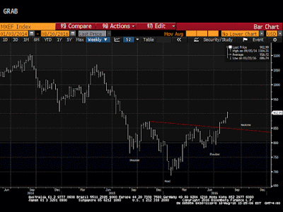
Great Graphic: Bullish Emerging Market Equity Index
Liquidity rather than intrinsic value seems to be driving EM assets. MSCI EM equity index looks constructive technically. The chart pattern suggests scope for around 13% gains from here.
Read More »
Read More »
Great Graphic: Oil Recovery Extends
Oil prices extend last week's rally. Last week's rally was driven by the fall of gasoline inventories. Today's advance was helped by speculation over next month's IEA meeting.
Read More »
Read More »
Great Graphic: Real Broad Trade-Weighted Dollar
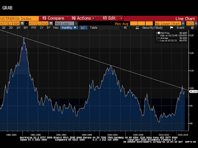
The real broad trade-weighted dollar index rose in July for the third month. It peaked in January above trendline drawn through the Reagan and Clinton dollar rallies. Expect the trendline to be violated again before the end of the year.
Read More »
Read More »
Great Graphic: Relative Performance of Bank Stocks–US, Europe, and Japan
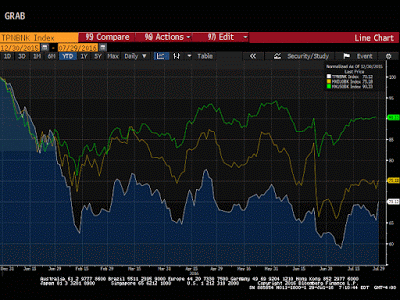
MSCI US Bank Index, MSCI European Bank Index and the Japan Topix Bank Index compared. Divergence in the health of the financial sector.
Read More »
Read More »
Great Graphic: How the US Recovery Stacks Up
The US recovery may have surpassed the 2001 recovery in Q2. Though disappointing, the recovery has been faster than average from a balance sheet crisis. Although slow, it is hard to see the secular stagnation in the data.
Read More »
Read More »
Great Graphic: OIl Breaks Down Further
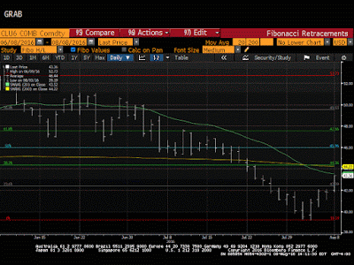
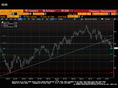
With today's losses the Sept contract has retraced 50% of this year's rally. The oil glut has partly been transformed into a gasoline glut. US rig count is rising and output has increased two weeks in a row.
Read More »
Read More »
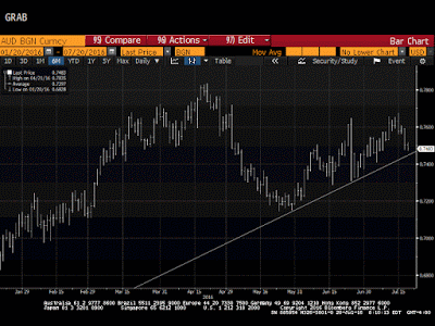
Great Graphic: Aussie Approaches Two-Month Uptrend
Australian dollar is the second heaviest currency this week after a key downside reversal at the end of last week. It is approaching an uptrend line near $0.7450. Many perceive an increased likelihood that the RBA eases and many are reassessing chance of a Fed hike later this year.
Read More »
Read More »
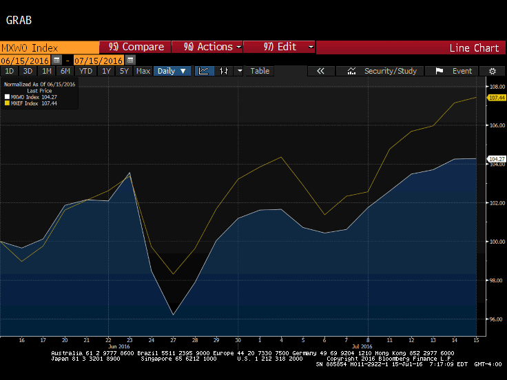
Great Graphic: Equities Since Brexit
Since the UK voted to leave the EU, emerging market equities have outperformed equities from the developed markets. This Great Graphic, composed on Bloomberg, shows the MSCI Emerging Market equities (yellow line) and the MSCI World Index of developed equities (white line).
Read More »
Read More »
Great Graphic: The Yuan’s Weakness
Don't be fooled, the yuan has fallen more against its basket that against the dollar this year. It is not clear what China means by stable. Market forces appear to be moving in the same direction as officials wish.
Read More »
Read More »


