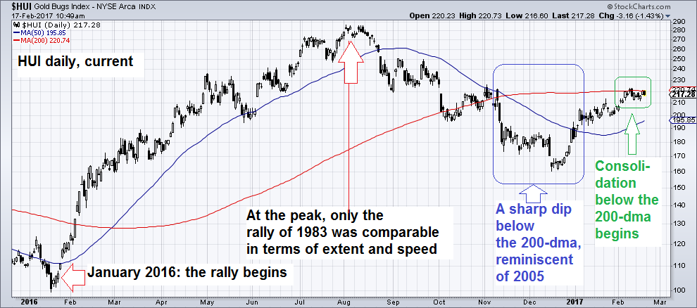
The Technical Picture – a Comparison of AntecedentsWe wanted to post an update to our late December post on the gold sector for some time now (see “Gold – Ready to Spring Another Surprise?” for the details). Perhaps it was a good thing that some time has passed, as the current juncture seems particularly interesting. We received quite a few mails from friends and readers recently, expressing concern about the inability of gold stocks to lead, or even confirm strength in gold of late. In light of past experience, such market behavior certainly deserves to be scrutinized. We felt reminded of another occasion though, when a negative divergence prompted a flood of mails to us as well (not every divergence does). As our long-time readers know, we sometimes catch important turns in timely fashion, but we are not exactly Nostradamus. What’s more, we are biased – a bias that results from our understanding of the current monetary and economic backdrop. Anyway, we can definitely not predict the future with certainty. At best, we can offer our interpretation of probabilities and risk-reward scenarios over a range of different time frames. The markets can, and frequently do prove us wrong and you should keep that in mind as you read on. The above chart suggests that context is important when interpreting short term divergences. Consider for instance this chart of the 1992 low in the XAU, which we showed on an earlier occasion. We only marked the positive divergences, but if you look at the final wave of selling and the period immediately before and after the low was put in, you will see a somewhat similar sequence of events as in 2015/16. First there were two positive divergences, followed by a negative one right at the low, followed by another positive one shortly thereafter. So what is the context at present? For one thing, sentiment and positioning in the gold sector is far from excessively bullish. On the contrary, it is still marked by great caution. In fact, it deserves a separate discussion, which will follow right after this post. Another thing that seems important to us is the current position of the HUI. It has approached its 200-day moving average from below, recovering from the fairly sharp post-election dip. It is now consolidating below the 200-dma, and so far failing to break through it. |
HUI Compared to Gold September 2015 - February 2017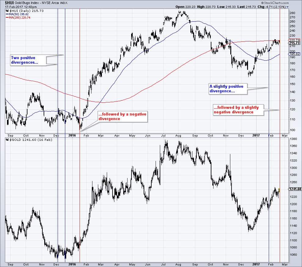 The HUI compared to gold. It is a good rule of thumb that positive divergences between the HUI and gold are bullish signals and negative divergences are bearish signals. Also, gold stocks should ideally lead gold in order to confirm the prevailing trend. They should be strong relative to gold in uptrends and weak relative to gold in downtrends. As you can see above though, not every negative divergence is meaningful. It can even turn out to be a major misdirection, as happened in early 2016. We published a great many posts on the sector between August and December of 2015, stressing that we felt a great opportunity was at hand. The brief break of support in January 2016, coupled with a negative divergence, prompted many people to write in and express concern. - Click to enlarge |
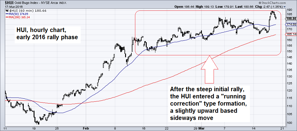
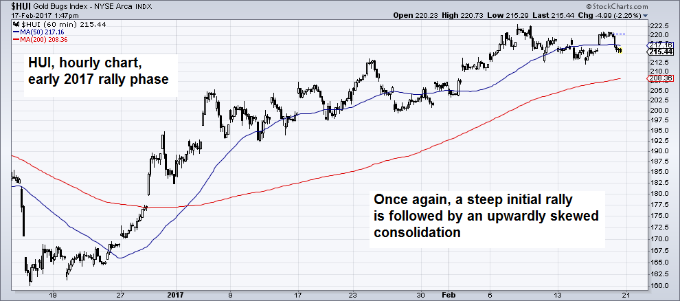
| Lastly, if one compares a 60 minute chart of the early rally phase in 2016 to the current one, a strong parallel between the formations is immediately evident. In 2016 we noted that while the market was overbought, the chart reminded us of a “running correction” – a corrective wave with an upward bias, which is generally considered quite bullish. Here is the 2016 hourly chart: |
HUI Hourly 2017 |
| The behavior of the index following the initial rally kept everyone on their toes and slightly nervous. As we recall, it certainly helped with keeping the bullish consensus quite subdued. Here is what the current 60 minute chart looks like: |
HUI, Hourly Chart Early 2017 |
The 200-Day Moving Average – a Historically Important DemarcationLet us now consider the HUI’s 200-day moving average. In October 2015 we published an article that discussed the role of the 200-dma specifically at the beginning of new bull markets (see “Gold and Gold Stocks, How to Recognize an Emerging Bull Market”). As we pointed out at the time, in the past the market’s behavior following a breach of this moving average tended to provide important hints as to whether the market’s character had indeed changed. It is important to be aware of these technical pointers for the simple reason that the fundamental backdrop is sometimes only confirming a character change with a lag (there is no hard and fast rule – at times the market lags a change in fundamentals – this happened e.g. at the 1980 peak and the 2000 low, and sometimes it leads by a considerable stretch, such as in 2005/2006). It often takes a while for the index to get through the 200-dma when it approaches it from below in bull markets, unless the 200-dma is already very close to the low from which prices start to rise. Once it does get through, the subsequent rallies tend to be quite large in the majority of cases, and most of the time begin after one or more retests from above. At times the retest of the moving average is not as “clean” and clear-cut as in most of the examples shown below (e.g. in early 2009 following the 2008 panic low). |
HUI 2000 - 2001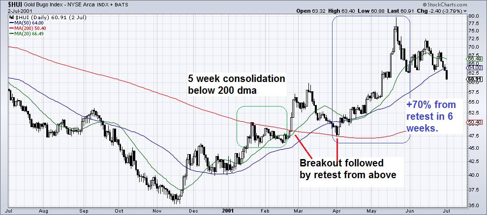 HUI 2000 – 2001. This is not an ideal example in the sense that it shows the very beginning of a new bull market, but the consolidation below the 200-dma and the subsequent retest were so clear-cut on this occasion that we decided to include it. Also, the accelerated rally after the retest is typical. - Click to enlarge |
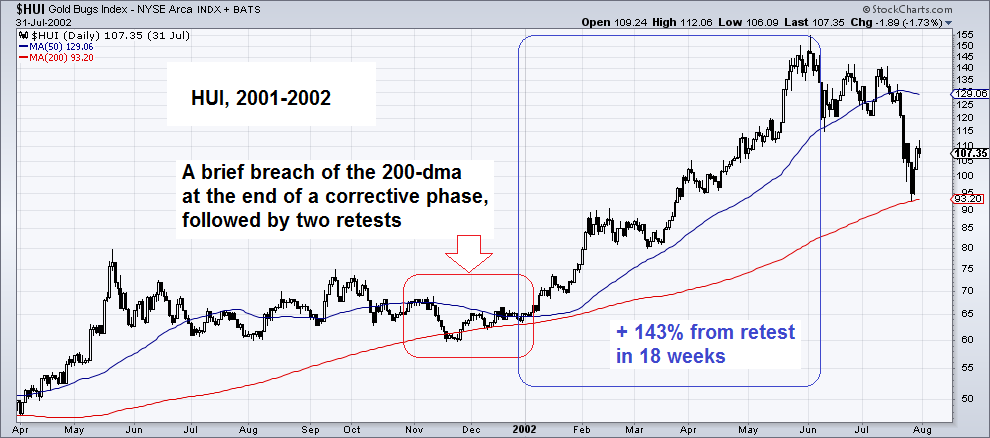
| The next chart shows the first lengthy correction after the initial rally shown above, which ended with a small breach of the 200-dma, a reversal back above it, and two retests. Then the rally resumed. |
HUI 2001 - 2002 |
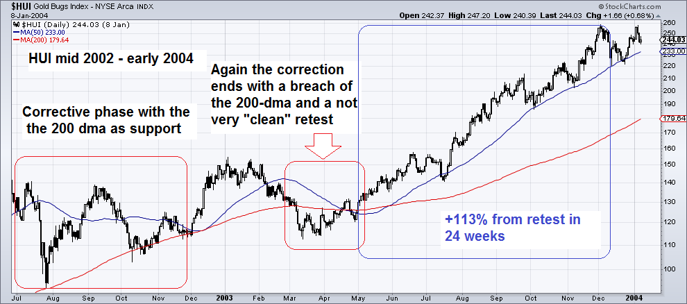
| The next correction ended again after the 200-dma was undercut and regained. Ironically, the retest low was preceded by a “death cross” (the 50-dma crossed below the 200-dma). Death crosses often occur near the end of bull market corrections. |
HUI July 2002 - January 2004 |
| Now we come to the 2005 – 2006 sequence, which resembles the current situation the most, in two respects. First, the dip below the 200-dma was rather pronounced in this instance, so the market had to cover some distance to regain it. Secondly, industrial commodities had outperformed gold for a while, which mirrors what has happened over the past several months. The rally after the retest of the 200-dma was a doozy in this case. |
HUI January 2005 - September 2006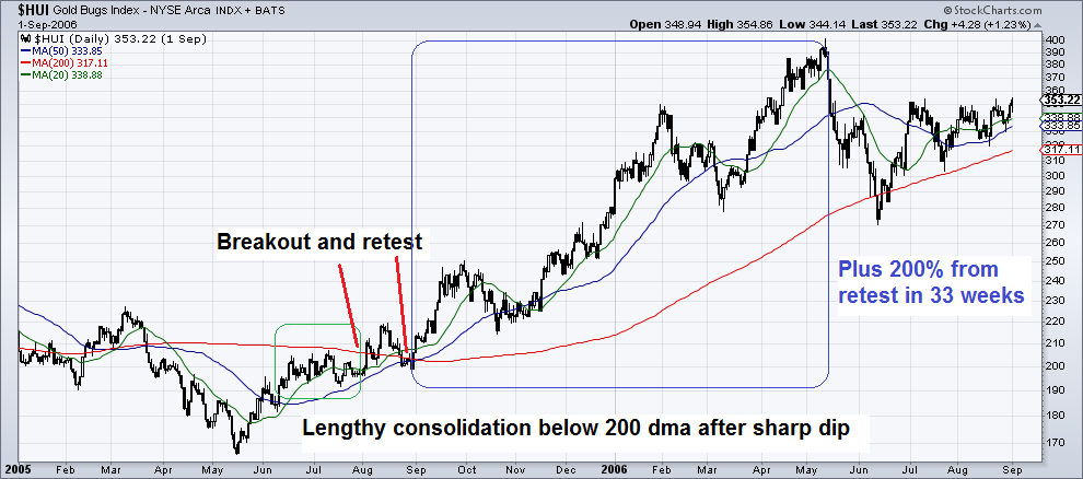 It took the index a while to get back above the 200-dma after the sharp dip below it in 2005 – but once it did, a scorching rally ensued. Keep in mind that this was also a case of the gold market anticipating a change in the fundamental backdrop far in advance. It rose while the Fed was busy tightening – which eventually killed the asset bubbles it had set into motion. - Click to enlarge |
| Now let us compare the current picture to the charts shown above. It needs to be stressed that while the fundamental backdrop for gold has improved since our December missive (at the time, it was mixed with a bearish bias), it is still far from unequivocally bullish. As Keith has pointed out though, gold is now trading some $130 below its fundamental price according to his method. In our experience, most of the time such significant gaps are resolved by a rally in the market price. |
HUI, Daily January 2016 - February 2017 |
| As the charts above strongly suggest, regaining the 200-dma tends to be a momentous event in bull markets, as very big rallies tend to follow once it happens. This raises an obvious question: are bull market conditions actually in force at the moment? To this it should be noted that the 200-dma acts as an important demarcation in bear markets as well, only the effect of breaching it from below is very different. These breaches tend to be short-lived, and once the market reverses back below the 200-dma, accelerated declines tend to follow.
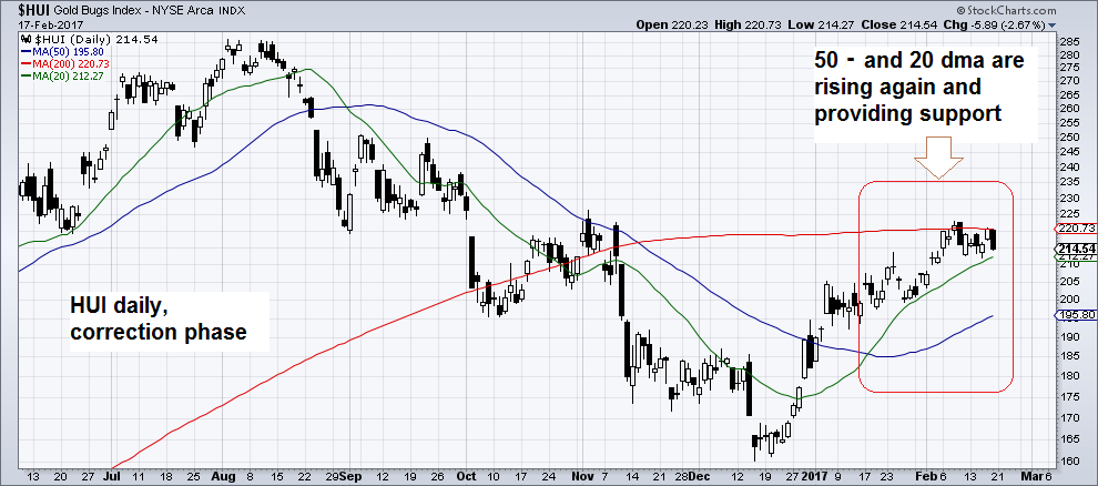
The market has gone through a very pronounced correction, but the correction has stopped short just above the last line of defense that we thought would have to hold to still consider it a potential bull market from a technical perspective (see our monthly long term support/resistance chart). After all, the preceding advance was very strong, so a very big correction was to be expected. The strong bounce from the low underpins the notion that is still a bull market. Also, bear markets tend to be characterized by a falling 200-dma, with prices trading below it most of the time. Shorter term moving averages (50 and 20-day) also tend to be below the 200-dma in bear markets, and are also falling most of the time. Both short term moving averages are obviously still below the 200-dma at the moment, but both are rising, prices are above them and the 20-day ma remains above the 50-day ma. It is worth noting that the index was reluctant to give up the support of the 200-day ma after dipping slightly below it in October. If not for the election upset that took the markets by surprise, this test may well have held, similar to 2002 or 2003. We also believe that if a new bull market is underway, it will ultimately play out regardless of the election outcome. The reason for this is that the foundation for a bull market was laid long before the election (only the timing of its beginning was in doubt). As we once remarked, regardless of whether Donald Trump will emphasize positive rather then negative economic policies, he has no time machine and hence cannot go back in time to dissuade central bankers from printing gobs of money as they have done since 2008. To some extent, the future is already predetermined. The 200-dma has flattened after rising since March of 2016. Its current position is still in line with a bull market, but that would probably change if the attempt to break through it were to fail. In that case, we would definitely have to reassess whether a bull market is still in force. Are there reasons for caution? There are of course always reasons for caution. One is that silver is quite overbought a the moment, and contrary to gold, positioning and sentiment are quite stretched in silver. More on this in the sentiment and positioning update that comes next. |
HUI, Daily Correction Phase July 2016 - February 2017 |
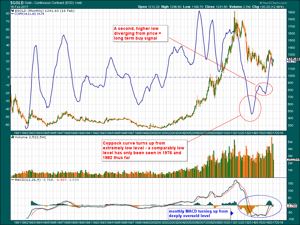
ConclusionAll in all, we believe the probabilities favor a breakout above the 200-dma at the moment. Conversely, a renewed decline would probably indicate that the recent cyclical bull market is over. A slightly improved fundamental backdrop and still cautious sentiment and positioning by speculators are lending support to the bullish case, but a negative outcome cannot be ruled out yet based on this. At least we are once again at a point that is set to provide more certainty fairly soon – within a few weeks or maybe even days. Bonus Chart – the Gold Coppock Curve:The Coppock curve is a very long term momentum indicator. That has the distinct advantage that one only has to look at it every few years. The Coppock curve for gold has given a bullish signal by turning up and putting in a second, higher low that diverged from the gold price near the late 2015 low. |
Coppock Curve 1981 - 2017 |
Charts by: StockCharts
Full story here Are you the author? Previous post See more for Next post
Tags: Chart Update,HUI Gold Miners Index,newslettersent,Precious Metals


