Chart 1
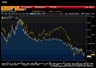
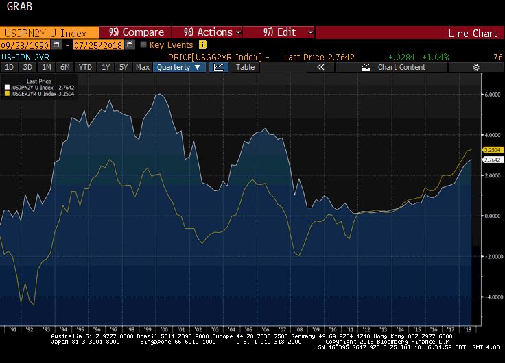
This Great Graphic is a favorite of mine. Created on Bloomberg, it depicts the 2-year spread between Germany and the US on two-year money (white line) and the euro-dollar exchange rate (yellow line). The chart covers the past five years.
The scales of the two time series are different so it makes little sense to claim that euro gravitates toward the rate differential. And there have been some significant misalignment, like in 2013 and into 2014. However those periods seem to be an exception.

Chart 2
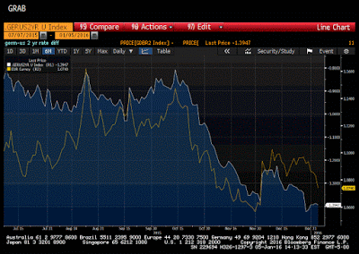
Look at this second chart. It covers only the last six months. Despite the different scales, there seems to be a fairly good relationship. This is not just an optical illusion.
On a purely directional basis the two time series are rarely more correlated than now. Specifically, over the past one hundred sessions, the correlation (on levels) is about 0.87. Since 2010 it has been higher only a handful of times.
It seems to me that those who say that the euro has bottomed must argue either that the German discount to the US will not grow much more and/or that another driver will replace the rate differentials. Either or both are possible. However, it does not seem particularly likely. The risk is that progress toward its inflation goal proves unsatisfactory, compelling the ECB to ease further. As we saw in December, a consensus to cut the deposit rate is easier to forge than an agreement to accelerate purchases.
When the Fed raised rates in December, they were clearly not of the mindset that they would hike just once. Instead, we should assume that it anticipated, barring a significant surprise, the start of a “gradual” and limited tightening cycle. Rather than playing a novice, investors should assume they are matching wits with a grandmaster, who is thinking a few moves ahead.
It is ironic that many still regard the Fed, and the chair in particular, as dovish, even though many if not most in the market do not believe that it will be able to hike rates four times this year as the dot plot and commentary (e.g. Williams yesterday 3-5 hikes this year may be appropriate) indicate. The market is more dovish than the Fed.
The last extreme of the two-year rate differential was in 2005 at 177 bp. With some conservative assumptions (two rate hikes in the US and no more cuts by the ECB), and allowing for some of the hikes to have already been discounted, the spread can return to 2005 levels later this year. That should help underpin the dollar. Although we obviously expect further dollar appreciation this year, our forecasts do not have the euro going to parity until closer to mid-year.


