Found 151 search results for keyword: label/Great Graphic
Great Graphic: What is Happening to Global Equities?
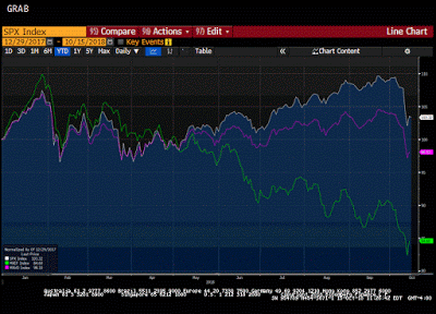
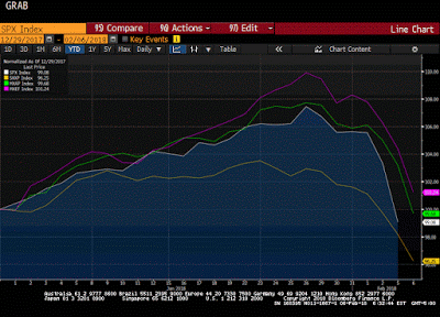
The decline in the global equity market is the most serious since the February and March spill. In this Great Graphic, the white line is the S&P 500. With the setback, it is up a little more than 8% for the year. It managed to recover fully from the sell-off earlier in the year.
Read More »
Read More »
Great Graphic: Is Something Important Happening to Oil Prices?
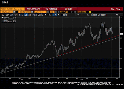
Oil prices are weaker for the third straight day and are off in four of the past five sessions, the poorest run in two months. Supply considerations may threaten a year-old trend line. OPEC and non-OPEC, essentially Saudi Arabia and Russia are making good on their commitment to boost output, and US oil inventories unexpectedly rose.
Read More »
Read More »
Great Graphic: US 2-year Premium Grows and Outlook for G3 Central Banks
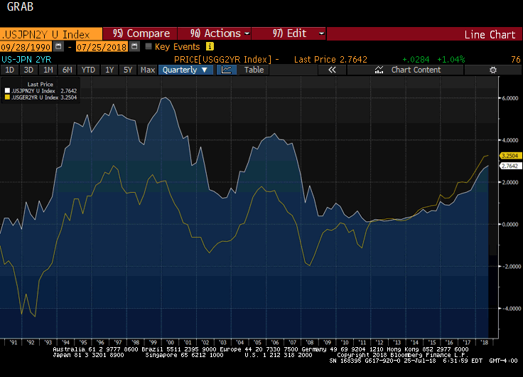
A cry was heard last week when President Trump expressed displeasure with the Fed's rate hikes. Some, like former Treasury Secretary Lawrence Summers, claimed that this was another step toward becoming a "banana republic." Jeffrey Sachs, another noted economist, claimed that "American democracy is probably one more war away from collapsing into tyranny."
Read More »
Read More »
Great Graphic: Euro Bulls Stir but Hardly Shaken
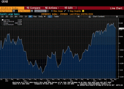
Euro has fallen 10.5 cents since mid-February. Net speculative longs in the futures market remain near record. Gross long euros have actually increased over the past month.
Read More »
Read More »
Great Graphic: Euro-Swiss Shows Elevated Systemic Risk
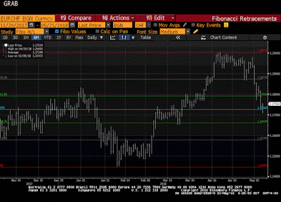
The Swiss National Bank's decision in January 2015 to remove the cap on the Swiss franc (floor on the euro) that it has set at CHF1.20 is seared into the memory of a generation of foreign exchange participants. It is not exactly clear where the euro bottomed in the frenzied activity that followed the SNB's surprise move. Bloomberg records the euro's low near CHF0.8520.
Read More »
Read More »
Great Graphic: Aussie Tests Trendline
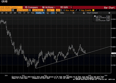
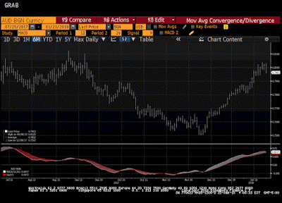
It is not that the Australian dollar is the weakest currency this month. Its 0.4% decline puts it among the better performers against the US dollar. However, it has fallen to a new low for the year today. The losses have carried to a trendline drawn off of the early 2016 low near $0.6800.
Read More »
Read More »
Great Graphic: Loonie Takes Big Step toward Technical Objective
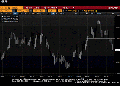
For a little more than two weeks, we have been monitoring the formation of a possible head and shoulders top in the US dollar against the Canadian dollar. The neckline broke a week ago. It is not uncommon for the neckline to be retested after the break. That was what happened yesterday. The US dollar recorded an outside down day yesterday.
Read More »
Read More »
Great Graphic: Aussie-Kiwi Approaches Trendline
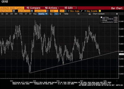
Today is the fifth consecutive session that the Australian dollar has weakened against the New Zealand dollar. It has now fallen to test a three-year old trendline that we show on the Great Graphic, composed on Bloomberg. The last leg down in the Aussie actually began last October, and through today's low, it is off by a little more than 7%.
Read More »
Read More »
Great Graphic: Has the Dollar Bottomed Against the Yen?
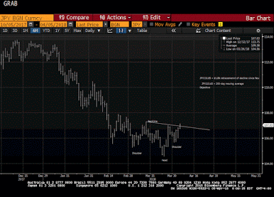
The US dollar appears to be carving a low against the yen. After a significant fall, investor ought to be sensitive to bottoming patterns. The first tell was the key reversal on March 26. In this case, the key reversal was when the dollar made a new low for the move (~JPY104.55) and then rallied to close above the previous session high.
Read More »
Read More »
Great Graphic: EMU Inflation Not Making it Easy for ECB
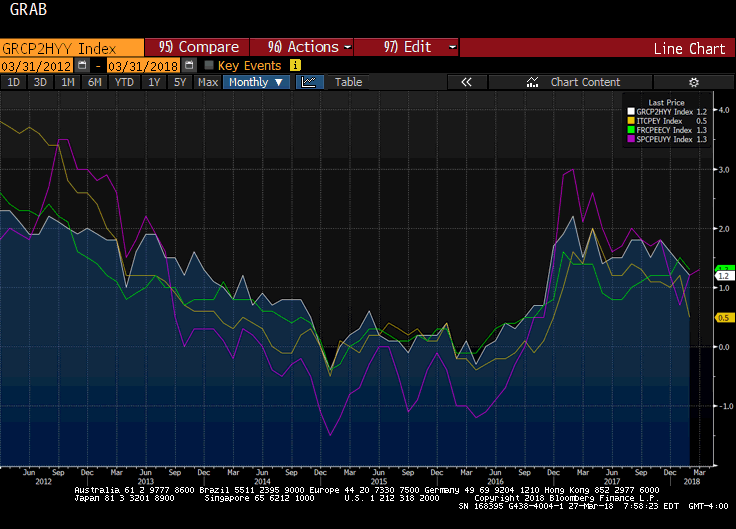
The Reserve Bank of New Zealand is credited with being the first central bank to adopt a formal inflation target. Following last year's election, the central bank's mandate has been modified to include full employment. To be sure this was a political decision, and one that initially saw the New Zealand dollar retreat.
Read More »
Read More »
Great Graphic: Bears Very Short US 10-Year Ahead of CPI
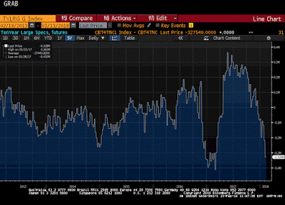
The US reports January CPI figures tomorrow. The market seems especially sensitive to it. The main narrative is that it is an inflation scare spurred by the jump in January average hourly earnings that pushed yields higher and unhinged the stock market. This Great Graphic comes from Bloomberg and is derived from data issued by the Commodity Futures Trading Commission (CFTC).
Read More »
Read More »
Great Graphic: European Equities Lead Move
European equities peaked earlier and have fallen the furthest. MSCI EM equities faring the best, and as of now, they are still up on the year. MSCI Asia Pacific fell 3.4% today and is now down 0.33% for the year.
Read More »
Read More »
Great Graphic: Is Aussie Cracking?
The Australian dollar bottomed in early December $0.7500 after having tested $0.8100 a couple of times in September. Since early December, however, the Australian dollar appreciated by nearly 6.5%. As it tested the $0.8000 area, the momentum faded.
Read More »
Read More »
Great Graphic: Treasury Holdings
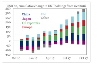
The combination of a falling dollar and rising US interest rates has sparked a concern never far from the surface about the foreign demand for US Treasuries. Moreover, as the Fed's balance sheet shrinks, investors will have to step up their purchases.
Read More »
Read More »
Great Graphic: Euro Monthly
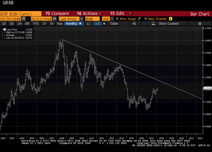
The euro peaked in July 2008 near $1.6040. It was a record. The euro has trended choppily lower through the end of 2016 as this Great Graphic, created on Bloomberg, illustrates. We drew in the downtrend line on the month bar chart. The trend line comes in a little below $1.27 now and is falling at about a quarter cent a week, and comes in near $1.26 at the end of February.
Read More »
Read More »
Great Graphic: Progress
The world looks like a mess. While the economy appears to be doing better, disparity of wealth and income has grown. Debt levels are rising. Protectionism appears on the rise. Global flash points, like Korea, Middle East, Pakistan, Venezuela are unaddressed. At the same time, this Great Graphic tweeted by @DinaPomeranz, with a hat tip to @bill_easterly is a helpful corrective.
Read More »
Read More »
Great Graphic: Sterling Toys with Three-Year Downtrend Line
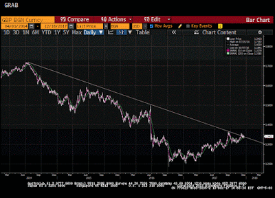
Sterling is the second major currency this year after the euro (and its shadow the Danish krone). The downtrend line from mid-2014 is fraying. Is this the breakout?
Read More »
Read More »
Great Graphic: Euro Pushes below November Uptrend
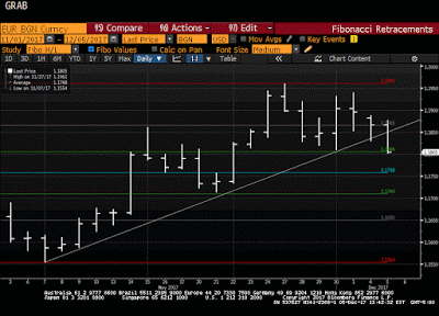
Euro is lower for the third day, the longest downdraft in a month and a half. It violated the November uptrend. It is testing the $1.1800 area, which houses a few technical levels (retracement, moving average and congestion).
Read More »
Read More »
Great Graphic: US 2-year Yield Rises Above Australia for First Time since 2000
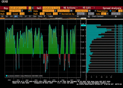
The US and Australian two-year interest rates have diverged. There is scope for a further widening of the spread. Directionally the correlation between the exchange rate and the rate differentials is strong, but not stable. Near-term technicals are supportive but the move above trendline resistance is needed to confirm.
Read More »
Read More »
Great Graphic: Is that a Potential Head and Shoulders Pattern in the Euro?
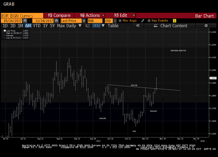
The euro is breaking out to the upside. The measuring objective is near $1.2150, which is near the 50% retracement of the euro's drop from the mid-2014 high. Key caveat: It is about the upper Bollinger Band and rate differentials make it the most expensive to hold since the late 1990s.
Read More »
Read More »


