Found 1,868 search results for keyword: label
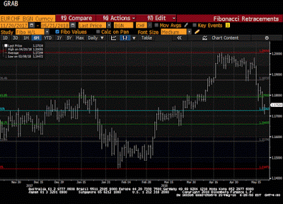
Great Graphic: Euro-Swiss Shows Elevated Systemic Risk
The Swiss National Bank's decision in January 2015 to remove the cap on the Swiss franc (floor on the euro) that it has set at CHF1.20 is seared into the memory of a generation of foreign exchange participants. It is not exactly clear where the euro bottomed in the frenzied activity that followed the SNB's surprise move. Bloomberg records the euro's low near CHF0.8520.
Read More »
Read More »
Welsh Gold Being Hyped Due To The Royal Wedding?
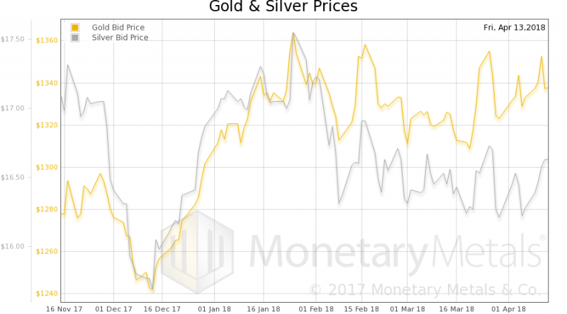
Welsh gold and the misconceptions surrounding it – GoldCore speak to China Central Television (CCTV). Welsh gold mired in misconceptions, namely that it is ‘rarest’ and most ‘sought after’ gold in world. Investors to be reminded that all mined gold is rare and homogenous. Nothing chemically different between Welsh gold and that mined elsewhere. Investors led to believe Welsh gold is more valuable, despite lack of authenticity in some Welsh gold...
Read More »
Read More »
Demand for organic food grows strongly in Switzerland
One in ten fresh food items sold in Switzerland last year was organic, according to the Federal Office for Agriculture. The market share of organic products rose from 4.6% in 2007 to 9% in 2017, while the share of fresh organic food sold in Switzerland rose from just under 6% to 11.5% over the same period, the agriculture office reported on Tuesday.
Read More »
Read More »
Why don’t the Swiss recycle more plastic?
Most plastics carry a recycling label, but few are convenient to recycle in Switzerland. For 30 days, swissinfo.ch journalist Susan Misicka saved all of her plastic garbage. She filled four shopping bags, but found that not even half of the waste could be recycled. Is it as bad as it sounds? (swissinfo.ch) — swissinfo.ch is …
Read More »
Read More »
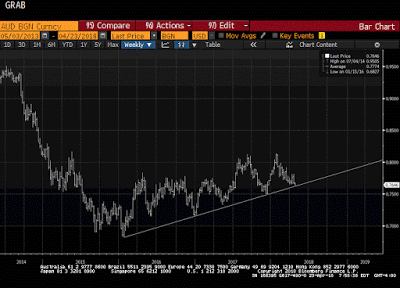
Great Graphic: Aussie Tests Trendline
It is not that the Australian dollar is the weakest currency this month. Its 0.4% decline puts it among the better performers against the US dollar. However, it has fallen to a new low for the year today. The losses have carried to a trendline drawn off of the early 2016 low near $0.6800.
Read More »
Read More »
The Retail Sales Shortage
Retail sales rose (seasonally adjusted) in March 2018 for the first time in four months. Related to last year’s big hurricanes and the distortions they produced, retail sales had surged in the three months following their immediate aftermath and now appear to be mean reverting toward what looks like the same weak pre-storm baseline. Exactly how far (or fast) won’t be known until subsequent months.
Read More »
Read More »
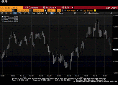
Great Graphic: Loonie Takes Big Step toward Technical Objective
For a little more than two weeks, we have been monitoring the formation of a possible head and shoulders top in the US dollar against the Canadian dollar. The neckline broke a week ago. It is not uncommon for the neckline to be retested after the break. That was what happened yesterday. The US dollar recorded an outside down day yesterday.
Read More »
Read More »
Great Graphic: Aussie-Kiwi Approaches Trendline
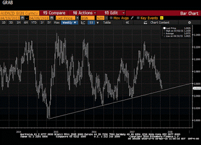
Today is the fifth consecutive session that the Australian dollar has weakened against the New Zealand dollar. It has now fallen to test a three-year old trendline that we show on the Great Graphic, composed on Bloomberg. The last leg down in the Aussie actually began last October, and through today's low, it is off by a little more than 7%.
Read More »
Read More »
Cross-border workers in Geneva face ‘toxic’ environment
Cross-border workers are tired of being the target of political attacks in Geneva, says the president of a French-Swiss cross-border lobby group, who calls for a change in current rhetoric to prevent future damage to the Swiss economy. For Michel Charrat, president of the Groupement transfrontalier européenexternal link, disenchantment between Geneva and its cross-border workers may be at its lowest point.
Read More »
Read More »
Great Graphic: Has the Dollar Bottomed Against the Yen?
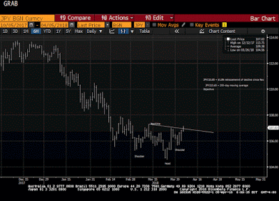
The US dollar appears to be carving a low against the yen. After a significant fall, investor ought to be sensitive to bottoming patterns. The first tell was the key reversal on March 26. In this case, the key reversal was when the dollar made a new low for the move (~JPY104.55) and then rallied to close above the previous session high.
Read More »
Read More »
Great Graphic: EMU Inflation Not Making it Easy for ECB
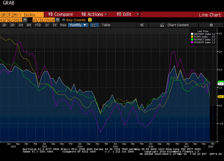
The Reserve Bank of New Zealand is credited with being the first central bank to adopt a formal inflation target. Following last year's election, the central bank's mandate has been modified to include full employment. To be sure this was a political decision, and one that initially saw the New Zealand dollar retreat.
Read More »
Read More »
Imports curdle mood of Swiss cheese producers
Switzerland may be living up to its cliché as a cheese loving nation, but a growing appetite for foreign brands has alarmed local farmers. On average the Swiss consumed 21 kilograms of cheese per person last year, compared to 18 kilograms across Europe, according to figures published by the Swiss Farmers’ Associationexternal link on Wednesday.
Read More »
Read More »
US Stock Market – How Bad Can It Get?
In view of the fact that the stock market action has gotten a bit out of hand again this week, we are providing a brief update of charts we have discussed in these pages over the past few weeks (see e.g. “The Flight to Fantasy”). We are doing this mainly because the probability that a low probability event will actually happen has increased somewhat in recent days.
Read More »
Read More »
Should Facebook and Google Pay Users When They Sell Data Collected from Users?
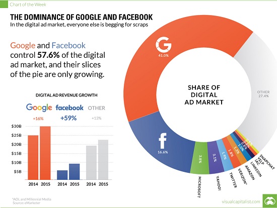
Let's imagine a model in which the marketers of data distribute some of their immense profits to the users who created and thus "own" the data being sold for a premium. It's not exactly news that Facebook, Google and other "free" services reap billions of dollars in profits by selling data mined/collected from their millions of users. As we know, If you're not paying for it, you're not the customer; you're the product being sold, also phrased as if...
Read More »
Read More »
Is Profit-Maximizing Data-Mining Undermining Democracy?
As many of you know, oftwominds.com was falsely labeled propaganda by the propaganda operation known as ProporNot back in 2016. The Washington Post saw fit to promote ProporNot's propaganda operation because it aligned with the newspaper's view that any site that wasn't pro-status quo was propaganda; the possibility of reasoned dissent has vanished into a void of warring accusations of propaganda and "fake news" --which is of course propaganda in...
Read More »
Read More »
Drive for women in top jobs suffers setback
The percentage of women in top executive positions dropped slightly in Switzerland last year, a report has found. The annual survey by the Schilling human resource consultancyexternal link shows a 1% drop to 7% in 2017 compared with the previous year. In 2016, the share of women in company executive positions had risen by 2%, raising hopes of a strong increase over the years to come.
Read More »
Read More »
Tax ‘total meltdown’ averted
More than 84% of voters have renewed the government’s right to tax its citizens and companies for another 15 years. This is a unique feature of Switzerland’s political system of direct democracy and federalism. Live results of March 04 2018 ballot: Licence fee for public broadcasters and Federal taxes 2021.
Read More »
Read More »
China Going Boom
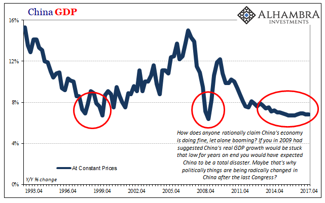
For a very long time, they tried it “our” way. It isn’t working out so well for them any longer, so in one sense you can’t blame them for seeking answers elsewhere. It was a good run while it lasted. The big problem is that what “it” was wasn’t ever our way. Not really. The Chinese for decades followed not a free market paradigm but an orthodox Economics one. This is no trivial difference, as the latter is far more easily accomplished in a place...
Read More »
Read More »


