The Long Awaited Correction is UnderwayThe gathering of central planners at Jackson Hole was widely expected to bring some clarity regarding the Fed’s policy intentions. This is of course a ridiculous assumption, since these people have not the foggiest idea what they are doing or what they are going to do next. Like all central planners, they are forever groping in the dark. Nevertheless, financial markets keep reacting to their words as if they actually meant something – and of course we have to deal with that reaction, regardless of how irrational it is. As we have mentioned many times during the gold bear market from 2011 to 2015, it was primarily the threat of a rate hike that put pressure on gold and supported the US dollar. We argued that once the Fed finally dared to implement a baby step rate hike, gold would very likely rally in a “buy the news” type response – which indeed happened. Ms. Yellen’s speech at Jackson Hole (we will post a little post mortem on that gathering of interventionists soon) was still deemed non-committal enough by the markets. Her deputy Stanley Fischer attended the event as well though, and he started mumbling something about rate hikes. Pure fantasy this may well turn out to be, but rate hike odds as reflected in the Federal Funds futures market shifted anyway. The gold market in turn still seems to care a lot about these shifts, in spite of the fact that trading in the underlying federal funds market is essentially dead as a doornail (with trillions in excess reserves, banks have no need for interbank borrowing). The threat of a rate hike was deemed to have returned. |
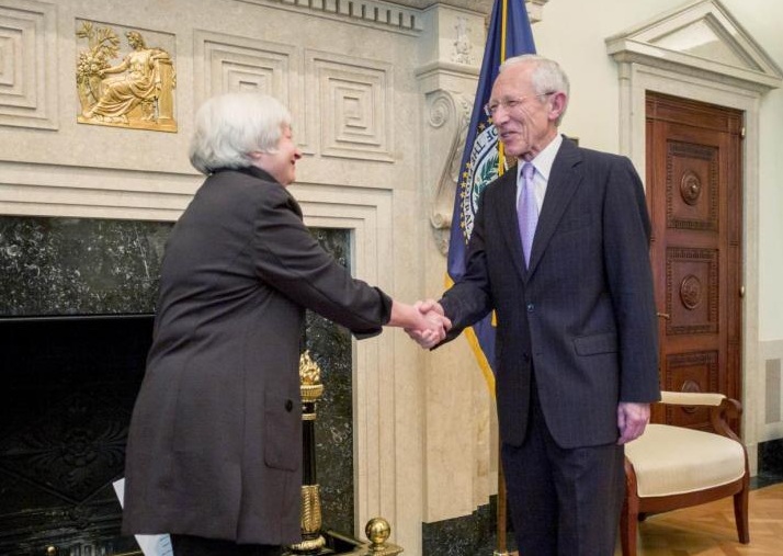
Hi there! Stanley Fischer finds chief central planner Janet Yellen deep in the bowels of the Eccles building. In Jackson Hole, they played “good cop, bad cop”. Photo credit: Federal Reserve / Reuters |
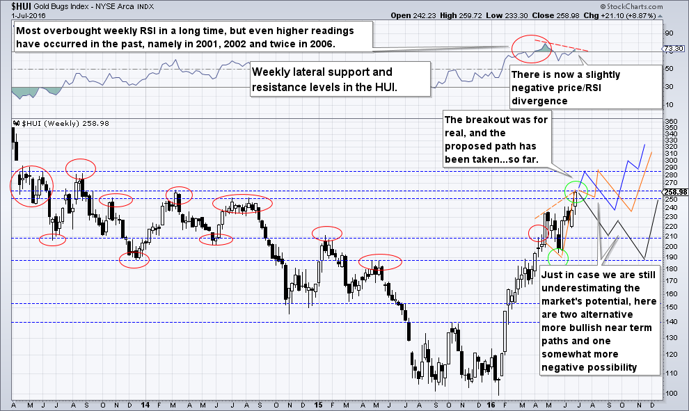
Weekly RSIMoreover, gold was already vulnerable due to the one-sided speculative net long positioning in gold futures – so all it needed to correct was a trigger. When we last discussed gold and gold stocks in early July, we pointed out that there was a growing number of bulls, who still seemed a bit lacking in conviction though (see “The Gold Situation” for details). Our conclusion based on anecdotal sentiment, positioning data and the technical picture read as follows:
We also showed a chart illustrating possible paths for the HUI Index to take. You will notice that it did in fact elect a mixture of the proposed paths, as it first rose to the indicated resistance level, and has now moved quite swiftly to the vicinity of one a short term support level. Here is a reproduction of the chart we posted at the time – we have left the annotations untouched: |
Weekly RSI(see more posts on HUI Gold Miners Index, ) |
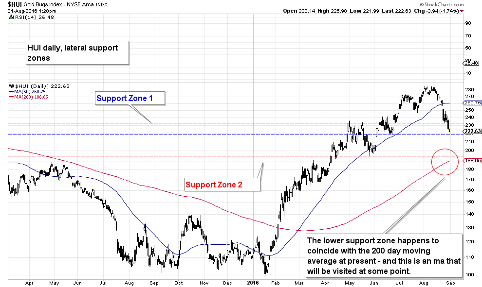
The Technical Picture in Different Time FramesThe recent correction has happened so fast that sentiment hasn’t had a chance to properly catch up yet and we still have to wait for updates on the positioning data before being able to comment on them. From an anecdotal sentiment perspective we do note though that there are suddenly more articles in the financial press again with titles such as this one: Sorry Bugs, Gold Has Seen Its 2016 Peak. We should probably thank the eager beavers at RBC Capital Markets for letting us know that the time to buy back in is close…:). Admittedly, the upcoming payrolls report represents a notable short term risk – but it is just as big a risk for bears as it is for bulls. The extent of this short term risk can be gleaned from our old chart shown above, as well as from the daily chart shown below. Today we want to take a look at he HUI in three different time frames – daily, weekly and monthly – to see what, if anything can be learned from these charts. Note in this context that the index demonstrably respects past lateral support/ resistance levels, even if they are associated with the more distant past, which is why this exercise makes sense. Let us begin with the daily chart: |
HUI Daily, Lateral Support Zones(see more posts on HUI Gold Miners Index, )There are two major lateral support zones on the daily chart, with the lower one (in red) looking more solid than the higher one, not least because it coincides with the current level of the 200-day ma. We could easily imagine the market zig-zagging toward it though, by bouncing off the higher support level first – click to enlarge. |
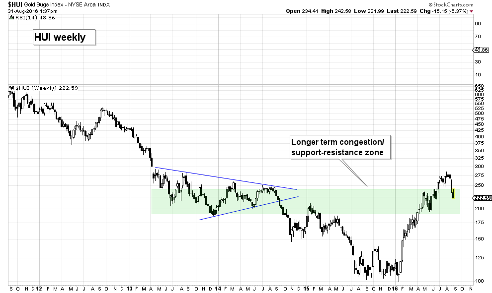
HUI WeeklyThe less cluttered annotation to the weekly chart was suggested to us by our friend BA (a fund manager with great interest in the sector). It highlights the wider support/ resistance zone that has recently been overcome, and into which the index has now returned. It seems a very good bet to us that the lower boundary of this congestion zone will hold. Those who have missed the surprise rally in the gold sector should look at the correction as an opportunity to climb aboard at fairly low risk. This is to say, risk can be controlled by using the lower boundary as a bull-bear demarcation, with a stop set a small distance below it. The blue triangle shape circumscribes the sector’s attempt to bottom out in 2013 to 2014, which ultimately failed. The interesting thing about this bottoming attempt is that it happened after the gold price put in its correction low in euro terms in late 2013. |
HUI Weekly(see more posts on HUI Gold Miners Index, ) |
Gold in Terms of the EuroThe subsequent breakdown in the HUI could well be seen as a bit of an aberration, as the gold price only declined further in USD, but in no other major currency. Naturally, there were numerous different reasons for this, some of which were actually quite sensible. The 2015 capitulation didn’t make much sense though, as it coincided with improving fundamentals (i.e., stabilizing and even rising gold mining margins). It largely reflected the widespread, but erroneous expectation that gold prices would fall further, based on the above mentioned fear of rate hikes. It seems no-one bothered to look at gold in non-dollar terms and the growing divergence with the USD gold price, which indicated that major support just above the USD 1040 level was highly likely to hold. |
Gold bottomed in euro terms in late 2013 already. In yen terms one could not even speak of a bear market – at most it was a correction. Gold made its low in most other currencies in 2013 as well. |
| HUI Monthly
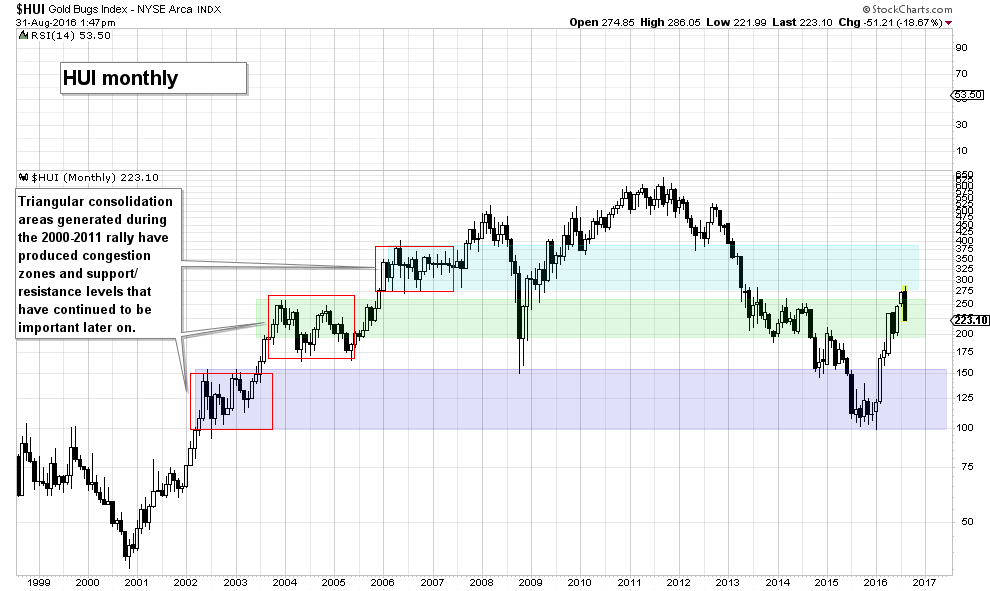
The congestion zone highlighted on the weekly HUI chart above is interesting for another reason as well though, which is revealed when looking at an even longer term monthly chart. |
HUI Monthly(see more posts on HUI Gold Miners Index, )The monthly chart of the HUI illustrates that the origin of the green congestion zone shown on the weekly chart is actually a triangular consolidation that occurred between late 2003 and 2005. There are two more triangles from the 2000-2011 bull market that have produced support and resistance levels that proved important later on – in fact, the HUI reversed earlier this year from the lower boundary of the even older light-blue congestion zone. |
“I Said Fuggedaboutit”This is a reminder that the market has an elephantine memory – and curiously enough, it always “remembers” nominal price levels rather than real prices. Even this year’s major low in the HUI has occurred at a support level that was first established in 2002 – 2003, the lower boundary of the purple congestion zone, which incidentally served as resistance in 1999 – 2000, as seen right at the beginning of the monthly chart. As we stated at the outset: the index respects support and resistance levels even if they were generated a very long time ago. This is obviously extremely helpful; once a major new trend is underway, one can relatively easily gauge short to medium term price risk and where the “must hold” support levels and likely major resistance points are. Note in this context that if the lower boundary of the green congestion zone should fail, there still remains an alternate support level at 150, which is defined by the 2008 low, as well as the peak of the purple congestion zone created in 2002 – 2003. We mention this because in view of the speed and size of this year’s rally, a very deep correction should not be entirely ruled out, even though we think it has fairly low probability. We would guess that this will largely depend on how long it takes until perceptions about the “rate hike threat” change again. An actual rate hike may do the trick again as well, as it would remove the “threat” and increase the likelihood of a downturn in risks assets. |
Conclusion
Naturally, we cannot really answer the rhetorical question asked in the headline – we actually don’t know “what happens next”. We continue to assume though that the long term bull market has resumed. Until there is evidence suggesting otherwise, corrections should be regarded as opportunities that allow one to take positions aligned with the larger trend at relatively low risk.
In the short term the HUI index remains in correction mode, but an initial support zone has just been reached. We suspect though that even if a bounce develops from there, the 200 dma will eventually have to be tested. This would also allow for positioning in gold futures as well as sentiment to become more supportive to another leg up in prices.
As the monthly chart illustrates, even in major bull markets there are often quite lengthy consolidation periods during which the index tends to fluctuate in a very wide range. Given that a larger scale correction has finally begun, one must not lose sight of the fact that these phases often require one to exercise a great deal of patience.
We will discuss current sentiment and positioning picture in detail once the required updates are available.
Charts by: StockCharts
Full story here Are you the author? Previous post See more for Next post
Tags: central banks,Chart Update,HUI Gold Miners Index,Janet Yellen,newslettersent,Precious Metals,Stanley Fischer,The Stock Market


