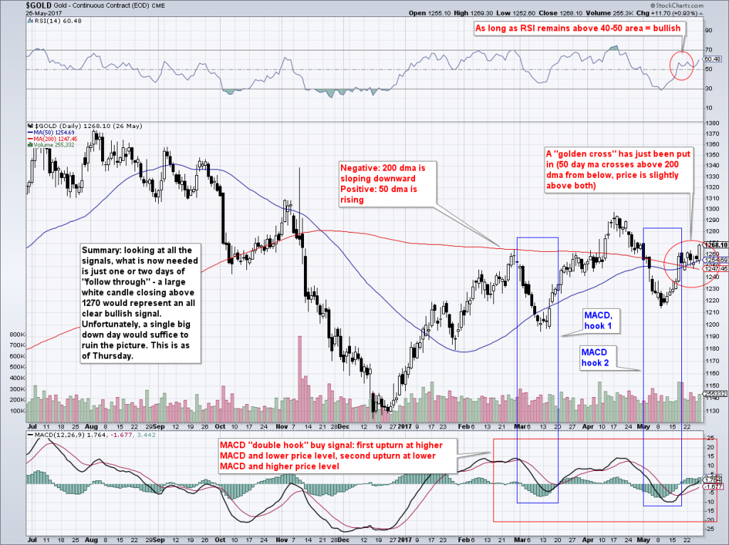
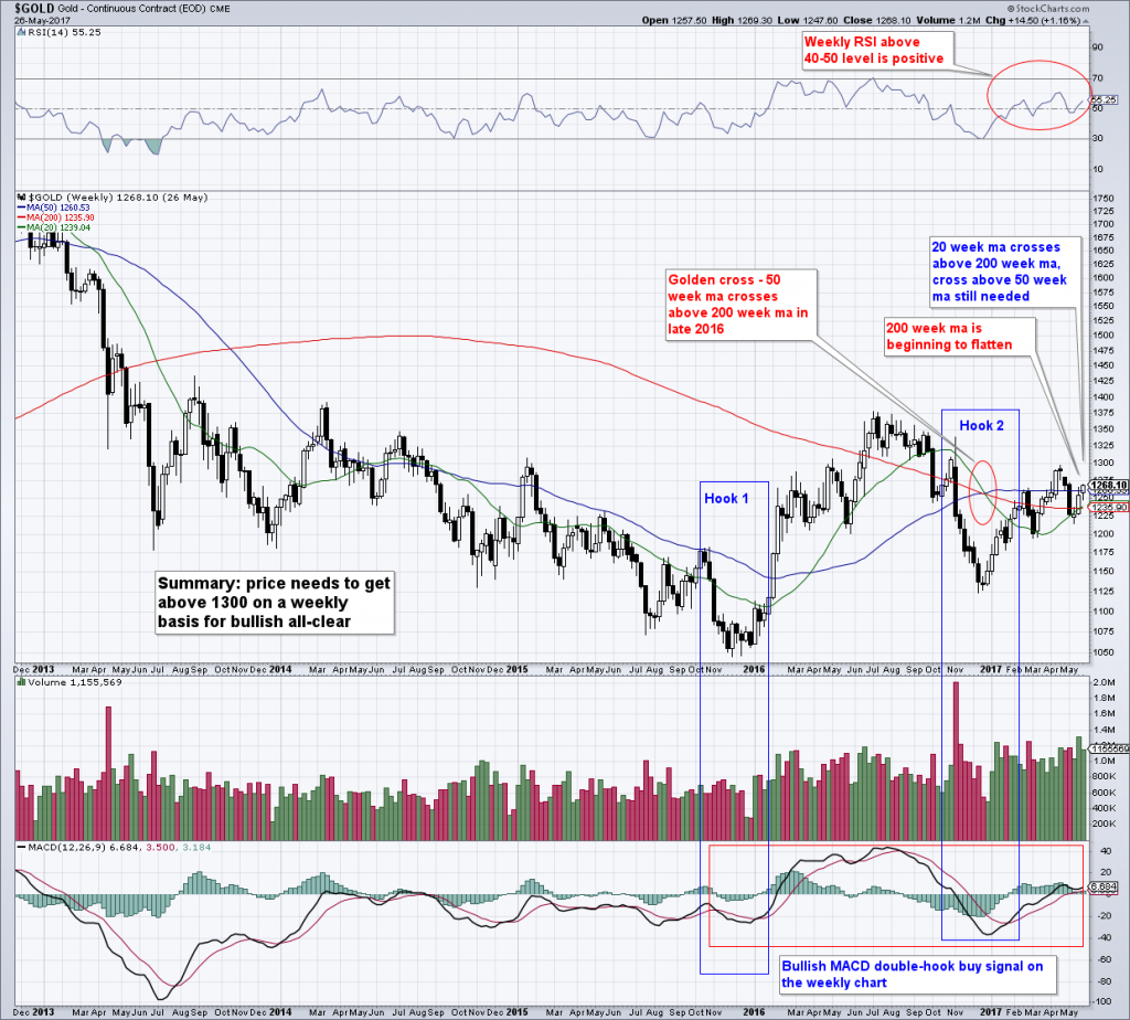
Keeping it SimpleWe recently (on Thursday last week to be precise) put together a few gold-related charts based on the “keep it simple” principle. The annual Incrementum “In Gold We Trust” report is going to be published shortly and contains a quite thorough technical analysis section, so we will keep this brief and just discuss a few things that have caught our eye. So what is the “conundrum”? We will get to that further below. First we will look at two very simple gold charts, with 50 and 200 day simple moving averages, RSI and MACD, both daily and weekly. We actually made the chart annotations already before the COMEX open on Friday, but the charts do include Friday’s action. It makes no difference, since the same criteria still apply. |
 Going for the gold: The two gentlemen on the left are standing at what is officially the deepest below-ground spot humans have ever stood on. - Click to enlarge It is more than 4 kilometers or approx. 2.5 miles below the surface, at the very bottom of the Mponeng deep level gold mine in South Africa. The rock face with the grid painted on it is about to blasted to smithereens (the giant rock drill to the right drills holes into it, which are then filled with explosives). The people working in this tunnel, we kid you not, are referred to as the “mine deepening team”. That’s right – they are drilling down another 7,000 feet to reach an ore body at a depth of 3 miles – or more than 4.8 kilometers deep. Where they stand right now, the rock face has a surface temperature of more than 66 degrees C, or about 151 degrees F. The gold-bearing reef that is eventually going to be mined when the tunnel reaches it has a thickness of only about one meter, or 3.3 feet – but it will lengthen the mine’s life until around 2030. Photo credit: Discovery World |
Daily and Weekly Price Charts of GoldWhat is to be said about the daily and weekly price charts of gold itself? They actually look fine – even though prices remain within a trading range that has held for three months, we see a few tentatively encouraging technical signs. The most important fundamental data (i.e., the ones that are currently most closely correlated to gold prices) have actually slightly improved since we last discussed them (they’re still in more or less neutral ranges, but slightly better – such as real interest rates, the relative performance of bank stocks vs. the SPX or the US dollar…). So the neutral to mildly encouraging technical picture is actually lining up well with the fundamental picture at the moment, in that both have improved, but are still in limbo. |
Gold Chart Analysis, Daily(see more posts on Gold, ) |
| To summarize our annotations based on the “keep it simple” principle: 1. RSI above 50 = good; 2. a golden cross – 50 dma went above the 200 dma and keeps rising, price is above both = good; 3. 200 dma is still sloping downward = bad, but not a terrible tragedy all things considered; 4. and we have this MACD “double-hook” buy signal (mirrored by RSI actually).
Now, we don’t even know if the term “double hook MACD buy signal” officially exists in any technical analysis manuals, as we basically made it up a while ago. But it might as well (it’s a mize-well for short). All it is saying is that there is a double divergence – in this case: hook 1= higher MACD buy signal @ lower price, and hook 2 = lower MACD buy signal @ higher price. That’s all there is to it – as we said, we are keeping it simple. As we see it, on the daily chart the 1,270 level needs to be overcome in order to open the way for a test of 1,300. It’s not something that is seems completely undoable or unimaginable, at least not yet. We see essentially the same things on the weekly chart (keep in mind that everything on this chart is of the weekly variety, including the ma’s and all other technical signals). The only difference is that here it is the 1300 level that needs to be overcome – followed by 1,375 down the road. |
Gold Chart Analysis, Weekly(see more posts on Gold, ) |
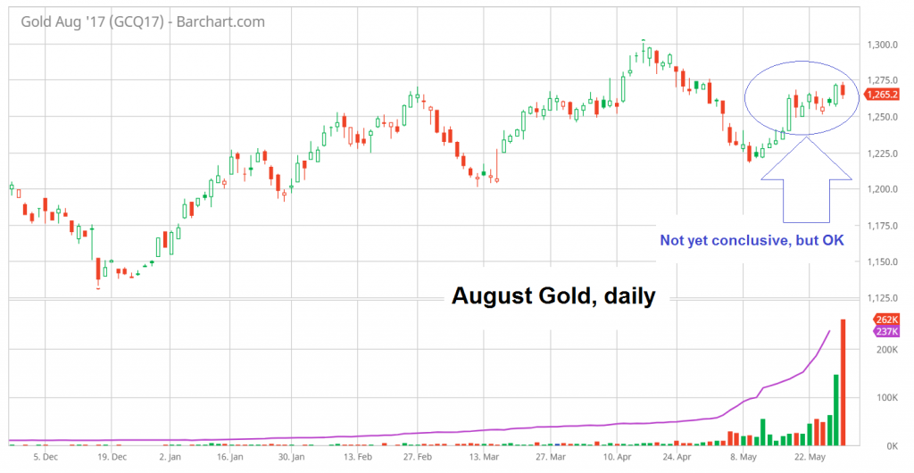
Gold Daily, August 2016One could say in a way that the two time frames are confirming each other. Next comes an updated clean daily chart of the August gold contract, just to show where things stand at the moment, which essentially is “follow-through is still missing, but things still look OK so far”. Unfortunately, as you will see further below, one has to take this with a big grain of salt at the moment. |
Gold Daily, August 2016(see more posts on Gold, ) |
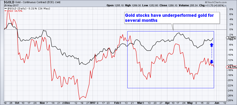
Comparison of the HUI with GoldHe then goes on to assert that it is simply not true that strength and weakness in gold stocks tells us anything about the future performance of gold, which as anyone with a little bit of experience in trading this sector knows is incorrect, even if he tries to support his claim with presumably carefully cherry-picked statistics. Now, if at the end of last week not just one, but several gold bulls have indeed advanced the argument that one should be bullish on gold “because gold stocks are outperforming gold”, then we want to know where precisely this nest of anonymous gold bulls is located, and what they are smoking there. Look at this performance comparison of the HUI with gold: |
Gold / HUI Direct Comparison, Oct 2016 - Jun 2017(see more posts on Gold, ) |
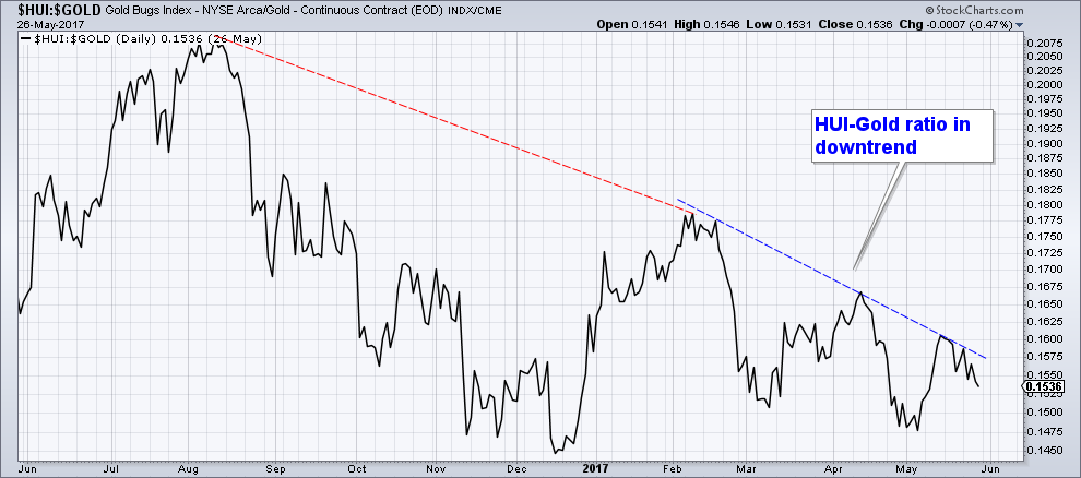
HUI-Gold RatioWe can perhaps show this even more clearly by simply looking at the HUI-gold ratio – which somehow manages to at least look even more terrible. Obviously, even in the face of this chart, it is always possible to argue that gold stocks have actually outperformed in such and such a time frame by cherry-picking dates. But why would a professed expert gold timer ever do that? It simply makes no sense in light of a trend like the one seen below (which incidentally masks quite a bit of internal weakness in less liquid stocks to boot). |
HUI:Gold Ratio, Jun 2016 - May 2017(see more posts on Gold, ) |
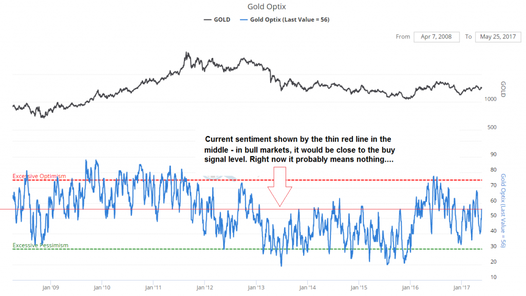
Gold OptixAnyway, the problem is precisely that the message from the gold stocks is not very encouraging at present. And that is not too surprising, because the bubble in “risk” is still bubbling. Before it ends, progress in the gold sector will probably be halting at best, although we remain of course open to gold sensing future changes in fundamentals with a long lead time, which can happen out of the blue – but that kind of character change will definitely be noticeable. Still, we keep wondering about those gold timers. There once was a time when these guys were really good, back in 2003 to 2004 for instance – they kept being right with their consensus calls, particularly at the most crucial turning points – regardless of the fact that Mark Hulbert steadfastly interpreted these consensus calls as contrarian signals. By the way, we are not trying to say that he is wrong a lot – in fact, we tend to take his alerts into account, because often he is actually right. We just want to point out that the sentiment signal from advisor newsletters doesn’t always work as rigidly as he seems to assume. Anyway, the timers really had smart money qualities at the time. And they definitely used gold stocks as confirmation/non-confirmation indicators – probably the way we are doing it, by gut and by eyeballing charts (of course we are often wrong, and coin flipping may be a better way. But we do at times sense when turning points are at hand based on the to and fro between gold, gold stocks and sub-sectors within the mining stocks universe). In terms of sentimentalists Optix, gold is in currently in no-man’s land – at a level that would actually be fairly bullish if a clear uptrend were underway, but is essentially neutral when it is going sideways as happened recently. |
Gold Optix, Jan 2008 - 2017(see more posts on Gold, ) |
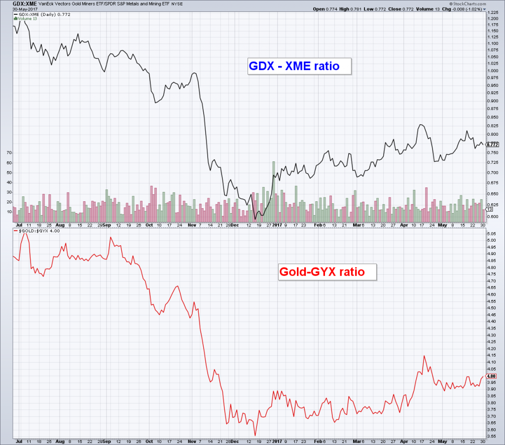
ConclusionDespite the fact that the charts of gold itself don’t look bad at the moment, overall this is more of a neutral situation… with the relative weakness of gold stocks a concern (and the main reason why many people didn’t really like the recent gold rally all that much). We leave you with a final chart that shows that gold is only slowly gaining back ground it lost against industrial metals since the US presidential election. The chart compares the GDX-XME ratio and the Gold-GYX ratio. Both indicate that the market is still betting on growth rather than credit problems or other calamities. That can of course change very quickly – and these ratios should tell us if and when it does. |
GDX-XME Ratio and Gold-GYX Ratio, Jul 2016 - May 2017(see more posts on Gold, ) |
| Bonus Photograph: The Devil’s Worm
As hard as it may be to believe, down in deep level mines like Mponeng, small creatures were found to live in the dark and the heat, whom no-one had seen before. Rock-eating bacteria for instance, but also a nematode that eats said bacteria if we’re not mistaken and goes by the name of Halicephalobus mephisto – or the Devil’s Worm (Mephistopheles means literally “he who doesn’t love light”, but it is also one of the devil’s names). These nematodes are the only multi-cellular organisms ever found at depths of 2.2 miles under the surface. And although they are very small, their discoverer, a geoscientist by the name of Mr. Tullis Onstott, got a Prometheus-type fright when he first came across them (we are referring to the Ridley Scott movie here). As Onstott stated: “It scared the life out of me when I first saw them moving…they look like black little swirly things” Yep, they probably do. |
Conundrums for the Unlucky
At the end of last week we saw a column by Mark Hulbert that left us startled. What on earth was he talking about? Let us interpose here that what didn’t startle us, was the title of the column, namely: “Gold bulls can expect more bad luck”. What else would gold bulls expect? The typical gold bug’s life is one of grievous woe, unending complaint, violent gnashing of teeth and dreadful wails of despair, interspersed with brief moments of glory. Those are of course worth it… more often than not, they are really glorious, double-plus glorious so to speak.
Over time, gold bugs become Zen-masters of endurance and patience. Telling them that they are about to run into “bad luck” will hardly faze them. You might as well tell them that there will be damp weather in England. At least he didn’t rub it in quite as brutally as he did in early May, just as the most recent $55 rally got underway, an event he prefaced with “Bull run for gold is pure fantasy”. In a way the month of May therefore represented a stay of execution, or maybe we should call it a “stay of reality”, since the fantasy came true, if only for three weeks. We can tell you that nobody really liked that rally anyway.
But let us get back to what Mark Hulbert writes in his latest infomercial. He starts by telling us how terrible things are:
Gold’s sentiment foundation has weakened considerably over the last month. That’s saying something, since at the beginning of May it already was quite weak. But the month of May has witnessed a sentiment development in the gold market that you hardly ever see: Even as the price of gold bullion GCM7, -0.51% has fallen, bullishness among gold timers has skyrocketed. This is a bearish development, […]
(emphasis added).
Of course gold has rallied by $55 over the past three weeks, which may have something to do with the too bright mood. We will concede that it is probably not good if all those gold timers are actually bullish – especially as there really is a big fly in the ointment from our perspective. But now for the truly startling part:
“What has led the gold timers to become so much more bullish in the wake of bullion weakness? There is no one reason, of course. But one argument that several gold bulls have advanced is that, even as gold bullion has dropped, the shares of gold mining companies have risen. In contrast to gold bullion’s 1% month-to-date decline, for example, the PHLX Gold/Silver Index XAU, -1.14% has gained more than 1%. This is supposedly bullish, these timers argue, since mining company shares’ relative strength historically has been a leading indicator for the price of gold itself.”
(emphasis added)
Full story here Are you the author? Previous post See more for Next postTags: Chart Update,Gold,newslettersent,Precious Metals


