


Murray Rothbard called Richard Cantillon the “father of modern economics.” While that title is often given to Adam Smith, Rothbard suggested that all the good things in Smith were first discovered by Cantillon or other pre-Smithian economists and that virtually all of Smith’s original ideas were “a significant deterioration of economic thought.”
One of Cantillon’s greatest insights involved the uneven effects of monetary expansion. New money enters the economy at a particular point—the first spender of new money acquires goods from the market, and those sellers may now use the money to increase their demands for goods, and so on. The money ripples out from its origin, providing real benefits to those closest to the center. As the new money is spent, prices rise, meaning those whose incomes rise later in this spending chain (or never) are the “losers” in this process.
In our modern world with fiat money and central banking, the government, banks, and privileged financial institutions are at the center. Those on fixed incomes and those who don’t have assets to sell to those earlier in the spending chain are on the outskirts. Money printing creates winners and losers, and perpetual money printing creates big winners and big losers.
The idea of Cantillon effects is intuitive enough, but does it show up in economic data?
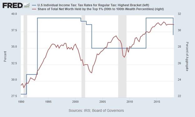
We’ll start with a chart that does not show Cantillon effects in action. The Left loves to blame economic inequality on tax cuts for the rich, but as the chart below shows, it doesn’t look like top tax rates have much to do with wealth inequality. If they were right, we’d expect the big increase in tax rates from 1990 to 1993 to be associated with a fall in the top 1 percent’s share of net worth, not the observed increase. And when top tax rates fell from 2001 to 2003, there was a slight decrease in wealth inequality. The top tax rate stayed the same for a decade after that while wealth inequality went up and down. If you squint your eyes, there’s almost a positive correlation in these series, not a negative one as the Left would have us believe.
Figure 1: Do “tax cuts for the rich” exacerbate inequality?
https://fred.stlouisfed.org/graph/?g=1eICt
Source: “Internal Revenue Service, US Individual Income Tax: Tax Rates for Regular Tax: Highest Bracket (IITTRHB)“ and “Share of Total Net Worth Held by the Top 1 Percent (99 to 100 Wealth Percentiles) (WFRBST01134),” FRED, Federal Reserve Bank of St. Louis. Data from the US Department of the Treasury and the Board of Governors of the Federal Reserve System.
But there are tight correlations in measures of monetary expansion and economic inequality.
This first one shows the establishment’s favorite money supply measure, M2, against the net worth held by the top 0.1 percent. The most striking feature of this graph is the structural break in 2020. It’s as if Jerome Powell inserted the money hose straight into the pockets of the richest of the rich.
Figure 2: More money printing, more inequality
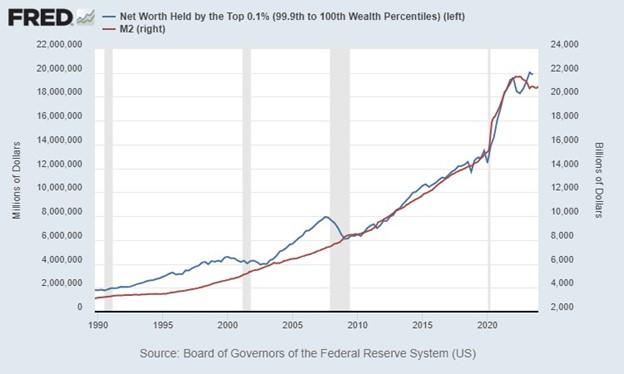
Source: “Net Worth Held by the Top 0.1 Percent (99.9 to 100 Wealth Percentiles) (WFRBLTP1246)” and “M2 (M2SL),” FRED, Federal Reserve Bank of St. Louis, accessed January 30, 2023. Data from Board of Governors of the Federal Reserve System.
This next one shows the relationship between low interest rates and the Gini coefficient. When the Fed wants to stimulate the economy, they do so by targeting a lower federal funds rate. The Gini coefficient is a common measure of income inequality. It equals zero if everybody has the same income, and it equals one if one person has all the income and everybody else has none. Since higher Gini numbers mean more inequality, I’ve flipped the federal funds rate data so it is easier to see if lower interest rates result in greater income inequality.
Figure 3: Low interest rates let the Gini out of the bottle
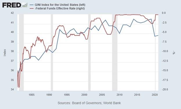
Source: “Gini Index for the United States (SIPOVGINIUSA)” and “Federal Funds Effective Rate (FEDFUNDS),” FRED, Federal Reserve Bank of St. Louis, accessed January 30, 2023. Data from the World Bank and the Board of Governors of the Federal Reserve System.
Our third chart relates bank credit and the total net worth of the top 1 percent. It’s important to remember that monetary expansion does not just come from the Federal Reserve. Banks can expand credit through fractional reserve banking. Of course, the Fed enables and exacerbates this, but either way, bank credit is another way to see Cantillon effects in action.
Figure 4: Credit expansion and wealth inequality
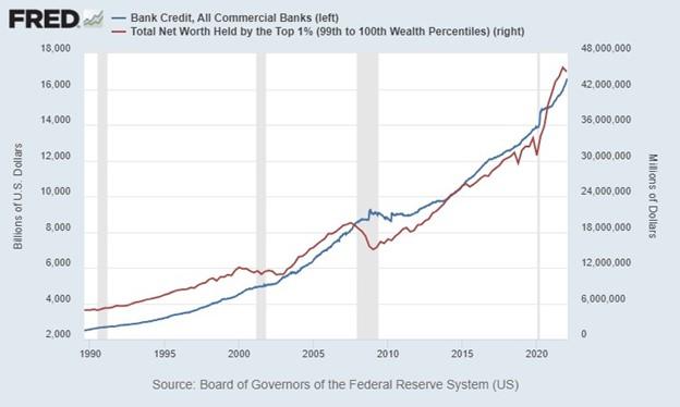
Source: “Bank Credit, All Commercial Banks (TOTBKCR)” and “Total Net Worth Held by the Top 1 Percent (99 to 100 Wealth Percentiles) (WFRBLT01026),” FRED, Federal Reserve Bank of St. Louis, accessed January 30, 2023. Data from the Board of Governors of the Federal Reserve System.
This last one comes courtesy of Lyn Alden, author of the book Broken Money. It includes the Standard and Poor’s 500 and a somewhat complex measure of total liquidity injections from both the Fed and the US Treasury. The reason this showcases Cantillon effects is because typically the rich are the ones invested in the stock market. In 2022, 93 percent of stock market equity was owned by the wealthiest 10 percent. Those living paycheck to paycheck can’t afford to gamble their money in the Fed’s stock market casino.
Figure 5: Government money drives the stock market
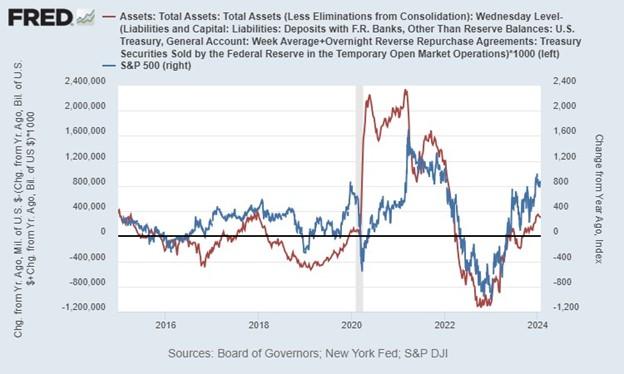
Source: “Liabilities and Capital: Liabilities: Deposits with F.R. Banks, Other Than Reserve Balances: US Treasury, General Account: Week Average (WTREGEN),” “Assets: Total Assets: Total Assets (Less Eliminations from Consolidation): Wednesday Level (WALCL),” “Overnight Reverse Repurchase Agreements: Treasury Securities Sold by the Federal Reserve in the Temporary Open Market Operations (RRPONTSYD),” and “Standard and Poor’s 500 (SP500),” FRED, Federal Reserve Bank of St. Louis, accessed January 30, 2023. Data from the Board of Governors of the Federal Reserve System, Federal Reserve Bank of New York, and Standard and Poor’s Dow Jones Indices LLC.
Of course, there’s a glaring “exception period” in this last graph from the middle of 2020 to early 2021. This was when both monetary and fiscal policy went like Buzz Lightyear to infinity and beyond in the covid panic while the stock market stumbled behind. Overall, however, you can see that there’s no such thing as stock market fundamentals anymore—only a liquidity-injection rollercoaster.
Conclusion
The logic of the Cantillon effect is incontrovertible. Of course, money printing will create winners and losers. If it didn’t, the government and run-of-the-mill counterfeiters wouldn’t have an incentive to run their printing presses.
The data confirms Cantillon’s insight from the 1730s. Measures of money printing and bank credit expansion are highly correlated with a variety of measures of economic inequality. While any healthy economy would have some inequality, it’s certain that putting the government in charge of the money supply has exacerbated it.
Full story here Are you the author?Tags: Featured,newsletter