Joseph Y. Calhoun
My articles My siteAbout meMy videosMy books
Follow on:LinkedINTwitterSeeking AlphaAmazon
|
The stock market has recovered most of its losses from the March COVID-19 induced sell-off and the enthusiasm with which stocks are being bought – and sold but mostly bought – could lead one to believe that the crisis is over, that the economy has completely or nearly completely recovered. Unfortunately, other markets do not support that notion nor does the available economic data. Of course, markets look forward and there is the possibility that stock market buyers are privy to knowledge about the future that bond traders are not. Sure. There is no doubt that economic activity is recovering from its worst levels. We can see that in numerous official and anecdotal reports. Because the official economic data is so delayed, investors have turned to new, non-traditional, and more timely measures of economic activity. This chart, for instance, shows total traveler throughput from the TSA on June 14th. Traffic has obviously improved since the nadir in March but it is still down 80% from last year. |
TSA checkpoint travel numbers for 2020 and 2019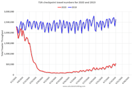 - Click to enlarge |
| You wouldn’t know that from looking at airline stocks. American Airlines stock has doubled from its lows and at its recovery high had nearly tripled. United, Delta, and Southwest have performed similarly. These stocks are still down roughly 50% YTD and they did receive government support but eventually, they will have to stand on their own. Air travel will have to recover a lot more than it has for that to come to pass.
We see a similar dynamic in the hotel industry where occupancy is currently about half the normal levels for this time of year. |
Hotel Occupancy Rate by week of year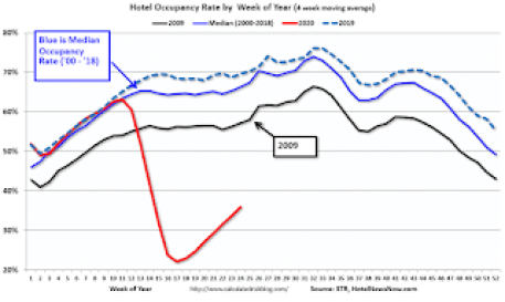 - Click to enlarge |
| Hilton stock, on the other hand, is down about 25% YTD and at the recovery high was down just 15%. Like the airline stocks, either the recovery accelerates from here or the hotel stocks have gone way too far, way too fast.
The travel industry will probably take longer to recover from the virus shutdowns than almost any other industry so to get a view of the economy as a whole, we need to look at other data. Unfortunately, there are only a few data points available for May, with most of the data in the table below being from April. One exception is Retail Sales which rebounded impressively in May: |
Advance Retail Sales, 2013-2020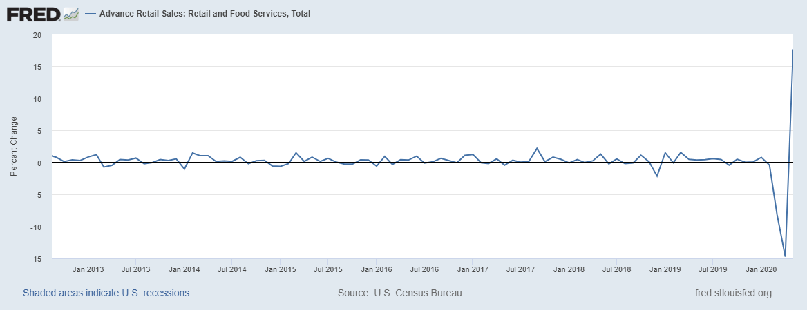 - Click to enlarge |
| I think that is the chart all the stock traders are looking at, the month-to-month percent change. What investors ought to be looking at though is the actual level of sales: |
Advance Retail Sales, 2012-2020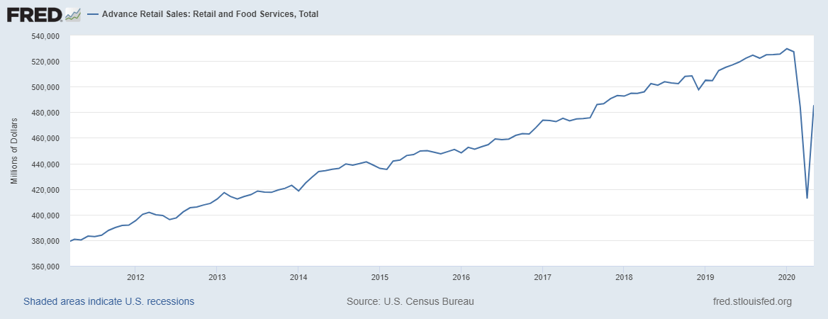 - Click to enlarge |
| Retail sales did indeed rebound in May but they are still down over 8% since January and 6.1% year over year. I would also warn anyone buying stocks on this news that this is one month after a 2-month shutdown after everyone received a stimulus payment and enhanced unemployment benefits. Is it sustainable? That is far from clear in my opinion.
I would also pay some attention to this chart of the inventory/sales ratio. This is from April so it probably improved somewhat in May but the point is that a sales rebound does not mean increased production until some of this inventory gets cleared out: |
Total Business, 1994-2020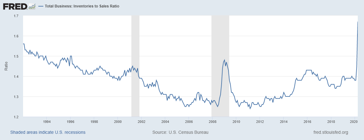 - Click to enlarge |
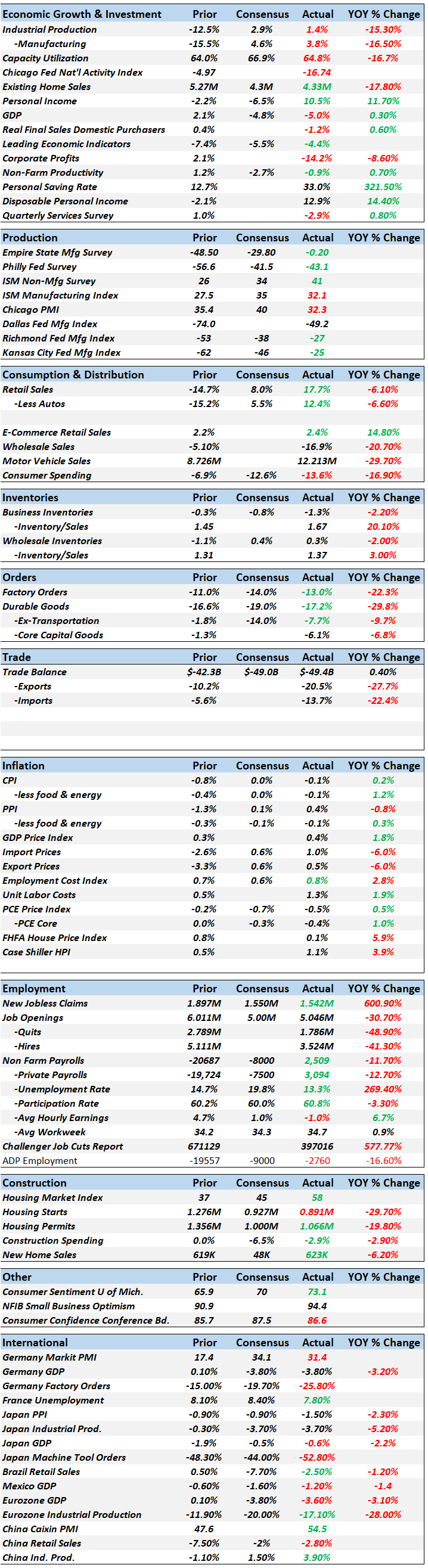
| If you scroll through the table of economic data below the positives are hard to find but there are some bright spots. Most prominent is personal income which has actually risen thanks to the government payments I mentioned above. Caution is still warranted since the enhanced unemployment benefits are scheduled to expire at the end of July but expecting an extension in an election year doesn’t seem a big stretch. Further stimulus checks are certainly not out of the question either, especially if President Trump’s poll numbers keep dropping.
The housing market has also held up quite well so far as mortgage rates have hit historic lows. The most current reading comes from the Housing Market Index, essentially a sentiment survey of builders, which rebounded to a 58 reading in early June. |
Economic Growth & Investment - Click to enlarge |
| That is down from 76 at year-end 2019 but back over the 50 level that indicates expansion.
Other than that, good news is hard to find. Which I think is why we don’t see any other markets exhibiting the exuberance of stocks. Long term nominal Treasury yields have risen very modestly but real rates (TIPS) haven’t budged off their lows. In other words, inflation expectations have risen slightly but real growth expectations are still as bad as they were in early March. Other market indicators of growth are also less than enthusiastic about future growth. Gold is near its highs, the dollar has been trending lower and commodities have recovered only slightly. Even crude oil, which has made a huge comeback from negative prices, is still down 44% year to date. And there is a long line of shale producers down at the bankruptcy court. The economy is working its way out of a giant hole so the rates of change look impressive but getting back to anywhere close to where we were is going to be a long slog. I often say that it isn’t our job to predict the future but merely to accurately interpret the present. Today that interpretation is that things are mostly better than they were in March and April but still pretty bleak. And some things, like employment, are still getting worse, just at a slower pace. As for the future, let’s just say I don’t think I’ll be needing any shades anytime soon. It is hard right now to be positive about the economy given the data and the message of the markets that aren’t trading stocks. But I wouldn’t get too pessimistic. The wonder of our economy is that it allows people to change, to adjust to new conditions, and find new ways to succeed. It just takes time and patience to see what emerges, to see how creative people will innovate and thrive amidst difficult circumstances. Right now, everyone wants to believe that we will recover quickly, that we’ve beaten the virus and all the government programs will work as advertised. So much confidence in government is hard to square with the historical performance of emergency government programs. So, my suggestion is to be patient, let the recovery happen naturally and respond as it does rather than trying to anticipate what is impossible to anticipate. |
 |
Market Indicators10-Year Treasury Yield10-year Treasury yields are off their lows but still very depressed. There is a consensus that yields are being held low by Fed buying but I have my doubts. If bond traders start to anticipate growth or inflation or both, the Fed won’t be able to stop rates from rising. That has always been the contradiction in QE. It is designed to reduce rates to stimulate the economy but evidence of its success would be higher yields. If the market thought what the Fed is doing was going to be successful, yields would already be higher. |
10-Year Treasury Yield, 2019-2020 - Click to enlarge |
| A longer-term view shows just how far below trend rates are now. Just getting back to that previous support line would require a move to 1.4% or basically double the current yield. That isn’t as extreme a move as it first appears. Getting back to the worst of the 2016 slowdown would theoretically do the trick. |
10-Year Treasury Yield, 2001-2020 - Click to enlarge |
10-Year TIPS YieldReal rates were already negative when the stock market peaked on February 19th and continued lower during the virus shutdown. Real rates hit their lows early in the shutdowns (March 6th) and have stayed depressed. Real rates are essentially the intersection of savings and investment, a proxy for real growth. This pretty much speaks for itself. |
10-Year Treasury Inflation-Indexed Security, 2014-2020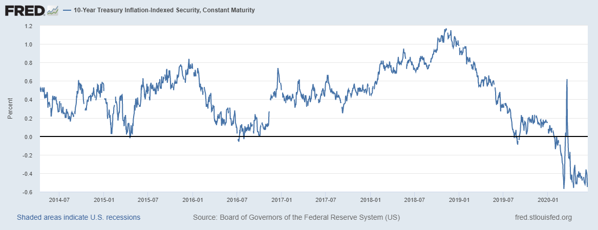 - Click to enlarge |
| This longer-term view clearly shows the weak recovery in this cycle. Peak rates after the 2008 crisis were only around 1%. Real rates today are only slightly above the nadir in 2013. |
10-Year Treasury Inflation-Indexed Security, 2004-2020 - Click to enlarge |
Inflation ExpectationsInflation expectations have recovered from their worst levels but are still well below the long-term average. And they have been declining for most of the post-2008 crisis period. I don’t see this as the problem that many others do. What matters for living standards is real growth and low inflation is not an impediment to growth. |
10-Year Breakeven Inflation Rate, 2004-2020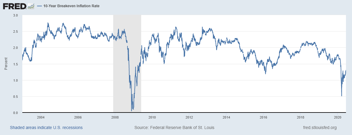 - Click to enlarge |
2-Year Treasury Note Yield2-year Treasury yields are still trading near their lows. The consensus view is that 2-year yields are anchored by Fed policy but history says the Fed is a follower. If the market believes that economic recovery is in progress 2-year yields will rise and eventually the Fed will hike the Fed Funds rate. |
2-Year US Treasury Yield, 2019-2020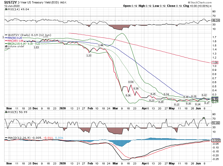 - Click to enlarge |
2-Year US Treasury Yield, 2008-2020 - Click to enlarge |
|
Yield CurveThe yield curve has steepened by 56 basis points since its max inversion on August 27th of last year. That was a result of the 2-year note yield falling 134 basis points and the 10-year falling 78 basis points. That is the classic steepening we usually see just prior to recession. This recession happened so quickly that the vast majority of the steepening happened after the recession already started. |
10-Year US Treasury constant Maturity 2-Year US Treasury Constant Maturity, 2007-2020 - Click to enlarge |
| The long-term view raises further questions. In previous cycles, the yield curve peaked near the economic bottom. Industrial production, for instance, bottomed in June of 2009 with the yield curve at roughly 250 basis points. The curve today is 50 basis points. Does that mean the worst is yet to come? Or that the curve won’t steepen nearly as much as it has in the past? |
10-Year US Treasury constant Maturity 2-Year US Treasury Constant Maturity, 1992-2020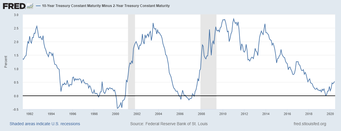 - Click to enlarge |
Credit SpreadsCredit spreads have improved from their worst levels, mostly from traders front running the Fed buying HYG. I suppose that the recent peak could be as bad as it gets but the recovery better be smooth. There are probably a lot of bankruptcies yet to come before this is over. |
US High Yield Index Option, 2008-2020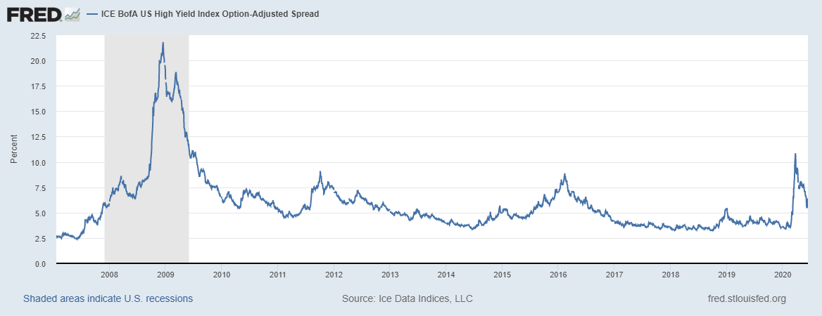 - Click to enlarge |
US DollarThe movement of the dollar index in this crisis has been very odd at times. Starting in late February, it fell 5% in a near straight line over 12 days. Then during the heart of the crisis, it rose nearly 10% in just 9 days. Then another 5% drop over 5 days. And now, lately, another 5% selloff over the last month. Where it goes from here may depend on whether we see a second wave of the virus. |
U.S. Dollar Index, 2019-2020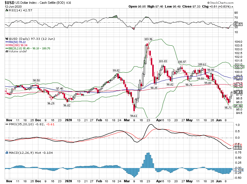 - Click to enlarge |
| The longer-term view shows that while the dollar has been strong, most of the gains were way back in 2014. There was surge right after Trump’s election but that only lasted a few months. For now, all we can say is that the dollar remains fairly strong against its major counterparts. Our economy isn’t great but it is still better than the alternatives. |
U.S. Dollar Index, 2008-2020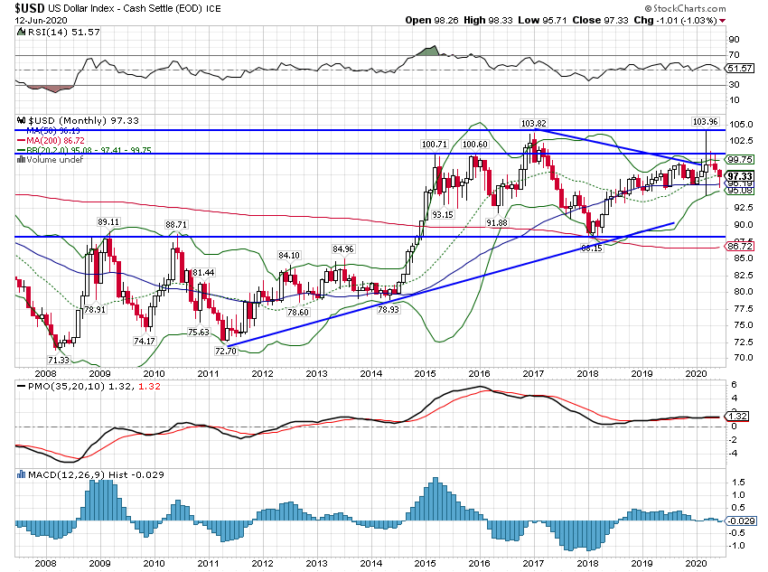 - Click to enlarge |
| The broad dollar index shows even more strength although it has backed off the highs. |
Trade Weighted U.S. Dollar Index, 2007-2020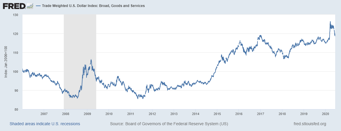 - Click to enlarge |
GoldGold is up on the year but had some troubles during the most intense part of the crisis. It has stalled since mid-April and underperformed stocks recently. Gold is another asset that doesn’t agree with the economic optimism of the stock market. |
Gold - Continuous Contract, 2019-2020 - Click to enlarge |
| Gold has been in an uptrend since 2016 but it really accelerated in late 2018. It is now bumping up against the highs from late 2011 when QE was stoking inflation worries. Getting through resistance would probably require more dollar weakness. |
Gold - Continuous Contract, 2008-2020 - Click to enlarge |
Commodity IndexesCommodities have come off their lows, but are still quite depressed. Oil has led the way but copper is also in a short-term uptrend. Again, the message is that yes, things have mostly stopped getting worse, but there is still a lot of slack. |
S&P GSCI Total Return Index, 2019-2020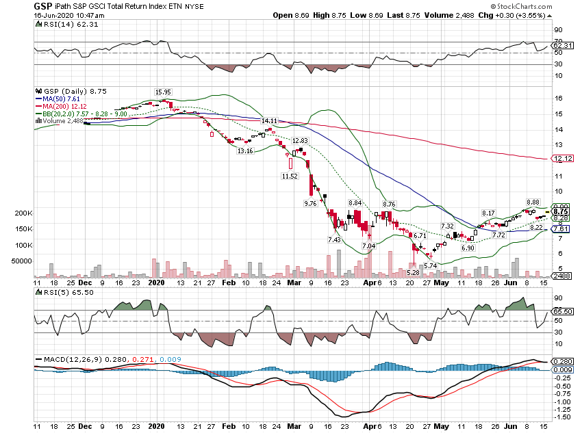 - Click to enlarge |
IPath Bloomberg Commodity Index Total Return, 2019-2020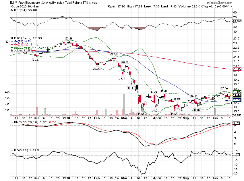 - Click to enlarge |
|
| If the recovery does accelerate there is a lot of upside for this asset class. Just getting back to the previous downtrend would require a move of roughly 90%. |
S&P GSCI Total Return Index, 2018-2020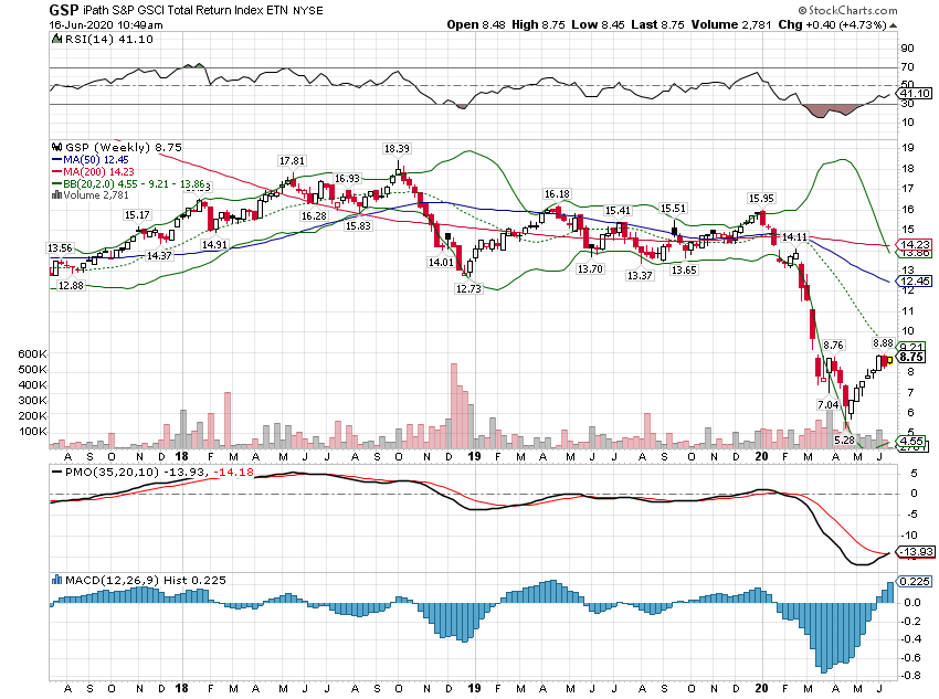 - Click to enlarge |
Copper: Gold RatioThe copper to gold ratio has also recovered from the lows but is still well below the long-term trend. Bond yields have lagged the recovery in this ratio but which market proves right is something I can’t predict. Either this ratio will fall because growth proves disappointing. Or rates rise as the recovery accelerates. |
Copper/Gold Continuous Contract, 2019-2020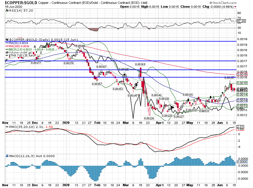 - Click to enlarge |
Copper/Gold Continuous Contract, 2019-2020 - Click to enlarge |
|
Copper Continuous Contract, 2008-2020 - Click to enlarge |
|
Gold:GSCI RatioThe gold to GSCI ratio shows a similar picture with general commodities outperforming recently but with gold having the upper hand longer-term. |
Gold Continuous Contract, 2019-2020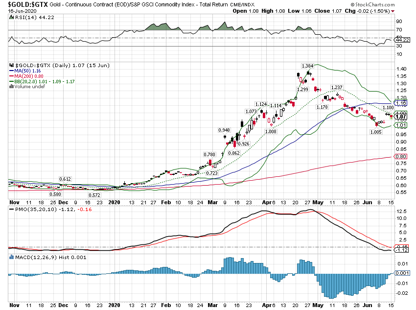 - Click to enlarge |
| On the other hand, this long term chart looks like an exhaustion move to me. Will gold fall or will commodities rally? That depends on growth. |
Gold Continuous Contract, 2008-2020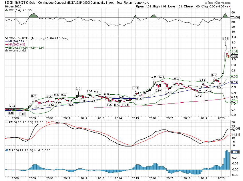 - Click to enlarge |
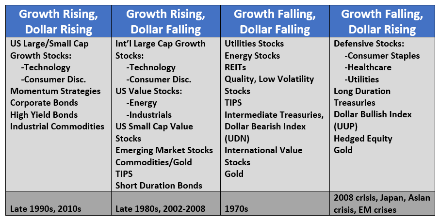
| Identifying the correct current economic environment is critical to getting asset allocation correct. We spent most of the last cycle in that first column with steady growth and a strong dollar. The recession pushed us into the far right column. Stock buyers today are assuming we will return to the previous regime but the evidence of that is still pretty thin. The dollar is still strong – although weakening recently – but evidence of growth is still quite thin and not supported by most of the market indicators we monitor. |
 . |
Full story here Are you the author?
Tags: Alhambra Research,Bonds,commodities,currencies,economy,Federal Reserve/Monetary Policy,Markets,newsletter,Real Estate,stocks,Taxes/Fiscal Policy