Charles Hugh Smith
My articles My offerMy siteAbout meMy videosMy books
Follow on:TwitterFacebookYoutubeAmazon
Isn’t it obvious that those at the top of the wealth-power pyramid don’t want us to know how much ground we’ve lost while they’ve gorged on immense gains?
In the late 1970s and early 1980s, an era of stagflation, the Misery Index was the unemployment rate plus inflation, both of which were running hot.
Now those numbers are at 50-year lows: both the unemployment rate and inflation are about as low as they can go, reaching levels not seen since the mid-1960s. (See chart below)
By these measures, the U.S. economy’s Misery Index has never been lower and hence prosperity has never been higher or more widespread.
But this simply isn’t true: the top 5% are indeed doing better than ever but the bottom 80% are losing ground and the middle 15% are only appearing to do well because asset bubbles have temporarily created illusory wealth.
I propose a 21st century Misery Index: Labor’s Share of the Economy and Real-World Inflation. Headlines about labor shortages and rising wages are popping up, suggesting the long-awaited boost in labor’s share of the economy’s growth is finally starting.
But these measures of increases are flawed. Median wage increases mask the fact that most of the gains are flowing to the top wage earners; gains are not equally distributed.
| Analysts touting increases in compensation costs paid by employers don’t realize much of these increases aren’t going into paychecks–they’re rising because employee healthcare costs are soaring.The one metric that counts is how much of the Gross Domestic Product is going to labor compensation. As the chart below illustrates, labor’s share of the economy has hit historic lows, and the recent bump up has been modest.
If we look at weekly wages for full-time employees, we find exceedingly modest gains on the order of $6 per week since the Great Recession of 2009–$300 a year. But this inflation-adjusted number is bogus: if wages were adjusted for real-world inflation, which is on the order of 7% to 8% for those exposed to real-world prices, i.e. those whose expenses aren’t subsidized, then wages have lost purchasing power since 2009. Here’s how your government figures inflation: your tuition rose by $25,000, your healthcare costs are $25,000 higher, your childcare went up by $10,000, but your last TV was $200 cheaper–mix it all up and inflation is 2%. This is of course beyond absurd, as this chart reveals: |
Inflation 1996 - 2016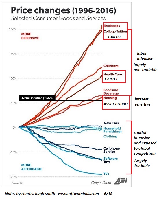 - Click to enlarge |
| As I’ve explained before, it all depends on how much of one’s exposure to real-world costs are being subsidized by the government or an institution. Those without subsidies are experiencing runaway inflation in big-ticket expenses such as rent, junk fees, childcare, college tuition/fees and healthcare.The point is: if costs are soaring, the institutions subsidizing the costs are absorbing the higher inflation; the cost of healthcare isn’t low because the subsidized patient pays $10 of a $1,000 bill.
Here’s official inflation, which is used to create an illusion of near-zero cost increases and phantom increases in wages: |
US Consumer Prices and Inflation, 1970 - 2018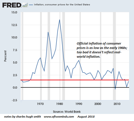 - Click to enlarge |
| Here’s labor compensation’s share of GDP: rising modestly off historic lows: |
US Labour Compensation in GDP, 1980 - 2018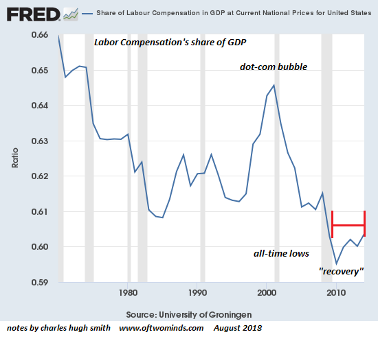 - Click to enlarge |
| Wages are rising, but only at the top: |
Wage Inequality, 1973 - 2015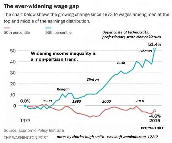 - Click to enlarge |
| So wages have risen $300 a year, while real-world costs have risen $3,000:this is why people don’t feel more prosperity in their paychecks: they’ve been losing ground for a decade or even longer.
Can we be honest for moment? Isn’t it obvious that those at the top of the wealth-power pyramid don’t want us to know how much ground we’ve lost while they’ve gorged on immense gains? The 21st Misery Index isn’t as pretty as the the official propaganda, but choose wisely when choosing what to believe is an accurate measure of the real world. |
Weekly Wages, 2010 - 2018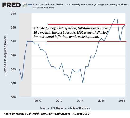 - Click to enlarge |
Summer Book Sale: 30% off Kindle editions, 25% off print editions. If you’re interested in real solutions, check these out:
A Radically Beneficial World ($6.95 Kindle, $15 print)
Read the first chapter for free
Money and Work Unchained ($6.95 Kindle, $15 print)
Read the first section for free (PDF).
Resistance, Revolution, Liberation ($6.95 Kindle, $15 print)
Read the first chapter for free.
My new book is The Adventures of the Consulting Philosopher: The Disappearance of Drake. For more, please visit the book's website.

Tags: newslettersent