


Authored by John Mauldin via MauldinEconomics.com,
“Vanity of vanities, saith the Preacher, vanity of vanities; all is vanity.”
– Ecclesiastes 1:2, King James Version (attributed to King Solomon in his old age)
| This week’s letter will take a look at the growing number of ridiculous, inane, and otherwise nonsensical absurdities that fill the daily economic headlines. I have gone from the occasional smile to scratching my head now and then to “WTF” moments several times a week.
Wondering if it was just me, I recently sent an appeal to a what became a large number of my friends and fellow writers and analysts, asking for their graphic examples of this paranormal economic activity. Suffice to say, it is not just me who sees absurdities. I received so many responses that I may have to extend this letter another week or two. (Note: This letter will print long, as there are lots of graphs.) Some of what you’ll see depicted in the following charts originated a decade ago in the Global Financial Crisis – or was caused by the reactions of central bankers to that crisis. The many shocking, previously unimaginable acts by central banks and governments left us so numb that I think we started to simply accept them without much thought. That was our mistake: We must confront the unthinkable, not just shrug our shoulders at it. Because when we have our next crisis, I will bet you dollars to donuts that central banks and governments will react in ways that are even more unthinkable. Now on to the bonfire. |
 - Click to enlarge |
Vanity of VanitiesIf you work in the financial industry you’ve probably read, or at least know plenty about, the Tom Wolfe novel Bonfire of the Vanities. It’s a great book, but it’s not the source of this letter’s headline. I’m thinking back further to the original “bonfire of the vanities” in fifteenth-century Florence. In 1490 the ruling Medici family brought in Dominican friar Girolamo Savonarola to serve them, but within a few years he was more or less ruling the city. In 1495, during the pre-Lenten carnival, Savonarola began hosting a “bonfire of the vanities,” at which people would burn objects that inspired the deadly sin of vanity: mirrors, cosmetics, musical instruments, and so on. This being Florence, they also destroyed tons of artworks, tapestries, books, furniture, and other priceless treasures. Did doing so make them any less vain? Probably not, but I’m sure the bonfires were quite magnificent. In a similar manner, we in this century routinely “burn” hard-won lessons (or at least expel them from our thoughts) because someone with an ulterior motive convinces us they’re useless or harmful. That’s rarely true, as we often discern too late, and then we have to learn the same lessons again. Think about this. How often do central bankers, regulators, corporate leaders, lawyers, politicians, and ordinary investors make the same mistakes over and over again? All the time. If we would stop burning our memories, we might make better progress. But no, we must have our bonfires. And so the absurdities are perpetuated. To kick off our tour of absurdities, Michael Lebowitz of 720 Global sends this chart of Federal Reserve assets as a percentage of GDP. You might notice a slight trend change along about 2008: |
Fed Assets as a percent of GDP, 1914 - 2014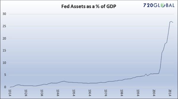 - Click to enlarge |
| Not to put too fine a point on it, but this is bonkers. I understand that we were caught up in an unprecedented crisis back then, and I actually think QE1 was a reasonable and rational response; but QEs 2 and 3 were simply the Fed trying to manipulate the market. The Keynesian Fed economists who were dismissive of Reagan’s trickle-down theory still don’t appear to see the irony in the fact that they applied trickle-down monetary policy in the hope that by giving a boost to asset prices they would create wealth that would trickle down to the bottom 50% of the US population or to Main Street. It didn’t.
The Fed has left that bloated balance sheet alone for almost 10 years. And now for some reason they feel it is urgent to reduce the balance sheet even as they also raise rates. This is not model-based monetary policy; it is simply an emotional monetary policy experiment. I can understand raising rates – I wish they had done that four years ago. I can even understand reducing the balance sheet. But at the same time? When you don’t know what you don’t know? I mean really, there is no way to know how the market is going to react to either of these events, let alone to both at the same time. This seems to me the height of monetary policy lunacy. The Fed’s stimulus efforts manifested themselves, among other places, in years of near-zero interest rates, helpfully illustrated here by Peter Boockvar: |
Federal Funds Target Rate, 2007 - 2017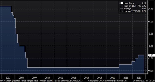 - Click to enlarge |
| We all lived through this remarkable set of experiments, but it’s still amazing to think that in 2007–2008 the Fed chopped short-term rates by five full percentage points in just five quarters. Today we agonize over whether they’ll hike rates by half as much, spread over five years or more. Note also that this gargantuan rate cut still couldn’t avert a near meltdown of the banking system. You can argue that it would have been even worse to do nothing, but it’s hard to argue they didn’t do all they could have.
But it wasn’t just the Federal Reserve. The European Central Bank and the Bank of Japan have both grown their balance sheets more than the US has. The Bank of Japan’s balance sheet is almost five times larger in proportion to GDP. And it is still growing. The Land of the Rising Sun has become the land of the rising central bank balance sheet. This graph is courtesy of my friend Dr. Ed Yardeni: |
Total Assets of Major Central Banks, 2007 - 2018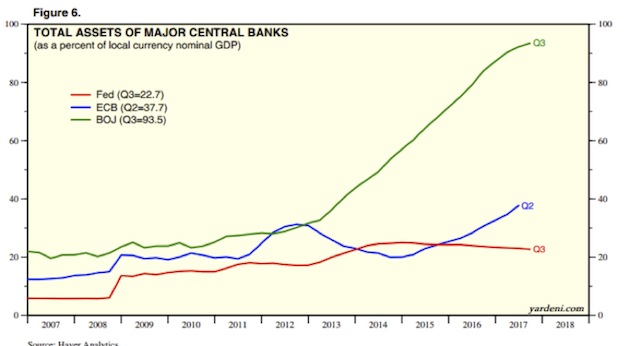 - Click to enlarge |
Those Crazy SwissMeanwhile, the more sober-minded (hah!) gnomes of the Swiss National Bank expanded their own balance sheet at a much steadier pace, though in percentage terms they blew it up far more than the Fed or the BOJ did theirs. The Swiss National Bank is now the world’s largest hedge fund. My friend Dennis Gartman wrote me yesterday, saying,
|
SNB Total Assets, 2007 - 2017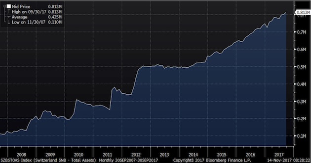 - Click to enlarge |
As I wrote earlier this year:
|
SNB Holdings(see more posts on SNB Holdings, )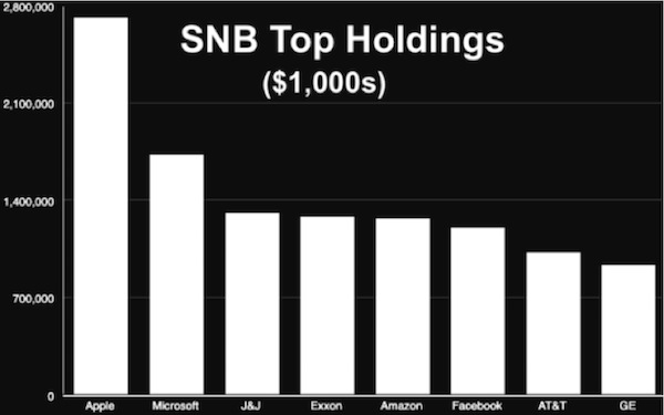 - Click to enlarge |
The Absurdities in the Bond MarketsNot coincidentally, European yields are at rock bottom, or actually below that, in negative territory. And what is even more absurd, European high-yield bonds, which in theory should carry much higher rates than US Treasury bonds, actually yield below them. Here’s a chart from old friend Tony Sagami: Interest rates are supposed to reflect risk. The greater the risk of default, the higher the rate, right? Yet here we see that European small-cap businesses are borrowing more cheaply than the world’s foremost nuclear-armed government can. That, my friends, is absurd. Understand, the ECB is buying almost every major bond it can justify under its rules, which leaves “smaller” investors fewer choices, so they move to high-yield (junk), driving yields down. Ugh. |
European HY, December 2011 - November 2017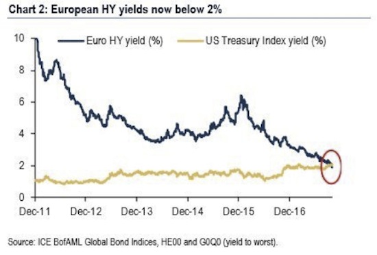 - Click to enlarge |
| And can anything be more absurd than negative interest rates in long-term bonds? |
Sovereign Debt with Negative Yields, April 2016 - May 2017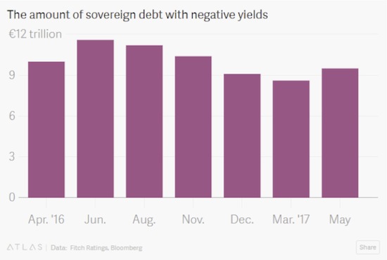 - Click to enlarge |
This 2016 article on the Quartz site, under the subhead “World Gone Mad,” makes clear the level of ridiculousness we’re looking at here:
|
Government Bond Yields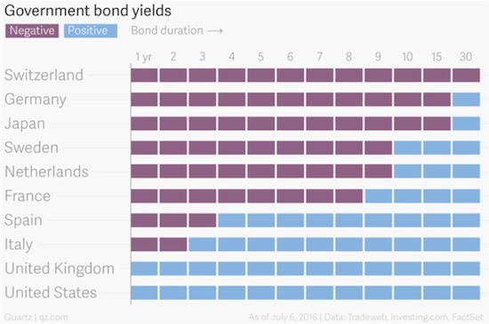 - Click to enlarge |
| All that said, the economists who designed these interventions had their reasons. They thought lower interest rates and liquidity injections would create jobs, spur investment, and eventually produce inflation. The idea was to then reduce the stimulus before inflation got out of control. Their gauge for assessing this tricky process is the unemployment rate. An economy at “full employment” is one in which inflation is right around the corner. The theoretical relationship looks something like this – chart from Gary Shilling. |
Philips Curve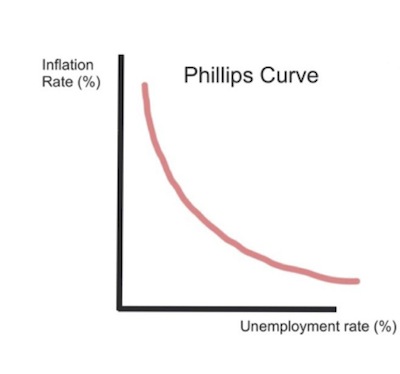 - Click to enlarge |
| In fact, we now have very low unemployment, accompanied by stubbornly low inflation. Why is that? No one really knows. All sorts of theories are floating around, but none have yet proven helpful in restoring the Phillips Curve. Here’s reality, again via Gary Shilling: |
Unemployment Rate and Consumer Price Index, 2007 - 2017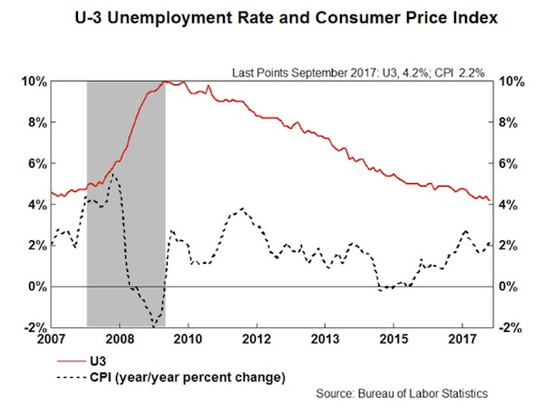 - Click to enlarge |
| The result is a strange economy in which the people who want jobs mostly have them – but remain deeply dissatisfied, stressed, overleveraged, and often angry. Consider this graph of real median household income, from my friend Murat Koprulu. |
US Real Median Household Income, 1985 - 2017 - Click to enlarge |
| This is median, not average, household income. That means half of households are doing better and half worse. It’s also inflation-adjusted, so the amounts are consistent over time. We see that the median family is roughly back where it was 20 years ago, in the mid-1990s. Worse, it’s still far below where it was ten years ago before the financial crisis. Is it any wonder people are mad?
One more absurdity. In the US we often think education is the key to getting ahead. That’s not necessarily the case anymore. Here’s another chart Murat sent me, showing real average hourly wages by education level. |
Wages, 2006 - 2017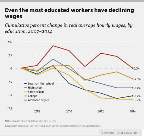 - Click to enlarge |
| From 2007–2014, possessing an advanced degree enabled you to “get ahead” only in a relative sense. Your wages stayed flat while those of the less-educated fell.
Notice how having “some college” was actually more negative for wages than having only a high school education. How can that be? Possibly because going to college without obtaining a degree leaves you in debt with less practical experience than your peers who went straight to work after high school. To that point, student debt is quickly becoming a problem for everyone. Look at this chart from Grant Williams on student loan debt held by the federal government. Do we add that to our national debt? |
Federal Government Held Student Loans, 1951 - 2016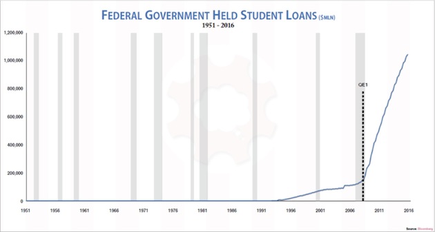 - Click to enlarge |
| Taxpayers are on the hook for over a trillion dollars in student debt. Unlike mortgage or business debt, student debt is backed by no tangible asset you can repossess. It bought knowledge that now hopefully resides in the student’s brain, but it may have just gone in one ear and out the other. That makes this debt uniquely risky. You and I are taking that risk, like it or not.
And here’s another chart from Grant Williams, showing stock market capitalization to GDP. We are only another healthy bull market run away from being back to dot-com bubble levels. A run that many of my friends firmly believe awaits us. |
Stock Market, GDP 1971 - 2017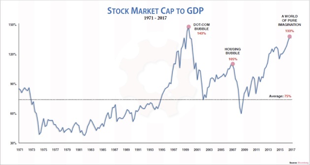 - Click to enlarge |
| The US stock market as a percentage of GDP is now far bigger than it was at the housing bubble’s peak, and it’s rapidly approaching the dot-com bubble peak. That ought to make us a little nervous as we watch the Dow hit new all-time highs.
And we will close this week’s adventure into absurdities with a note I got from Louis Gave this morning. Rather than just looking for absurdities in the developed world, Louis’ research team at GaveKal scours the entire world in depth every day. So he gives us a few lesser-known absurdities. [My comments will be in brackets.]
|
Current Account Balance, 1994 - 2017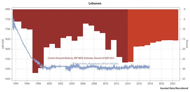 - Click to enlarge |
|
World, Equity Indices, MSCI, Mid & Large Cap, Aerospace & Defense, Index, Price/Book Value 1995 - 2017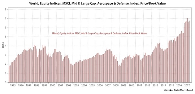 - Click to enlarge |
|
Global Market Cap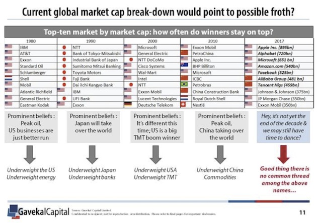 - Click to enlarge |
Okay, John back. Please note the serious level of sarcasm in the right-hand column above: “Good thing there is no common thread in the above names…” It’s all tech and all digital in the top seven. Note, however, that Exxon Mobil keeps hanging in there.
Full story here Are you the author?Tags: Apple,B+,Bank of Japan,Bond,Business,Central Bank,central banks,default,economy,Equity Markets,ETC,European central bank,Eurozone,federal government,Federal Reserve,Financial crisis of 2007–2008,headlines,housing bubble,Japan,Main Street,Meltdown,Monetary Policy,National Debt,newslettersent,None,Reality,SNB Holdings,Stock market crashes,Swiss Franc,Swiss National Bank,Switzerland,U.S. Treasury,Unemployment,US Federal Reserve,US government


1 comments
Stefan Wiesendanger
2017-11-22 at 19:20 (UTC 2) Link to this comment
Dear Sir
You regularly publish about the SNB. While most is correct, you seem to echo a misperception among American experts such as your friend James Grant.
Unlike the Fed, the SNB is *not* creating currency “out of thin air”. It is a fiduciary depositor for real claims of Swiss savers against abrod.
In more detail: Switzerland has had excess savings for as long as anyone can think. I am aware of reports dating back to the 17th century.
The resulting claims on abroad are reinvested abroad in normal times. Ever since the 2007 crisis, this channel is clogged for a number of reasons (sentiment, investment opportunities, regulations).
It is useful to look at the orders of magnitude: the total Swiss holdings abroad are north of 5trn USD (the stock variable), the yearly current account surplus fluctuates around 80bn USD (the flow variable).
Somewhat generalised: since 2007, the Swiss have frozen their stock of foreign holdings and started to repatriate the annual flow of fresh real savings in their dealings with abroad, to the tune of approx. 10% of GDB per annum (the current account surplus).
In this situation, the SNB does *not* create CHF out of thin air, it simply hands Swiss savers new CHF against their real claims on abroad that they want to change into CHF, and in turn takes the real claims on its balance sheet.
Now, there is a lot to say about this, most notably if it is up to a central bank to insure savers against potential currency and/or investment losses at the expense of the general public. But it is also true that the real options are limited if the free flow of capital is to be upheld and if the local manufacturing base is not to succumb to the Dutch disease.
Best regards
Stefan Wiesendanger