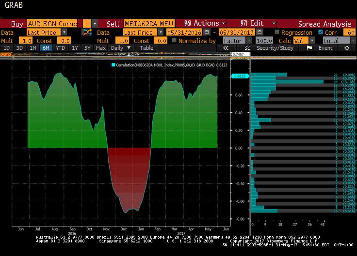
| This Great Graphic, from Bloomberg, shows the correlation between the price of iron ore and the Australian dollar on a rolling 60-day basis over the past year. The correlation is a little more than 0.81. The relationship is the tightest since last August. This is purely directional.
The correlation weakens considerably if we look at returns. When conducted on the basis of percentage change, the correlation drops to a little more than 0.2. While this is not particularly high, it is is a three-month best. Iron ore has made a round trip. Last September the 62% iron ore delivered to Qingdao, China cost about $55 a ton. It rose to almost $95 a ton by late February, and with today’s nearly 3% loss, is back at $57, its lowest level since last October. The Australian dollar had buckled under the dollar’s rally in the last part of the 2016, and finished the year near $0.7200. It rallied a bit more than nickel by the end of February as iron ore peaked. It has been trending lower since the spring equinox, recording a low near $0.7330 on May 9. It broke above the downtrend on May 22, but was unable to sustain the advance through $0.7500. The Aussie is flat to slightly heavier today. Initial support is seen near $0.7440 and resistance pegged near $0.7470. Technical indicators on the daily bar charts seem to favor the downside. |
Correlation Between The Price Of Iron Ore And The Australian Dollar, May 2017 |
Tags: $AUD,Australia,Great Graphic,newslettersent


