Charles Hugh Smith
My articles My offerMy siteAbout meMy videosMy books
Follow on:TwitterFacebookYoutubeAmazon
| Should the wealth effect reverse as assets fall, capital gains evaporate and investment income declines, the top 10% will no longer have the means or appetite to spend so freely.
Soaring wealth-income inequality has all sorts of consequences. As many (including me) have noted, the concentration of wealth and income in the top 0.1% has enabled the few to buy political influence to protect their interests at the expense of the many and the common good. In other words, extreme wealth-income inequality dismantles democracy. There is no way to sugarcoat this reality. But the concentration of wealth and income isn’t limited to the top 0.1% or top 1%. The top 5% and top 10% have increased their share of household wealth and income, too, and this has far-reaching consequences for the economy, as the top 10% accounts for the bulk not just of income but of spending. According to the Federal Reserve, (Distribution of Household Wealth in the U.S. since 1989), the top 1% owned 22.7% of all household wealth in 1989. Their share increased to 30.6% in 2022. The share of the 9% below the top 1% (90% to 99%) remained virtually unchanged at 37.4%. The top 10% own 68% of all household wealth. But this doesn’t reflect the real concentration of income-producing assets, i.e. investments. Total household wealth includes the family home, the F-150 truck, the snowmobile, etc. What separates the economic classes isn’t their household possessions, it’s their ownership of assets that generate income and capital gains. As the chart below shows, the top 10% own the vast majority of business equity, stocks/bonds and income-producing real estate, between 80% and 90% of each category. |
 . |
| This means the tremendous increases in asset valuations of the past two decades have flowed almost exclusively to the top 10%, with the important caveat that the vast majority of the gains in income and wealth have flowed to the top 0.1%, top 1% and top 5%.According to the US Census Bureau, (Income in the United States: 2021), the top 20% of households have 52% of all household income, and the top 5% have about 1/4th, (23.5%). The top 20% have roughly 50% of all income, but the top 10% have 40% of all income.
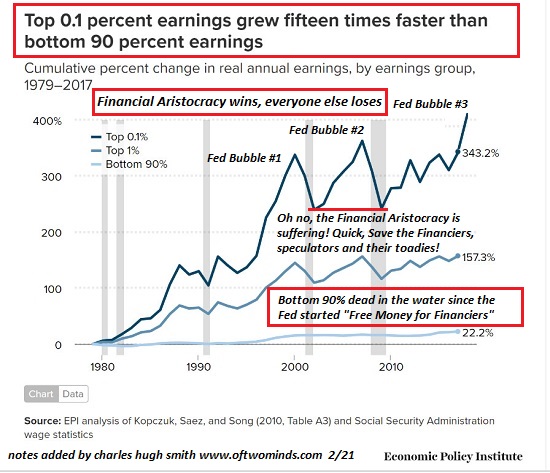
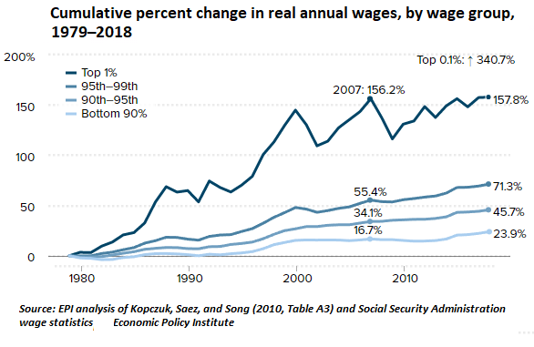
The other charts below reveal that the bulk of income gains sine 1980 have been concentrated in the top 1%. The top 5% registered triple the gains (71%) of the bottom 90% (24%). The income of the top 0.1% soared by 340%. For context, let’s look at some annual-income numbers. According to the Bureau of Labor Statistics, the mean income of the top 10% ($290,000) is almost six times the mean income of households at the 50% level ($51,000). Even more telling, the top 10% households ($290,000) earn twice as much as the 80% to 90% households ($145,000). What’s all this mean? It boils down to the wealth effect and spending. The top 10% account for roughly half of all consumption, which makes sense given they own 2/3 of the wealth and 85% of income producing assets, and they get 40% of the total income. If their wealth were to diminish in an extended Bear Market, their spending will also diminish. Not only will they no longer feel so rich (the wealth effect), the income and capital gains produced by their assets will also decline. |
 . |
| The dependence of major sectors of the economy on the spending of the top 10% is often overlooked. For example, one study of US airline flights found that 12% of the American populace take two-thirds (66 per cent) of all flights.
You see the pattern here: the top 10% account for half, two-thirds or over three-quarters of everything: wealth, income, income-producing assets, capital gains and spending. Should the wealth effect reverse as assets fall, capital gains evaporate and investment income declines, the top 10% will no longer have the means or appetite to spend so freely. By concentrating wealth and income in the top 10%, and making their spending so heavily dependent on capital gains and income generated by the bubble du jour, we’ve set our economy up for an asymmetric decline as credit-asset bubbles popping will lead to steep declines in top 10% spending–spending that supports myriad sectors that are heavily dependent on the free-spending top 10%. Put another way: the chickens of income-wealth inequality will inevitably come home to roost, generating far-reaching consequences in consumption, employment, tax revenues and virtually every other economic metric. If you want to know the direction of the economy, watch the top 10%. In some sense, everything else is signal noise. |
 . |
Tags: Featured,newsletter