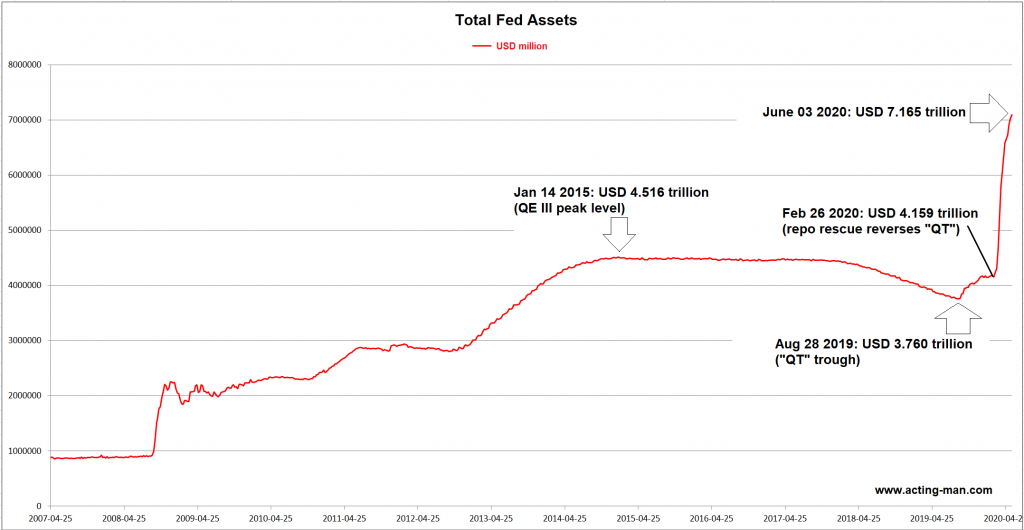
Printing Until the Cows Come Home…It started out with Jay Powell planting a happy little money tree in 2019 to keep the repo market from suffering a terminal seizure. This essentially led to a restoration of the status quo ante “QT” (the mythical beast known as “quantitative tightening” that was briefly glimpsed in 2018/19). Thus the roach motel theory of QE was confirmed: once a central bank resorts to QE, a return to “standard monetary policy” becomes impossible. You can check in, but you can never leave. |
|
| It is easy to see why. Any attempt to seriously reduce outstanding central bank credit will bring about the very situation QE was intended to prevent, i.e., falling asset prices and an economic bust. Seemingly no-one in officialdom ever stops to ask why that should be so. What happened to “self-sustaining recoveries” and “achieving escape velocity”? Could it be the economy is neither a perpetuum mobile nor a space ship?
Before we consider this question, here is what has happened since then: shortly after the double-plus-uncool novel SARS-2 corona-virus traversed several ponds and made landfall in the US, Mr. Powell and his fellow merry pranksters decided to water the money tree with super-gro. Or maybe it was hyper-gro: That is a rather noteworthy bout of inflation. Readers may have noticed that in the realms of finance and economics there has also been an inflation of verbiage describing never before seen extremes. By its very nature, one would normally not expect to hear the term “unprecedented” very often, but it has become disconcertingly commonplace in connection with monetary pumping, deficit spending and debt growth. |
Total Fed Assets, 2007-2020
|
Impact on the Money SupplyWe were surprised to find out that a number of observers still insist that the Fed does not or cannot “print” money. It can, and it does (here is a comprehensive overview of the mechanics: Can the Fed Print Money?). Confirmation from the horse’s mouth was recently provided by Fed chair Jay Powell himself in a 60 Minutes interview with Scott Pelley:
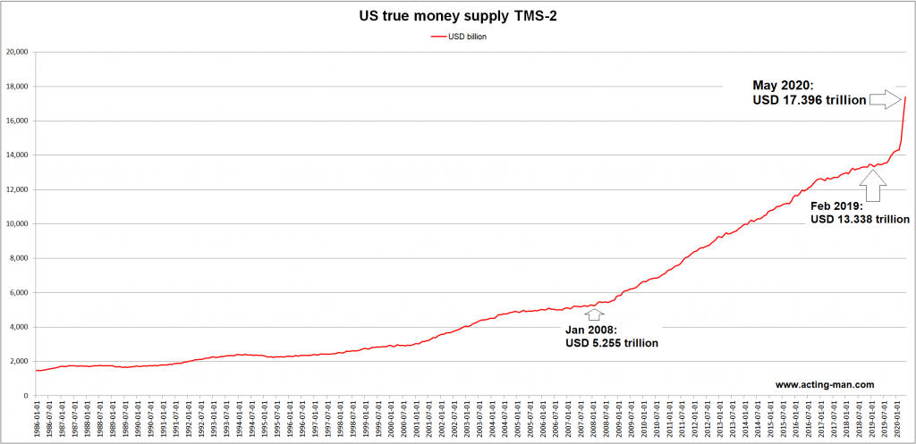
Indeed, they print money both digitally and physically. And since this money is created ex nihilo, the printing exercise is theoretically unlimited (a practical limit is imposed by public confidence in the central bank’s money). We frequently read in the financial press that central banks are supposedly in danger of “running out of ammunition”. That is obviously not possible, since all they need to create and deploy said ammunition is a computer and an internet connection. Here is the broad true US money supply TMS-2 as of May: |
US True Money Supply TMS-2, 1986-2020US money supply growth keeps going “more parabolic” from crisis to crisis. The COVID-19 induced pumping has added more than $4 trillion to the US money supply between February and May alone. In early 2008, just before the GFC became a serious concern, the entire TMS-2 money stock was just $5.255 trillion – which in turn was up from $2.928 trillion in January 2000. |
| Even by the already unusual standards of the past two decades the most recent QE effort is a stand-out. The next chart shows that year-on-year growth of TMS-2 has shot up to almost 30% as of May (based on the more frequently updated major components of TMS-2 it stands at roughly 33% by now) – surpassing all peak growth rates seen after the collapse of the tech mania in 2000 and the 2007-2009 crisis.
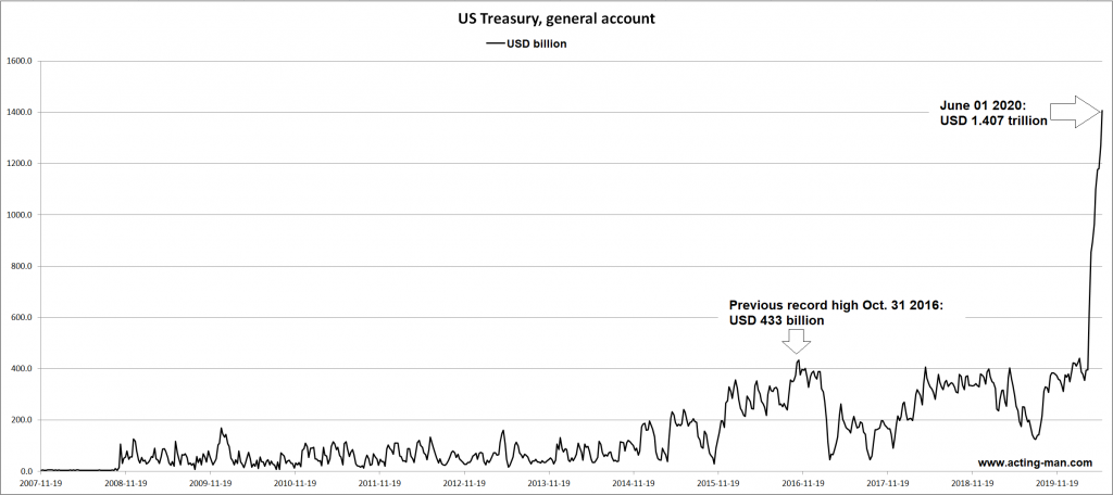
Meanwhile, total bank credit growth stands at 11% y/y, up from 5.4% at the beginning of the year. Bank credit growth has accelerated as companies have frantically drawn down credit lines in order to secure liquidity during the lockdown. Lending standards have tightened across the board otherwise. Still, the bulk of the recent spurt in money supply growth is obviously due to money the Fed has created directly. There is one important component of TMS-2 worth highlighting separately. This is one of the memorandum items on the Fed’s balance sheet that is not included in the traditional money supply measures (M1 and M2), namely the general account of the US Treasury. |
Annual Growth rate of TMS-2 with 12 month Moving Average, 1996-2020 |
| This used to be a fairly unimportant item, but that has changed since the GFC (previously the US Treasury’s cash float was as a rule far smaller and was partly held in accounts with commercial banks).
The important point is that this is indeed money – and the Treasury is going to spend it in coming weeks and months. The government has expanded its debt issuance activity in recent weeks in parallel with the Fed’s new QE program, pushing its cash deposit at the Fed to a new all time high in the process. As this money is spent, it will provide a boost to aggregate statistics of economic activity, but similar to QE, it won’t create any sustainable wealth. Ultimately all these interventions merely distort prices and redistribute existing resources. Regardless of how the government obtains the money it spends – whether by taxation, borrowing or inflation – every last cent of it is taken from the private sector. |
US Treasury, general account, 2007-2019(see more posts on US Treasury, ) |
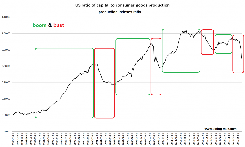
Production Structure Shortened as the Bust Takes HoldAs we have pointed out in these pages on previous occasions, one can to some extent gauge what is happening in the economy by comparing the production indexes of capital goods (business equipment) and consumer goods, which are proxies for activity in the higher and lower order stages of the economy’s capital structure (here is a brief primer on the production structure). As a boom progresses, more and more scarce resources are drawn toward the higher stages and the ratio rises. An economic bust will become visible by a decline in the ratio, as long-term investment projects are abandoned and resources are withdrawn from the higher stages and redirected toward the lower stages close to the consumer. Of course this ratio shows us only a rough approximation of what is a rather complex process, but it clearly does work well as a coincident indicator of booms and busts. The chart below shows the history of the ratio since 1990, with boom and bust periods highlighted. Major downturns in the ratio do indeed roughly coincide with periods officially designated as recessions by NBER. The downturn from 2014-2016 was an exception to this rule, as the bust was mainly confined to the oil sector and didn’t engulf the economy at large. During the fracking boom the energy sector accounted for a sizable proportion of capital spending in the US economy, which explains why the capital/consumer goods production ratio was visibly affected when the oil patch ran into trouble. In April this year the ratio fell to its lowest level in ten years. Needless to say, the current downturn is of the broad-based variety. Ever since a pure fiat money system was adopted in 1971 and the associated unfettered expansion in money and credit began, the ratio has fluctuated within an overarching upward trend (contrary to the sideways channel it inhabited before the 1970s). We believe this is a reflection of growing Fed activism, as the central bank is intervening ever more heavily in order to quickly arrest and reverse economic and financial market corrections. The reason why the Fed has stepped up its interventionism is that it fears a collapse of the giant credit bubble it has fostered. The problem with this is that malinvested capital is never fully liquidated or redeployed. As a result of this, ever greater structural deficiencies are accumulating in the economy. This hampers genuine growth and wealth creation and leaves the economy in an ever more vulnerable position, prompting even more pronounced interventionism whenever the next bust inevitably arrives. |
US ratio of capital to consumer goods production, 1990-2019Boom and bust periods as reflected in the ratio of capital to consumer goods production |
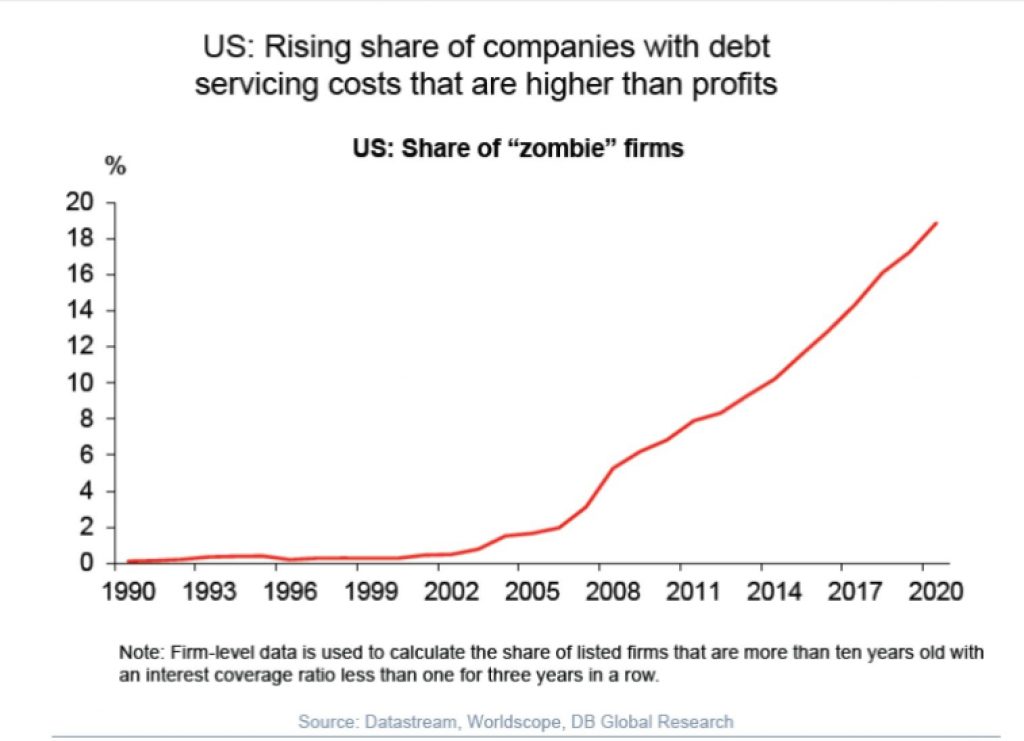
Rise of the ZombiesOne statistic that illustrates the cumulative deterioration in the economy’s structural foundation quite clearly is the rising number of so-called “zombie corporations” – i.e., companies that are not even able to earn their debt servicing costs and are therefore entirely dependent on ever-growing debt issuance to survive. The chart below shows the percentage of listed US zombie corporations according to Deutsche Bank Research – it is rather sobering: These companies represent a veritable powderkeg for investors, whether they hold their shares or their debt securities. However, that is not the only problem. These wealth-consuming entities compete for scarce resources with genuine wealth creators, making life more difficult for the latter. In other words, they are not only actively destroying wealth – they are also an obstacle to the creation of new wealth. As a result, net capital accumulation is slowing down and may eventually even reverse. |
US: Share of "zombie" firms, 1990-2020 |
Conclusion
Little thought is given to the long-term consequences of once again pumping up the money supply and enlarging government debt in response to the recent crisis. In fact, critical voices are very hard to find. However, this does not mean that these consequences can be avoided, and the long term has a nasty habit of eventually catching up with us and becoming the here and now.
Contrary to Keynes’ famous bon-mot “in the long run we are all dead”, many of us were actually still among the quick when the increasingly harrowing crises of recent decades materialized. Undoubtedly the monetary pumping and deficit spending orgies in response to the COVID-19 epidemic have blunted the effects of the downturn in the short run and are keeping a large number of zombies on life support – but this will make the next downturn even less palatable.
The pool of real funding, i.e., the real capital that actually funds production is neither infinite, nor magically self-replicating, nor guaranteed to always continue growing. There is a threshold somewhere – and one day the economy’s ability to generate wealth could well be overwhelmed.
Full story here Are you the author? Previous post See more for Next postTags: central-banks,Chart Update,newsletter


