Effects of Monetary Pumping on the Real WorldAs long time readers know, we are looking at the economy through the lens of Austrian capital and monetary theory (see here for a backgrounder on capital theory and the production structure). In a nutshell: Monetary pumping falsifies interest rate signals by pushing gross market rates below the rate that reflects society-wide time preferences; this distorts relative prices in the economy and sets a boom into motion – which is characterized by widespread malinvestment of scarce capital and over-consumption; eventually, the distorted capital structure proves unsustainable – interest rates begin to rise, and boom turns to bust. Many businessmen belatedly realize that the accounting profits of the boom were an illusion – in reality, capital was consumed. Many as yet unfinished investment projects have to be abandoned, as they either turn out to be unprofitable at higher rates and/or the resources needed to complete them are lacking. |
 When capital runs short: several of countless housing developments in Spain which had to be abandoned when the bust of 2007-2009 started. - Click to enlarge The image on the right hand side shows a Spanish construction machinery graveyard in 2010. Money supply growth in the US and the euro area exploded after the turn of the millennium, as central banks pumped heavily to combat the demise of the tech boom. In the process they egged on an even more dangerous bubble in real estate. In their great wisdom they have now replaced the expired real estate boom with an even larger, more comprehensive bubble in everything. |
| Below we show updates of a chart that depicts the effect of money supply and interest rate manipulation on the capital structure. The caveat to this is that such statistical data have to be viewed with a critical eye: one must always to ask to what extent the economy is actually amenable to “measurement” – often such aggregated data obscure more than they reveal. Having said that, many data series at least convey information about general trends.
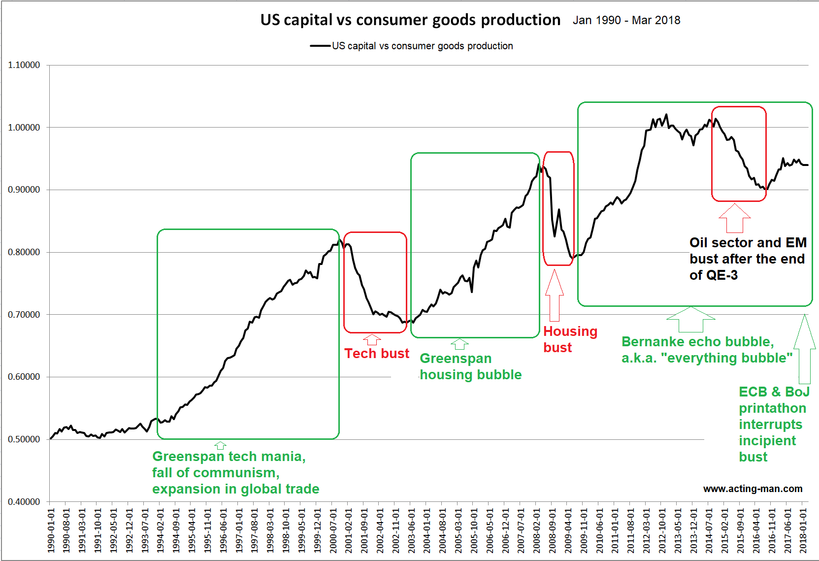
The chart shows the ratio between the production indexes for capital and consumer goods in the US. The trends in the ratio certainly seem consistent with theory: in booms driven by credit expansion, investment is increasingly drawn toward the higher stages of the production structure – capital goods production therefore increases relative to consumer goods production. Busts are heralded by a reversal of this trend. Eventually downtrends will be arrested, as monetary pumping is resumed at full blast and a new cycle starts. There is a catch though: this only “works” as long as there is enough real wealth that can be diverted by an inflow of new money. Obviously, printing additional fiat money is not equivalent to creating new capital (an aside: obviously the production structure is a complex latticework of processes and plans and does not just comprise two broadly defined sectors – but this simplification makes sense for the particular purpose of this illustration). Here is a medium term chart of the ratio since 1990: The current GBEB (Great Bernanke Echo Bubble) is still underway, although it almost keeled over when the Fed discontinued “QE 3” in 2014. This led to a downturn in the oil sector (and the wider commodities space). At the time capital spending related to energy production seemed quite important to the US economy, so it could not be ruled out that the sector’s woes would lead to a wider bust. Readers may recall that Fed district surveys of the manufacturing sector were weakening rather noticeably at the time and credit spreads started blowing out. Moreover, a number of emerging market economies did suffer outright busts. In some ways the situation was reminiscent of the 1997/1998 Asian/ Russian crisis, which caused a growth scare in developed markets, but didn’t trigger a recession. Instead of the Fed intervening and reigniting the bubble, the ECB and the BoJ stepped into the breach this time. Their debt monetization exercises propagated across the globe, suppressing yields and credit spreads far and wide through arbitrage effects. |
US Capital vs Consumer Goods Production, Jan 1990 - Mar 2018The ratio is currently well below its 2014 peak, but it remains close to the level it reached at the height of the previous boom. It seems fair to conclude that the fat lady is still in the process of clearing her throat. |
The Long Term ViewThe next chart shows the pattern in the capital vs. consumer goods production ratio since 1947, i.e., over the entire post WW 2 era. Under the Bretton Woods gold exchange standard, it was confined to a sideways channel far below recent levels. Recessions were more frequent at the time, but they tended to be shorter and less severe than the busts we have experienced since then. Not to forget, economic growth was on average much stronger as well. This is not surprising; the gold exchange standard was far from an ideal system, but it did impose some limits on central banks and governments – theoretically, anyway. It failed because they eventually decided to simply ignore these limits. By the time Nixon decided to default on the US government’s obligation to exchange its confetti for gold at a fixed ratio in line with the Bretton Woods agreement, the only open question was the degree of embarrassment the default would involve. He probably went for a “flight forward” because it created the illusion that he was still in control of events. His solemn declaration that he would “temporarily” suspend gold convertibility (a qualification that was never officially rescinded as far as we know), while blaming shadowy “speculators” for the dollar’s woes and announcing the imposition of tariffs and price controls was both funny and sad. It also serves as a useful reminder that government officials will routinely lie and misrepresent reality, particularly when they are about to reach deep into the wallets of the citizenry. |
“Hi there dear fellow hoi-polloi, allow me to temporarily relieve you of the ghastly burden of prosperity and give you an unprecedented opportunity to pay a lot more for everything. We’ll show them money-shufflers!” Famous guns and butter merchant, wagging a finger at nameless international speculators. |
| In any case, it certainly made for a very interesting decade – and the global debt-berg has expanded exponentially ever since. Here is the long term chart of our ratio: |
US Capital vs Consumer Goods Production, Jan 1947 - Mar 2018 |
| There is probably more than just one reason for the uptrend in the ratio since the adoption of the fiat money system. Nevertheless, the ups and downs in the ratio clearly continue to correspond to boom-bust cycles.
Over time much more wealth was created under the capitalist system than was consumed in credit expansion-induced booms – at least so far. Note that even a severely hampered market economy has enormous wealth creation potential. Ludwig von Mises states in this context that the ultimate outcome of credit expansion is “general impoverishment” (Human Action, p.562). While some people will escape this fate, or may even end up profiting due to a good sense of timing or due to sheer luck, the majority of the population will pay a price for the capital malinvestment and over-consumption of the boom period. However, he adds the following important point by way of clarification:
|
The more often cyclical boom-bust sequences are repeated, the more difficult real wealth generation is likely to become, as more and more capital will be consumed. Eventually a tipping point could be reached, after which “impoverishment” could well become a problem in absolute rather than merely in relative terms.
Up next: recent developments on the money supply and credit front.
Full story here Are you the author? Previous post See more for Next postTags: central-banks,newslettersent,On Economy,On Politics


