Charles Hugh Smith
My articles My offerMy siteAbout meMy videosMy books
Follow on:TwitterFacebookYoutubeAmazon
If you study these charts closely, you can only conclude that the US economy is doomed to secular stagnation and never-ending recession.
The stock market, bond yields and statistical measures of the economy can be gamed, manipulated and massaged by authorities, but the real economy cannot. This is espcially true for the core drivers of the economy, real (adjusted for inflation) household income and real disposable household income, i.e. the real income remaining after debt service (interest and principal), rent, healthcare co-payments and insurance and other essential living expenses.
If you want to predict the future of the U.S. economy, look at real household income. If real income is stagnant or declining, households cannot afford to take on more debt or pay for additional consumption.
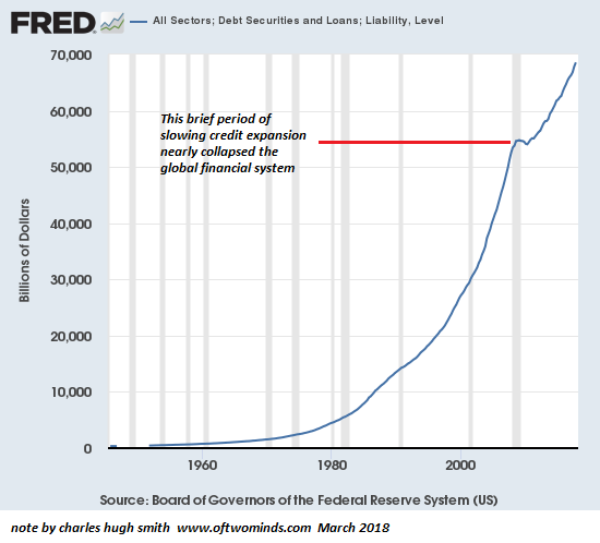
The Masters of the Economy have replaced the income lost to inflation and economic stagnation with debt for the past 17 years. They’ve managed to do so by lowering interest rates (and thus lowering interest payments), enabling households to borrow more (and thus buy more) with the same monthly debt payments.
But this financial shuck and jive eventually runs out of rope: eventually, the rising cost of living soaks up so much of the household income that the household can not legitimately afford additional debt, even at near-zero interest rates.
For this reason, real household income will dictate the future of the economy.If household incomes continue stagnating or declining, widespread advances in prosperity are impossible.
The Masters of the Economy have played another financial game to mask the erosion of real income: inflating speculative asset bubbles to boost the illusion of wealth, a form of financial sorcery called the wealth effect: households that see their stock and bond funds swelling by 50% to 100% in a few years are emboldened to believe this phantom “wealth” is permanent and thus can be freely spent in the present.
| The problem with this financial shuck and jive is only the top 5% own enough assets to experience the speculative high of asset bubbles. This is one reason why the top 5% have pulled away from the bottom 95%, a trend that is blindingly obvious in this chart of Real Average Household Income by Quintile and the Top 5%from the always-insightful Doug Short (U.S. Household Incomes: A 49-Year Perspective):
The gains since 1992 reflect the national distribution of wealth very closely: those with minimal financial wealth (the bottom 80%) experienced minimal gains in real income. Those with some financial wealth (the top 20%) enjoyed substantial gains, but the truly outsized gains were reserved for the top 5%, the class that owns the majority of the nation’s wealth. |
US Average Household Income, 1965 - 2017(see more posts on household income, )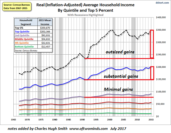 - Click to enlarge |
| The problem for the Masters of the Economy is that adjusted for inflation, even the incomes of the top 20% and 5% have gone nowhere in the 21st century. If even those households exposed to the enormous gains of this century’s two asset bubbles (2002 to 2008 and 2009 to the present) have stagnated, then all the financial shuck and jive isn’t trickling down to real income, which is the bedrock of the real economy.
This second chart from Doug Short reveals the period in which the top 20% pulled away from the bottom 80%, and the top 5% pulled away from the bottom 95%. In 1990-92, the gap between the bottom 80% and the top 20% and 5% was modest. The go-go decade of the dot-com boom saw the income of the top 20% pull away from the bottom 80% and the income of the top 5% leave the bottom 95% in the dust. |
US Household Income Cumulative Growth, 1965 - 2017(see more posts on household income, )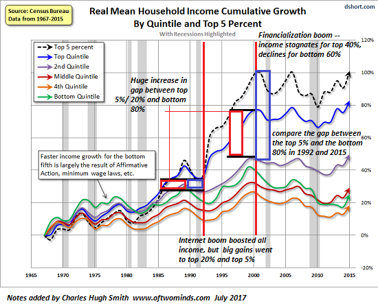 - Click to enlarge |
| All that changed in the Financialization Era of 2000 to 2015. Despite two unprecedented asset bubbles, the inflation-adjusted incomes of the top 40% have at best returned to the levels of 2000, while the real incomes of the bottom 60% have fallen dramatically since 2000.Please note that this data is from the U.S. Census Bureau. Many of the charts one finds on the web (see an example below) of income/wealth inequality are drawn from data collected by Piketty et al., which as many critics have pointed out, does not include government transfers and social welfare programs that are a substantial (and rising) share of household income for the bottom 60%. These include earned income tax refunds, Medicaid healthcare coverage, rent subsidies, direct welfare payments, subsidized school lunches, direct grants for higher education, and so on.
Anecdotally, the sum of these social welfare transfers can double the effective income of low-income households from $20,000 to roughly $40,000 or more. We can quibble about the total value of these transfers and benefits, but they are undeniably substantial and when included, more accurately reflect the real-world income available to lower-income households. It’s also necessary to include capital gains, i.e. income from invested wealth and speculative gains reaped from asset bubbles. Data collected by Piketty et al. includes capital gains. |
US Income by Percentile, 1980 - 2017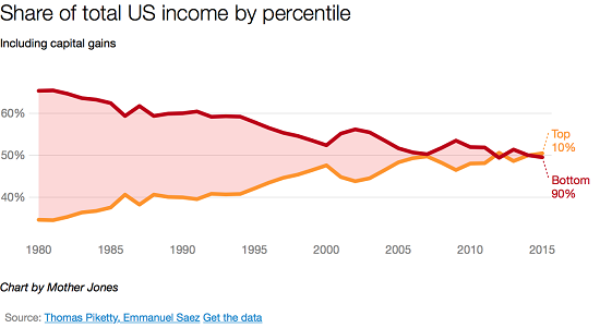 11 Charts That Show Income Inequality Isn’t Getting Better Anytime Soon - Click to enlarge
|
The point here is that no source of data on income disparity captures all these income streams or equivalents of income. I prefer to rely on I.R.S. tax records as the most reliable and least gamed source of income data, but the I.R.S. doesn’t tax Medicaid benefits, rent subsidies, etc., so it seriously under-represents the effective income of lower-income households.
That said, the incomes of the top 20% are mostly taxable and thus more accurately reflected in the data presented here.
If you study these charts closely, you can only conclude that the US economy is doomed to secular stagnation and never-ending recession as long as real income for all segments is stagnating or declining (other than the top of the wealth apex, i.e. the top .5% of households).
Every other economic measure other than real household income is shuck and jive, statistical trickery, or phantom “wealth” conjured into existence by unsustainable credit/asset bubbles. If the Masters of the Economy can’t move the needle of real household income for the bottom 95%, they’ll end up with a banquet of consequences that extend deep into the social and political orders.
My new book is The Adventures of the Consulting Philosopher: The Disappearance of Drake. For more, please visit the book's website.

Tags: household income,newslettersent